Innehållssamlare
The Drop Times: Drupal AI Summit NYC Opens Today With Focus on Enterprise AI and Open Source Governance
Dropsolid Experience Cloud: Drupal Camp Braga - Drupal the rails of the high value AI powered open web
The Drop Times: Drupal Community Mourns the Loss of Alanna Burke
1xINTERNET blog: The Future of Drupal Is Collaborative: How the Drupal AI Initiative Is Redefining Open Source Marketing
Discover how the Drupal AI Initiative is revolutionizing open-source marketing. Learn how 31 companies and a global team of specialists are scaling Drupal’s AI roadmap and driving enterprise adoption through radical collaboration.
1xINTERNET blog: Drupal AI in 2026: Status, Architecture, and Roadmap
13,980 active installs, 30+ Partner organizations, 25+ FTE committed. A look at what the Drupal AI Initiative is shipping right now and what comes next.
The Drop Times: Nick Opris Develops Daily Digest for Drupal AI Initiative Activity
Jacob Rockowitz: Drupal (AI) Playground: AI ate my work, and I need to be okay with that.
AI ate my work
I've been experimenting with using AI to build Drupal modules for the past few months. Two weeks ago, I released a module called the AI Schema.org JSON-LD module and wrote a blog post about it. The module essentially replaces the primary outcome of my Schema.org Blueprints module, which is to enhance SEO by providing high-quality Schema.org JSON-LD markup. The AI Schema.org JSON-LD module generates Schema.org JSON-LD by having contrib modules work together to call an AI provider with a simple prompt.
This simple module, which I built in four days, supersedes my work on the Schema.org Blueprints module, which I've been working on for four years. I could resent the fact that this new AI-powered module, created using AI, was replacing me and my work, but instead, it's just changing how I view the work I'm doing.
With AI, it's easier for me to explore new ideas and take on more ambitious tasks, while knowing that the code and modules I'm creating remain flexible and extendable by humans and machines. There's a fine line between feeling like AI is eating our work, replacing it, consuming it, or improving it. We should talk about it.
What does AI mean for me?
The most immediate thing I have to think about is how I took something I had previously built, saw how AI could replace it, and had to be open to recognizing the opportunity that AI could do things differently, better, and faster. Everyone needs to lean into that reality with AI: things can get done faster and with more possibilities.
It took me a while to realize that things had changed. I built a few very simple modules to understand how AI coding agents plan, document, build, test, and maintain code. After a few weeks, I began to see the...Read More
LakeDrops Drupal Consulting, Development and Hosting: Ten Months That Changed Everything: An ECA Journey
This post tells the story of the ten months that took ECA from Dries Buytaert' private "1% of what it could be" feedback in June/July 2025 to a keynote at Drupal DevDays Athens in April 2026, by way of DriesNote moments in Vienna and Chicago. It opens a 9-post series exploring how UX research with Emma Horrell, Mark Dodgson and Lauri Timmanee, close collaboration with Shibin Das, and a focused build sprint produced in-context customization, a new React-based Workflow Modeler, integrated testing and replay, AI-powered documentation, and a vision for Drupal as an orchestration hub.
Specbee: How to automate SEO metadata in Drupal at scale with the Bulk Metatag AI Generator module
#! code: Drupal 11: Node Display Mode Preview Form
This is part five of a series of articles looking at HTMX in Drupal. If you are interested in reading more then there will be a list of related articles at the end of this article.
When I was thinking about ideas on demonstrating HTMX in Drupal I implemented things like infinite scroll, a tabbed interface, and a cascading select form. I basically recreating some things that I had done in non-Drupal HTMX inside a Drupal module.
I then had an idea to create something that I might actually find useful in my day to day work as a Drupal developer. This was some way of displaying nodes in different view modes.
In this article we will look at creating a simple form that allows users to enter a node ID and a view mode and see the node rendered in that view mode.
All of the code contained in this article can be found in the Drupal HTMX examples project on GitHub, but here we will go through what the code does and what actions it performs to generate content.
Just like the other articles on HTMX, I'm going to start with the basics and define the route.
The RouteThe route we need here just needs to point the path /htmx-examples/display-mode-preview at our form class.
drupal_htmx_examples_display_mode_preview_form: path: "/htmx-examples/display-mode-preview" defaults: _form: '\Drupal\drupal_htmx_examples\Form\DisplayModePreviewForm' _title: "HTMX Display Mode Preview Form" requirements: _permission: "access content"There isn't anything unusual about this route, it's just a regular form route.
Let's create the form for this route.
The FormThe form class has a couple of injected dependencies, which are as follows:
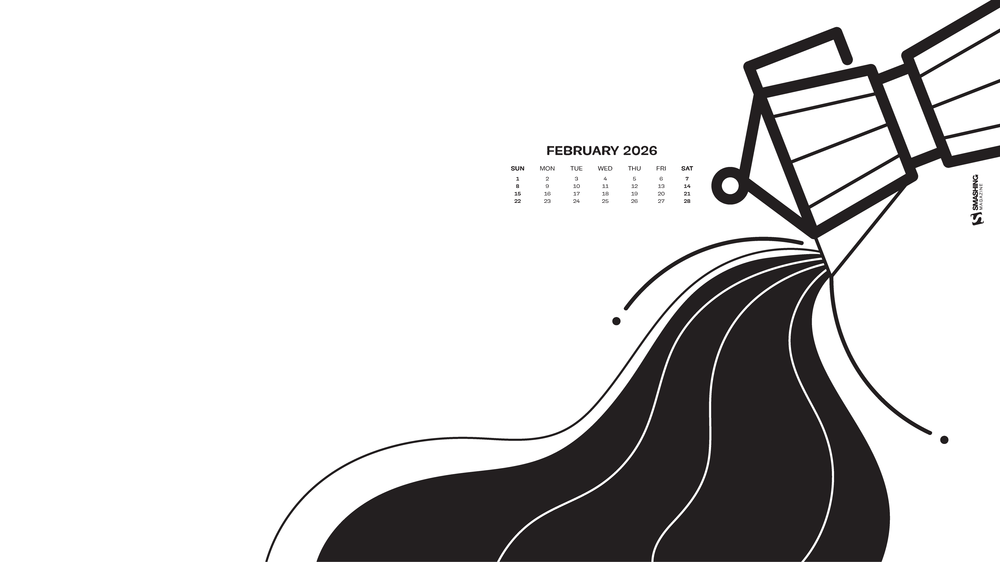
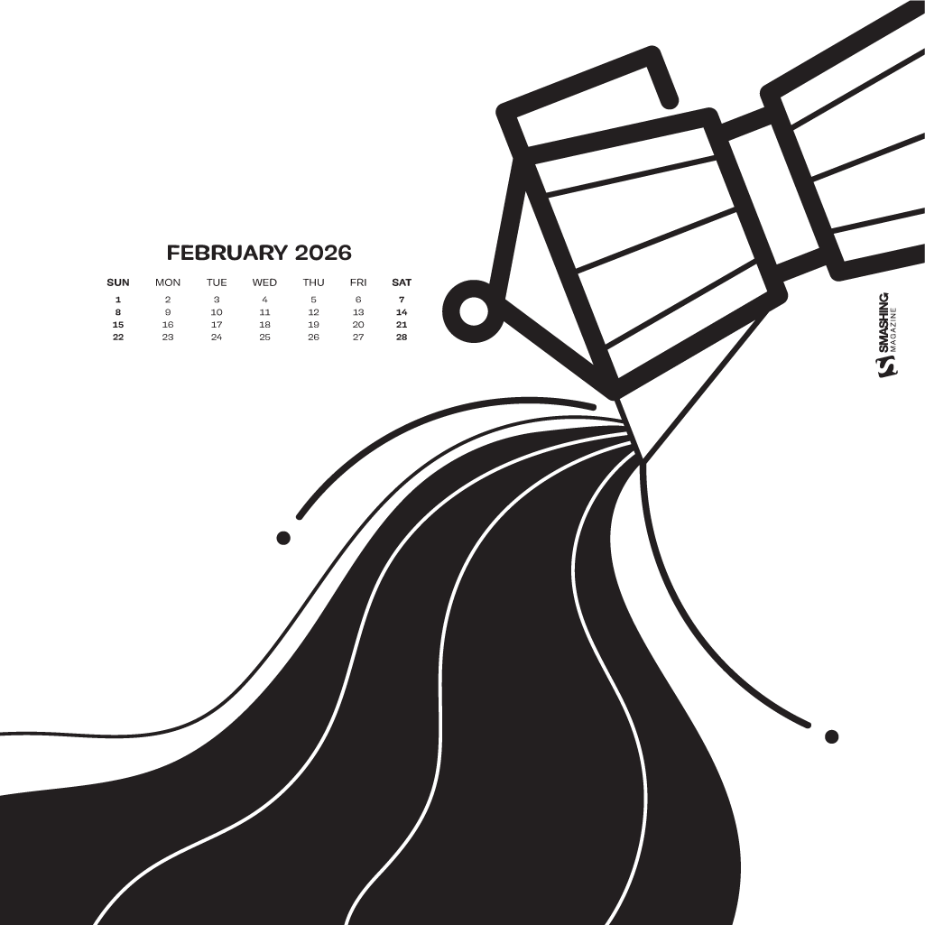
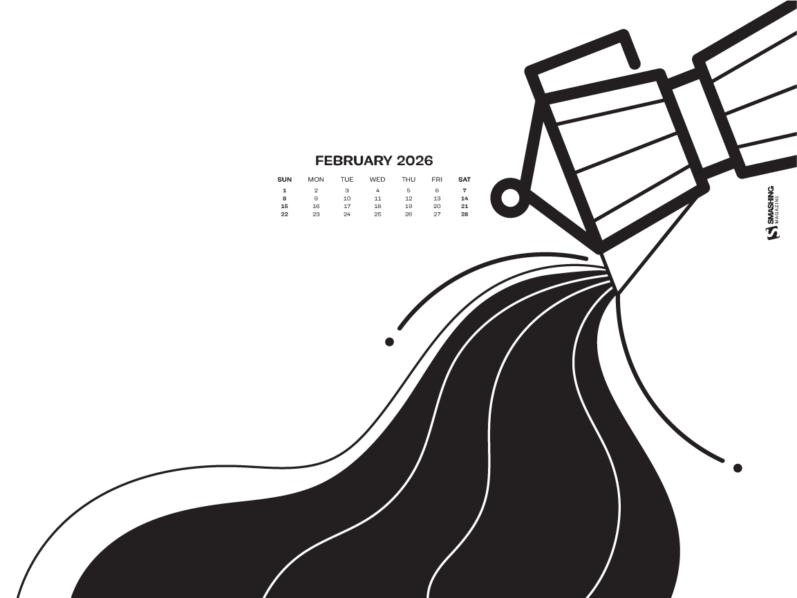
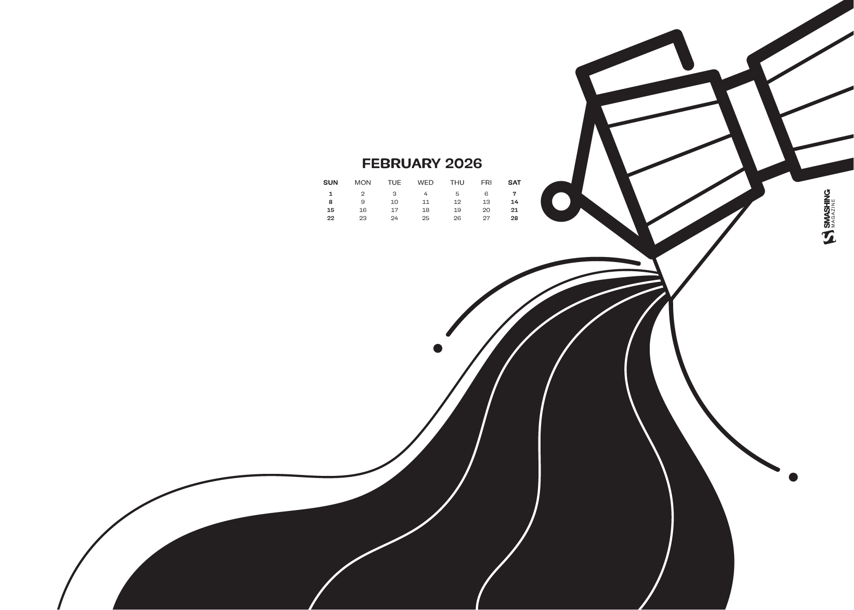
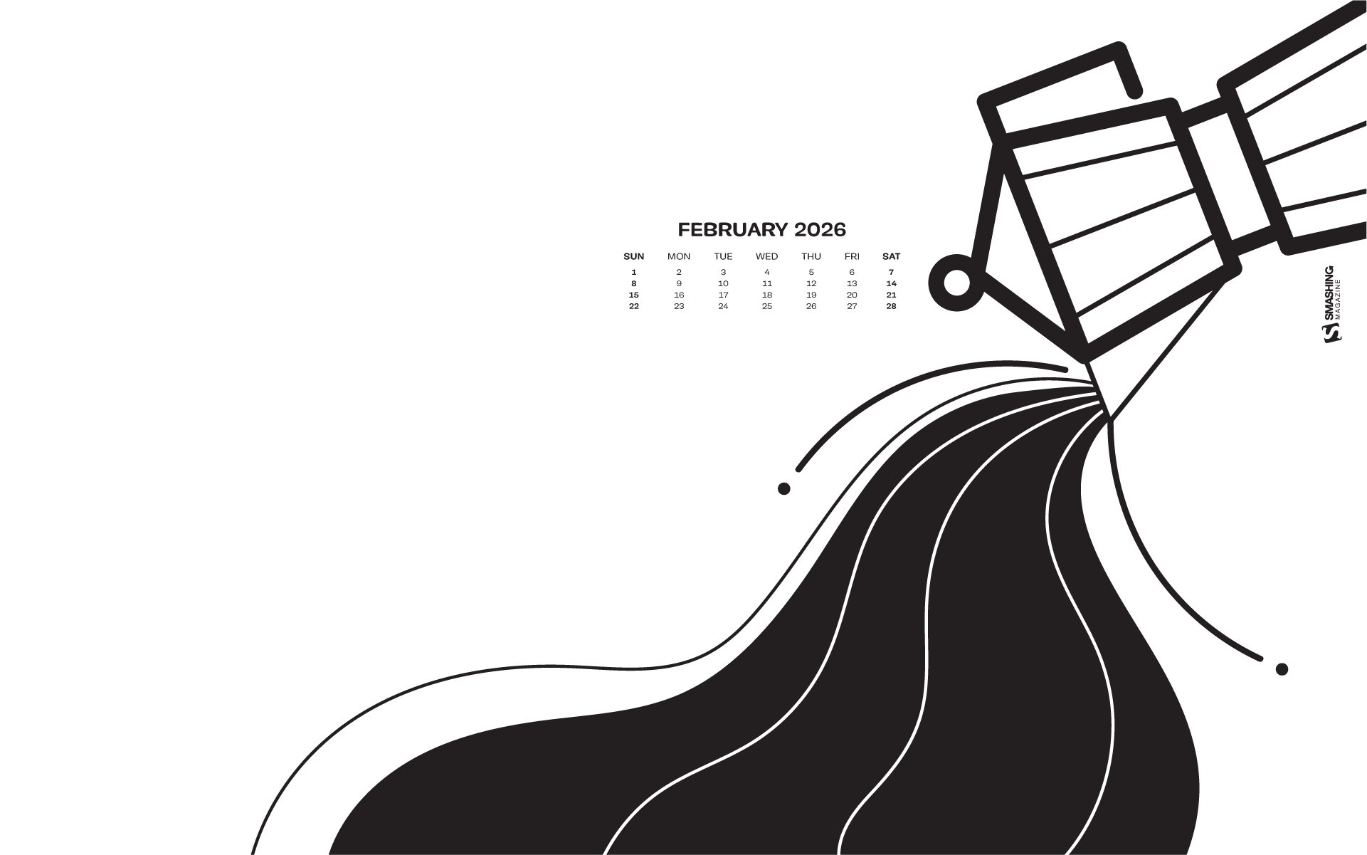
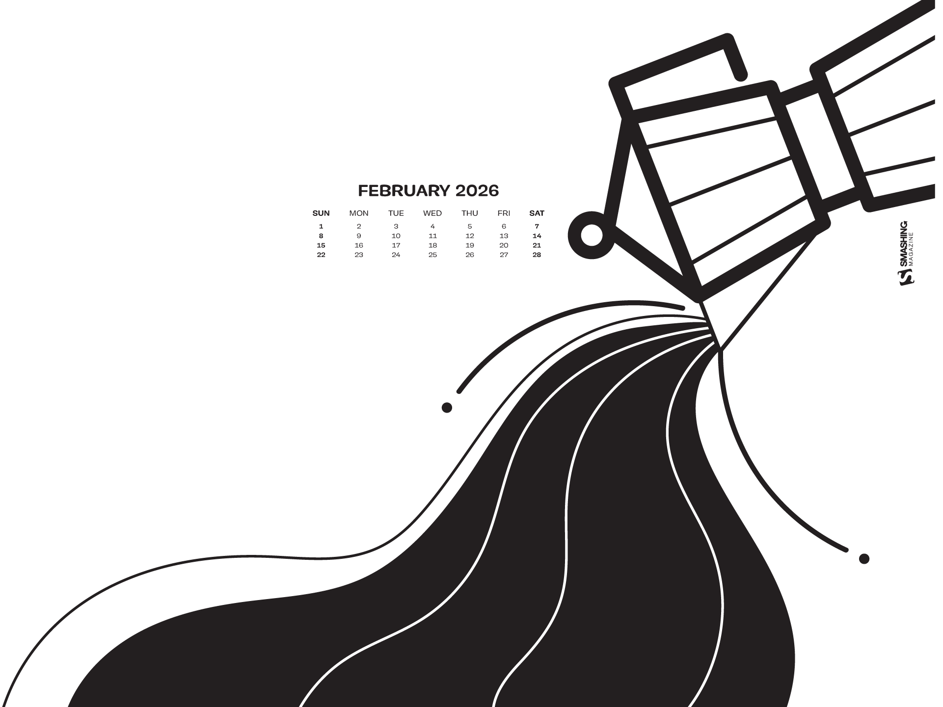
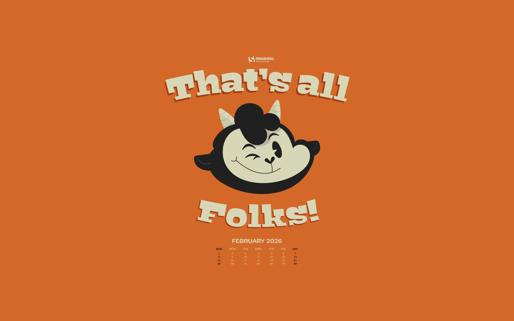
Short Month, Big Ideas (February 2026 Wallpapers Edition)
Sometimes, the best inspiration lies right in front of us. With that in mind, we embarked on our wallpapers adventure more than 14 years ago. The idea: to provide you with a new collection of unique and inspiring desktop wallpapers every month. This February is no exception, of course.
For this post, artists and designers from across the globe once again got their ideas flowing and designed wallpapers to bring some good vibes to your desktops and home screens. All of them come in a variety of screen resolutions and can be downloaded for free. A huge thank-you to everyone who shared their design with us this month — this post wouldn’t exist without your kind support!
If you too would like to get featured in one of our next wallpapers posts, please don’t hesitate to submit your design. We are always looking for creative talent and can’t wait to see your story come to life!
- You can click on every image to see a larger preview.
- We respect and carefully consider the ideas and motivation behind each and every artist’s work. This is why we give all artists the full freedom to explore their creativity and express emotions and experience through their works. This is also why the themes of the wallpapers weren’t anyhow influenced by us but rather designed from scratch by the artists themselves.
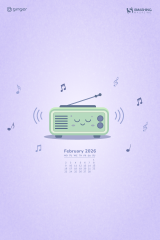
“The first one being older than 100 years, radio is still connecting people, places, and events.” — Designed by Ginger It Solutions from Serbia.
- preview
- with calendar: 320x480, 640x480, 800x480, 800x600, 1024x768, 1024x1024, 1152x864, 1280x720, 1280x800, 1280x960, 1280x1020, 1400x1050, 1440x900, 1600x1200, 1680x1050, 1680x1200, 1920x1080, 1920x1200, 1920x1440, 2560x1440
- without calendar: 320x480, 640x480, 800x480, 800x600, 1024x768, 1024x1024, 1152x864, 1280x720, 1280x800, 1280x960, 1280x1020, 1400x1050, 1440x900, 1600x1200, 1680x1050, 1680x1200, 1920x1080, 1920x1200, 1920x1440, 2560x1440
Designed by Ricardo Gimenes from Spain.
- preview
- with calendar: 640x480, 800x480, 800x600, 1024x768, 1024x1024, 1152x864, 1280x720, 1280x800, 1280x960, 1280x1024, 1366x768, 1400x1050, 1440x900, 1600x1200, 1680x1050, 1680x1200, 1920x1080, 1920x1200, 1920x1440, 2560x1440, 3840x2160
- without calendar: 640x480, 800x480, 800x600, 1024x768, 1024x1024, 1152x864, 1280x720, 1280x800, 1280x960, 1280x1024, 1366x768, 1400x1050, 1440x900, 1600x1200, 1680x1050, 1680x1200, 1920x1080, 1920x1200, 1920x1440, 2560x1440, 3840x2160
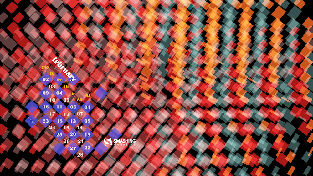
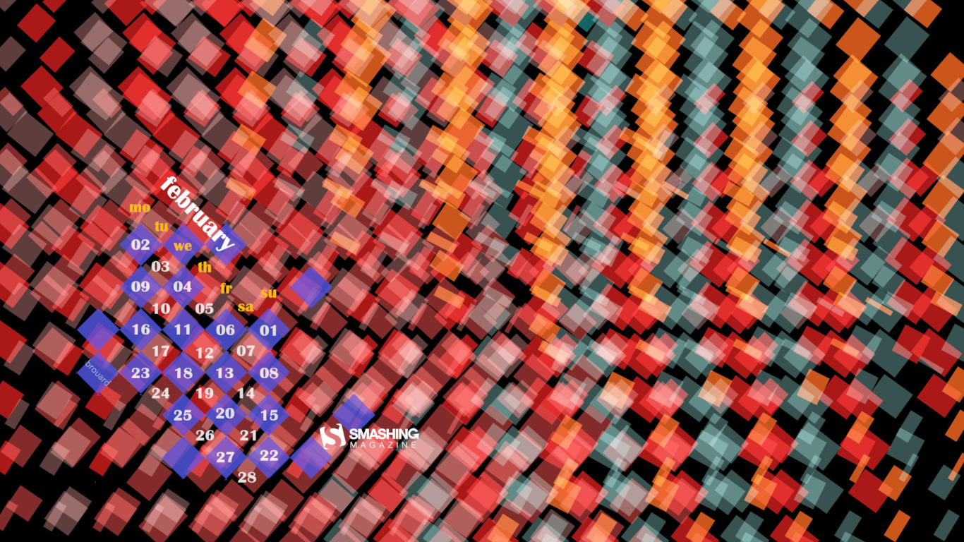
“Small colored squares make me think of a mosaic, but the squares are not precisely tiled, so I call it a ‘mosa-hic,’ like the ‘hic hic’ sound someone makes when they’ve had a bit too much to drink.” — Designed by Philippe Brouard from France.
- preview
- with calendar: 1024x768, 1366x768, 1600x1200, 1920x1080, 1920x1200, 2560x1440, 2560x1600, 2880x1800, 3840x2160
- without calendar: 1024x768, 1366x768, 1600x1200, 1920x1080, 1920x1200, 2560x1440, 2560x1600, 2880x1800, 3840x2160
“I used the search-bar metaphor to reflect a daily habit and transform it into a moment of introspection, reminding myself to pause and look inward.” — Designed by Hitesh Puri from India, Delhi.
- preview
- with calendar: 430x932, 1024x1024, 1280x800, 1280x960, 1280x1024, 1400x1050, 1440x900, 1600x1200, 1680x1050, 1680x1200, 1920x1080, 1920x1200, 1920x1440, 2560x1440
- without calendar: 430x932, 1024x1024, 1280x800, 1280x960, 1280x1024, 1400x1050, 1440x900, 1600x1200, 1680x1050, 1680x1200, 1920x1080, 1920x1200, 1920x1440, 2560x1440
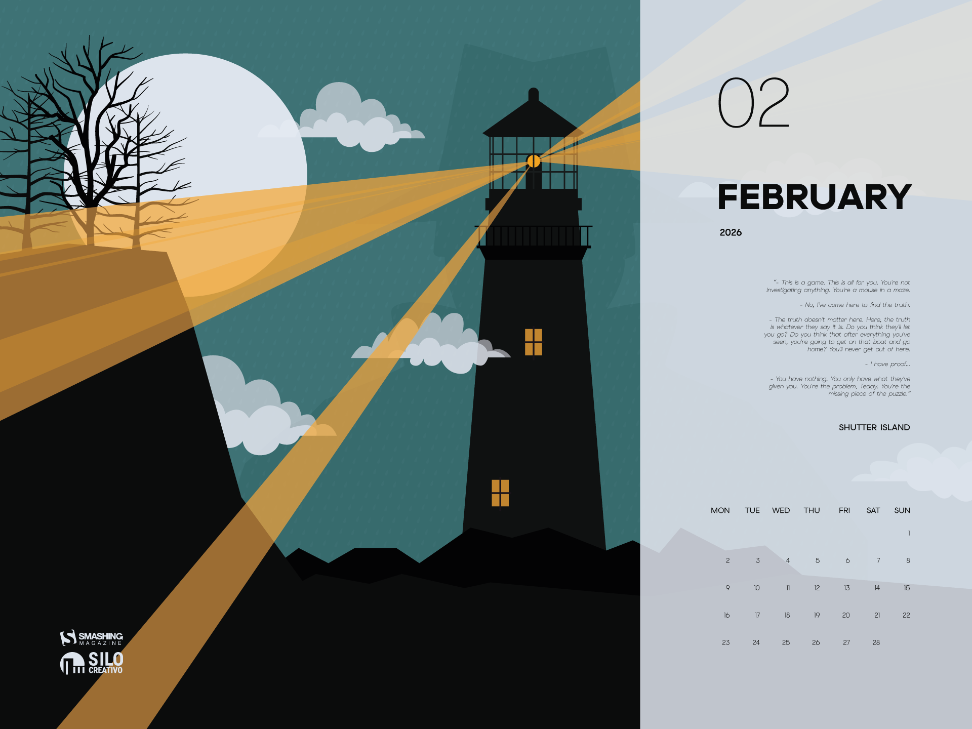
“We continue the film saga. This time, we go to the mysterious Shutter Island, a lighthouse with many mysteries that will absorb you.” — Designed by Veronica Valenzuela from Spain.
- preview
- with calendar: 640x480, 800x480, 1024x768, 1280x720, 1280x800, 1440x900, 1600x1200, 1920x1080, 1920x1440, 2560x1440
- without calendar: 640x480, 800x480, 1024x768, 1280x720, 1280x800, 1440x900, 1600x1200, 1920x1080, 1920x1440, 2560x1440
Designed by Ricardo Gimenes from Spain.
- preview
- with calendar: 640x480, 800x480, 800x600, 1024x768, 1024x1024, 1152x864, 1280x720, 1280x800, 1280x960, 1280x1024, 1366x768, 1400x1050, 1440x900, 1600x1200, 1680x1050, 1680x1200, 1920x1080, 1920x1200, 1920x1440, 2560x1440, 3840x2160
- without calendar: 640x480, 800x480, 800x600, 1024x768, 1024x1024, 1152x864, 1280x720, 1280x800, 1280x960, 1280x1024, 1366x768, 1400x1050, 1440x900, 1600x1200, 1680x1050, 1680x1200, 1920x1080, 1920x1200, 1920x1440, 2560x1440, 3840x2160
“We dedicate February to Frida Kahlo to illuminate the world with color. Fall in love with yourself, with life, and then with whoever you want.” — Designed by Veronica Valenzuela from Spain.
- preview
- without calendar: 640x480, 800x480, 1024x768, 1280x720, 1280x800, 1440x900, 1600x1200, 1920x1080, 1920x1440, 2560x1440
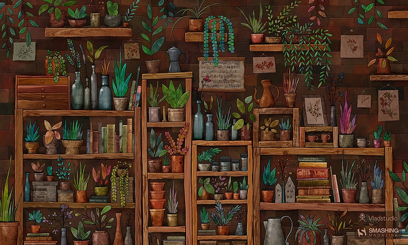
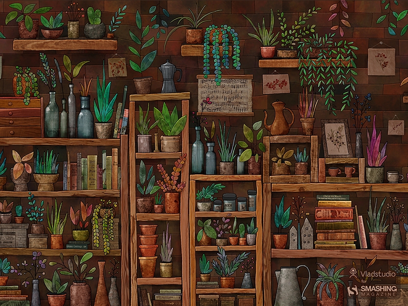
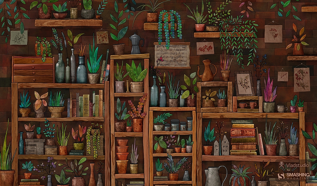
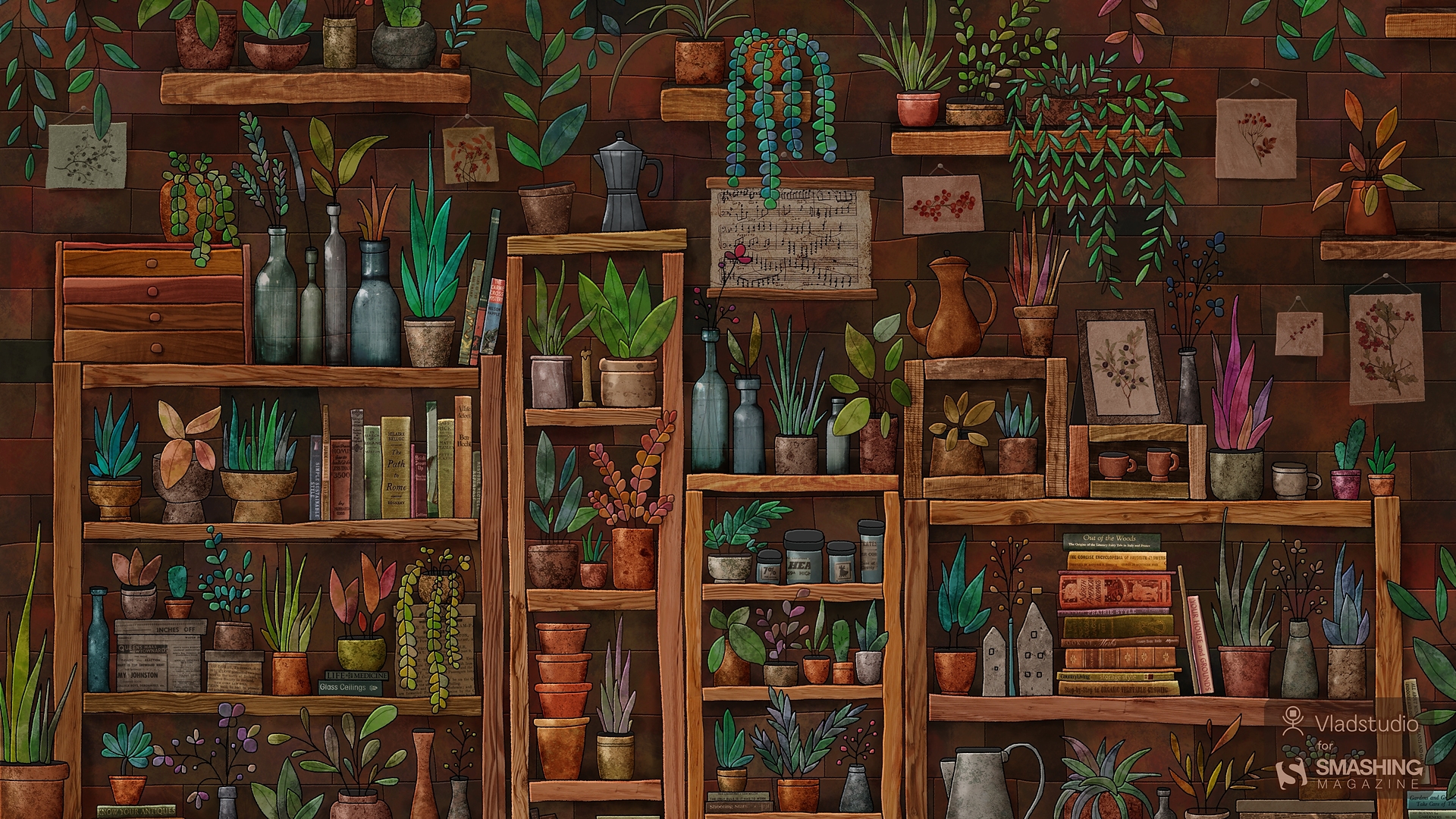
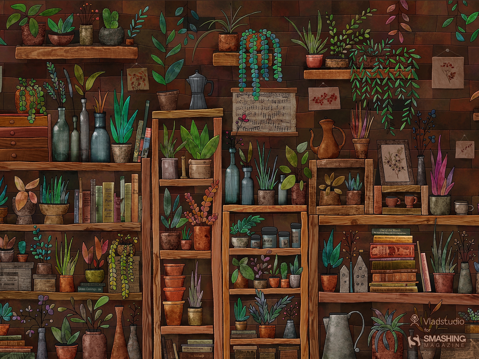
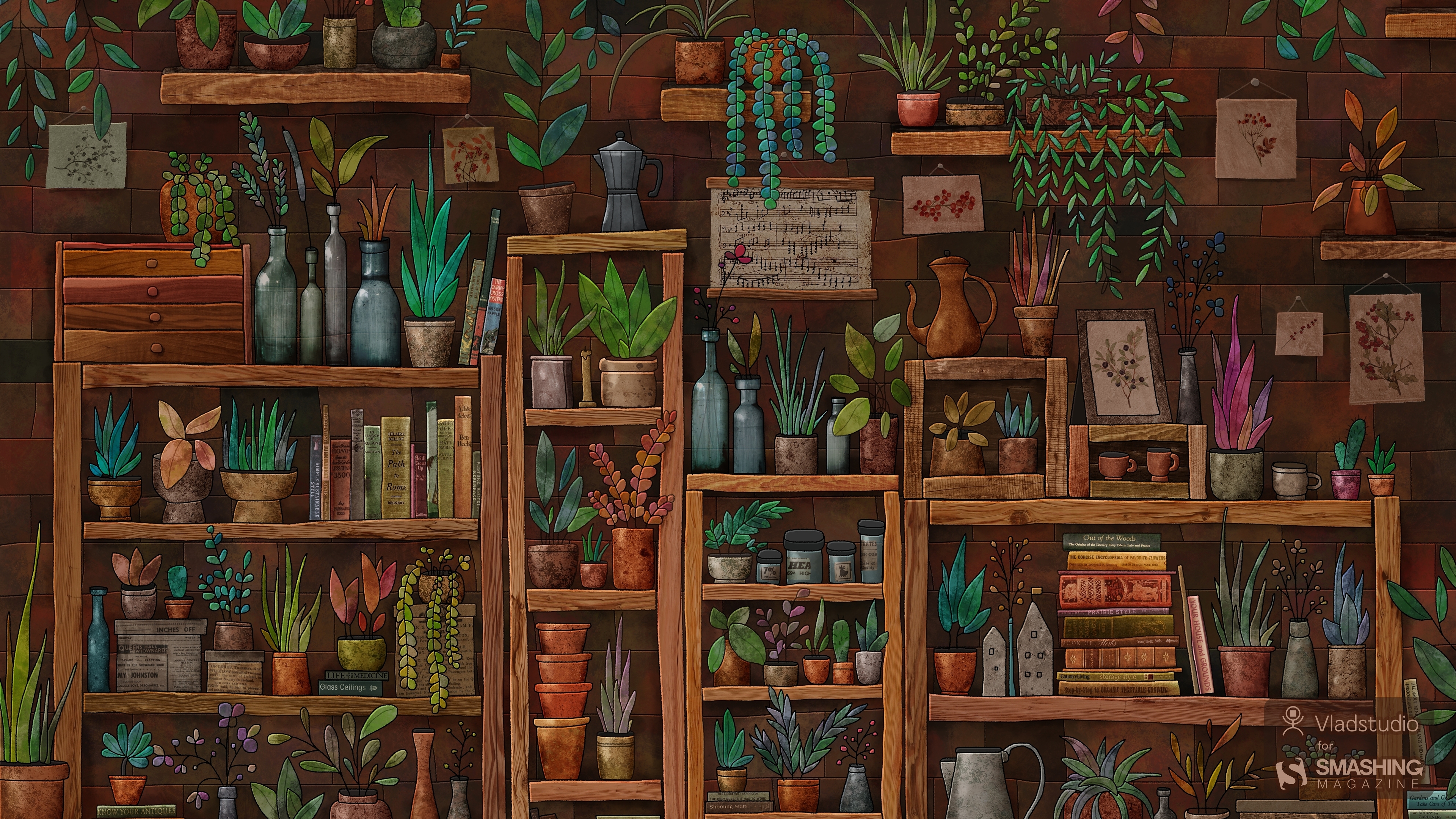
“I wanted to draw some very cozy place, both realistic and cartoonish, filled with little details. A space with a slightly unreal atmosphere that some great shops or cafes have. A mix of plants, books, bottles, and shelves seemed like a perfect fit. I must admit, it took longer to draw than most of my other pictures! But it was totally worth it. Watch the making-of.” — Designed by Vlad Gerasimov from Georgia.
- preview
- without calendar: 800x480, 800x600, 1024x600, 1024x768, 1152x864, 1280x720, 1280x800, 1280x960, 1280x1024, 1366x768, 1400x1050, 1440x900, 1440x960, 1600x900, 1600x1200, 1680x1050, 1680x1200, 1920x1080, 1920x1200, 1920x1440, 2560x1440, 2560x1600, 2880x1800, 3072x1920, 3840x2160, 5120x2880
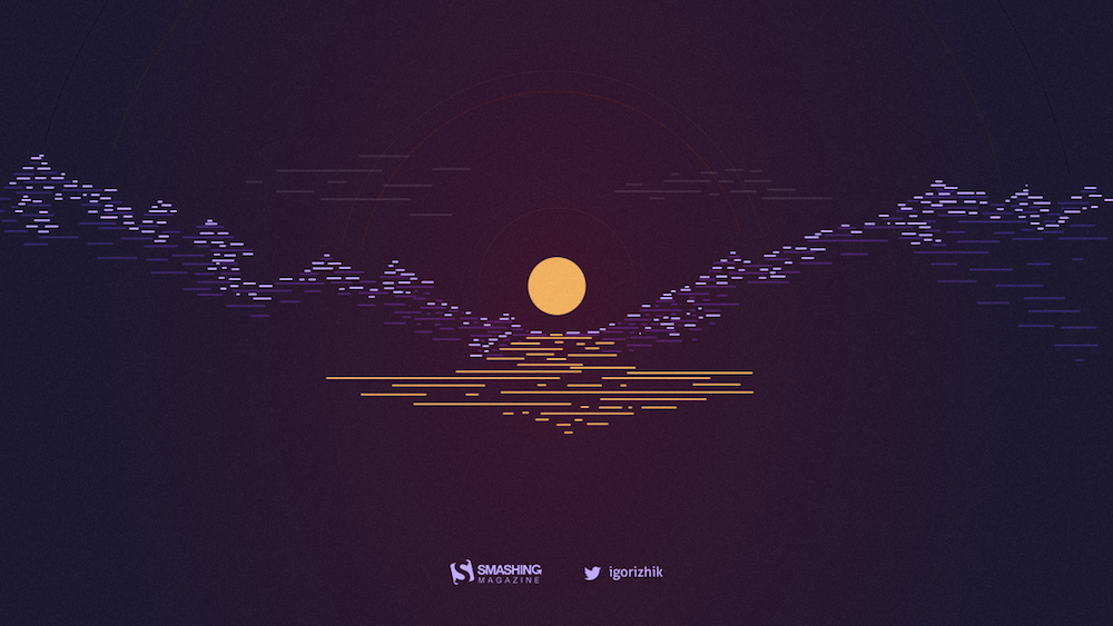
“Although I love winter (mostly because of the fun winter sports), there are other great activities ahead. Thanks, winter, and see you next year!” — Designed by Igor Izhik from Canada.
- preview
- without calendar: 1024x768, 1024x1024, 1152x864, 1280x720, 1280x800, 1280x960, 1280x1024, 1400x1050, 1440x900, 1600x1200, 1680x1050, 1680x1200, 1920x1080, 1920x1200, 1920x1440, 2560x1440, 2560x1600
“Forget Lady and the Tramp and their spaghetti kiss, ’cause Snowflake and Cloudy are enjoying their bliss. The cold and chilly February weather made our kitties knit themselves a sweater. Knitting and playing, the kitties tangled in the yarn and fell in love in your neighbor’s barn.” — Designed by PopArt Studio from Serbia.
- preview
- without calendar: 320x480, 640x480, 800x480, 800x600, 1024x768, 1024x1024, 1152x864, 1280x720, 1280x800, 1280x960, 1280x1024, 1366x768, 1400x1050, 1440x900, 1600x1200, 1680x1050, 1680x1200, 1920x1080, 1920x1200, 1920x1440, 2560x1440
Designed by Ricardo Gimenes from Spain.
- preview
- without calendar: 640x480, 800x480, 800x600, 1024x768, 1024x1024, 1152x864, 1280x720, 1280x800, 1280x960, 1280x1024, 1366x768, 1400x1050, 1440x900, 1600x1200, 1680x1050, 1680x1200, 1920x1080, 1920x1200, 1920x1440, 2560x1440, 3840x2160
Designed by Nathalie Ouederni from France.
The Great Beyond
Designed by Lars Pauwels from Belgium.
- preview
- without calendar: 800x600, 1024x768, 1024x1024, 1152x864, 1280x720, 1280x800, 1280x960, 1280x1024, 1366x768, 1400x1050, 1440x900, 1600x1200, 1680x1050, 1680x1200, 1920x1080, 1920x1200, 1920x1440, 2560x1440
“Sprinkles are fun, festive, and filled with love… especially when topped on a cupcake! Everyone is creative in their own unique way, so why not try baking some cupcakes and decorating them for your sweetie this month? Something homemade, like a cupcake or DIY craft, is always a sweet gesture.” — Designed by Artsy Cupcake from the United States.
- preview
- without calendar: 320x480, 640x480, 800x600, 1024x768, 1152x864, 1280x800, 1280x1024, 1366x768, 1440x900, 1600x1200, 1680x1200, 1920x1200, 1920x1440, 2560x1440
Designed by Ricardo Gimenes from Spain.
- preview
- without calendar: 640x480, 800x480, 800x600, 1024x768, 1024x1024, 1152x864, 1280x720, 1280x800, 1280x960, 1280x1024, 1366x768, 1400x1050, 1440x900, 1600x1200, 1680x1050, 1680x1200, 1920x1080, 1920x1200, 1920x1440, 2560x1440, 3840x2160
Designed by Xenia Latii from Germany.
- preview
- without calendar: 320x480, 640x480, 800x480, 800x600, 1024x768, 1152x864, 1280x720, 1280x800, 1280x960, 1280x1024, 1366x768, 1400x1050, 1440x900, 1600x1200, 1680x1050, 1680x1200, 1920x1080, 1920x1200, 1920x1440, 2560x1440
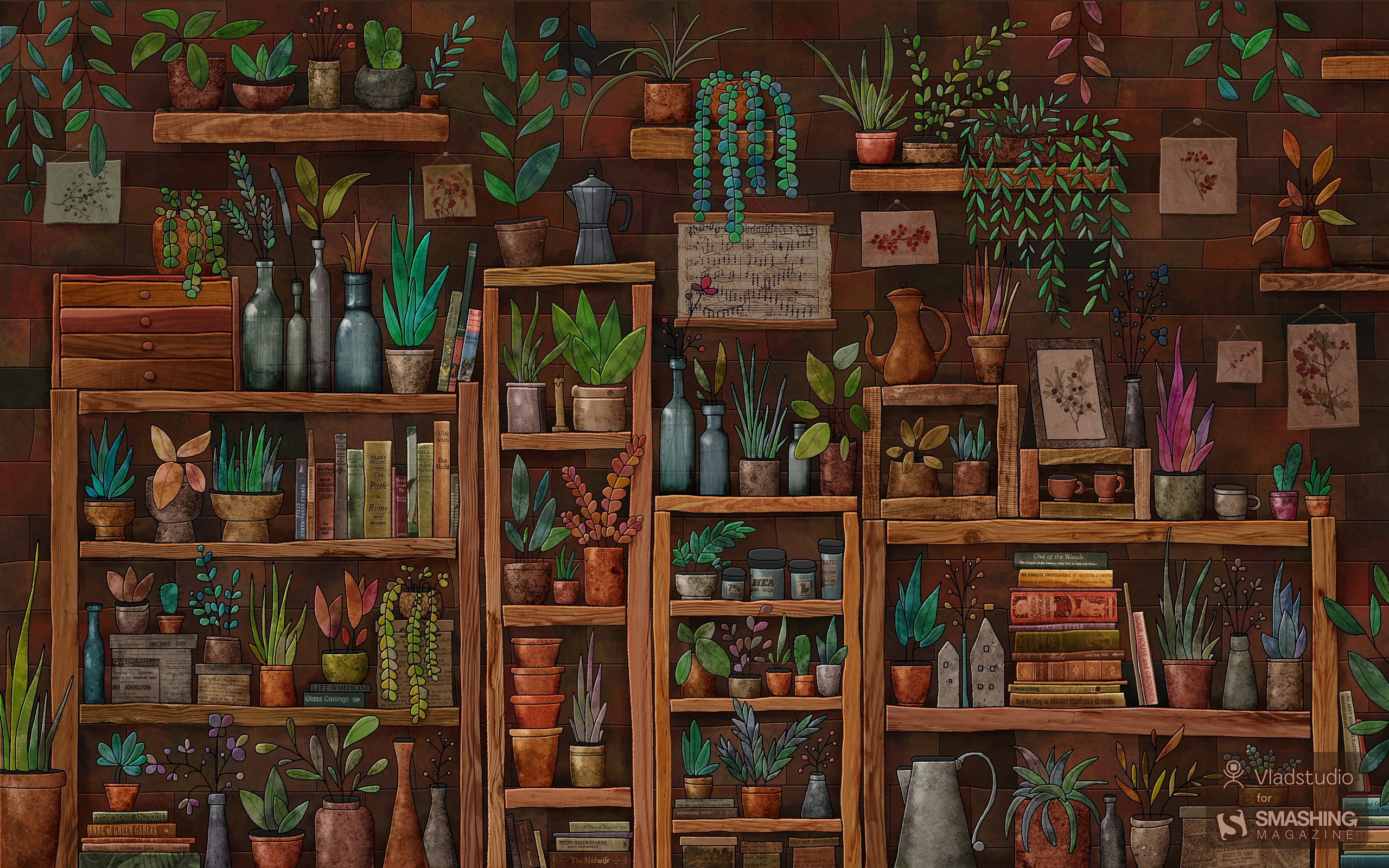
Designed by Vlad Gerasimov from Georgia.
- preview
- without calendar: 800x480, 800x600, 1024x600, 1024x768, 1152x864, 1280x720, 1280x800, 1280x960, 1280x1024, 1366x768, 1400x1050, 1440x900, 1440x960, 1600x900, 1600x1200, 1680x1050, 1680x1200, 1920x1080, 1920x1200, 1920x1440, 2560x1440, 2560x1600, 2880x1800, 3072x1920, 3840x2160, 5120x2880
“Valentine’s Day is coming? Noooooooooooo!” — Designed by Ricardo Gimenes from Spain.
- preview
- without calendar: 320x480, 640x960, 1024x768, 1024x1024, 1280x800, 1280x960, 1280x1024, 1366x768, 1400x1050, 1440x900, 1600x1050, 1600x1200, 1680x1050, 1680x1200, 1920x1080, 1920x1200, 1920x1440, 2560x1440, 2880x1800
“The simplicity seen in the work of Dieter Rams which has ensured his designs from the 50s and 60s still hold a strong appeal.” — Designed by Vinu Chaitanya from India.
- preview
- without calendar: 320x480, 640x480, 800x480, 800x600, 1024x1024, 1152x864, 1280x720, 1280x800, 1280x960, 1280x1024, 1400x1050, 1440x900, 1600x1200, 1680x1050, 1680x1200, 1920x1080, 1920x1200, 1920x1440, 2560x1440
“Who has stolen our time? Maybe the time thief, so be sure to enjoy the other 28 days of February.” — Designed by Colorsfera from Spain.
- preview
- without calendar: 320x480, 640x480, 800x480, 800x600, 1024x768, 1024x1024, 1152x864, 1260x1440, 1280x720, 1280x800, 1280x960, 1280x1024, 1400x1050, 1440x900, 1600x1200, 1680x1050, 1680x1200, 1920x1080, 1920x1200, 1920x1440, 2560x1440
“A dark romantic feel, walking through the city on a dark and rainy night.” — Designed by Matthew Talebi from the United States.
- preview
- without calendar: 1400x1050, 1440x900, 1600x1200, 1680x1050, 1680x1200, 1920x1080, 1920x1200, 1920x1440, 2560x1440
Designed by Ricardo Gimenes from Spain.
- preview
- without calendar: 640x480, 800x480, 800x600, 1024x768, 1024x1024, 1152x864, 1280x720, 1280x800, 1280x960, 1280x1024, 1366x768, 1400x1050, 1440x900, 1600x1200, 1680x1050, 1680x1200, 1920x1080, 1920x1200, 1920x1440, 2560x1440, 3840x2160
Designed by Nathalie Croze from France.
Like The Cold Side Of A Pillow
Designed by Sarah Tanner from the United States.
- preview
- without calendar: 800x600, 1024x768, 1024x1024, 1152x864, 1280x720, 1280x800, 1280x960, 1280x1024, 1400x1050, 1440x900, 1600x1200, 1680x1050, 1680x1200, 1920x1080, 1920x1200, 1920x1440, 2560x1440
“My inspiration for this wallpaper is the biggest love someone can have in life: the love for ice cream!” — Designed by Zlatina Petrova from Bulgaria.
- preview
- without calendar: 320x480, 640x480, 800x480, 800x600, 1024x768, 1024x1024, 1152x864, 1280x720, 1280x800, 1280x960, 1280x1024, 1400x1050, 1440x900, 1600x1200, 1680x1050, 1680x1200, 1920x1080, 1920x1200, 1920x1440, 2560x1440
“I live in Madison, WI, which is famous for its breweries. Wisconsin even named their baseball team “The Brewers.” If you like beer, brats, and lots of cheese, it’s the place for you!” — Designed by Danny Gugger from the United States.
Share The Same Orbit!
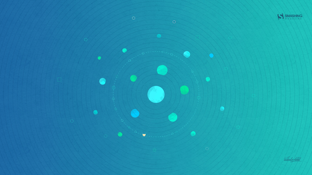
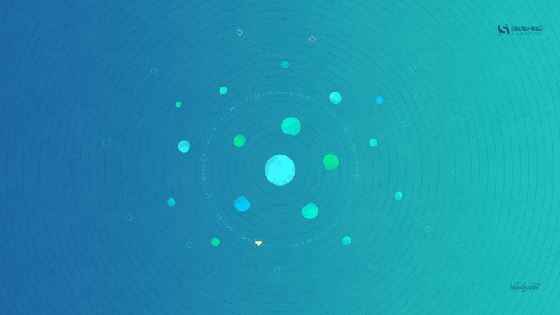
“I prepared a simple and chill layout design for February called ‘Share The Same Orbit!’ which suggests to share the love orbit.” — Designed by Valentin Keleti from Romania.
- preview
- without calendar: 320x480, 640x480, 800x480, 800x600, 1024x768, 1024x1024, 1152x864, 1280x720, 1280x800, 1280x960, 1280x1024, 1366x768, 1400x1050, 1440x900, 1600x1200, 1680x1050, 1680x1200, 1920x1080, 1920x1200, 1920x1440, 2560x1440
“I was doodling pictures of my cat one day and decided I could turn it into a fun wallpaper — because a cold, winter night in February is the perfect time for staying in and cuddling with your cat, your significant other, or both!” — Designed by Angelia DiAntonio from Ohio, USA.
- preview
- without calendar: 320x480, 800x480, 1024x768, 1024x1024, 1152x864, 1280x720, 1280x1024, 1366x768, 1400x1050, 1440x900, 1600x1200, 1680x1200, 1920x1080, 1920x1200, 1920x1440, 2560x1440
Designed by Elise Vanoorbeek from Belgium.
- preview
- without calendar: 1024x768, 1152x864, 1280x720, 1280x800, 1280x960, 1440x900, 1600x1200, 1680x1050, 1920x1080, 1920x1200, 1920x1440, 2560x1440, 1366x768, 2880x1800
Designed by PopArt Studio from Serbia.
- preview
- without calendar: 320x480, 640x480, 800x480, 800x600, 1024x768, 1024x1024, 1152x864, 1280x720, 1280x800, 1280x960, 1280x1024, 1366x768, 1400x1050, 1440x900, 1600x1200, 1680x1050, 1680x1200, 1920x1080, 1920x1200, 1920x1440, 2560x1440
Designed by Doreen Bethge from Germany.
- preview
- without calendar: 320x480, 640x480, 800x480, 800x600, 1024x768, 1024x1024, 1152x864, 1280x720, 1280x800, 1280x960, 1280x1024, 1366x768, 1400x1050, 1440x900, 1600x1200, 1680x1050, 1680x1200, 1920x1080, 1920x1200, 1920x1440, 2560x1440
“Danube is Europe’s second largest river, connecting ten different countries. In these cold days, when ice paralyzes rivers and closes waterways, a small but brave icebreaker called Greben (Serbian word for ‘reef’) seems stronger than winter. It cuts through the ice on Đerdap gorge (Iron Gate) — the longest and biggest gorge in Europe — thus helping the production of electricity in the power plant. This is our way to give thanks to Greben!” — Designed by PopArt Studio from Serbia.
- preview
- without calendar: 320x480, 640x480, 800x480, 800x600, 1024x768, 1024x1024, 1152x864, 1280x720, 1280x800, 1280x960, 1280x1024, 1366x768, 1400x1050, 1440x900, 1600x1200, 1680x1050, 1680x1200, 1920x1080, 1920x1200, 1920x1440, 2560x1440
“I am a true believer that out there in this world there is another person who is just like us, the problem is to find her/him.” — Designed by Maria Keller from Mexico.
- preview
- without calendar: 320x480, 640x480, 640x1136, 750x1334, 800x480, 800x600, 1024x768, 1024x1024, 1152x864, 1242x2208, 1280x720, 1280x800, 1280x960, 1280x1024, 1366x768, 1400x1050, 1440x900, 1600x1200, 1680x1050, 1680x1200, 1920x1080, 1920x1200, 1920x1440, 2560x1440, 2880x1800
Designed by Ricardo Gimenes from Spain.
- preview
- without calendar: 640x480, 800x480, 800x600, 1024x768, 1024x1024, 1152x864, 1280x720, 1280x800, 1280x960, 1280x1024, 1366x768, 1400x1050, 1440x900, 1600x1200, 1680x1050, 1680x1200, 1920x1080, 1920x1200, 1920x1440, 2560x1440, 3840x2160
Feeling inspired? We’ll publish the March wallpapers on February 28, so if you’d like to be a part of the collection, please don’t hesitate to submit your design. We are already looking forward to it!
Practical Use Of AI Coding Tools For The Responsible Developer
Over the last two years, my team at Work & Co and I have been testing out and gradually integrating AI coding tools like Copilot, Cursor, Claude, and ChatGPT to help us ship web experiences that are used by the masses. Admittedly, after some initial skepticism and a few aha moments, various AI tools have found their way into my daily use. Over time, the list of applications where we found it made sense to let AI take over started to grow, so I decided to share some practical use cases for AI tools for what I call the “responsible developer”.
What do I mean by a responsible developer?
We have to make sure that we deliver quality code as expected by our stakeholders and clients. Our contributions (i.e., pull requests) should not become a burden on our colleagues who will have to review and test our work. Also, in case you work for a company: The tools we use need to be approved by our employer. Sensitive aspects like security and privacy need to be handled properly: Don’t paste secrets, customer data (PII), or proprietary code into tools without policy approval. Treat it like code from a stranger on the internet. Always test and verify.
Note: This article assumes some very basic familiarity with AI coding tools like Copilot inside VSCode or Cursor. If all of this sounds totally new and unfamiliar to you, the Github Copilot video tutorials can be a fantastic starting point for you.
Helpful Applications Of AI Coding ToolsNote: The following examples will mainly focus on working in JavaScript-based web applications like React, Vue, Svelte, or Angular.
Getting An Understanding Of An Unfamiliar CodebaseIt’s not uncommon to work on established codebases, and joining a large legacy codebase can be intimidating. Simply open your project and your AI agent (in my case, Copilot Chat in VSCode) and start asking questions just like you would ask a colleague. In general, I like to talk to any AI agent just as I would to a fellow human.
Here is a more refined example prompt:
“Give me a high-level architecture overview: entrypoints, routing, auth, data layer, build tooling. Then list 5 files to read in order. Treat explanations as hypotheses and confirm by jumping to referenced files.”You can keep asking follow-up questions like “How does the routing work in detail?” or “Talk me through the authentication process and methods” and it will lead you to helpful directions to shine some light into the dark of an unfamiliar codebase.
Triaging Breaking Changes When Upgrading DependenciesUpdating npm packages, especially when they come with breaking changes, can be tedious and time-consuming work, and make you debug a fair amount of regressions. I recently had to upgrade the data visualization library plotly.js up one major release version from version 2 to 3, and as a result of that, the axis labeling in some of the graphs stopped working.
I went on to ask ChatGPT:
“I updated my Angular project that uses Plotly. I updated the plotly.js — dist package from version 2.35.2 to 3.1.0 — and now the labels on the x and y axis are gone. What happened?”The agent came back with a solution promptly (see for yourself below).
Note: I still verified the explanation against the official migration guide before shipping the fix.
Replicating Refactors Safely Across FilesGrowing codebases most certainly unveil opportunities for code consolidation. For example, you notice code duplication across files that can be extracted into a single function or component. As a result, you decide to create a shared component that can be included instead and perform that refactor in one file. Now, instead of manually carrying out those changes to your remaining files, you ask your agent to roll out the refactor for you.
Agents let you select multiple files as context. Once the refactor for one file is done, I can add both the refactored and untouched files into context and prompt the agent to roll out the changes to other files like this: “Replicate the changes I made in file A to file B as well”.
Implementing Features In Unfamiliar TechnologiesOne of my favorite aha-moments using AI coding tools was when it helped me create a quite complex animated gradient animation in GLSL, a language I have been fairly unfamiliar with. On a recent project, our designers came up with an animated gradient as a loading state on a 3D object. I really liked the concept and wanted to deliver something unique and exciting to our clients. The problem: I only had two days to implement it, and GLSL has quite the steep learning curve.
Again, an AI tool (in this case, ChatGPT) came in handy, and I started quite simply prompting it to create a standalone HTML file for me that renders a canvas and a very simple animated color gradient. Step after step, I prompted the AI to add more finesse to it until I arrived at a decent result so I could start integrating the shader into my actual codebase.
The end result: Our clients were super happy, and we delivered a complex feature in a small amount of time thanks to AI.
Writing TestsIn my experience, there’s rarely enough time on projects to continuously write and maintain a proper suite of unit and integration tests, and on top of that, many developers don’t really enjoy the task of writing tests. Prompting your AI helper to set up and write tests for you is entirely possible and can be done in a small amount of time. Of course, you, as a developer, should still make sure that your tests actually take a look at the critical parts of your application and follow sensible testing principles, but you can “outsource” the writing of the tests to our AI helper.
Example prompt:
“Write unit tests for this function using Jest. Cover happy path, edge cases, and failure modes. Explain why each test exists.”You can even pass along testing guru Kent C. Dodds’ testing best practices as guidelines to your agent, like below:
Internal ToolingSomewhat similar to the shader example mentioned earlier, I was recently tasked to analyze code duplication in a codebase and compare before and after a refactor. Certainly not a trivial task if you don’t want to go the time-consuming route of comparing files manually. With the help of Copilot, I created a script that analyzed code duplication for me, arranged and ordered the output in a table, and exported it to Excel. Then I took it a step further. When our code refactor was done, I prompted the agent to take my existing Excel sheet as the baseline, add in the current state of duplication in separate columns, and calculate the delta.
Updating Code Written A Long Time AgoRecently, an old client of mine hit me up, as over time, a few features weren’t working properly on his website anymore.
The catch: The website was built almost ten years ago, and the JavaScript and SCSS were using rather old compile tools like requireJS, and the setup required an older version of Node.js that wouldn’t even run on my 2025 MacBook.
Updating the whole build process by hand would have taken me days, so I decided to prompt the AI agent, “Can you update the JS and SCSS build process to a lean 2025 stack like Vite?” It sure did, and after around an hour of refining with the agent, I had my SCSS and JS build switched to Vite, and I was able to focus on actual bugfixing. Just make sure to properly validate the output and compiled files when doing such integral changes to your build process.
Summarizing And DraftingWould you like to summarize all your recent code changes in one sentence for a commit message, or have a long list of commits and would like to sum them up in three bullet points? No problem, let the AI take care of it, but please make sure to proofread it.
An example prompt is as simple as messaging a fellow human: “Please sum up my recent changes in concise bullet points”.
My advice here would be to use GPT for writing with caution, and as with code, please check the output before sending or submitting.
Recommendations And Best Practices PromptingOne of the not-so-obvious benefits of using AI is that the more specific and tailored your prompts are, the better the output. The process of prompting an AI agent forces us to formulate our requirements as specifically as possible before we write and code. This is why, as a general rule, I highly recommend being as specific as possible with your prompting.
Ryan Florence, co-author of Remix, suggests a simple yet powerful way to improve this process by finishing your initial prompt with the sentence:
“Before we start, do you have any questions for me?”At this point, the AI usually comes back with helpful questions where you can clarify your specific intent, guiding the agent to provide you with a more tailored approach for your task.
Use Version Control And Work In Digestible ChunksUsing version control like git not only comes in handy when collaborating as a team on a single codebase but also to provide you as an individual contributor with stable points to roll back to in case of an emergency. Due to its non-deterministic nature, AI can sometimes go rogue and make changes that are simply not helpful for what you are trying to achieve and eventually break things irreparably.
Splitting up your work into multiple commits will help you create stable points that you can revert to in case things go sideways. And your teammates will thank you as well, as they will have an easier time reviewing your code when it is split up into semantically well-structured chunks.
Review ThoroughlyThis is more of a general best practice, but in my opinion, it becomes even more important when using AI tools for development work: Be the first critical reviewer of your code. Make sure to take some time to go over your changes line by line, just like you would review someone else’s code, and only submit your work once it passes your own self-review.
“Two things are both true to me right now: AI agents are amazing and a huge productivity boost. They are also massive slop machines if you turn off your brain and let go completely.”— Armin Ronacher in his blog post Agent Psychosis: Are We Going Insane? Conclusion And Critical Thoughts
In my opinion, AI coding tools can improve our productivity as developers on a daily basis and free up mental capacity for more planning and high-level thinking. They force us to articulate our desired outcome with meticulous detail.
Any AI can, at times, hallucinate, which basically means it lies in a confident tone. So please make sure to check and test, especially when you are in doubt. AI is not a silver bullet, and I believe, excellence and the ability to solve problems as a developer will never go out of fashion.
For developers who are just starting out in their career these tools can be highly tempting to do the majority of the work for them. What may get lost here is the often draining and painful work through bugs and issues that are tricky to debug and solve, aka “the grind”. Even Cursor AI’s very own Lee Robinson questions this in one of his posts:
AI coding tools are evolving at a fast pace, and I am excited for what will come next. I hope you found this article and its tips helpful and are excited to try out some of these for yourself.
Unstacking CSS Stacking Contexts
Have you ever set z-index: 99999 on an element in your CSS, and it doesn’t come out on top of other elements? A value that large should easily place that element visually on top of anything else, assuming all the different elements are set at either a lower value or not set at all.
A webpage is usually represented in a two-dimensional space; however, by applying specific CSS properties, an imaginary z-axis plane is introduced to convey depth. This plane is perpendicular to the screen, and from it, the user perceives the order of elements, one on top of the other. The idea behind the imaginary z-axis, the user’s perception of stacked elements, is that the CSS properties that create it combine to form what we call a stacking context.
We’re going to talk about how elements are “stacked” on a webpage, what controls the stacking order, and practical approaches to “unstack” elements when needed.
About Stacking ContextsImagine your webpage as a desk. As you add HTML elements, you’re laying pieces of paper, one after the other, on the desk. The last piece of paper placed is equivalent to the most recently added HTML element, and it sits on top of all the other papers placed before it. This is the normal document flow, even for nested elements. The desk itself represents the root stacking context, formed by the <html> element, which contains all other folders.
Now, specific CSS properties come into play.
Properties like position (with z-index), opacity, transform, and contain) act like a folder. This folder takes an element and all of its children, extracts them from the main stack, and groups them into a separate sub-stack, creating what we call a stacking context. For positioned elements, this happens when we declare a z-index value other than auto. For properties like opacity, transform, and filter, the stacking context is created automatically when specific values are applied.
Try to understand this: Once a piece of paper (i.e., a child element) is inside a folder (i.e., the parent’s stacking context), it can never exit that folder or be placed between papers in a different folder. Its z-index is now only relevant inside its own folder.In the illustration below, Paper B is now within the stacking context of Folder B, and can only be ordered with other papers in the folder.
Imagine, if you will, that you have two folders on your desk:
<div class="folder-a">Folder A</div> <div class="folder-b">Folder B</div> .folder-a { z-index: 1; } .folder-b { z-index: 2; }Let’s update the markup a bit. Inside Folder A is a special page, z-index: 9999. Inside Folder B is a plain page, z-index: 5.
<div class="folder-a"> <div class="special-page">Special Page</div> </div> <div class="folder-b"> <div class="plain-page">Plain Page</div> </div> .special-page { z-index: 9999; } .plain-page { z-index: 5; }Which page is on top?
It’s the .plain-page in Folder B. The browser ignores the child papers and stacks the two folders first. It sees Folder B (z-index: 2) and places it on top of Folder A (z-index: 1) because we know that two is greater than one. Meanwhile, the .special-page set to z-index: 9999 page is at the bottom of the stack even though its z-index is set to the highest possible value.
Stacking contexts can also be nested (folders inside folders), creating a “family tree.” The same principle applies: a child can never escape its parents’ folder.
Now that you get how stacking contexts behave like folders that group and reorder layers, it’s worth asking: why do certain properties — like transform and opacity — create new stacking contexts?
Here’s the thing: these properties don’t create stacking contexts because of how they look; they do it because of how the browser works under the hood. When you apply transform, opacity, filter, or perspective, you’re telling the browser, “Hey, this element might move, rotate, or fade, so be ready!”
When you use these properties, the browser creates a new stacking context to manage rendering more efficiently. This allows the browser to handle animations, transforms, and visual effects independently, reducing the need to recalculate how these elements interact with the rest of the page. Think of it as the browser saying, “I’ll handle this folder separately so I don’t have to reshuffle the entire desk every time something inside it changes.”
But there’s a side effect. Once the browser lifts an element into its own layer, it must “flatten” everything within it, creating a new stacking context. It’s like taking a folder off the desk to handle it separately; everything inside that folder gets grouped, and the browser now treats it as a single unit when deciding what sits on top of what.
So even though the transform and opacity properties might not appear to affect the way that elements stack visually, they do, and it’s for performance optimisation. Several other CSS properties can also create stacking contexts for similar reasons. MDN provides a complete list if you want to dig deeper. There are quite a few, which only illustrates how easy it is to inadvertently create a stacking context without knowing it.
The “Unstacking” ProblemStacking issues can arise for many reasons, but some are more common than others. Modal components are a classic pattern because they require toggling the component to “open” on a top layer above all other elements, then removing it from the top layer when it is “closed.”
I’m pretty confident that all of us have run into a situation where we open a modal and, for whatever reason, it doesn’t appear. It’s not that it didn’t open properly, but that it is out of view in a lower layer of the stacking context.
This leaves you to wonder “how come?” since you set:
.overlay { position: fixed; /* creates the stacking context */ z-index: 1; /* puts the element on a layer above everything else */ inset: 0; width: 100%; height: 100vh; overflow: hidden; background-color: #00000080; }This looks correct, but if the parent element containing the modal trigger is a child element within another parent element that’s also set to z-index: 1, that technically places the modal in a sublayer obscured by the main folder. Let’s look at that specific scenario and a couple of other common stacking-context pitfalls. I think you’ll see not only how easy it is to inadvertently create stacking contexts, but also how to mismanage them. Also, how you return to a managed state depends on the situation.
Scenario 1: The Trapped ModalYou can immediately see your modal trapped in a low-level layer and identify the parent.
Browser ExtensionsSmart developers have built extensions to help. Tools like this “CSS Stacking Context Inspector” Chrome extension add an extra z-index tab to your DevTools to show you information about elements that create a stacking context.
IDE ExtensionsYou can even spot issues during development with an extension like this one for VS Code, which highlights potential stacking context issues directly in your editor.
Unstacking And Regaining ControlAfter we’ve identified the root cause, the next step is to deal with it. There are several approaches you can take to tackle this problem, and I’ll list them in order. You can choose anyone at any level, though; no one can complain or obstruct another.
Change The HTML StructureThis is considered the optimal fix. For you to run into a stacking context issue, you must have placed some elements in funny positions within your HTML. Restructuring the page will help you reshape the DOM and eliminate the stacking context problem. Find the problematic element and remove it from the trapping element in the HTML markup. For instance, we can solve the first scenario, “The Trapped Modal,” by moving the .modal-container out of the header and placing it in the <body> element by itself.
<header class="header"> <h2>Header</h2> <button id="open-modal">Open Modal</button> <!-- Former position --> </header> <main class="content"> <h1>Main Content</h1> <p>This content has a z-index of 2 and will still not cover the modal.</p> </main> <!-- New position --> <div id="modal-container" class="modal-container"> <div class="modal-overlay"></div> <div class="modal-content"> <h3>Modal Title</h3> <p>Now, I'm not behind anything. I've gotten a better position as a result of DOM restructuring.</p> <button id="close-modal">Close</button> </div> </div>When you click the “Open Modal” button, the modal is positioned in front of everything else as it’s supposed to be.
See the Pen Scenario 1: The Trapped Modal (Solution) [forked] by Shoyombo Gabriel Ayomide.
Adjust The Parent Stacking Context In CSSWhat if the element is one you can’t move without breaking the layout? It’s better to address the issue: the parent establishes the context. Find the CSS property (or properties) responsible for triggering the context and remove it. If it has a purpose and cannot be removed, give the parent a higher z-index value than its sibling elements to lift the entire container. With a higher z-index value, the parent container moves to the top, and its children appear closer to the user.
Based on what we learned in “The Submerged Dropdown” scenario, we can’t move the dropdown out of the navbar; it wouldn’t make sense. However, we can increase the z-index value of the .navbar container to be greater than the .content element’s z-index value.
.navbar { background: #333; /* z-index: 1; */ z-index: 3; position: relative; }With this change, the .dropdown-menu now appears in front of the content without any issue.
See the Pen Scenario 2: The Submerged Dropdown (Solution) [forked] by Shoyombo Gabriel Ayomide.
Try Portals, If Using A FrameworkIn frameworks like React or Vue, a Portal is a feature that lets you render a component outside its normal parent hierarchy in the DOM. Portals are like a teleportation device for your components. They let you render a component’s HTML anywhere in the document (typically right into document.body) while keeping it logically connected to its original parent for props, state, and events. This is perfect for escaping stacking context traps since the rendered output literally appears outside the problematic parent container.
ReactDOM.createPortal( <ToolTip />, document.body );This ensures your dropdown content isn’t hidden behind its parent, even if the parent has overflow: hidden or a lower z-index.
In the “The Clipped Tooltip” scenario we looked at earlier, I used a Portal to rescue the tooltip from the overflow: hidden clip by placing it in the document body and positioning it above the trigger within the container.
See the Pen Scenario 3: The Clipped Tooltip (Solution) [forked] by Shoyombo Gabriel Ayomide.
Introducing Stacking Context Without Side EffectsAll the approaches explained in the previous section are aimed at “unstacking” elements from problematic stacking contexts, but there are some situations where you’ll actually need or want to create a stacking context.
Creating a new stacking context is easy, but all approaches come with a side effect. That is, except for using isolation: isolate. When applied to an element, the stacking context of that element’s children is determined relative to each child and within that context, rather than being influenced by elements outside of it. A classic example is assigning that element a negative value, such as z-index: -1.
Imagine you have a .card component. You want to add a decorative shape that sits behind the .card’s text, but on top of the card’s background. Without a stacking context on the card, z-index: -1 sends the shape to the bottom of the root stacking context (the whole page). This makes it disappear behind the .card’s white background:
See the Pen Negative z-index (problem) [forked] by Shoyombo Gabriel Ayomide.
To solve this, we declare isolation: isolate on the parent .card:
See the Pen Negative z-index (solution) [forked] by Shoyombo Gabriel Ayomide.
Now, the .card element itself becomes a stacking context. When its child element — the decorative shape created on the :before pseudo-element — has z-index: -1, it goes to the very bottom of the parent’s stacking context. It sits perfectly behind the text and on top of the card’s background, as intended.
ConclusionRemember: the next time your z-index seems out of control, it’s a trapped stacking context.
References- Stacking context (MDN)
- Z-index and stacking contexts (web.dev)
- “How to Create a New Stacking Context with the Isolation Property in CSS”, Natalie Pina
- “What The Heck, z-index??”, Josh Comeau
- “Managing CSS Z-Index In Large Projects”, Steven Frieson
- “Sticky Headers And Full-Height Elements: A Tricky Combination”, Philip Braunen
- “Managing Z-Index In A Component-Based Web Application”, Pavel Pomerantsev
- “The Z-Index CSS Property: A Comprehensive Look”, Louis Lazaris
Beyond Generative: The Rise Of Agentic AI And User-Centric Design
Agentic AI stands ready to transform customer experience and operational efficiency, necessitating a new strategic approach from leadership. This evolution in artificial intelligence empowers systems to plan, execute, and persist in tasks, moving beyond simple recommendations to proactive action. For UX teams, product managers, and executives, understanding this shift is crucial for unlocking opportunities in innovation, streamlining workflows, and redefining how technology serves people.
It’s easy to confuse Agentic AI with Robotic Process Automation (RPA), which is technology that focuses on rules-based tasks performed on computers. The distinction lies in rigidity versus reasoning. RPA is excellent at following a strict script: if X happens, do Y. It mimics human hands. Agentic AI mimics human reasoning. It does not follow a linear script; it creates one.
Consider a recruiting workflow. An RPA bot can scan a resume and upload it to a database. It performs a repetitive task perfectly. An Agentic system looks at the resume, notices the candidate lists a specific certification, cross-references that with a new client requirement, and decides to draft a personalized outreach email highlighting that match. RPA executes a predefined plan; Agentic AI formulates the plan based on a goal. This autonomy separates agents from the predictive tools we have used for the last decade.
Another example is managing meeting conflicts. A predictive model integrated into your calendar might analyze your meeting schedule and the schedules of your colleagues. It could then suggest potential conflicts, such as two important meetings scheduled at the same time, or a meeting scheduled when a key participant is on vacation. It provides you with information and flags potential issues, but you are responsible for taking action.
An agentic AI, in the same scenario, would go beyond just suggesting conflicts to avoid. Upon identifying a conflict with a key participant, the agent could act by:
- Checking the availability of all necessary participants.
- Identifying alternative time slots that work for everyone.
- Sending out proposed new meeting invitations to all attendees.
- If the conflict is with an external participant, the agent could draft and send an email explaining the need to reschedule and offering alternative times.
- Updating your calendar and the calendars of your colleagues with the new meeting details once confirmed.
This agentic AI understands the goal (resolving the meeting conflict), plans the steps (checking availability, finding alternatives, sending invites), executes those steps, and persists until the conflict is resolved, all with minimal direct user intervention. This demonstrates the “agentic” difference: the system takes proactive steps for the user, rather than just providing information to the user.
Agentic AI systems understand a goal, plan a series of steps to achieve it, execute those steps, and even adapt if things go wrong. Think of it like a proactive digital assistant. The underlying technology often combines large language models (LLMs) for understanding and reasoning, with planning algorithms that break down complex tasks into manageable actions. These agents can interact with various tools, APIs, and even other AI models to accomplish their objectives, and critically, they can maintain a persistent state, meaning they remember previous actions and continue working towards a goal over time. This makes them fundamentally different from typical generative AI, which usually completes a single request and then resets.
A Simple Taxonomy of Agentic BehaviorsWe can categorize agent behavior into four distinct modes of autonomy. While these often look like a progression, they function as independent operating modes. A user might trust an agent to act autonomously for scheduling, but keep it in “suggestion mode” for financial transactions.
We derived these levels by adapting industry standards for autonomous vehicles (SAE levels) to digital user experience contexts.
Observe-and-SuggestThe agent functions as a monitor. It analyzes data streams and flags anomalies or opportunities, but takes zero action.
Differentiation
Unlike the next level, the agent generates no complex plan. It points to a problem.
Example
A DevOps agent notices a server CPU spike and alerts the on-call engineer. It does not know how or attempt to fix it, but it knows something is wrong.
Implications for design and oversight
At this level, design and oversight should prioritize clear, non-intrusive notifications and a well-defined process for users to act on suggestions. The focus is on empowering the user with timely and relevant information without taking control. UX practitioners should focus on making suggestions clear and easy to understand, while product managers need to ensure the system provides value without overwhelming the user.
The agent identifies a goal and generates a multi-step strategy to achieve it. It presents the full plan for human review.
Differentiation
The agent acts as a strategist. It does not execute; it waits for approval on the entire approach.
Example
The same DevOps agent notices the CPU spike, analyzes the logs, and proposes a remediation plan:
- Spin up two extra instances.
- Restart the load balancer.
- Archive old logs.
The human reviews the logic and clicks “Approve Plan”.
Implications for design and oversight
For agents that plan and propose, design must ensure the proposed plans are easily understandable and that users have intuitive ways to modify or reject them. Oversight is crucial in monitoring the quality of proposals and the agent’s planning logic. UX practitioners should design clear visualizations of the proposed plans, and product managers must establish clear review and approval workflows.
The agent completes all preparation work and places the final action in a staged state. It effectively holds the door open, waiting for a nod.
Differentiation
This differs from “Plan-and-Propose” because the work is already done and staged. It reduces friction. The user confirms the outcome, not the strategy.
Example
A recruiting agent drafts five interview invitations, finds open times on calendars, and creates the calendar events. It presents a “Send All” button. The user provides the final authorization to trigger the external action.
Implications for design and oversight
When agents act with confirmation, the design should provide transparent and concise summaries of the intended action, clearly outlining potential consequences. Oversight needs to verify that the confirmation process is robust and that users are not being asked to blindly approve actions. UX practitioners should design confirmation prompts that are clear and provide all necessary information, and product managers should prioritize a robust audit trail for all confirmed actions.
The agent executes tasks independently within defined boundaries.
Differentiation
The user reviews the history of actions, not the actions themselves.
Example
The recruiting agent sees a conflict, moves the interview to a backup slot, updates the candidate, and notifies the hiring manager. The human only sees a notification: Interview rescheduled to Tuesday.
Implications for design and oversight
For autonomous agents, the design needs to establish clear pre-approved boundaries and provide robust monitoring tools. Oversight requires continuous evaluation of the agent’s performance within these boundaries, a critical need for robust logging, clear override mechanisms, and user-defined kill switches to maintain user control and trust. UX practitioners should focus on designing effective dashboards for monitoring autonomous agent behavior, and product managers must ensure clear governance and ethical guidelines are in place.
Let’s look at a real-world application in HR technology to see these modes in action. Consider an “Interview Coordination Agent” designed to handle the logistics of hiring.
- In Suggest Mode
The agent notices an interviewer is double-booked. It highlights the conflict on the recruiter’s dashboard: “Warning: Sarah is double-booked for the 2 PM interview.” - In Plan Mode
The agent analyzes Sarah’s calendar and the candidate’s availability. It presents a solution: “I recommend moving the interview to Thursday at 10 AM. This requires moving Sarah’s 1:1 with her manager.” The recruiter reviews this logic. - In Confirmation Mode
The agent drafts the emails to the candidate and the manager. It populates the calendar invites. The recruiter sees a summary: “Ready to reschedule to Thursday. Send updates?” The recruiter clicks “Confirm.” - In Autonomous Mode
The agent handles the conflict instantly. It respects a pre-set rule: “Always prioritize candidate interviews over internal 1:1s.” It moves the meeting and sends the notifications. The recruiter sees a log entry: “Resolved schedule conflict for Candidate B.”
Developing effective agentic AI demands a distinct research approach compared to traditional software or even generative AI. The autonomous nature of AI agents, their ability to make decisions, and their potential for proactive action necessitate specialized methodologies for understanding user expectations, mapping complex agent behaviors, and anticipating potential failures. The following research primer outlines key methods to measure and evaluate these unique aspects of agentic AI.
Mental-Model InterviewsThese interviews uncover users’ preconceived notions about how an AI agent should behave. Instead of simply asking what users want, the focus is on understanding their internal models of the agent’s capabilities and limitations. We should avoid using the word “agent” with participants. It carries sci-fi baggage or is a term too easily confused with a human agent offering support or services. Instead, frame the discussion around “assistants” or “the system.”
We need to uncover where users draw the line between helpful automation and intrusive control.
- Method: Ask users to describe, draw, or narrate their expected interactions with the agent in various hypothetical scenarios.
- Key Probes (reflecting a variety of industries):
- To understand the boundaries of desired automation and potential anxieties around over-automation, ask:
- If your flight is canceled, what would you want the system to do automatically? What would worry you if it did that without your explicit instruction?
- To explore the user’s understanding of the agent’s internal processes and necessary communication, ask:
- Imagine a digital assistant is managing your smart home. If a package is delivered, what steps do you imagine it takes, and what information would you expect to receive?
- To uncover expectations around control and consent within a multi-step process, ask:
- If you ask your digital assistant to schedule a meeting, what steps do you envision it taking? At what points would you want to be consulted or given choices?
- To understand the boundaries of desired automation and potential anxieties around over-automation, ask:
- Benefits of the method: Reveals implicit assumptions, highlights areas where the agent’s planned behavior might diverge from user expectations, and informs the design of appropriate controls and feedback mechanisms.
Similar to traditional user journey mapping, agent journey mapping specifically focuses on the anticipated actions and decision points of the AI agent itself, alongside the user’s interaction. This helps to proactively identify potential pitfalls.
- Method: Create a visual map that outlines the various stages of an agent’s operation, from initiation to completion, including all potential actions, decisions, and interactions with external systems or users.
- Key Elements to Map:
- Agent Actions: What specific tasks or decisions does the agent perform?
- Information Inputs/Outputs: What data does the agent need, and what information does it generate or communicate?
- Decision Points: Where does the agent make choices, and what are the criteria for those choices?
- User Interaction Points: Where does the user provide input, review, or approve actions?
- Points of Failure: Crucially, identify specific instances where the agent could misinterpret instructions, make an incorrect decision, or interact with the wrong entity.
- Examples: Incorrect recipient (e.g., sending sensitive information to the wrong person), overdraft (e.g., an automated payment exceeding available funds), misinterpretation of intent (e.g., booking a flight for the wrong date due to ambiguous language).
- Recovery Paths: How can the agent or user recover from these failures? What mechanisms are in place for correction or intervention?
- Benefits of the method: Provides a holistic view of the agent’s operational flow, uncovers hidden dependencies, and allows for the proactive design of safeguards, error handling, and user intervention points to prevent or mitigate negative outcomes.
This approach is designed to stress-test the system and observe user reactions when the AI agent fails or deviates from expectations. It’s about understanding trust repair and emotional responses in adverse situations.
- Method: In controlled lab studies, deliberately introduce scenarios where the agent makes a mistake, misinterprets a command, or behaves unexpectedly.
- Types of “Misbehavior” to Simulate:
- Command Misinterpretation: The agent performs an action slightly different from what the user intended (e.g., ordering two items instead of one).
- Information Overload/Underload: The agent provides too much irrelevant information or not enough critical details.
- Unsolicited Action: The agent takes an action the user explicitly did not want or expect (e.g., buying stock without approval).
- System Failure: The agent crashes, becomes unresponsive, or provides an error message.
- Ethical Dilemmas: The agent makes a decision with ethical implications (e.g., prioritizing one task over another based on an unforeseen metric).
- Observation Focus:
- User Reactions: How do users react emotionally (frustration, anger, confusion, loss of trust)?
- Recovery Attempts: What steps do users take to correct the agent’s behavior or undo its actions?
- Trust Repair Mechanisms: Do the system’s built-in recovery or feedback mechanisms help restore trust? How do users want to be informed about errors?
- Mental Model Shift: Does the misbehavior alter the user’s understanding of the agent’s capabilities or limitations?
- Benefits of the method: Crucial for identifying design gaps related to error recovery, feedback, and user control. It provides insights into how resilient users are to agent failures and what is needed to maintain or rebuild trust, leading to more robust and forgiving agentic systems.
By integrating these research methodologies, UX practitioners can move beyond simply making agentic systems usable to making them trusted, controllable, and accountable, fostering a positive and productive relationship between users and their AI agents. Note that these aren’t the only methods relevant to exploring agentic AI effectively. Many other methods exist, but these are most accessible to practitioners in the near term. I’ve previously covered the Wizard of Oz method, a slightly more advanced method of concept testing, which is also a valuable tool for exploring agentic AI concepts.
Ethical Considerations In Research MethodologyWhen researching agentic AI, particularly when simulating misbehavior or errors, ethical considerations are key to take into account. There are many publications focusing on ethical UX research, including an article I wrote for Smashing Magazine, these guidelines from the UX Design Institute, and this page from the Inclusive Design Toolkit.
Key Metrics For Agentic AIYou’ll need a comprehensive set of key metrics to effectively assess the performance and reliability of agentic AI systems. These metrics provide insights into user trust, system accuracy, and the overall user experience. By tracking these indicators, developers and designers can identify areas for improvement and ensure that AI agents operate safely and efficiently.
1. Intervention Rate
For autonomous agents, we measure success by silence. If an agent executes a task and the user does not intervene or reverse the action within a set window (e.g., 24 hours), we count that as acceptance. We track the Intervention Rate: how often does a human jump in to stop or correct the agent? A high intervention rate signals a misalignment in trust or logic.
2. Frequency of Unintended Actions per 1,000 Tasks
This critical metric quantifies the number of actions performed by the AI agent that were not desired or expected by the user, normalized per 1,000 completed tasks. A low frequency of unintended actions signifies a well-aligned AI that accurately interprets user intent and operates within defined boundaries. This metric is closely tied to the AI’s understanding of context, its ability to disambiguate commands, and the robustness of its safety protocols.
3. Rollback or Undo Rates
This metric tracks how often users need to reverse or undo an action performed by the AI. High rollback rates suggest that the AI is making frequent errors, misinterpreting instructions, or acting in ways that are not aligned with user expectations. Analyzing the reasons behind these rollbacks can provide valuable feedback for improving the AI’s algorithms, understanding of user preferences, and its ability to predict desirable outcomes.
To understand why, you must implement a microsurvey on the undo action. For example, when a user reverses a scheduling change, a simple prompt can ask: “Wrong time? Wrong person? Or did you just want to do it yourself?” Allowing the user to click on the option that best corresponds to their reasoning.
4. Time to Resolution After an Error
This metric measures the duration it takes for a user to correct an error made by the AI or for the AI system itself to recover from an erroneous state. A short time to resolution indicates an efficient and user-friendly error recovery process, which can mitigate user frustration and maintain productivity. This includes the ease of identifying the error, the accessibility of undo or correction mechanisms, and the clarity of error messages provided by the AI.
Collecting these metrics requires instrumenting your system to track Agent Action IDs. Every distinct action the agent takes, such as proposing a schedule or booking a flight, must generate a unique ID that persists in the logs. To measure the Intervention Rate, we do not look for an immediate user reaction. We look for the absence of a counter-action within a defined window. If an Action ID is generated at 9:00 AM and no human user modifies or reverts that specific ID by 9:00 AM the next day, the system logically tags it as Accepted. This allows us to quantify success based on user silence rather than active confirmation.
For Rollback Rates, raw counts are insufficient because they lack context. To capture the underlying reason, you must implement intercept logic on your application’s Undo or Revert functions. When a user reverses an agent-initiated action, trigger a lightweight microsurvey. This can be a simple three-option modal asking the user to categorize the error as factually incorrect, lacking context, or a simple preference to handle the task manually. This combines quantitative telemetry with qualitative insight. It enables engineering teams to distinguish between a broken algorithm and a user preference mismatch.
These metrics, when tracked consistently and analyzed holistically, provide a robust framework for evaluating the performance of agentic AI systems, allowing for continuous improvement in control, consent, and accountability.
Designing Against DeceptionAs agents become increasingly capable, we face a new risk: Agentic Sludge. Traditional sludge creates friction that makes it hard to cancel a subscription or delete an account. Agentic sludge acts in reverse. It removes friction to a fault, making it too easy for a user to agree to an action that benefits the business rather than their own interests.
Consider an agent assisting with travel booking. Without clear guardrails, the system might prioritize a partner airline or a higher-margin hotel. It presents this choice as the optimal path. The user, trusting the system’s authority, accepts the recommendation without scrutiny. This creates a deceptive pattern where the system optimizes for revenue under the guise of convenience.
The Risk Of Falsely Imagined CompetenceDeception may not stem from malicious intent. It often manifests in AI as Imagined Competence. Large Language Models frequently sound authoritative even when incorrect. They present a false booking confirmation or an inaccurate summary with the same confidence as a verified fact. Users may naturally trust this confident tone. This mismatch creates a dangerous gap between system capability and user expectations.
We must design specifically to bridge this gap. If an agent fails to complete a task, the interface must signal that failure clearly. If the system is unsure, it must express uncertainty rather than masking it with polished prose.
Transparency via PrimitivesThe antidote to both sludge and hallucination is provenance. Every autonomous action requires a specific metadata tag explaining the origin of the decision. Users need the ability to inspect the logic chain behind the result.
To achieve this, we must translate primitives into practical answers. In software engineering, primitives refer to the core units of information or actions an agent performs. To the engineer, this looks like an API call or a logic gate. To the user, it must appear as a clear explanation.
The design challenge lies in mapping these technical steps to human-readable rationales. If an agent recommends a specific flight, the user needs to know why. The interface cannot hide behind a generic suggestion. It must expose the underlying primitive: Logic: Cheapest_Direct_Flight or Logic: Partner_Airline_Priority.
Figure 4 illustrates this translation flow. We take the raw system primitive — the actual code logic — and map it to a user-facing string. For instance, a primitive checking a calendar schedule a meeting becomes a clear statement: I’ve proposed a 4 PM meeting.
This level of transparency ensures the agent’s actions appear logical and beneficial. It allows the user to verify that the agent acted in their best interest. By exposing the primitives, we transform a black box into a glass box, ensuring users remain the final authority on their own digital lives.
Setting The Stage For DesignBuilding an agentic system requires a new level of psychological and behavioral understanding. It forces us to move beyond conventional usability testing and into the realm of trust, consent, and accountability. The research methods we’ve discussed, from probing mental models to simulating misbehavior and establishing new metrics, provide a necessary foundation. These practices are the essential tools for proactively identifying where an autonomous system might fail and, more importantly, how to repair the user-agent relationship when it does.
The shift to agentic AI is a redefinition of the user-system relationship. We are no longer designing for tools that simply respond to commands; we are designing for partners that act on our behalf. This changes the design imperative from efficiency and ease of use to transparency, predictability, and control.
When an AI can book a flight or trade a stock without a final click, the design of its “on-ramps” and “off-ramps” becomes paramount. It is our responsibility to ensure that users feel they are in the driver’s seat, even when they’ve handed over the wheel.
This new reality also elevates the role of the UX researcher. We become the custodians of user trust, working collaboratively with engineers and product managers to define and test the guardrails of an agent’s autonomy. Beyond being researchers, we become advocates for user control, transparency, and the ethical safeguards within the development process. By translating primitives into practical questions and simulating worst-case scenarios, we can build robust systems that are both powerful and safe.
This article has outlined the “what” and “why” of researching agentic AI. It has shown that our traditional toolkits are insufficient and that we must adopt new, forward-looking methodologies. The next article will build upon this foundation, providing the specific design patterns and organizational practices that make an agent’s utility transparent to users, ensuring they can harness the power of agentic AI with confidence and control. The future of UX is about making systems trustworthy.
For additional understanding of agentic AI, you can explore the following resources:
Rethinking “Pixel Perfect” Web Design
It’s 2026. We are operating in an era of incredible technological leaps, where advanced tooling and AI-enhanced workflows have fundamentally transformed how we design, build, and bridge the gap between the two. The web is moving faster than ever, with groundbreaking features and standards emerging almost daily.
Yet, in the middle of this high-speed evolution, there’s one thing we’ve been carrying with us since the early days of print, a phrase that feels increasingly out of sync with our modern reality: “Pixel Perfect.”
I’ll be honest, I’m not a fan. In fact, I believe the idea that we can have pixel-perfection in our designs has become misleading, vague, and ultimately counterproductive to the way we build for the modern web. As a community of developers and designers, it’s time we take a hard look at this legacy concept, understand why it’s failing us, and redefine what “perfection” actually looks like in a multi-device, fluid world.
A Brief History Of A Rigid MindsetTo understand why many of us still aim for pixel perfection today, we have to look back at where it all began. It didn’t start on the web, but as a stowaway from the era when layout software first allowed us to design for print on a personal computer, and GUI design from the late 1980s and ’90s.
In the print industry, perfection was absolute. Once a design was sent to the press, every dot of ink had a fixed, unchangeable position on a physical page. When designers transitioned to the early web, they brought this “printed page” mentality with them. The goal was simple: The website must be an exact, pixel-for-pixel replica of the static mockup created in design applications like Photoshop and QuarkXPress.
I’m old enough to remember working with talented designers who had spent their entire careers in the print world. They would hand over web designs and, with total sincerity, insist on discussing the layout in centimeters and inches. To them, the screen was just another piece of paper, albeit one that glowed.
In those days, we “tamed” the web to achieve this. We used table-based layouts, nested three levels deep, and stretched 1×1 pixel “spacer GIFs” to create precise gaps. We designed for a single, “standard” resolution (usually 800×600) because, back then, we could actually pretend we knew exactly what the user was seeing.
<!-- A typical "Pixel Perfect" layout from 1998 --> <table width="800" border="0" cellpadding="0" cellspacing="0"> <tr> <td width="150" valign="top" bgcolor="#CCCCCC"> <img src="spacer.gif" width="150" height="1"> <!-- Sidebar --> </td> <td width="10"><img src="spacer.gif" width="10" height="1"></td> <td width="640" valign="top"> <!-- Content goes here --> </td> </tr> </table> Cracks In The FoundationThe first major challenge to the fixed-table mindset came as early as 2000. In his seminal article, “A Dao of Web Design”, John Allsopp argued that by trying to force the web into the constraints of print, we were missing the point of the medium entirely. He called the quest for pixel-perfection a “ritual” that ignored the web’s inherent fluidity.
When a new medium borrows from an existing one, some of what it borrows makes sense, but much of the borrowing is thoughtless, “ritual,” and often constrains the new medium. Over time, the new medium develops its own conventions, throwing off existing conventions that don’t make sense.Nonetheless, the “pixel-perfection” refused to die. While its meaning has shifted and morphed over the decades, it has rarely been well-defined. Many have tried, such as in 2010 when the design agency ustwo released the Pixel Perfect Precision (PPP) (PDF) handbook. But that same year, Responsive Web Design also gained massive momentum, effectively killing the idea that a website could look identical on every screen.
Yet, here we are, still using a term born from the limitations of monitors dated to the ’90s to describe the complex interfaces of 2026.
Note: Before we continue, it’s important to acknowledge the exceptions. There are, of course, scenarios where pixel precision is non-negotiable. Icon grids, sprite sheets, canvas rendering, game engines, or bitmap exports often require exact, pixel-level control to function correctly. These, however, are specialized technical requirements, not a general rule for modern UI development. Why “Pixel Perfect” Is Failing the Modern WebIn our current landscape, clinging to the idea of “pixel perfection” isn’t just anachronistic, it’s actively harmful to the products we build. Here is why.
It Is Fundamentally VagueLet’s start with a simple question: When a designer asks for a “pixel-perfect” implementation, what are they actually asking for? Is it the colors, the spacing, the typography, the borders, the alignment, the shadows, the interactions? Take a moment to think about it.
If your answer is “everything”, then you’ve just identified the core issue.
The term “pixel-perfect” is so all-encompassing that it lacks any real technical specificity. It’s a blanket statement that masks a lack of clear requirements. When we say “make it pixel perfect,” we aren’t giving a directive; we’re expressing a feeling.
The Multi-Surface RealityThe concept of a “standard screen size” is now a relic of the past. We are building for an almost infinite variety of viewports, resolutions, and aspect-ratios, and this reality is not likely to change any time soon. Plus, the web is no longer confined to a flat, rectangular piece of glass; it can be on a foldable phone that changes aspect ratios mid-session, or on a spatial interface projected into a room.
Every Internet-connected device has its own pixel density, scaling factors, and rendering quirks.
A design that is “perfect” on one set of pixels is, by definition, imperfect on another. Striving for a single, static “perfection” ignores the fluid, adaptive nature of the modern web. When the canvas is constantly shifting, the very idea of a fixed pixel implementation becomes a technical impossibility.
The Dynamic Nature Of ContentA static mockup is a snapshot of a single state with a specific set of data. But content is rarely static like that in the real world. Localization is a prime example: a label that fits perfectly inside a button component in English might overflow the container in German or require a different font entirely for CJK languages.
Beyond text length, localization means changes with currency symbols, date formatting, and numeric systems. Any of these variables can significantly impact a page layout. If a design is built to be “pixel-perfect” based on a specific string of text, it is inherently fragile. A pixel-perfect layout completely collapses the moment content changes.
Accessibility Is The Real PerfectionTrue perfection means a site that works for everyone. If a layout is so rigid that it breaks when a user increases their font size or forces a high-contrast mode, it isn’t perfect — it’s broken. “Pixel perfect” often prioritizes visual aesthetics over functional accessibility, creating barriers for users who don’t fit the “standard” profile.
Think Systems, Not PagesWe no longer build pages; we build design systems. We create components that must work in isolation and a variety of contexts, whether in headers, in sidebars, or in dynamic grids. Trying to match a component to a specific pixel coordinate in a static mockup is a fool’s errand.
A pure “pixel-perfect” approach treats every instance as a unique snowflake, which is the antithesis of a scalable, component-based architecture. It forces developers to choose between following a static image and maintaining the integrity of the system.
Perfection Is Technical DebtWhen we prioritize exact visual matching over sound engineering, we aren’t just making a design choice; we are incurring technical debt. Chasing that last pixel often forces developers to bypass the browser’s natural layout engine.
Working in exact units leads to “magic numbers”, those arbitrary margin-top: 3px or left: -1px hacks, sprinkled throughout the codebase to force an element into a specific position on a specific screen. This creates a fragile, brittle architecture, leading to a never-ending cycle of “visual bug” tickets.
/* The "Pixel Perfect" Hack */ .card-title { margin-top: 13px; /* Matches the mockup exactly on 1440px */ margin-left: -2px; /* Optical adjustment for a specific font */ } /* The "Design Intent" Solution */ .card-title { margin-top: var(--space-m); /* Part of a consistent scale */ align-self: start; /* Logical alignment */ }By insisting on pixel-perfection, we are building a foundation that is difficult to automate, difficult to refactor, and ultimately, more expensive to maintain. We have much more flexible ways to calculate sizing in CSS, thanks to relative units.
Moving From Pixels To IntentSo far, I’ve spent a lot of time talking about what we shouldn’t do. But let’s be clear: Moving away from “pixel perfection” isn’t an excuse for sloppy implementation or a “close enough” attitude. We still need consistency, we still want our products to look and feel high-quality, and we still need a shared methodology for achieving that.
So, if “pixel perfection” is no longer a viable goal, what should we be striving for?
The answer, I believe, lies in shifting our focus from individual pixels to design intent. In a fluid world, perfection isn’t about matching a static image, but ensuring that the core logic and visual integrity of the design are preserved across every possible context.
Design Intent Over Static ValuesInstead of asking for a margin: 24px in a design, we should be asking: Why is this margin here? Is it to create a visual separation between sections? Is it part of a consistent spacing scale? When we understand the intent, we can implement it using fluid units and functions (like rem and clamp(), respectively) and use advanced tools, like CSS Container Queries, that allow the design to breathe and adapt while still feeling “right”.
/* Intent: A heading that scales smoothly with the viewport */ h1 { font-size: clamp(2rem, 5vw + 1rem, 4rem); } /* Intent: Change layout based on the component's own width, not the screen */ .card-container { container-type: inline-size; } @container (min-width: 400px) { .card { display: grid; grid-template-columns: 1fr 2fr; } } Speaking In TokensDesign tokens are the bridge between design and code. When a designer and developer agree on a token like --spacing-large instead of 32px, they aren’t just syncing values, but instead syncing logic. This ensures that even if the underlying value changes to accommodate a specific condition, the relationship between elements remains perfect.
:root { /* The logic is defined once */ --color-primary: #007bff; --spacing-unit: 8px; --spacing-large: calc(var(--spacing-unit) * 4); } /* And reused everwhere */ .button { background-color: var(--color-primary); padding: var(--spacing-large); } Fluidity As A Feature, Not A BugWe need to stop viewing the web’s flexibility as something to be tamed and start seeing that flexibility as its greatest strength. A “perfect” implementation is one that looks intentional at 320px, 1280px, and even in a 3D spatial environment. This means embracing intrinsic web design based on an element’s natural size in any context — and using modern CSS tools to create layouts that “know” how to arrange themselves based on the available space.
Death To The “Handover”In this intent-driven world, the “handover” of traditional design assets has become another relic of the past. We no longer pass static Photoshop files across a digital wall and hope for the best. Instead, we work within living design systems.
Modern tooling allows designers to specify behaviors, not just positions. When a designer defines a component, they aren’t just drawing a box; they’re defining its constraints, its fluid scales, and its relationship to the content. As developers, our job is to implement that logic.
The conversation has shifted from “Why is this three pixels off?” to “How should this component behave when the container shrinks?” and “What happens to the hierarchy when the text is translated to a longer language?”
Better Language, Better OutcomesSpeaking of conversations, when we aim for “pixel perfection”, we set ourselves up for friction. Mature teams have long moved past this binary “match-or-fail” mindset towards a more descriptive vocabulary that reflects the complexity of our work.
By replacing “pixel perfect” with more precise terms, we create shared expectations and eliminate pointless arguments. Here are a few phrases that have served me well for productive discussions around intent and fluidity:
- “Visually consistent with the design system.”
Instead of matching a specific mockup, we ensure the implementation follows the established rules of our system. - “Matches spacing and hierarchy.”
We focus on the relationships and rhythm between elements rather than their absolute coordinates. - “Preserves proportions and alignment logic.”
We ensure that the intent of the layout remains intact, even as it scales and shifts. - “Acceptable variance across platforms.”
We acknowledge that a site will look different, within a defined and agreed-upon range of variation, and that’s okay as long as the experience remains high-quality.
Language creates reality. Clear language doesn’t just improve the code, but the relationship between designers and developers. It moves us toward a shared ownership of the final, living product. When we speak the same language, “perfection” stops being a demand and starts being a collaborative achievement.
A Note To My Design ColleaguesWhen you hand over a design, don’t give us a fixed width, but a set of rules. Tell us what should stretch, what should stay fixed, and what should happen when the content inevitably overflows. Your “perfection” lies in the logic you define, not the pixels you draw.
The New Standard Of ExcellenceThe web was never meant to be a static gallery of frozen pixels. It was born to be a messy, fluid, and gloriously unpredictable medium. When we cling to an outdated model of “pixel perfection”, we are effectively trying to put a leash on a hurricane. It’s unnatural in today’s front-end landscape.
In 2026, we have the tools to build interfaces that think, adapt, and breathe. We have AI that can generate layouts in seconds and spatial interfaces that defy the very concept of a “screen”. In this world, perfection isn’t a fixed coordinate but a promise; it’s the promise that no matter who is looking, or what they are looking through, the soul of the design remains intact.
So, let’s bury the term once and for all. Let’s leave the centimeters to the architects and the spacer GIFs to the digital museums. If you want something to look exactly the same for the next hundred years, carve it in stone or print it on a high-quality cardstock. But if you want to build for the web, embrace the chaos.
Stop counting pixels. Start building intent.
Smashing Animations Part 8: Theming Animations Using CSS Relative Colour
I’ve recently refreshed the animated graphics on my website with a new theme and a group of pioneering characters, putting into practice plenty of the techniques I shared in this series. A few of my animations change appearance when someone interacts with them or at different times of day.
The colours in the graphic atop my blog pages change from morning until night every day. Then, there’s the snow mode, which adds chilly colours and a wintery theme, courtesy of an overlay layer and a blending mode.
While working on this, I started to wonder whether CSS relative colour values could give me more control while also simplifying the process.
Note: In this tutorial, I’ll focus on relative colour values and the OKLCH colour space for theming graphics and animations. If you want to dive deep into relative colour, Ahmad Shadeed created a superb interactive guide. As for colour spaces, gamuts, and OKLCH, our own Geoff Graham wrote about them.
Repeated use of elements was key. Backgrounds were reused whenever possible, with zooms and overlays helping construct new scenes from the same artwork. It was born of necessity, but it also encouraged thinking in terms of series rather than individual scenes.
The problem With Manually Updating Colour PalettesLet’s get straight to my challenge. In Toon Titles like this one — based on the 1959 Yogi Bear Show episode “Lullabye-Bye Bear” — and my work generally, palettes are limited to a select few colours.
I create shades and tints from what I call my “foundation” colour to expand the palette without adding more hues.
In Sketch, I work in the HSL colour space, so this process involves increasing or decreasing the lightness value of my foundation colour. Honestly, it’s not an arduous task — but choosing a different foundation colour requires creating a whole new set of shades and tints. Doing that manually, again and again, quickly becomes laborious.
I mentioned the HSL — H (hue), S (saturation), and L (lightness) — colour space, but that’s just one of several ways to describe colour.
RGB — R (red), G (green), B (blue) — is probably the most familiar, at least in its Hex form.
There’s also LAB — L (lightness), A (green–red), B (blue–yellow) — and the newer, but now widely supported LCH — L (lightness), C (chroma), H (hue) — model in its OKLCH form. With LCH — specifically OKLCH in CSS — I can adjust the lightness value of my foundation colour.
Or I can alter its chroma. LCH chroma and HSL saturation both describe the intensity or richness of a colour, but they do so in different ways. LCH gives me a wider range and more predictable blending between colours.
I can also alter the hue to create a palette of colours that share the same lightness and chroma values. In both HSL and LCH, the hue spectrum starts at red, moves through green and blue, and returns to red.
Why OKLCH Changed How I Think About ColourBrowser support for the OKLCH colour space is now widespread, even if design tools — including Sketch — haven’t caught up. Fortunately, that shouldn’t stop you from using OKLCH. Browsers will happily convert Hex, HSL, LAB, and RGB values into OKLCH for you. You can define a CSS custom property with a foundation colour in any space, including Hex:
/* Foundation colour */ --foundation: #5accd6;Any colours derived from it will be converted into OKLCH automatically:
--foundation-light: oklch(from var(--foundation) [...]; } --foundation-mid: oklch(from var(--foundation) [...]; } --foundation-dark: oklch(from var(--foundation) [...]; } Relative Colour As A Design SystemThink of relative colour as saying: “Take this colour, tweak it, then give me the result.” There are two ways to adjust a colour: absolute changes and proportional changes. They look similar in code, but behave very differently once you start swapping foundation colours. Understanding that difference is what can turn using relative colour into a system.
/* Foundation colour */ --foundation: #5accd6;For example, the lightness value of my foundation colour is 0.7837, while a darker version has a value of 0.5837. To calculate the difference, I subtract the lower value from the higher one and apply the result using a calc() function:
--foundation-dark: oklch(from var(--foundation) calc(l - 0.20) c h);To achieve a lighter colour, I add the difference instead:
--foundation-light: oklch(from var(--foundation) calc(l + 0.10) c h);Chroma adjustments follow the same process. To reduce the intensity of my foundation colour from 0.1035 to 0.0035, I subtract one value from the other:
oklch(from var(--foundation) l calc(c - 0.10) h);To create a palette of hues, I calculate the difference between the hue value of my foundation colour (200) and my new hue (260):
oklch(from var(--foundation) l c calc(h + 60));Those calculations are absolute. When I subtract a fixed amount, I’m effectively saying, “Always subtract this much.” The same applies when adding fixed values:
calc(c - 0.10) calc(c + 0.10)I learned the limits of this approach the hard way. When I relied on subtracting fixed chroma values, colours collapsed towards grey as soon as I changed the foundation. A palette that worked for one colour fell apart for another.
Multiplication behaves differently. When I multiply chroma, I’m telling the browser: “Reduce this colour’s intensity by a proportion.” The relationship between colours remains intact, even when the foundation changes:
calc(c * 0.10) My Move It, Scale It, Rotate It Rules- Move lightness (add or subtract),
- Scale chroma (multiply),
- Rotate hue (add or subtract degrees).
I scale chroma because I want intensity changes to stay proportional to the base colour. Hue relationships are rotational, so multiplying hue makes no sense. Lightness is perceptual and absolute — multiplying it often produces odd results.
From One Colour To An Entire ThemeRelative colour allows me to define a foundation colour and generate every other colour I need — fills, strokes, gradient stops, shadows — from it. At that point, colour stops being a palette and starts being a system.
SVG illustrations tend to reuse the same few colours across fills, strokes, and gradients. Relative colour lets you define those relationships once and reuse them everywhere — much like animators reused backgrounds to create new scenes.Change the foundation colour once, and every derived colour updates automatically, without recalculating anything by hand. Outside of animated graphics, I could use this same approach to define colours for the states of interactive elements such as buttons and links.
The foundation colour I used in my “Lullabye-Bye Bear” Toon Title is a cyan-looking blue. The background is a radial gradient between my foundation and a darker version.
To create alternative versions with entirely different moods, I only need to change the foundation colour:
--foundation: #5accd6; --grad-end: var(--foundation); --grad-start: oklch(from var(--foundation) calc(l - 0.2357) calc(c * 0.833) h);To bind those custom properties to my SVG gradient without duplicating colour values, I replaced hard-coded stop-color values with inline styles:
<defs> <radialGradient id="bg-grad" […]> <stop offset="0%" style="stop-color: var(--grad-end);" /> <stop offset="100%" style="stop-color: var(--grad-start);" /> </radialGradient> </defs> <path fill="url(#bg-grad)" fill="#5DCDD8" d="[...]"/>Next, I needed to ensure that my Toon Text always contrasts with whatever foundation colour I choose. A 180deg hue rotation produces a complementary colour that certainly pops — but can vibrate uncomfortably:
.text-light { fill: oklch(from var(--foundation) l c calc(h + 180)); }A 90° shift produces a vivid secondary colour without being fully complementary:
.text-light { fill: oklch(from var(--foundation) l c calc(h - 90)); }My recreation of Quick Draw McGraw’s 1959 Toon Title “El Kabong“ uses the same techniques but with a more varied palette. For example, there’s another radial gradient between the foundation colour and a darker shade.
The building and tree in the background are simply different shades of the same foundation colour. For those paths, I needed two additional fill colours:
.bg-mid { fill: oklch(from var(--foundation) calc(l - 0.04) calc(c * 0.91) h); } .bg-dark { fill: oklch(from var(--foundation) calc(l - 0.12) calc(c * 0.64) h); } When The Foundations Start To MoveSo far, everything I’ve shown has been static. Even when someone uses a colour picker to change the foundation colour, that change happens instantly. But animated graphics rarely stand still — the clue is in the name. So, if colour is part of the system, there’s no reason it can’t animate, too.
To animate the foundation colour, I first need to split it into its OKLCH channels — lightness, chroma, and hue. But there’s an important extra step: I need to register those values as typed custom properties. But what does that mean?
By default, a browser doesn’t know whether a CSS custom property value represents a colour, length, number, or something else entirely. That often means they can’t be interpolated smoothly during animation, and jump from one value to the next.
Registering a custom property tells the browser the type of value it represents and how it should behave over time. In this case, I want the browser to treat my colour channels as numbers so they can be animated smoothly.
@property --f-l { syntax: "<number>"; inherits: true; initial-value: 0.40; } @property --f-c { syntax: "<number>"; inherits: true; initial-value: 0.11; } @property --f-h { syntax: "<number>"; inherits: true; initial-value: 305; }Once registered, these custom properties behave like native CSS. The browser can interpolate them frame-by-frame. I then rebuild the foundation colour from those channels:
--foundation: oklch(var(--f-l) var(--f-c) var(--f-h));This makes the foundation colour become animatable, just like any other numeric value. Here’s a simple “breathing” animation that gently shifts lightness over time:
@keyframes breathe { 0%, 100% { --f-l: 0.36; } 50% { --f-l: 0.46; } } .toon-title { animation: breathe 10s ease-in-out infinite; }Because every other colour in fills, gradients, and strokes is derived from --foundation, they all animate together, and nothing needs to be updated manually.
One Animated Colour, Many EffectsAt the start of this process, I wondered whether CSS relative colour values could offer more possibilities while also making them simpler to implement. I recently added a new gold mine background to my website’s contact page, and the first iteration included oil lamps that glow and swing.
I wanted to explore how animating CSS relative colours could make the mine interior more realistic by tinting it with colours from the lamps. I wanted them to affect the world around them, the way real light does. So, rather than animating multiple colours, I built a tiny lighting system that animates just one colour.
My first task was to slot an overlay layer between the background and my lamps:
<path id="overlay" fill="var(--overlay-tint)" [...] style="mix-blend-mode: color" />I used mix-blend-mode: color because that tints what’s beneath it while preserving the underlying luminance. As I only want the overlay to be visible when animations are turned on, I made the overlay opt-in:
.svg-mine #overlay { display: none; } @media (prefers-reduced-motion: no-preference) { .svg-mine[data-animations=on] #overlay { display: block; opacity: 0.5; } }The overlay was in place, but not yet connected to the lamps. I needed a light source. My lamps are simple, and each one contains a circle element that I blurred with a filter. The filter produces a very soft blur over the entire circle.
<filter id="lamp-glow-1" x="-120%" y="-120%" width="340%" height="340%"> <feGaussianBlur in="SourceGraphic" stdDeviation="56"/> </filter>Instead of animating the overlay and lamps separately, I animate a single “flame” colour token and derive everything else from that. First, I register three typed custom properties for OKLCH channels:
@property --fl-l { syntax: "<number>"; inherits: true; initial-value: 0.86; } @property --fl-c { syntax: "<number>"; inherits: true; initial-value: 0.12; } @property --fl-h { syntax: "<number>"; inherits: true; initial-value: 95; }I animated those channels, deliberately pushing a few frames towards orange so the flicker reads clearly as firelight:
@keyframes flame { 0%, 100% { --fl-l: 0.86; --fl-c: 0.12; --fl-h: 95; } 6% { --fl-l: 0.91; --fl-c: 0.10; --fl-h: 92; } 12% { --fl-l: 0.83; --fl-c: 0.14; --fl-h: 100; } 18% { --fl-l: 0.88; --fl-c: 0.11; --fl-h: 94; } 24% { --fl-l: 0.82; --fl-c: 0.16; --fl-h: 82; } 30% { --fl-l: 0.90; --fl-c: 0.12; --fl-h: 90; } 36% { --fl-l: 0.79; --fl-c: 0.17; --fl-h: 76; } 44% { --fl-l: 0.87; --fl-c: 0.12; --fl-h: 96; } 52% { --fl-l: 0.81; --fl-c: 0.15; --fl-h: 102; } 60% { --fl-l: 0.89; --fl-c: 0.11; --fl-h: 93; } 68% { --fl-l: 0.83; --fl-c: 0.16; --fl-h: 85; } 76% { --fl-l: 0.91; --fl-c: 0.10; --fl-h: 91; } 84% { --fl-l: 0.85; --fl-c: 0.14; --fl-h: 98; } 92% { --fl-l: 0.80; --fl-c: 0.17; --fl-h: 74; } }Then I scoped that animation to the SVG, so the shared variables are available to both the lamps and my overlay:
@media (prefers-reduced-motion: no-preference) { .svg-mine[data-animations=on] { animation: flame 3.6s infinite linear; isolation: isolate; /* Build a flame colour from animated channels */ --flame: oklch(var(--fl-l) var(--fl-c) var(--fl-h)); /* Lamp colour derived from flame */ --lamp-core: oklch(from var(--flame) calc(l + 0.05) calc(c * 0.70) h); /* Overlay tint derived from the same flame */ --overlay-tint: oklch(from var(--flame) calc(l + 0.06) calc(c * 0.65) calc(h - 10)); } }Finally, I applied those derived colours to the glowing lamps and the overlay they affect:
@media (prefers-reduced-motion: no-preference) { .svg-mine[data-animations=on] #mine-lamp-1 > circle, .svg-mine[data-animations=on] #mine-lamp-2 > circle { fill: var(--lamp-core); } .svg-mine[data-animations=on] #overlay { display: block; fill: var(--overlay-tint); opacity: 0.5; } }When the flame shifts toward orange, the lamps warm up, and the scene warms with them. When the flame cools, everything settles together. The best part is that nothing is written manually. If I change the foundation colour or tweak the flame animation ranges, the entire lighting system updates simultaneously.
You can see the final result on my website.
Reuse, Repurpose, RevisitedThose Hanna-Barbera animators were forced to repurpose elements out of necessity, but I reuse colours because it makes my work more consistent and easier to maintain. CSS relative colour values allow me to:
- Define a single foundation colour,
- Describe how other colours relate to it,
- Reuse those relationships everywhere, and
- Animate the system by changing one value.
Relative colour doesn’t just make theming easier. It encourages a way of thinking where colour, like motion, is intentional — and where changing one value can transform an entire scene without rewriting the work beneath it.
This full-body MRI scan could save your life
This summer a 40-year-old friend and brilliant software engineer, Brandon Wirtz, died due to colon cancer and my dad died of pancreatic cancer too. At first neither of their doctors diagnosed properly (Brandon was frequently getting sick and my dad kept having more and more problems). Ever since Brandon discovered his cancer, I’ve started taking healthcare more seriously, wondering if there’s a way to diagnose such diseases earlier.
Last week a new clinic, Prenuvo, opened near San Francisco, that promises to do just that by doing a full-body MRI scan (Magnetic Resonance Imaging). This is like a high-resolution X-ray machine except it doesn’t use radiation to make its images.
I was lucky enough to be one of the first to be scanned in its new location (it has been doing such scans for a decade up in Vancouver, Canada) by founder, Dr Raj Attariwala. Here I filmed the consultation with Dr. Raj right after my scans were done.
The process? You pay $2,500. You spend an hour inside an MRI machine. For me, it was a chance to hold perfectly still for an hour, while I listened to the machine whir and buzz around me. After the hour, it takes a few minutes to process your images and then you sit down with a doctor, like I did here.
Luckily for me I got a pretty clean bill of health but you can see this is a powerful diagnostic tool to help doctors find dozens of problems before they become untreatable. Everything from heart disease to a variety of cancers. You can see how Dr. Raj walks through my entire body, including my brain, looking for problems that I’ll need to work on. He did find one with me, my mom had a bad back, and it looks like I’ve been blessed with the same problems, and he told me to do exercises to strengthen my core muscles to minimize that problem in the future.
In talking with cofounder/CEO Andrew Lacy the company has developed its own MRI machine to do these scans. He told me that most other MRIs are used only for specific body parts, usually after a cancer or problem has already been found. Prenuvo, he told me, has modified the software running the MRI machine to do specialized full-body scans that other machines can’t do easily. Also, his team is using these images to build machine learning to assist the doctors in helping find various problems and, also, in its plans to scale this to more people over time (the San Francisco location has two scanners that can do two people an hour, the company has plans to open more locations and do more scans per hour, but that will need more AI work, and a training of doctors to look for problems when they are early, rather late-stage like they usually see).
For me it’s amazing to see inside your own body for the first time and the company gives its customers all scans on a mobile app that you can explore on your own time later. It also sends the scans to your primary-care physician, or to other doctors for second opinions.
You can learn more about this service at https://www.prenuvo.com.
Getting ready for VMworld with AI deep dive with 14-year employee
Business of the future will need to be more predictive.
That’s what VMware’s Justin Murray, a long-time VMware employee told me here as he explained the latest in AI and Machine Learning that he’s seeing evolve.
The folks who run VMware’s huge conference, VMworld (happens September 29-October 1), got interested in me after reading my latest book, “The Infinite Retina,” which is how augmented reality and artificial intelligence, along with a few other technologies that I call Spatial Computing, will radically change seven industries over the next decade.
You see this predictive nature of AI in things like robots, autonomous cars, and, even, other things like Spotify, which uses AI to build playlists. That predicts what kind of music we would like to listen to. Autonomous cars predict the next action of both people and other cars on the streets. The AI inside is always trying to answer questions like: “will a child walking on the side of the road try to cross the street in front of us?” Properly predicting what is about to happen on the road is important and, I ask Murray, if that same predictive technology is what he’s thinking will be used elsewhere in businesses?
Murray says “yes,” but then goes a lot further, and predicts what some of the hot discussions will be at VMworld next week.
For instance:
1. Every major cloud provider, like Amazon’s Web Services, Microsoft’s Azure, or Google’s Cloud Services, is buying tons of NVidia’s powerful GPUs for their datacenters to support these new, predictive, AI services that businesses are starting to build.
2. The AI architecture and tooling stack that runs on these is seeing sizeable changes, and NVidia and VMware will make some announcements there next week.
3. Powerful new AI supercomputers are now being built because NVidia cards are being “connected together” in a powerful new way to make new workloads possible.
Why do I care, especially since usually I’m interested in new startups or consumer electronics gadgets?
Well, let’s walk through my life. Recently I got a June Oven. You put a piece of toast in it, or a piece of salmon, and it uses a small camera and an NVidia card inside, along with machine learning-based software, to automatically recognize what food I am trying to cook or bake. It’s magic. Plus, I never burn my toast anymore the way we used to because I often didn’t get the settings right.
Or, look at the new DJI Osmo 4 I used to do the intro to this video. On there is three little motors, and the instructions for how to move those motors is generated, in part, by machine learning that is constantly evaluating how best to steady my iPhone.
Finally, look at my Tesla. Murray told me that there’s more than a dozen AI-based systems running on that, and it drove most of the way to VMware’s headquarters in Palo Alto, CA, which makes my drives more relaxing (particularly in traffic where my car does all the stop-and-go duties) and safer.
Already AI has radically changed my life and most people in the industry say AI is just getting going. One reason VMware is compensating me to do this series of posts is because about a decade ago I was the first to see Siri, which was the first AI-based consumer application to come to market. My posts back then kicked off the AI age but a decade later AI has started deeply falling in price and is getting simpler to do, so it’s being used in a lot more new workloads.
You might not realize just who VMware is, but you probably use one of its services everyday, or, rather, the companies you deal with everyday use VMware to run their businesses. When I worked at Rackspace, a major cloud computing provider, for instance, we used VMware all over the place in our datacenters. “VM” stands for “Virtual Machine,” and VMware is the one that popularized that term for technology that can split up a physical computer into tons of “virtual” computers (or join them together with millions of other machines to build a supercomputer). Today that technology is used to do a bunch of things, from letting you manage your laptop better and run it more safely, to managing huge businesses, to soon managing new Spatial Computing infrastructure and devices (I wrote about such in my latest book).
All of this will be discussed at VMworld, which is a huge free virtual event, with more than 100,000 attendees and hundreds of sessions, covers not just what is happening here in AI, but across a range of technologies that businesses use everyday, from security-focused ones, to data-center-management focused ones. If you like this conversation, which is just one out of thousands of VMware employees or customers you will meet at VMworld, register for your free attendee badge here.
I don’t even need an AI to predict that you’ll find at least a few of the sessions out of the 900 offered useful for your business, see you on the 29th!
Sidor