Smashingmagazine
Anime vs. Marvel/DC: Designing Digital Products With Emotion In Flow
Design isn’t only pixels and patterns. It’s pacing and feelings, too. Some products feel cinematic as they guide us through uncertainty, relief, confidence, and calm without yanking us around. That’s Emotion in Flow. Others undercut their own moments with a joke in the wrong place, a surprise pop-up, or a jumpy transition. That’s Emotion in Conflict.
These aren’t UX-only ideas. You can see them everywhere in entertainment. And the clearest way to feel the difference is to compare how anime handles emotional shifts versus how Marvel and DC films stumble. We’ll use two specific examples, one from Dan da Dan (anime series on Netflix) and one from James Gunn’s Superman movie, to define the two concepts, and then translate them into practical product design patterns you can apply right away.
Note: We’ll focus on digital products, including apps, SaaS, and web.
Emotion In Flow (Anime: Dan da Dan)In Dan da Dan, the tonal range is wild, horror, comedy, tenderness, yet it flows.
Example: In one arc, the protagonists are on a bizarre, comedic quest involving the “golden genitals” of one of the main characters (yes, really), and in another, we’re drawn into a heartbreaking story of a mother whose child is kidnapped. On paper, that shift should be a car crash. On screen, it’s coherent and emotionally legible.
Why does this work on screen?
- Continuity of stakes.
Even when a gag lands, the characters’ goals and danger stay intact. Humor releases tension after a mini‑resolution; it doesn’t deny the threat. - Clear mood cues.
Music, framing, pacing, and character reactions telegraph the next feeling. You’re primed for the shift, so you ride it rather than getting yanked. - One emotional anchor.
Relationships remain the North Star, so the scene’s heart doesn’t get lost when the tone moves.
How does this translate to UX?
Good products do the same: prepare, transition, resolve, so users stay immersed as the emotional tone shifts.
Emotion In Conflict (Marvel/DC: James Gunn’s Superman)Lois & Clark are having a heartfelt, intimate conversation, a slow, human moment, while in the background a running gag plays out (a monster getting clobbered with a giant baseball bat). The gag steals the focus right when the scene asks you to feel something real. The result is a tonal clash that punctures the emotion instead of releasing it.
Why does this fail on screen?
- Increased cognitive load.
What’s happening here maps directly to cognitive load theory. When a scene (or interface) asks users to process two competing emotional signals at once, it introduces extraneous cognitive load, mental effort that has nothing to do with the task or moment itself. Instead of focusing on the emotional beat, attention is split between signals that don’t resolve each other. In products, this is what happens when humor, promotions, or unexpected UI changes intrude on high-stakes moments: users are forced to interpret tone and intent at the same time they’re trying to act, which slows comprehension and increases stress. - Competing beats at the same time.
The joke overlaps the climax of a serious beat; the audience pays attention to the switch rather than the feeling. - No tonal handoff.
There’s no transition that lands the intimacy before humor arrives, so the moment feels undercut rather than resolved.
How does this translate to UX?
In products, this is the confetti-before-confirmation problem, the cheeky error in a money flow, or the promo modal that appears right in the middle of a critical task. This also spikes cognitive load: users must process the humor while trying to fix a problem, which slows them down and increases stress.
Quick Definitions Emotion in FlowEmotional shifts feel earned, telegraphed, and timed so they resolve prior beats. Immersion holds.
Emotion in Conflict
A jarring switch (or hard cut) that punctures a live emotional beat. Immersion breaks.
Now that we’ve named it: how does this connect to UX?
How Emotions Shape Product MemorabilityPeople don’t remember the average of an experience; they remember peaks and the ending. If your flow’s peak is frustration, or your ending is messy, that’s what sticks. So design the emotional curve on purpose.
Emotions live across three layers (from Don Norman’s Emotional Design), and your product needs to line them up:
- Visceral (gut): First-impression signals: visuals, motion, haptics, sound.
Examples: A steady skeleton loader calms more than a jittery spinner; a gentle success chime/haptic tap lets the win land without shouting; consistent easing/direction tells the eye what changed. - Behavioral (doing): Can I complete my task smoothly? Friction here means stress.
Examples: Three clear payment steps with predictable progress; error states that explain what happened and how to recover; inline validation instead of end-of-form explosions. - Reflective (meaning): The story I tell myself after, “Was that worth it? Do I trust this?”
Examples: A tidy wrap-up screen (“Done. You’ll get X by Friday.”) gives closure; a small recap (“You saved €18 this year”) creates pride without fireworks.
Microinteractions are the emotional glue. Each one has a trigger (I tap Pay), rules (what the system does), feedback (progress and a clear result), and loops or modes (what happens if the user tries again). Get these right, and your transitions bridge feelings. Get them wrong, and they break the flow.
The emotional beat sheet maps cleanly onto Norman’s layers of experience:
- Uncertainty lives in the visceral and early behavioral layers, where users rely on sensory cues (motion, clarity, feedback) to understand what’s happening.
- Clarity is firmly in the behavioral layer, the moment when the system’s intent and the user’s next action lock into place.
- Anticipation is a blend of behavioral (the user is doing something with purpose) and reflective (the user is already predicting the outcome and imagining what comes next).
- Achievement is a reflective peak, where the user evaluates success, trust, and whether the experience “felt right.”
- Calm/Closure is primarily reflective, helping users wrap up the meaning of the interaction and decide if the product is trustworthy and worth returning to.
In real products, this sequence doesn’t disappear when things go wrong. Errors, latency, and degraded states are not exceptions to the emotional arc — they are part of it. Seen through a narrative lens, these moments are the obstacles in the hero’s journey. A well-designed recovery state acknowledges the setback, clarifies what happened, and guides the next step without introducing new emotional noise. When failure is treated as a beat instead of a rupture, emotional flow can be preserved even under stress.
UX Examples: Emotion In Flow vs. Emotion In Conflict Emotion In FlowCheckout done right (Stripe/Apple Pay style): short steps, clear progress, and a crisp success state (a checkmark with an optional soft haptic). The peak (success) lands, and the end gives closure (receipt or next step).
Pickup status (ride‑hailing apps, e.g., Uber, Free Now, or Bolt): progressive updates maintain orientation and reduce anxiety (“Driver arriving”, “2 min away”, “Arrived”). Uncertainty turns into clarity, with gentle motion preparing each transition.
Emotion In ConflictNote: We’re not naming specific products here — we respect the work behind them. Instead, we’re showing the patterns that cause emotional conflict and exactly how to fix them.
- Jokes in serious moments.
Cheeky copy-in-error states for money/health/security. Users are stressed; humor amplifies irritation. - Celebration before resolution.
Confetti, fireworks, or loud sounds before confirmation. The party interrupts the climax. - Hard state jumps.
Surprise modals/promos mid‑task, full‑screen takeovers without preparation. Feels like an abrupt cut during an emotional beat.
Here’s a Notion page with the full template you can duplicate:
1. Write The Emotional Beat Sheet FirstFor each core flow (onboarding, payment, recovery), map the feelings per step: uncertainty → clarity → anticipation → achievement → calm. Attach copy, motion, and microinteractions to each beat. (Who carries the emotion where?)
2. Align Tone With Task RiskCreate a tone matrix (risk level × state). In high‑risk errors, be calm, plain, and solution‑oriented. Save playfulness for low‑risk contexts.
Template snippets:
- High‑risk error: “We couldn’t verify your ID. Try again or contact support.”
- Low‑risk empty state: “Nothing here yet. Want to start with a sample?”
This is where many mature products quietly drift into emotional conflict. Over time, teams add delight by habit rather than intent.
A useful self-check is to ask: If we removed every playful or celebratory element from this step, would the flow still feel humane — or were those elements masking friction?
Good emotional design clarifies experience; great emotional design doesn’t need decoration to compensate for confusion.
3. Design Peak And End On PurposeEngineer one clear peak (the moment of success) and one clean end (confirmation and what happens next). Measure recall and satisfaction at both points.
4. Use Microinteractions As Bridges, Not Spotlights- Prepare: Small, consistent motion hints before a big state change.
- Confirm: Success gets a subtle settle, with a slightly slower ease-out and an optional light haptic.
- Recover: Repeated failure gracefully shifts tone from upbeat to supportive and guides the next step.
In usability sessions, don’t just ask “Was that easy?” Instead, you can ask “What feeling changed here?” If you hear “confused → amused → confused,” you’ve got conflict, not flow. Iterate transitions, not just screens.
How To Avoid Emotion in Conflict: Fast ChecklistRed flags → fixes:
- Jokes in serious moments → swap for calm, direct language, and a clear recovery path.
- Celebration before resolution → move celebration to after confirmation; tone it down for high‑risk tasks.
- Hard state jumps → pre‑announce transitions; keep framing consistent; use meaningful motion to preserve continuity.
- Cross‑team tone drift → centralize voice & tone guidelines with examples per risk level and state.
There are moments when breaking emotional flow is intentional and necessary. Security warnings, legal confirmations, and safety-critical alerts often benefit from abrupt tonal shifts. In these cases, disruption signals importance and demands attention. The problem isn’t emotional conflict itself; it’s accidental conflict. When designers choose disruption deliberately, users understand the stakes instead of feeling whiplash.
ConclusionGreat experiences are directed experiences. Dan da Dan shows how to move through feelings without losing us: it prepares, transitions, and resolves. The Superman scene shows the opposite: a gag colliding with a heartfelt beat.
Do the former. Map your emotional beats, align tone to task risk, and let microinteractions bridge feelings so users remember the right peak and the right end, not the whiplash in the middle.
Moving From Moment.js To The JS Temporal API
Almost any kind of application written in JavaScript works with times or dates in some capacity. In the beginning, this was limited to the built-in Date API. This API includes basic functionality, but is quite limited in what it can do.
Third-party libraries like Moment.js, and later built-in APIs such as the Intl APIs and the new Temporal API, add much greater flexibility to working with times and dates.
The Rise And Fall Of Moment.jsMoment.js is a JavaScript library with powerful utilities for working with times and dates. It includes missing features from the basic Date API, such as time zone manipulation, and makes many common operations simpler. Moment also includes functions for formatting dates and times. It became a widely used library in many different applications.
However, Moment also had its share of issues. It’s a large library, and can add significantly to an application’s bundle size. Because the library doesn’t support tree shaking (a feature of modern bundlers that can remove unused parts of libraries), the entire Moment library is included even if you only use one or two of its functions.
Another issue with Moment is the fact that the objects it creates are mutable. Calling certain functions on a Moment object has side effects and mutates the value of that object. This can lead to unexpected behavior or bugs.
In 2020, the maintainers of Moment decided to put the library into maintenance mode. No new feature development is being done, and the maintainers recommend against using it for new projects.
There are other JavaScript date libraries, such as date-fns, but there’s a new player in town, an API built directly into JavaScript: Temporal. It’s a new standard that fills in the holes of the original Date API as well as solves some of the limitations found in Moment and other libraries.
What Is Temporal?Temporal is a new time and date API being added to the ECMAScript standard, which defines modern JavaScript. As of March 2026, it has reached Stage 4 of the TC39 process (the committee that oversees proposals and additions to the JavaScript language), and will be included in the next version of the ECMAScript specification. It has already been implemented in several browsers: Chrome 144+ and Firefox 139+, with Safari expected to follow soon. A polyfill is also available for unsupported browsers and Node.js.
The Temporal API creates objects that, generally, represent moments in time. These can be full-time and date stamps in a given time zone, or they can be a generic instance of “wall clock” time without any time zone or date information. Some of the main features of Temporal include:
- Times with or without dates.
A Temporal object can represent a specific time on a specific date, or a time without any date information. A specific date, without a time, can also be represented. - Time zone support.
Temporal objects are fully time zone aware and can be converted across different time zones. Moment supports time zones, too, but it requires the additional moment-timezone library. - Immutability.
Once a Temporal object is created, it cannot be changed. Time arithmetic or time zone conversions do not modify the underlying object. Instead, they generate a new Temporal object. - 1-based indexing.
A common source of bugs with the Date API (as well as with Moment) is that months are zero-indexed. This means that January is month 0, rather than month 1 as we all understand in real life. Temporal fixes this by using 1-based indexing — January is month 1. - It’s built into the browser.
Since Temporal is an API in the browser itself, it adds nothing to your application’s bundle size.
It’s also important to note that the Date API isn’t going away. While Temporal supersedes this API, it is not being removed or deprecated. Many applications would break if browsers suddenly removed the Date API. However, also keep in mind that Moment is now considered a legacy project in maintenance mode.
In the rest of the article, we’ll look at some “recipes” for migrating Moment-based code to the new Temporal API. Let’s start refactoring!
Creating Date And Time ObjectsBefore we can manipulate dates and times, we have to create objects representing them. To create a Moment object representing the current date and time, use the moment function.
const now = moment(); console.log(now); // Moment<2026-02-18T21:26:29-05:00>This object can now be formatted or manipulated as needed.
// convert to UTC // warning: This mutates the Moment object and puts it in UTC mode! console.log(now.utc()); // Moment<2026-02-19T02:26:29Z> // print a formatted string - note that it's using the UTC time now console.log(now.format('MM/DD/YYYY hh:mm:ss a')); // 02/19/2026 02:27:07 amThe key thing to remember about Moment is that a Moment object always includes information about the time and the date. If you only need to work with time information, this is usually fine, but it can cause unexpected behavior in situations like Daylight Saving Time or leap years, where the date can have an effect on time calculations.
Temporal is more flexible. You can create an object representing the current date and time by creating a Temporal.Instant object. This represents a point in time defined by the time since “the epoch” (midnight UTC on January 1, 1970). Temporal can reference this instant in time with nanosecond-level precision.
const now = Temporal.Now.instant(); // see raw nanoseconds since the epoch console.log(now.epochNanoseconds); // 1771466342612000000n // format for UTC console.log(now.toString()); // 2026-02-19T01:55:27.844Z // format for a particular time zone console.log(now.toString({ timeZone: 'America/New_York' })); // 2026-02-18T20:56:57.905-05:00Temporal.Instant objects can also be created for a specific time and date by using the from static method.
const myInstant = Temporal.Instant.from('2026-02-18T21:10:00-05:00'); // Format the instant in the local time zone. Note that this only controls // the formatting - it does not mutate the object like moment.utc does. console.log(myInstant.toString({ timeZone: 'America/New_York' })); // 2026-02-18T21:10:00-05:00You can also create other types of Temporal objects, including:
- Temporal.PlainDate: A date with no time information.
- Temporal.PlainTime: A time with no date information.
- Temporal.ZonedDateTime: A date and time in a specific time zone.
Each of these has a from method that can be called with an object specifying the date and/or time, or a date string to parse.
// Just a date const today = Temporal.PlainDate.from({ year: 2026, month: 2, // note we're using 2 for February day: 18 }); console.log(today.toString()); // 2026-02-18 // Just a time const lunchTime = Temporal.PlainTime.from({ hour: 12 }); console.log(lunchTime.toString()); // 12:00:00 // A date and time in the US Eastern time zone const dueAt = Temporal.ZonedDateTime.from({ timeZone: 'America/New_York', year: 2026, month: 3, day: 1, hour: 12, minute: 0, second: 0 }); console.log(dueAt.toString()); // 2026-03-01T12:00:00-05:00[America/New_York] ParsingWe’ve covered programmatic creation of date and time information. Now let’s look at parsing. Parsing is one area where Moment is more flexible than the built-in Temporal API.
You can parse a date string by passing it to the moment function. With a single argument, Moment expects an ISO date string, but you can use alternative formats if you provide a second argument specifying the date format being used.
const isoDate = moment('2026-02-21T09:00:00'); const formattedDate = moment('2/21/26 9:00:00', 'M/D/YY h:mm:ss'); console.log(isoDate); // Moment<2026-02-21T09:00:00-05:00> console.log(formattedDate); // Moment<2026-02-21T09:00:00-05:00>In older versions, Moment would make a best guess to parse any arbitrarily formatted date string. This could lead to unpredictable results. For example, is 02-03-2026 February 2 or March 3? For this reason, newer versions of Moment display a prominent deprecation warning if it’s called without an ISO formatted date string (unless the second argument with the desired format is also given).
Temporal will only parse a specifically formatted date string. The string must be compliant with the ISO 8601 format or its extension, RFC 9557. If a non-compliant date string is passed to a from method, Temporal will throw a RangeError.
// Using an RFC 9557 date string const myDate = Temporal.Instant.from('2026-02-21T09:00:00-05:00[America/New_York]'); console.log(myDate.toString({ timeZone: 'America/New_York' })); // 2026-02-21T09:00:00-05:00 // Using an unknown date string const otherDate = Temporal.Instant.from('2/21/26 9:00:00'); // RangeError: Temporal error: Invalid character while parsing year value.The exact requirements of the date string depend on which kind of Temporal object you’re creating. In the above example, Temporal.Instant requires a full ISO 8601 or RFC 9557 date string specifying the date and time with a time zone offset, but you can also create PlainDate or PlainTime objects using just a subset of the date format.
const myDate = Temporal.PlainDate.from('2026-02-21'); console.log(myDate.toString()); // 2026-02-21 const myTime = Temporal.PlainTime.from('09:00:00'); console.log(myTime.toString()); // 09:00:00Note that these strings must still comply with the expected format, or an error will be thrown.
// Using a non-compliant time strings. These will all throw a RangeError. Temporal.PlainTime.from('9:00'); Temporal.PlainTime.from('9:00:00 AM'); Pro tip: Handling non-ISO stringsBecause Temporal prioritizes reliability, it won’t try to guess the format of a string like 02-01-2026. If your data source uses such strings, you will need to do some string manipulation to rearrange the values into an ISO string like 2026-02-01 before attempting to use it with Temporal. Formatting
Once you have a Moment or Temporal object, you’ll probably want to convert it to a formatted string at some point.
This is an instance where Moment is a bit more terse. You call the object’s format method with a string of tokens that describe the desired date format.
const date = moment(); console.log(date.format('MM/DD/YYYY')); // 02/22/2026 console.log(date.format('MMMM Do YYYY, h:mm:ss a')); // February 22nd 2026, 8:18:30 pmOn the other hand, Temporal requires you to be a bit more verbose. Temporal objects, such as Instant, have a toLocaleString method that accepts various formatting options specified as properties of an object.
const date = Temporal.Now.instant(); // with no arguments, we'll get the default format for the current locale console.log(date.toLocaleString()); // 2/22/2026, 8:23:36 PM (assuming a locale of en-US) // pass formatting options to generate a custom format string console.log(date.toLocaleString('en-US', { month: 'long', day: 'numeric', year: 'numeric', hour: '2-digit', minute: '2-digit' })); // February 22, 2026 at 8:23 PM // only pass the fields you want in the format string console.log(date.toLocaleString('en-US', { month: 'short', day: 'numeric' })); // Feb 22Temporal date formatting actually uses the Intl.DateTimeFormat API (which is already readily available in modern browsers) under the hood. That means you can create a reusable DateTimeFormat object with your custom formatting options, then pass Temporal objects to its format method. Because of this, it doesn’t support custom date formats like Moment does. If you need something like 'Q1 2026' or other specialized formatting, you may need some custom date formatting code or reach for a third-party library.
const formatter = new Intl.DateTimeFormat('en-US', { month: '2-digit', day: '2-digit', year: 'numeric' }); const date = Temporal.Now.instant(); console.log(formatter.format(date)); // 02/22/2026Moment’s formatting tokens are simpler to write, but they aren’t locale-friendly. The format strings “hard code” things like month/day order. The advantage of using a configuration object, as Temporal does, is that it will automatically adapt to any given locale and use the correct format.
const date = Temporal.Now.instant(); const formatOptions = { month: 'numeric', day: 'numeric', year: 'numeric' }; console.log(date.toLocaleString('en-US', formatOptions)); // 2/22/2026 console.log(date.toLocaleString('en-GB', formatOptions)); // 22/02/2026 Date calculationsIn many applications, you’ll need to end up performing some calculations on a date. You may want to add or subtract units of time (days, hours, seconds, etc.). For example, if you have the current date, you may want to show the user the date 1 week from now.
Moment objects have methods such as add and subtract that perform these operations. These functions take a value and a unit, for example: add(7, 'days'). One very important difference between Moment and Temporal, however, is that when performing these date calculations, the underlying object is modified and its original value is lost.
const now = moment(); console.log(now); // Moment<2026-02-24T20:08:36-05:00> const nextWeek = now.add(7, 'days'); console.log(nextWeek); // Moment<2026-03-03T20:08:36-05:00> // Gotcha - the original object was mutated console.log(now); // Moment<2026-03-03T20:08:36-05:00>To avoid losing the original date, you can call clone on the Moment object to create a copy.
const now = moment(); const nextWeek = now.clone().add(7, 'days'); console.log(now); // Moment<2026-02-24T20:12:55-05:00> console.log(nextWeek); // Moment<2026-03-03T20:12:55-05:00>On the other hand, Temporal objects are immutable. Once you’ve created an object like an Instant, PlainDate, and so on, the value of that object will never change. Temporal objects also have add and subtract methods.
Temporal is a little picky about which time units can be added to which object types. For example, you can’t add days to an Instant:
const now = Temporal.Now.instant(); const nextWeek = now.add({ days: 7 }); // RangeError: Temporal error: Largest unit cannot be a date unitThis is because Instant objects represent a specific point in time in UTC and are calendar-agnostic. Because the length of a day can change based on time zone rules such as Daylight Saving Time, this calculation isn’t available on an Instant. You can, however, perform this operation on other types of objects, such as a PlainDateTime:
const now = Temporal.Now.plainDateTimeISO(); console.log(now.toLocaleString()); // 2/24/2026, 8:23:59 PM const nextWeek = now.add({ days: 7 }); // Note that the original PlainDateTime remains unchanged console.log(now.toLocaleString()); // 2/24/2026, 8:23:59 PM console.log(nextWeek.toLocaleString()); // 3/3/2026, 8:23:59 PMYou can also calculate how much time is between two Moment or Temporal objects.
With Moment’s diff function, you need to provide a unit for granularity, otherwise it will return the difference in milliseconds.
const date1 = moment('2026-02-21T09:00:00'); const date2 = moment('2026-02-22T10:30:00'); console.log(date2.diff(date1)); // 91800000 console.log(date2.diff(date1, 'days')); // 1To do this with a Temporal object, you can pass another Temporal object to its until or since methods. This returns a Temporal.Duration object containing information about the time difference. The Duration object has properties for each component of the difference, and also can generate an ISO 8601 duration string representing the time difference.
const date1 = Temporal.PlainDateTime.from('2026-02-21T09:00:00'); const date2 = Temporal.PlainDateTime.from('2026-02-22T10:30:00'); // largestUnit specifies the largest unit of time to represent // in the duration calculation const diff = date2.since(date1, { largestUnit: 'day' }); console.log(diff.days); // 1 console.log(diff.hours); // 1 console.log(diff.minutes); // 30 console.log(diff.toString()); // P1DT1H30M // (ISO 8601 duration string: 1 day, 1 hour, 30 minutes) Comparing Dates And TimesMoment and Temporal both let you compare dates and times to determine which comes before the other, but take different approaches with the API.
Moment provides methods such as isBefore, isAfter, and isSame to compare two Moment objects.
const date1 = moment('2026-02-21T09:00:00'); const date2 = moment('2026-02-22T10:30:00'); console.log(date1.isBefore(date2)); // trueTemporal uses a static compare method to perform a comparison between two objects of the same type. It returns -1 if the first date comes before the second, 0 if they are equal, or 1 if the first date comes after the second. The following example shows how to compare two PlainDate objects. Both arguments to Temporal.PlainDate.compare must be PlainDate objects.
const date1 = Temporal.PlainDate.from({ year: 2026, month: 2, day: 24 }); const date2 = Temporal.PlainDate.from({ year: 2026, month: 3, day: 24 }); // date1 comes before date2, so -1 console.log(Temporal.PlainDate.compare(date1, date2)); // Error if we try to compare two objects of different types console.log(Temporal.PlainDate.compare(date1, Temporal.Now.instant())); // TypeError: Temporal error: Invalid PlainDate fields provided.In particular, this makes it easy to sort an array of Temporal objects chronologically.
// An array of Temporal.PlainDate objects const dates = [ ... ]; // use Temporal.PlainDate.compare as the comparator function dates.sort(Temporal.PlainDate.compare); Time Zone ConversionsThe core Moment library doesn’t support time zone conversions. If you need this functionality, you also need to install the moment-timezone package. This package is not tree-shakable, and therefore can add significantly to your bundle size. Once you’ve installed moment-timezone, you can convert Moment objects to different time zones with the tz method. As with other Moment operations, this mutates the underlying object.
// Assuming US Eastern time const now = moment(); console.log(now); // Moment<2026-02-28T20:08:20-05:00> // Convert to Pacific time. // The original Eastern time is lost. now.tz('America/Los_Angeles'); console.log(now); // Moment<2026-02-28T17:08:20-08:00>Time zone functionality is built into the Temporal API when using a Temporal.ZonedDateTime object. These objects include a withTimeZone method that returns a new ZonedDateTime representing the same moment in time, but in the specified time zone.
// Again, assuming US Eastern time const now = Temporal.Now.zonedDateTimeISO(); console.log(now.toLocaleString()); // 2/28/2026, 8:12:02 PM EST // Convert to Pacific time const nowPacific = now.withTimeZone('America/Los_Angeles'); console.log(nowPacific.toLocaleString()); // 2/28/2026, 5:12:02 PM PST // Original object remains unchanged console.log(now.toLocaleString()); // 2/28/2026, 8:12:02 PM ESTNote: The formatted values returned by toLocaleString are, as the name implies, locale-dependent. The sample code was developed in the en-US locale, so the format is like this: 2/28/2026, 5:12:02 PM PST. In another locale, this may be different. For example, in the en-GB locale, you would get something like 28/2/2026, 17:12:02 GMT-8.
A Real-world RefactoringSuppose we’re building an app for scheduling events across time zones. Part of this app is a function, getEventTimes, which takes an ISO 8601 string representing the time and date of the event, a local time zone, and a target time zone. The function creates formatted time and date strings for the event in both time zones.
If the function is given an input string that’s not a valid time/date string, it will throw an error.
Here’s the original implementation, using Moment (also requiring use of the moment-timezone package).
import moment from 'moment-timezone'; function getEventTimes(inputString, userTimeZone, targetTimeZone) { const timeFormat = 'MMM D, YYYY, h:mm:ss a z'; // 1. Create the initial moment in the user's time zone const eventTime = moment.tz( inputString, moment.ISO_8601, // Expect an ISO 8601 string true, // Strict parsing userTimeZone ); // Throw an error if the inputString did not represent a valid date if (!eventTime.isValid()) { throw new Error('Invalid date/time input'); } // 2. Calculate the target time // CRITICAL: We must clone, or 'eventTime' changes forever! const targetTime = eventTime.clone().tz(targetTimeZone); return { local: eventTime.format(timeFormat), target: targetTime.format(timeFormat), }; } const schedule = getEventTimes( '2026-03-05T15:00-05:00', 'America/New_York', 'Europe/London', ); console.log(schedule.local); // Mar 5, 2026, 3:00:00 pm EST console.log(schedule.target); // Mar 5, 2026, 8:00:00 pm GMTIn this example, we’re using an expected date format of ISO 8601, which is helpfully built into Moment. We’re also using strict parsing, which means Moment won’t try to guess with a date string that doesn’t match the format. If a non-ISO date string is passed, it will result in an invalid date object, and we throw an error.
The Temporal implementation looks similar, but has a few key differences.
function getEventTimes(inputString, userTimeZone, targetTimeZone) { // 1. Parse the input directly into an Instant, then create // a ZonedDateTime in the user's zone. const instant = Temporal.Instant.from(inputString); const eventTime = instant.toZonedDateTimeISO(userTimeZone); // 2. Convert to the target zone // This automatically returns a NEW object; 'eventTime' is safe. const targetTime = eventTime.withTimeZone(targetTimeZone); // 3. Format using Intl (built-in) const options = { year: 'numeric', month: 'short', day: 'numeric', hour: 'numeric', minute: '2-digit', second: '2-digit', timeZoneName: 'short' }; return { local: eventTime.toLocaleString(navigator.language, options), target: targetTime.toLocaleString(navigator.language, options) }; } const schedule = getEventTimes( '2026-03-05T15:00-05:00', 'America/New_York', 'Europe/London', ); console.log(schedule.local); // Mar 5, 2026, 3:00:00 PM EST console.log(schedule.target); // Mar 5, 2026, 8:00:00 PM GMTWith Moment, we have to explicitly specify a format string for the resulting date strings. Regardless of the user’s location or locale, the event times will always be formatted as Mar 5, 2026, 3:00:00 pm EST.
Also, we don’t have to explicitly throw an exception. If an invalid string is passed to Temporal.Instant.from, Temporal will throw the exception for us. One thing to note is that even with strict parsing, the Moment version is still more lenient. Temporal requires the time zone offset at the end of the string.
You should also note that since we’re using navigator.language, this code will only run in a browser environment, as navigator is not defined in a Node.js environment.
The Temporal implementation uses the browser’s current locale (navigator.language), so the user will automatically get event times formatted in their local time format. In the en-US locale, this is Mar 5, 2026, 3:00:00 pm EST. However, if the user is in London, for example, the event times will be formatted as 5 Mar 2026, 15:00:00 GMT-5.
Summary Action Moment.js Temporal Current time moment() Temporal.Now.zonedDateTimeISO() Parsing ISO moment(str) Temporal.Instant.from(str) Add time .add(7, 'days') (mutates) .add({ days: 7 }) (new object) Difference .diff(other, 'hours') .since(other).hours Time zone .tz('Zone/Name') .withTimeZone('Zone/Name')At first glance, the difference may be slightly different (and in the case of Temporal, sometimes more verbose and more strict) syntax, but there are several key advantages to using Temporal over Moment.js:
- Being more explicit means fewer surprises and unintended bugs. Moment may appear to be more lenient, but it involves “guesswork,” which can sometimes result in incorrect dates. If you give Temporal something invalid, it throws an error. If the code runs, you know you’ve got a valid date.
- Moment can add significant size to the application’s bundle, particularly if you’re using the moment-timezone package. Temporal adds nothing (once it’s shipped in your target browsers).
- Immutability gives you the confidence that you’ll never lose or overwrite data when performing date conversions and operations.
- Different representations of time (Instant, PlainDateTime, ZonedDateTime) depending on your requirements, where Moment is always a wrapper around a UTC timestamp.
- Temporal uses the Intl APIs for date formatting, which means you can have locale-aware formatting without having to explicitly specify tokens.
As mentioned earlier, there is a Temporal polyfill available, distributed as an npm package named @js-temporal/polyfill. If you want to use Temporal today, you’ll need this polyfill to support browsers like Safari that haven’t shipped the API yet. The bad news with this is that it will add to your bundle size. The good news is that it still adds significantly less than moment or moment-timezone. Here is a comparison of the bundle sizes as reported by Bundlephobia.com, a website that presents information on npm package sizes (click on each package name to see the Bundlephobia analysis):
Package Minified Minified & gzipped @js-temporal/polyfill 154.1 kB 44.1 kB moment 294.4 kB 75.4 kB moment-timezone 1 MB 114.2 kBThe polyfill also has historically had some performance issues around memory usage, and at the time of writing, it’s considered to be in an alpha state. Because of this, you may not want to use it in production until it reaches a more mature state.
The other good news is that hopefully the polyfill won’t be needed much longer (unless you need to support older browsers, of course). At the time of writing, Temporal has shipped in Chrome, Edge, and Firefox. It’s not quite ready in Safari yet, though it appears to be available with a runtime flag on the latest Technology Preview.
Beyond `border-radius`: What The CSS `corner-shape` Property Unlocks For Everyday UI
When I first started building websites, rounded corners required five background images, one for each corner, one for the body, and a prayer that the client wouldn’t ask for a different radius. Then the border-radius property landed, and the entire web collectively sighed with relief. That was over fifteen years ago, and honestly, we’ve been riding that same wave ever since. Just as then, I hope that we can look at this feature as a progressive enhancement slowly making its way to other browsers.
I like a good border-radius like any other guy, but the fact is that it only gives us one shape. Round. That’s it. Want beveled corners? Clip-path. Scooped ticket edges? SVG mask. Squircle app icons? A carefully tuned SVG that you hope nobody asks you to animate. We’ve been hacking around the limitations of border-radius for years, and those hacks come with real trade-offs: borders don’t follow clip-paths, shadows get cut off, and you end up with brittle code that breaks the moment someone changes a padding value.
Well, the new corner-shape changes all of that.
What Is corner-shape?The corner-shape property is a companion to border-radius. It doesn’t replace it; it modifies the shape of the curve that border-radius creates. Without border-radius, corner-shape does nothing. But together, they’re a powerful pair.
The property accepts these values:
- round: the default, same as regular border-radius,
- squircle: a superellipse, the smooth Apple-style rounded square,
- bevel: a straight line between the two radius endpoints (snipped corners),
- scoop: an inverted curve, creating concave corners,
- notch: sharp inward cuts,
- square: effectively removes the rounding, overriding border-radius.
And you can set different values per corner, just like border-radius:
*corner-shape: bevel round scoop squircle; /* top-left, top-right, bottom-right, bottom-left */You can also use the superellipse() function with a numeric parameter for fine-grained control.
.element { border-radius: 25px; corner-shape: superellipse(0); /* equal to 'bevel' */ }So the question here might be: why not call this property “border-shape” instead? Well, first of all, that is something completely different that we’ll get to play around with soon. Second, it does apply to a bit more than borders, such as outlines, box shadows, and backgrounds. That’s the thing that the clip-path property could never do.
Why Progressive Enhancement Matters HereAt the time of writing (March 2026), corner-shape is only supported in Chrome 139+ and other Chromium-based browsers. That’s a significant chunk of users, but certainly not everyone. The temptation is to either ignore the property until it’s everywhere or to build demos that fall apart without it.
I don’t think either approach is right. The way I see it, corner-shape is the perfect candidate for progressive enhancement, just as border-radius was in the age of Internet Explorer 6. The baseline should use the techniques we already know, such as border-radius, clip-path, radial-gradient masks and look intentionally good. Then, for browsers that support corner-shape, we upgrade the experience. Sometimes this can be as simple as just providing a more basic default; sometimes it might need to be a bit more.
Every demo in this article is created with that progressive enhancement idea. The structure for the demos looks like:
@layer base, presentation, demo;The presentation layer contains the full polished UI using proven techniques. The demo layer wraps everything in @supports:
@layer demo { @supports (corner-shape: bevel) { /* upgrade styles here */ } }No fallback banners, no “your browser doesn’t support this” messages. Just two tiers of design: good and better. I thought it could be nice just to show some examples. There are a few out there already, but I hope I can add a bit of extra inspiration on top of those.
Demo 1: Product Cards With Ribbon BadgesEvery e-commerce site has them: those little “New” or “Sale” badges pinned to the corner of a product card. Traditionally, getting that ribbon shape means reaching for clip-path: polygon() or a rotated pseudo-element, let's call it “fiddly code” that has the chance to fall apart the moment someone changes a padding value.
But here’s the thing: we don’t need the ribbon shape in the baseline. A simple badge with slightly rounded corners tells the same story and looks perfectly fine:
.product__badge { border-radius: 0 4px 4px 0; background-color: var(--badge-bg); }That’s it. A small, clean label sitting flush against the left edge of the card. Nothing fancy, nothing broken. It works in every browser.
For browsers that support corner-shape, we enhance:
@layer demo { /* If the browser supports `corner-shape` */ @supports (corner-shape: bevel) { .product { border-radius: 40px; corner-shape: squircle; } .product__badge { padding: 0.35rem 1.4rem 0.35rem 1rem; border-radius: 0 16px 16px 0; corner-shape: round bevel bevel round; } } }The round bevel bevel round combination creates a directional ribbon. Round where it meets the card edge, beveled to a point on the other side. No clip-path, no pseudo-element tricks. Borders, shadows, and backgrounds all follow the declared shape because it is the shape.
The cards themselves upgrade from border-radius: 12px to a larger size and the squircle corner-shape, that smooth superellipse curve that makes standard rounding look slightly off by comparison. Designers will notice immediately. Everyone else will just say it “feels more premium.”
Hot tip: Using the squircle value on card components is one of those upgrades where the before-and-after difference can be subtle in isolation, but transformative across an entire page. It’s the iOS effect: once everything uses superellipse curves, plain circular arcs start looking out of place. In this demo, I did exaggerate a bit.
The primary button starts beveled, faceted, and gem-like, and softens to squircle on hover. Because corner-shape values animate via their superellipse() equivalents, the transition is smooth. It’s a fun interaction that used to be hard to achieve but is now a single property (used alongside border-radius, of course).
The secondary button uses superellipse(0.5), a value that is between a standard circle and a squircle, combined with a larger border-radius for a distinctive pill-like shape. The danger button gets a more prominent squircle with a generous radius. And notch and scoop each bring their own sharp or concave personality.
Beyond buttons, the status tags get corner-shape: notch, those sharp inward cuts that give them a machine-stamped look. The directional arrow tags use round bevel bevel round (and its reverse for the back arrow), replacing what used to require clip-path: polygon(). Now borders and shadows work correctly across all states.
Hot tip: corner-shape: scoop pairs beautifully with serif fonts and warm color palettes. The concave curves echo the organic shapes found in editorial design, calligraphy, and print layouts. For geometric sans-serif designs, stick with squircle or bevel.
What I like about this demo is how the shape hierarchy mirrors the content hierarchy. The most important element (featured plan) gets the most distinctive shape (scoop). The badge gets the sharpest shape (bevel). Everything else gets a simpler upgrade (squircle). Shape becomes a tool for visual emphasis, not just decoration.
Browser SupportAs of writing, corner-shape is available in Chrome 139+ and Chromium-based browsers. Firefox and Safari don’t support it yet. The spec lives in CSS Borders and Box Decorations Module Level 4, which is a W3C Working Draft as of this writing.
For practical use, that’s fine. That’s the whole point of how these demos are built. The presentation layer delivers a polished, complete UI to every browser. The demo layer is a bonus for supporting browsers, wrapped in @supports (corner-shape: ...). I lived through the time when border-radius was only available in Firefox. Somewhere along the line, it seems like we have forgotten that not every website needs to look exactly the same in every browser. What we really want is: no “broken” layouts and no “your browser doesn’t support this” messages, but rather a beautiful experience that just works, and can progressively enhance a bit of extra joy. In other words, we’re working with two tiers of design: good and better.
Wrapping UpThe approach I keep coming back to is: don’t design for corner-shape, and don’t design around the lack of it. Design a solid baseline with border-radius and then enhance it. The presentation layer in every demo looks intentionally good. It’s not a degraded version waiting for a better browser. It’s a complete design. The demo layer adds a dimension that border-radius alone can’t express.
What surprises me most about corner-shape is the range it offers — the amazing powerhouse we have with this single property: squircle for that premium, superellipse feel on cards and avatars; bevel for directional elements and gem-like badges; scoop for editorial warmth and visual hierarchy; notch for mechanical precision on tags; and superellipse() for fine control between round and squircle. And the ability to mix values per corner (round bevel bevel round, scoop round) opens up shapes that would have required SVG masks or clip-path hacks.
We went from five background images to border-radius, to corner-shape. Each step removed a category of workarounds. I’m excited to see what designers do with this one.
Further Reading- corner-shape (MDN)
- “What Can We Actually Do With corner-shape?”, Daniel Schwarz
- CSS Borders and Box Decorations Module Level 4 (W3C specification)
- A fun demo for “eco-labels”, Sebastian on CodePen
Building Dynamic Forms In React And Next.js
This article is a sponsored by SurveyJS
There’s a mental model most React developers share without ever discussing it out loud. That forms are always supposed to be components. This means a stack like:
- React Hook Form for local state (minimal re-renders, ergonomic field registration, imperative interaction).
- Zod for validation (input correctness, boundary validation, type-safe parsing).
- React Query for backend: submission, retries, caching, server sync, and so on.
And for the vast majority of forms — your login screens, your settings pages, your CRUD modals — this works really well. Each piece does its job, they compose cleanly, and you can move on to the parts of your application that actually differentiate your product.
But every once in a while, a form starts accumulating things like visibility rules that depend on earlier answers, or derived values that cascade through three fields. Maybe even entire pages that should be skipped or shown based on a running total.
You handle the first conditional with a useWatch and an inline branch, which is fine. Then another. Then you’re reaching for superRefine to encode cross-field rules that your Zod schema can’t express in the normal way. Then, step navigation starts leaking business logic. At some point, you look at what you’ve built and realize that the form isn’t really UI anymore. It’s more of a decision process, and the component tree is just where you happened to store it.
This is where I think the mental model for forms in React breaks down, and it’s really nobody’s fault. The RHF + Zod stack is excellent at what it was designed for. The issue is that we tend to keep using it past the point where its abstractions match the problem because the alternative requires a different way of thinking about forms entirely.
This article is about that alternative. To show this, we’ll build the exact same multi-step form twice:
- With React Hook Form + Zod wired to React Query for submission,
- With SurveyJS, which treats a form as data — a simple JSON schema — rather than a component tree.
Same requirements, same conditional logic, same API call at the end. Then we’ll map exactly what moved and what stayed, and lay out a practical way to decide which model you should use, and when.
The form we’re building:
This form will use a 4-step flow:
Step 1: Details
- First name (required),
- Email (required, valid format).
Step 2: Order
- Unit price,
- Quantity,
- Tax rate,
- Derived:
- Subtotal,
- Tax,
- Total.
Step 3: Account & Feedback
- Do you have an account? (Yes/No)
- If Yes → username + password, both required.
- If No → email already collected in step 1.
- Satisfaction rating (1–5)
- If ≥ 4 → ask “What did you like?”
- If ≤ 2 → ask “What can we improve?”
Step 4: Review
- Only appears if total >= 100
- Final submission.
This is not extreme. But it’s enough to expose architectural differences.
Part 1: Component-Driven (React Hook Form + Zod) Installation npm install react-hook-form zod @hookform/resolvers @tanstack/react-query Zod SchemaLet’s start with the Zod schema, because that’s usually where the shape of the form gets established. For the first two steps — personal details and order inputs — everything is straightforward: required strings, numbers with minimums, and an enum. The interesting part starts when you try to express the conditional rules.
import { z } from "zod"; export const formSchema = z.object({firstName: z.string().min(1, "Required"),
email: z.string().email("Invalid email"),
price: z.number().min(0),
quantity: z.number().min(1),
taxRate: z.number(),
hasAccount: z.enum(["Yes", "No"]),
username: z.string().optional(),
password: z.string().optional(),
satisfaction: z.number().min(1).max(5),
positiveFeedback: z.string().optional(),
improvementFeedback: z.string().optional(),
}).superRefine((data, ctx) => {
if (data.hasAccount === "Yes") {
if (!data.username) {
ctx.addIssue({ code: "custom", path: ["username"], message: "Required" });
}
if (!data.password || data.password.length < 6) {
ctx.addIssue({ code: "custom", path: ["password"], message: "Min 6 characters" });
}
} if (data.satisfaction >= 4 && !data.positiveFeedback) {
ctx.addIssue({ code: "custom", path: ["positiveFeedback"], message: "Please share what you liked" });
} if (data.satisfaction <= 2 && !data.improvementFeedback) {
ctx.addIssue({ code: "custom", path: ["improvementFeedback"], message: "Please tell us what to improve" });
}
}); export type FormData = z.infer<typeof formSchema>;
Notice that username and password are typed as optional() even though they’re conditionally required because Zod’s type-level schema describes the shape of the object, not the rules governing when fields matter.
The conditional requirement has to live inside superRefine, which runs after the shape is validated and has access to the full object. That separation is not a flaw; it’s just what the tool is designed for: superRefine is where cross-field logic goes when it can’t be expressed in the schema structure itself.
What’s also notable here is what this schema doesn’t express. It has no concept of pages, no concept of which fields are visible at which point, and no concept of navigation. All of that will live somewhere else.
Form Component import { useForm, useWatch } from "react-hook-form";import { zodResolver } from "@hookform/resolvers/zod";
import { useMutation } from "@tanstack/react-query";
import { useState, useMemo } from "react";
import { formSchema, type FormData } from "./schema"; const STEPS = ["details", "order", "account", "review"]; type OrderPayload = FormData & { subtotal: number; tax: number; total: number }; export function RHFMultiStepForm() {
const [step, setStep] = useState(0); const mutation = useMutation({ mutationFn: async (payload: OrderPayload) => { const res = await fetch("/api/orders", { method: "POST", headers: { "Content-Type": "application/json" }, body: JSON.stringify(payload), }); if (!res.ok) throw new Error("Failed to submit"); return res.json(); }, }); const {
register,
control,
handleSubmit,
formState: { errors },
} = useForm<FormData>({
resolver: zodResolver(formSchema),
defaultValues: {
price: 0,
quantity: 1,
taxRate: 0.1,
satisfaction: 3,
hasAccount: "No",
},
});
const price = useWatch({ control, name: "price" });
const quantity = useWatch({ control, name: "quantity" });
const taxRate = useWatch({ control, name: "taxRate" });
const hasAccount = useWatch({ control, name: "hasAccount" });
const satisfaction = useWatch({ control, name: "satisfaction" });
const subtotal = useMemo(() => (price ?? 0) * (quantity ?? 1), [price, quantity]);
const tax = useMemo(() => subtotal * (taxRate ?? 0), [subtotal, taxRate]);
const total = useMemo(() => subtotal + tax, [subtotal, tax]);
const onSubmit = (data: FormData) => mutation.mutate({ ...data, subtotal, tax, total });
const showSubmit = (step === 2 && total < 100) || (step === 3 && total >= 100) return (
<form onSubmit={handleSubmit(onSubmit)}>
{step === 0 && (
<>
<input {...register("firstName")} placeholder="First Name" />
<input {...register("email")} placeholder="Email" />
</>
)} {step === 1 && (
<>
<input type="number" {...register("price", { valueAsNumber: true })} />
<input type="number" {...register("quantity", { valueAsNumber: true })} />
<select {...register("taxRate", { valueAsNumber: true })}>
<option value="0.05">5%</option>
<option value="0.1">10%</option>
<option value="0.15">15%</option>
</select> <div>Subtotal: {subtotal}</div>
<div>Tax: {tax}</div>
<div>Total: {total}</div>
</>
)} {step === 2 && (
<>
<select {...register("hasAccount")}>
<option value="Yes">Yes</option>
<option value="No">No</option>
</select> {hasAccount === "Yes" && (
<>
<input {...register("username")} placeholder="Username" />
<input {...register("password")} placeholder="Password" />
</>
)} <input type="number" {...register("satisfaction", { valueAsNumber: true })} /> {satisfaction >= 4 && (
<textarea {...register("positiveFeedback")} />
)} {satisfaction <= 2 && (
<textarea {...register("improvementFeedback")} />
)}
</>
)} {step === 3 && total >= 100 && <div>Review and submit</div>} <div>
{step > 0 && <button type="button" onClick={() => setStep(step - 1)}>Back</button>}
{showSubmit ? (
<button type="submit" disabled={mutation.isPending}>
{mutation.isPending ? "Submitting…" : "Submit"}
</button>
) : step < STEPS.length - 1 ? (
<button type="button" onClick={() => setStep(step + 1)}>Next</button>
) : null}
</div>
{mutation.isError && <div>Error: {mutation.error.message}</div>}
</form>
);
}
See the Pen SurveyJS-03-RHF [forked] by sixthextinction.
There’s quite a lot happening here, and it’s worth slowing down to notice where things ended up.
- The derived values — subtotal, tax, total — are computed in the component via useWatch and useMemo because they depend on live field values and there’s no other natural place for them.
- The visibility rules for username, password, positiveFeedback, and improvementFeedback live in JSX as inline conditionals.
- The step-skipping logic — the review page only appearing when total >= 100 — is embedded into the showSubmit variable and the render condition on step 3.
- Navigation itself is just a useState counter that we’re manually incrementing.
- React Query handles retries, caching, and invalidation. The form just calls mutation.mutate with validated data.
None of this is wrong, per se. This is still idiomatic React, and the component is quite performant thanks to how RHF isolates re-renders.
But if you were to hand this to someone who hadn’t written it and ask them to explain under what conditions the review page appears, they’d have to trace through showSubmit, the step 3 render condition, and the nav button logic — three separate places — to reconstruct a rule that could have been stated in one line.
The form works, yes, but the behavior isn’t really inspectable as a system. It has to be executed mentally.
More importantly, changing it requires engineering involvement. Even a small tweak, like adjusting when the review step shows up, means editing the component, updating validation, opening a pull request, waiting for review, and deploying again.
Part 2: Schema-Driven (SurveyJS)Now let’s build the same flow using a schema.
Installation npm install survey-core survey-react-ui @tanstack/react-query- survey-core
The MIT-licensed platform-independent runtime engine that powers SurveyJS’s form rendering — the part we care about here. It takes a JSON schema, builds an internal model from it, and handles everything that would otherwise live in your React component: evaluating visibility expressions, computing derived values, managing page state, tracking validation, and deciding what “complete” means given which pages were actually shown. - survey-react-ui
The UI / rendering layer that connects that model to React. It’s essentially a <Survey model={model} /> component that re-renders whenever the engine’s state changes. SurveyJS UI libraries are also available for Angular, Vue3, and many other frameworks.
Together, they give you a fully functional, multi-page form runtime without writing a single line of control flow.
The schema format itself is, as said before, just a JSON — no DSL or anything proprietary. You can inline it, import it from a file, fetch it from an API, or store it in a database column and hydrate it at runtime.
The Same Form, As DataHere’s the same form, this time expressed as a JSON object. The schema defines everything: structure, validation, visibility rules, derived calculations, page navigation — and hands it to a Model that evaluates it at runtime. Here’s what that looks like in full:
export const surveySchema = {title: "Order Flow",
showProgressBar: "top",
pages: [
{
name: "details",
elements: [
{ type: "text", name: "firstName", isRequired: true },
{ type: "text", name: "email", inputType: "email", isRequired: true, validators: [{ type: "email", text: "Invalid email" }] }
]
},
{
name: "order",
elements: [
{ type: "text", name: "price", inputType: "number", defaultValue: 0 },
{ type: "text", name: "quantity", inputType: "number", defaultValue: 1 },
{
type: "dropdown",
name: "taxRate",
defaultValue: 0.1,
choices: [
{ value: 0.05, text: "5%" },
{ value: 0.1, text: "10%" },
{ value: 0.15, text: "15%" }
]
},
{
type: "expression",
name: "subtotal",
expression: "{price} {quantity}"
},
{
type: "expression",
name: "tax",
expression: "{subtotal} {taxRate}"
},
{
type: "expression",
name: "total",
expression: "{subtotal} + {tax}"
}
]
},
{
name: "account",
elements: [
{
type: "radiogroup",
name: "hasAccount",
choices: ["Yes", "No"]
},
{
type: "text",
name: "username",
visibleIf: "{hasAccount} = 'Yes'",
isRequired: true
},
{
type: "text",
name: "password",
inputType: "password",
visibleIf: "{hasAccount} = 'Yes'",
isRequired: true,
validators: [{ type: "text", minLength: 6, text: "Min 6 characters" }]
},
{
type: "rating",
name: "satisfaction",
rateMin: 1,
rateMax: 5
},
{
type: "comment",
name: "positiveFeedback",
visibleIf: "{satisfaction} >= 4"
},
{
type: "comment",
name: "improvementFeedback",
visibleIf: "{satisfaction} <= 2"
}
]
},
{
name: "review",
visibleIf: "{total} >= 100",
elements: []
}
]
};
Compare this to the RHF version for a moment.
- The superRefine block that conditionally required username and password is gone. visibleIf: "{hasAccount} = 'Yes'" combined with isRequired: true handles both concerns together, on the field itself, where you'd expect to find them.
- The useWatch + useMemo chain that computed subtotal, tax, and total is replaced by three expression fields that reference each other by name.
- The review page condition, which in the RHF version was reconstructable only by tracing through showSubmit, the step 3 render branch.
- And finally, the nav button logic is a single visibleIf property on the page object.
The same logic is there. It’s just that the schema gives it a place to live where it’s visible in isolation, rather than spread across the component.
Also, note that the schema uses type: 'expression' for subtotal, tax, and total. Expression is read-only and used mainly to display calculated values. SurveyJS also supports type: 'html' for static content, but for calculated values, expression is the right choice.
Now for the React side.
Rendering And SubmissionVery simple. Wire onComplete to your API the same way — via useMutation or plain fetch:
import { useState, useEffect, useRef } from "react";import { useMutation } from "@tanstack/react-query";
import { Model } from "survey-core";
import { Survey } from "survey-react-ui";
import "survey-core/survey-core.css"; export function SurveyForm() {
const [model] = useState(() => new Model(surveySchema)); const mutation = useMutation({ mutationFn: async (data) => { const res = await fetch("/api/orders", { method: "POST", headers: { "Content-Type": "application/json" }, body: JSON.stringify(data), }); if (!res.ok) throw new Error("Failed to submit"); return res.json(); }, }); const mutationRef = useRef(mutation); mutationRef.current = mutation; useEffect(() => {
const handler = (sender) => mutationRef.current.mutate(sender.data);
model.onComplete.add(handler);
return () => model.onComplete.remove(handler);
}, [model]); // ref avoids re-registering handler every render (mutation object identity changes) return ( <> <Survey model={model} />
{mutation.isError && <div>Error: {mutation.error.message}</div>} </> ); }
See the Pen SurveyJS-03-SurveyJS [forked] by sixthextinction.
- onComplete fires when the user reaches the end of the last visible page. So if total never crosses 100 and the review page is skipped, it still fires correctly because SurveyJS evaluates visibility before deciding what “last page” means.
- Then, sender.data contains all answers along with the calculated values (subtotal, tax, total) as first-class fields, so the API payload is identical to what the RHF version assembled manually in onSubmit.
- The mutationRef pattern is the same one you’d reach for anywhere you need a stable event handler over a value that changes on every render — nothing SurveyJS-specific about it.
The React component no longer contains any business logic at all. There’s no useWatch, no conditional JSX, no step counter, no useMemo chain, no superRefine. React is doing what it’s actually good at: rendering a component and wiring it to an API call.
What Moved Out Of React? Concern RHF Stack SurveyJS Visibility JSX branches visibleIf Derived values useWatch / useMemo expression Cross-field rules superRefine Schema conditions Navigation step state Page visibleIf Rule location Distributed across files Centralized in the schemaWhat stays in React is layout, styling, submission wiring, and app integration, which is to say, the things React is actually designed for.
Everything else moved into the schema, and because the schema is just a JSON object, it can be stored in a database, versioned independently of your application code, or edited through internal tooling without requiring a deploy.
A product manager who needs to change the threshold that triggers the review page can do that without touching the component. That’s a meaningful operational difference for teams where form behavior evolves frequently and isn’t always driven by engineers.
When To Use Each Approach?Here’s a good rule of thumb that works for me: imagine deleting the form entirely. What would you lose?
- If it’s screens, you want component-driven forms.
- If it’s business logic, like thresholds, branching rules, and conditional requirements that encode real decisions, you want a schema engine.
Similarly, if the changes coming your way are mostly about labels, fields, and layout, RHF will serve you fine. If they’re about conditions, outcomes, and rules that your ops or legal team might need to adjust on a Tuesday afternoon without filing a ticket, the schema model with SurveyJS is the more honest fit.
These two approaches are not really in competition with each other. They address different classes of problems, and the mistake worth avoiding is mismatching the abstraction to the weight of the logic — treating a rule system like a component because that’s the familiar tool, or reaching for a policy engine because a form grew to three steps and acquired a conditional field.
The form we built here sits near the boundary deliberately, complex enough to expose the difference but not so extreme that the comparison feels rigged. Most real forms that have gotten unwieldy in your codebase probably sit near that same boundary, and the question is usually just whether anyone has named what they actually are.
Use React Hook Form + Zod when:
- Forms are CRUD-oriented;
- Logic is shallow and UI-driven;
- Engineers own all behavior;
- Backend remains the source of truth.
Use SurveyJS when:
- Forms encode business decisions;
- Rules evolve independently of UI;
- Logic must be visible, auditable, or versioned;
- Non-engineers influence behavior;
- The same form must run across multiple frontends.
Persuasive Design: Ten Years Later
Ten years ago, persuasive design was a relatively new frontier in the field of UX. In a 2015 Smashing article, I was among those who showed a way for practitioners to move from being primarily focused on improving usability and removing friction to also guide users toward a desired outcome. The premise was simple: by leveraging psychology, we could influence user behavior and drive outcomes like higher sign-ups, faster and richer onboarding, and stronger retention and engagement.
A decade later, that promise has proven true — but not in the same way many of us expected. Most product teams still face familiar problems: high bounce rates, weak activation, and users dropping off before experiencing core value. Usability improvements help, but they don’t always address the behavioral gap that sits underneath these patterns.
Persuasive design didn’t disappear — it matured.
Today, the more useful version of this work is often called behavioral design: a way to align product experiences with the real drivers of human behavior, with an ethical mindset. Done well, it can improve conversion, onboarding completion, engagement, and long-term use without slipping into manipulation.
Here’s what I’ll cover:
- What has held up from the last decade of persuasive design;
- What didn’t hold up, especially the limits of pattern-first gamification;
- What changed in how we model behavior, from triggers to context and systems;
- How to use modern behavioral frameworks to improve both discovery and ideation;
- A practical way to run this work as a team, using a five-exercise workshop sequence, you can adapt to your product.
The goal is not to add more tactics to your toolkit. It’s to help you build a repeatable, shared approach to diagnosing behavioral barriers and designing solutions that support both users’ goals and business outcomes.
Is Persuasion The Same As Deception?Behavioral Design is not about slapping deceptive patterns or superficial “growth hacks” onto your UI. It’s about understanding what truly enables or hinders your users on their way to achieving their goal and then designing experiences that guide them to success.
Behavioral design is more about bridging the gap between what users want (achieving their goals, feeling value) and what businesses need (activation, retention, revenue), creating win-win outcomes where good UX and good business results align.
But like with all powerful tools, they can be used both for good and bad. The difference lies in the intention of the designer. Some designers argue for not promoting behavioral or persuasive design, while others argue that we need to understand the tools to learn how to use them well and how we can easily, and often mindlessly, fall into the trap of promoting an unethical lens.
If we are not enlightened, then how can we judge what represents good and bad practice? If we do not understand how psychology works, then we lack the awareness needed to spot our biases. If we don’t understand these tools, we can’t spot when they’re misused.
The difference between persuasion and deception is intention, plus accountability.
A Decade Later, What Have We learned?In the early 2010s, many teams treated persuasive design as almost synonymous with gamification. If you added points, badges, and leaderboards, you were doing psychology. And to be fair, those surface mechanics did work in some cases, at least in the short term. They could nudge people through onboarding flows or encourage a few extra logins. But over the decade, their limits became clear. Once the novelty wore off, many of these systems felt shallow. Users learned to ignore streaks that did not connect to anything meaningful or dropped out when they realized the game layer was not helping them reach a real goal.
This is where self-determination theory has quietly reshaped how serious teams think about motivation. It distinguishes between extrinsic motivators, such as rewards, points, and status, and intrinsic drivers like autonomy, competence, and relatedness. Put simply, if your “gamification” fights against what people actually care about, it will eventually fail. The interventions that have survived are the ones that support intrinsic needs. A language learning streak that makes you feel more capable and shows progress can work because it makes the core activity feel more meaningful and manageable. A badge that only exists to move a dashboard number, on the other hand, quickly becomes noise.
Lesson 1: From Quick Fixes To Behavioral StrategyOne key lesson from the past decade is that behavioral design creates the most value when it moves beyond isolated fixes and becomes a deliberate strategy. Many product teams start with a narrow goal: improve a sign-up rate, reduce drop-off, or boost early retention. When standard UX optimizations plateau, they turn to psychology for a quick lift, often with success.
The biggest opportunity is not one more uplift on a stubborn metric, but having a systematic way to understand and shape behavior across the product.
Behavioral design isn’t about hacks.It’s about helping people succeed.
Common signals are easy to recognize: people sign up but never finish onboarding; they click around once and never return; key features sit unused. A behavioral strategy doesn’t just ask “What can we change on this screen?” It asks what is happening in the user’s mind and context at those moments.
That might lead you to design an onboarding experience that uses curiosity and the goal-gradient effect to guide people to a clear first win, instead of hoping they read a help doc. Or it might lead you to design for exploration and commitment over time: social proof where it actually matters, appropriate challenges that stretch but don’t overwhelm, progressive disclosure so advanced features show up when people are ready, and the right triggers at the most opportune moment instead of random nags.
Great products aren’t just easy to use.They’re easier to commit to.
Product psychology has shifted from scattered hypotheses to a growing library of repeatable patterns. Those patterns only shine when they sit inside a coherent behavioral model: what users are trying to achieve, what blocks them, and which levers the team will pull at each stage.
Simple nudges, inspired by Thaler and Sunstein, have helped popularize behavioral thinking in design. But we’ve also learned that nudges alone rarely solve deeper behavioral challenges. A behavioral strategy goes further: it blends tactics, grounds them in real motivations, and ties experiments to a clear theory of change. The goal is not a one-off win on today’s dashboard, but a way of working that compounds over time.
Lesson 2: Game Mechanics Alone Are Not EnoughGame mechanics alone are no longer a credible behavioral strategy. Ten years ago, adding points, badges, and leaderboards was almost shorthand for “we’re doing psychology.” Today, most teams have learned the hard way that this is decoration unless it serves a real need.
A behavioral approach starts with a blunt question: What is the game layer in service of, and for whom? Does it help people make progress that matters to them, or does it just keep a dashboard happy? If it ignores intrinsic motivation, it will look clever in a slide deck and brittle in production.
In practice, that means points and streaks are not treated as automatic upgrades anymore. Teams ask whether a mechanic helps users feel more competent, more in control, or more connected to others. A streak only makes sense if it reflects real progress in a skill the user cares about. A leaderboard only adds value if people actually want to compare themselves and if the ranking helps them decide what to do next. If it does not pass those tests, it is clutter, not a motivational engine.
Streaks and badges only work when they support something users truly value.The most effective products now start with the intrinsic side. They are clear about what the product helps users become or achieve, and only then ask whether a game mechanic can amplify that journey. When game elements are added, they live in the core loop rather than on top of it. They show mastery, mark meaningful milestones, and reinforce self-driven goals. That is the difference between treating gamification as a paint job and using it to support users on a path they already care about.
Lesson 3: From Cause And Effect To Holistic Systems ThinkingEarly persuasive design often assumed a simple logic: find the broken step, add the right lever, and users move forward. Nice on a slide, rarely true in reality.
People don’t act for a single reason. They have context, history, competing goals, mood, time pressure, trust issues, and different definitions of success. Two users can take the same step for completely different reasons. The same user can behave differently on a different day.
That’s why systems thinking matters. Behavior is shaped by feedback loops and delays, not just one trigger. Outcomes we care about, trust, competence, and habit, are built over time. A change that boosts this week’s conversion can still weaken next month’s retention.
If you have ever shipped a “conversion win” and then watched support tickets, refunds, or churn go up, you have felt this. The local metric improved. The system got worse.
Your design structures either enable people or box them in. Defaults, navigation, feedback, pacing, rewards — each of these decisions reshapes the system and therefore the journeys people take through it.
So the job is not to perfect a single funnel. It is to build an environment where multiple valid paths can succeed, and where the system supports long-term goals, not just short-term clicks.
The job isn’t to perfect one funnel, but to support multiple valid paths.A mature behavioral strategy is explicit about that. It is designed for several paths instead of one “happy flow,” supports autonomy instead of forcing compliance, and looks at downstream effects instead of only first-step conversion.
Lesson 4: From Triggers To ContextThe same shift has happened in the frameworks we use. A decade ago, the Fogg Behavior Model (FBM) was everywhere. It gave teams a simple trio: motivation, ability, trigger — and a clear message: shouting louder with prompts does not fix low motivation or poor ability. That alone was a useful upgrade.
Fogg’s own work has moved on, too. With Tiny Habits, the focus leans more on identity, emotion, and making behaviors feel easy and personally meaningful. That mirrors a broader shift in the field: away from “fire more prompts” and toward designing environments where the right behavior feels natural.
Teams eventually ran into the same wall: prompts do not fix low capability or missing opportunity. You cannot nag people into skills they do not have or into contexts that do not exist. That is where many teams that work deeply with behavior change have gravitated toward COM-B as a more complete foundation.
COM-B breaks behavior into capability, opportunity, and motivation. It starts with a blunt check: can people actually do this, and does their environment let them? That maps well to modern products, where behavior happens across devices, channels, and moments, not on a single screen. It also plugs into broader behavior change work in health and public policy, so we do not have to reinvent everything inside UX.
Thinking this way nudges teams away from simple cause-and-effect stories. A drop in completion rate is no longer “the button is bad” or “we need more reminders,” but a question about how skills, context, and motivation interact. A capability issue might need a better interface and better education. An opportunity issue might be about device access, timing, or social surroundings, not layout. Motivation might be shaped as much by pricing and brand trust as by any in-product message.
Modern behavioral design is less about activating clicks and more about shaping conditions where action feels easy and meaningful.This broader lens also makes cross-functional work simpler. Product, design, marketing, and data can share one behavior model and still see their own responsibilities in it. Designers shape perceived capability and opportunity in the interface, marketing shapes motivational framing and triggers, and operations shape the structural opportunity in the service. Instead of everyone pushing their own levers in isolation, COM-B helps teams see that they are working on different parts of the same system.
Lesson 5: Psychology Can Also Be Used To Design And Decode DiscoveryCOM-B is often used as a bridge between discovery and ideation. On the discovery side, it gives structure to research. You can use it to design interview guides, read analytics, and make sense of observational studies. It was built to diagnose what needs to change for a behavior to shift, which maps neatly onto early product discovery.
Good discovery doesn’t just ask what users say, but examines what their behavior reveals.Instead of asking “Why did you stop using the product?” and writing down the first answer, you deliberately walk through capability, opportunity, and motivation. You ask things like:
- Can users actually do this, given their skills and knowledge?
- Does their context help or hinder them in practice?
- How strong is their motivation compared with other demands on their time and money?
You walk through recent experiences in detail: which device they used, what time of day it was, who else was around, and what else they were juggling. You talk about how important this behavior is compared with everything else in their life and what trade-offs they make. To participants, these questions feel natural. Under the hood, you are systematically covering all three parts of COM-B, in line with how behavior change practitioners use the model in qualitative work.
You can look at behavioral data in the same way. Funnel drop-offs, time on task, and click patterns are clues: are people stuck because they cannot progress, because the environment gets in the way, or because they do not care enough to continue? Modern analytics tools make it easier to watch what people actually do rather than only what they report, and combining quantitative and qualitative data gives you a fuller picture than either alone.
When there is a gap between what people say and what they do, you treat it as a signal rather than an irritation. Someone might say that saving for retirement is very important, but never set up a recurring transfer. A user might claim that onboarding was simple, while their session shows repeated back and forth between steps. Those mismatches are often where biases, habits, and emotional barriers live. By labelling them in terms of capability, opportunity, and motivation, and linking them to specific barriers like risk aversion, analysis paralysis, status quo bias or present bias, you move from vague “insights” to a structured map of what is actually in the way.
The gap between what people say and what they do is not noise — it’s the map.The output of this kind of discovery is not just personas and journeys. You also get a clear statement of the current behavior, the target behavior, and the behavioral barriers and enablers that sit between them.
Lesson 6: Use Behavioral Discovery In Your IdeationThe bridge from discovery to ideation can be a single sentence template:
From current behavior to target behavior, by doing X, because of barrier Y.This “from–to–by–why” framing forces teams to say what they actually believe. You are not just saying “add a checklist.” You are saying: “We believe a checklist will help new users feel more capable, which will increase the chance they complete setup in their first session.” Now it is a behavioral hypothesis you can test with experiments, not just a design idea you hope for.
From there, you can generate several variants that express the same principle in different ways and design experiments around them. You might try a few messages that all lean on loss aversion, or several ways of simplifying a high-friction step, or different forms of social proof that vary in tone and proximity.
The important shift is that you are no longer throwing ideas at the wall. You are deliberately targeting the capability, opportunity, or motivation issues that discovery surfaced, and testing which levers actually work in your context.
Every idea should answer one question: which barrier are we trying to change?Over time, this loop between behavioral discovery and ideation turns into a local playbook. You learn that in your product, some principles reliably help your users and others fall flat. You also learn that patterns from glowing case studies do not automatically transfer. Even gamification and behavior change research often emphasize context-specific, user-centred implementations rather than generic recipes.
This dual use of psychology in discovery and ideation is one of the bigger shifts of the past decade. A product trio can look at a stubborn drop-off point and ask, together, “Is this a capability, opportunity, or motivation issue?” Then they generate ideas that target that part of the system instead of guessing. That shared language makes behavioral design less of a specialist add-on and more of a normal way for cross-functional teams to reason about their work.
A Decade Later: What Has Proven To Work In PracticeIf the first decade of persuasive design taught us anything, it is that behavioral insight is cheap until a team can act on it together.
Methods matter.
Over time, a small set of workshop formats has consistently helped product teams uncover behavioral barriers, align on opportunities, and generate solutions grounded in real psychology instead of surface patterns. As behavioral design has grown from tactical nudges into a strategic discipline, an obvious question keeps coming up: How do teams actually do this work together in practice?
How do product managers, designers, researchers, and engineers move from scattered observations (“people seem confused here”) to a shared behavioral diagnosis, and then to targeted ideas that reflect the real drivers of capability, opportunity, and motivation?
One effective way to make this concrete is through a workshop format. The aim is to help teams:
- Interpret research through a behavioral lens,
- Surface capability, opportunity, and motivation gaps,
- Prioritize high-potential opportunities, and
- Generate ideas that are both psychologically sound and ethically considered.
Real product work is messy and full of feedback loops; nobody follows a perfect step-by-step checklist. But for learning, and especially for introducing behavioral design into a team for the first time, a structured sequence of exercises gives people a mental model. It shows the journey from early discovery to behavioral clarity, from opportunities to ideas, and finally to interventions that have been stress-tested through an ethical lens.
The exercises below are one such recipe. The order is intentional: each step builds on the previous one to move from empathy and insight to prioritized opportunities, concrete concepts, and responsible solutions. No team will follow it letter-perfect every time, but it reflects how behavioral design work tends to unfold when it goes well.
Before diving into the details, here is the full recipe and how each exercise contributes to the bigger behavioral design process:
- Behavioral Empathy Mapping
Builds a shared understanding of the user’s psychological landscape: emotions, habits, misconceptions, and sources of friction. - Behavioral Journey Mapping
Maps the user’s flow over time, and overlays behavioral enablers and obstacles. - Behavior Scoring
Prioritizes which behavioral opportunities to tackle first based on impact, feasibility, and evidence. - Ideas First, Patterns Later
Encourages context-first ideation, then uses persuasive patterns to refine and strengthen promising concepts. - Dark Reality
Evaluates ethical risks, unintended consequences, and potential misuse.
A note on timing: In practice, this sequence can be run in different formats depending on constraints. For a compact format, teams often run Exercises 1–3 in a half-day workshop, and Exercises 4–5 in a second half-day session. With more time, the work can be spread across a full week: discovery synthesis early in the week, prioritization mid-week, and ideation plus ethical review toward the end. The structure matters more than the schedule; the goal is to preserve the progression from understanding → prioritization → ideation → reflection.
Below is a brief walkthrough of each exercise as I typically facilitate them in workshops in tandem with a library of persuasive patterns.
Exercise 1: Behavioral Empathy MappingThe first step is building a shared, psychologically informed understanding of users. Behavioral Empathy Mapping extends traditional empathy mapping by paying attention to what users attempt, avoid, postpone, misunderstand, or feel uncertain about. These subtle behavioral signals often reveal more than stated needs or pain points.
Goal: Understand what drives or blocks the target behavior by capturing what users think, feel, say, and do — and spotting behavioral barriers and enablers.
Steps:
- On a whiteboard or large paper, draw an empathy map: Thinking & Feeling, Seeing, Saying & Doing, and Hearing.
- Add research insights by letting everyone silently add sticky notes from interviews, data, support logs, or observations into the quadrants. One insight per note.
- Identify barriers and enablers.
Cluster notes that make the behavior harder (barriers) or easier (enablers).
Output: A focused map of the psychological and contextual forces shaping the target behavior, ready to feed into Behavioral Journey Mapping.
Exercise 2: Behavioral Journey MappingOnce you understand the user’s mindset and context, the next step is to map how those forces play out across time. Behavioral Journey Mapping overlays the user’s goals, actions, emotions, and environment onto the product journey, highlighting the specific moments where behavior tends to stall or shift.
Unlike traditional journey maps, the behavioral version focuses on where capability breaks down, where the environment works against the user, and where motivation fades or conflicts arise. These become early signals of where change is both needed and possible.
The output shows the team precisely where the product is asking too much, where users lack support, or where additional motivation or clarity might be required.
Goal: Map the steps from the user’s starting point to the target behavior, and capture the key enablers and barriers along the way.
Steps:
- Draw a horizontal line from A (starting point) to B (target behavior).
- Have everyone write the steps a user takes from A to B on sticky notes (one per note). Include actions inside and outside the product.
- Place the notes in order along the line. Merge duplicates and align on a shared sequence.
- Extend the vertical axis with two rows:
- Enablers (what could help users move forward),
- Barriers (what could slow or stop users).
- Look for steps with many barriers or few enablers. These are behavioral hot spots.
- Highlight the steps where a good nudge could meaningfully help users complete the journey.
Output: A clear, behavior-focused journey showing where users struggle, why, and which moments offer the most leverage for change.
Exercise 3: Behavior ScoringWith a clearer picture of the user journey and what moments could benefit from a behaviorally helpful hand, you are now ready to identify the behavior it makes most sense to focus on trying to influence.
Goal: Decide which potential target behaviors are worth focusing on first, based on impact, ease of change, and ease of measurement.
Steps:
- List potential target behaviors. Based on the output of the Behavioral Journey Mapping, list behaviors that could potentially be targeted. One behavior per sticky note. Be as concrete as possible (what users do, where, and when).
- Create a table with the following columns:
- Impact of behavior change (how much it could move the goal),
- Ease of change (how realistic it is to influence),
- Ease of measurement (how straightforward it is to track).
Potential target behaviors
Impact of behavior change
Ease of change
Ease of measurement
Total
…
…
…
- Enter each listed behavior into the table and score them from 0 to 10 in each column.
- Sort behaviors by total score and discuss the highest-scoring ones:
- Do they make sense given what you know about users and constraints?
- Select the primary target behaviors you want to carry into the next exercises.
Optionally, note “bonus behaviors” that might follow as a side effect.
Output: A small set of prioritized target behaviors with a clear rationale for why they matter now, and a list of lower-priority behaviors you may revisit later.
A filled-out Behavior Scoring table could look like this:
Potential target behaviors Impact of behavior change Ease of change Ease of measurement Total User completes onboarding checklist in first session. 8 6 9 23 User invites at least one teammate within 7 days. 9 4 8 21 User watches the full product tour video. 4 7 6 17 User reads help documentation during onboarding. 3 5 4 12In this case, the checklist completion emerges as the strongest initial focus: it has high impact, is realistically influenceable through design changes, and can be measured reliably. Inviting a teammate may be strategically important, but it may require broader changes beyond interface design, making it a secondary focus.
Exercise 4: Ideas First, Patterns LaterOnce the team has agreed on which behavior matters most, the next risk is jumping too quickly to familiar psychological tricks. One of the clearest lessons has been that starting with “the pattern” often leads to generic solutions that feel clever but fail in context.
This exercise deliberately separates idea generation from psychological framing.
Goal: Generate solutions grounded in user context first, then use psychological principles to sharpen and strengthen them.
Steps:
- Start by restating the prioritized target behavior and the key barrier identified during journey mapping. Keep this visible throughout the exercise.
- Then give the team a short, focused ideation window (10–15 minutes).
The rule here is simple: no references to behavioral models, cognitive biases, or persuasive patterns yet. Ideas should come directly from the user context, constraints, and moments uncovered earlier. - Collect ideas on a shared surface and group similar concepts. Look for multiple ways of solving the same underlying problem (cluster them together).
Only now do you introduce a library of psychological principles and techniques. I developed the persuasive patterns for this exact purpose. The goal of this step is not to replace ideas, but to refine them:
- Which ideas could be strengthened by reducing friction?
- Which might benefit from clearer feedback, social signals, or better timing?
Are there alternative ways to achieve the same effect more respectfully or more clearly?
Patterns are used as lenses, not prescriptions. If a pattern does not improve clarity, agency, or usefulness in this context, it is simply ignored.
Output: A refined set of solution concepts that are grounded in real user context and supported, where appropriate, by behavioral principles rather than driven by them.
This sequencing helps teams avoid “pattern-first design,” where ideas are reverse-engineered to fit a theory instead of addressing real human situations.
Exercise 5: Dark RealityBefore ideas turn into experiments or shipped features, they need one final test. Not for feasibility or metrics, but for ethics.
Over the years, this step has proven critical. Many persuasive solutions only reveal their downside when you imagine them working too well, or being applied in the wrong hands, or used on the wrong day by the wrong person.
Goal: Surface ethical risks, unintended consequences, and potential misuse before implementation.
Steps:
- Take one or two of the strongest ideas from the previous exercise.
- Imagine worst-case scenarios by asking the team to deliberately shift perspective:
- What if a competitor used this against us?
- What if this nudges users when they’re stressed, tired, or vulnerable?
- What happens if this works repeatedly over months, not once?
- Could this create pressure, guilt, or dependence?
- Capture concerns around autonomy, trust, fairness, inclusivity, or long-term well-being.
- For each risk, explore ways to soften or counterbalance the effect:
- Clearer intent or transparency,
- Lower frequency or gentler timing,
- Explicit opt-outs,
- Alternative paths forward.
- Some ideas are reshaped. Some are paused.
Some survive intact, but now with greater confidence.
Output: Solutions that have been stress-tested ethically, with known risks acknowledged and mitigated rather than ignored.
Building A Shared Vocabulary For Product PsychologyThe teams that get the most out of behavioral design rarely have a single “psychology expert.” Instead, their team shares a vocabulary around product psychology and knows how to communicate around customer problem behaviorally.
A shared vocabulary turns psychology into cross-functional work.When patterns and principles are shared:
- Product, design, engineering, and marketing can talk about behavior without talking past each other.
- Discovery insights are easier to interpret because common barriers and drivers have names.
- Ideas can be framed as behavioral hypotheses (“we believe this will increase early competence…”) instead of vague guesses.
The Persuasive Patterns collection grew from this need: giving teams a common language and a concrete set of examples to point at. Whether used as a printed deck in a workshop or as long-form references during everyday work, the goal is the same: make product psychology something the whole team can see and discuss.
Persuasive design was often framed as a bag of tricks. Today, the work looks different:
- Game mechanics are used to support intrinsic motivation, not drive vanity engagement.
- Frameworks like COM-B and systems thinking help teams see behavior in context, not as a single trigger.
- Behavioral insight is used to shape discovery and ideation, not just last-minute copy changes.
- Ethics is part of the design brief, not an afterthought.
The next step is not more sophisticated nudges. It is a more systematic practice: simple methods, shared language, and a habit of asking “What is really going on in our users’ lives here?”
If you start by focusing on one behavioral problem, use a couple of the exercises in this article, and give your team a shared set of patterns to reference, you are already practicing persuasive design in the way it has evolved over the last ten years: grounded in evidence, respectful of users, and aimed at outcomes that matter on both sides of the screen.
Human Strategy In An AI-Accelerated Workflow
I’ve been working in User Experience design for more than twenty years. Long enough to have seen the many job titles, from when stakeholders asked us to “just make it pretty” to when wireframes were delivered as annotated PDFs. I’ve seen many tools come and go over the years, methodologies rise and fall, and entire platforms disappear.
Yet, nothing has unsettled designers quite like AI.
When generative AI tools first entered my workflow, my reaction wasn’t excitement — it was unease, with a little bit of curiosity. Watching an interface appear in seconds, complete with sensible spacing, readable typography, and halfway-decent copy, triggered a very real fear: If a machine can do this, where does that leave me?
That fear is now widespread. Designers at every level ask the same question, often quietly, “Will an AI agent replace me by next week/month/year?” While the difference between next week and next year seems a lot, it depends on where you are in your career and the speed at which your employer chooses to engage with AI tools. I have been lucky in several roles to be working with organisations that haven’t allowed the use of AI tools due to data security concerns. If you’re interested in any of these conversations, you can view the discussions happening on platforms like Reddit.
Fearing the takeover of AI in our roles is not irrational. We’re seeing AI generate wireframes, prototypes, personas, usability summaries, accessibility suggestions, and entire design systems. Tasks that once took days can now literally take minutes.
Here’s the uncomfortable truth: If your role is largely about producing artefacts, drawing buttons, aligning components, or translating instructions into screens, then parts of that work are already being automated.
Still, UX design has never truly been about just creating a user interface.
UX is about navigating ambiguity. It’s about advocating for humans in systems optimised for efficiency. It’s about translating messy human needs and equally messy business goals into experiences that feel coherent, fair, sensible, and usable. It’s about solving human problems by creating a useful and effective user experience.AI isn’t replacing that work. Rather, it’s amplifying everything around it. The real shift happening is that designers are moving from being makers of outputs to directors of intent. From creators to curators. From hands-on executors to strategic decision-makers. That feels exciting to me. And the creativity and ingenuity this brings to the world of UX.
And that shift doesn’t reduce our value as UX designers, but it does redefine it.
What AI Does Better Than Us (The “Boring” Stuff)Let’s be clear, AI is better than humans at certain aspects of design work. Fighting that reality only keeps us stuck in fear.
Speed And VolumeAI is exceptionally good at generating large volumes of ideas quickly. For example, layout variations, copy options, component structures, and onboarding flows can all be produced in seconds. In early-stage design, this changes everything. Instead of spending hours sketching three concepts, you can review thirty. That doesn’t eliminate creativity but does expand the playground.
McKinsey estimates that generative AI can reduce the time spent on creative and design-related tasks by up to 70%, particularly during ideation and exploration phases.
AI can also help with the research side of UX, for example, exploring the habits of a certain demographic, and creating personas. While this can reduce research time required, the designer is still required to guardrail this by providing accurate prompts and reviewing generated responses. I have personally found that using AI to assist with the initial research for design projects is incredibly useful, specifically when there is limited time and access to users.
Consistency And Rule AdherenceDesign systems live or die by consistency. AI excels at following rules relentlessly, colour tokens, spacing systems, typography scales, and accessibility standards. It doesn’t forget. It doesn’t get tired. It doesn’t “eyeball it.”
AI’s precision makes it incredibly valuable for maintaining large-scale design systems, especially in enterprise or government environments where consistency and compliance matter more than novelty. This is one component of my UX role that I am happy to hand over to AI to manage!
Data Processing At ScaleAI can analyse behavioural data at volumes challenging, if not impossible, for a human team to reasonably process. User journey paths, scroll depth, heatmaps to identify mouse interactions, conversion funnels — AI can identify patterns and anomalies almost instantly.
Behavioural analytics platforms increasingly rely on AI to surface insights that designers might otherwise miss. Contentsquare, an AI-powered analytics platform, talks about the impacts and benefits of utilising behavioural analytics data. I’ve always said that quantitative data tells us the “what”, and qualitative data tells us the “why”. This is the human component of research where we get to connect with the users to understand the reason driving the behaviour.
The key insight here is simple: Analysing large volumes of behavioural data was never where our highest value lay.
If AI can take on repetitive production, system enforcement, and raw data analysis, designers would be free to focus on interpretation, judgment, and human meaning, the hardest parts of the job.
What Humans Do Better Than AI (The “Heart” Stuff)For all its power, AI has a fundamental limitation: it has never and will never be human.
Empathy Is Lived ExperienceAI can describe frustration. It can summarise user feedback. It can mimic empathetic language. But it has never felt the quiet rage of a broken form, the anxiety of submitting sensitive data, or the shame of not understanding an interface that assumes too much.
Empathy in UX isn’t a dataset. It’s a lived, embodied understanding of human vulnerability. This is why user interviews still matter. Why contextual inquiry still matters. Why designers who deeply understand their users consistently make better decisions.
In a previous role where I was designing an incredibly complex fraud alert platform, the key to successful outcomes of that design was based on my understanding of the variety of issues faced by customers. I accessed this information directly from members of the customer-facing team. This information was stored in their brain and based on direct experience with customers. No AI could know or access these goldmines of human experiences.
As the Nielsen Norman Group reminds us, good UX design is not about interfaces. It’s about communication and understanding.
Ethics Require JudgmentAI optimises for the objectives we give it. If the goal is engagement, it will try to maximise engagement — regardless of long-term harm.
It doesn’t inherently recognise dark patterns, manipulation, or emotional exploitation. Infinite scroll, variable rewards, and addictive loops are all patterns AI can enthusiastically optimise unless a human intervenes.
The Center for Humane Technology has documented how algorithmic optimisation can unintentionally undermine wellbeing.
Ethical UX design requires designers who can say, “We could do this, but we shouldn’t.”
Strategy Lives In ContextAI doesn’t sit in stakeholder meetings. It doesn’t hear what’s implied but not stated. It doesn’t understand organisational politics, regulatory nuance, or long-term positioning.
Designers act as translators between business intent and human impact. That translation relies on trust, relationships, and context, not pattern recognition.
This is why senior designers increasingly operate at the intersection of product, strategy, and culture.
The lesson is clear: As AI takes over execution, human designers become the guardians of intent.
How The Daily Work Of A Designer Is ChangingThis shift isn’t theoretical. It’s already reshaping daily design practice.
From Designing To PromptingDesigners are moving from manipulating pixels to articulating intent. Clear goals, constraints, and priorities become the input.
Instead of asking AI to “draw a dashboard,” the task becomes:
- “Create a dashboard that reduces cognitive load for first-time users.”
- “Explore layouts optimised for accessibility and low vision.”
Prompting isn’t about clever wording; it’s about clarity of thinking and understanding the intent of the outcomes. You may need to tweak your prompts as you go, but this is all part of the learning process of directing AI to deliver the outcomes needed.
From Making To ChoosingAI produces options. Designers make decisions.
A significant portion of future design work will involve reviewing, critiquing, and refining AI-generated outputs, and then selecting what best serves the user and aligns with ethical, business, and accessibility goals.
This mirrors how experienced designers already work: mentoring juniors, reviewing their concepts, and guiding direction, but at a much greater scale, given the sheer number of design options AI tools can generate.
The Movie Director MetaphorI often describe the modern designer as a movie director. A director doesn’t operate the camera, build the set, or act every role, but they are responsible for the story, the emotional intent, and the audience experience.
AI tools are the crew. Designers are responsible for the meaning of the story.
A Real-World Shift: What This Looks Like In PracticeTo make this less abstract, let’s ground it in a familiar scenario.
Ten years ago, a designer might spend days producing wireframes for a new feature, carefully crafting each screen, annotating every interaction, and defending each decision in reviews. Much of the designer’s perceived value lived in the artefacts themselves.
Today, that same feature can be scaffolded in an afternoon with AI support. But here’s what hasn’t changed — the hard conversations.
The UX designer still has to ask:
- Who is this actually for?
- What problem are we solving, and for whom?
- What happens when this fails?
- Who might this unintentionally exclude or disadvantage?
In practice, I’ve seen senior designers spend less time inside design tools and more time facilitating workshops, synthesising messy inputs, mediating between stakeholders, and protecting user needs when trade-offs arise.
AI accelerates production, but it does not remove the designer’s responsibility. In fact, it increases it. When options are cheap and plentiful, discernment becomes a scarce skill.
Conclusion: How To Prepare Right NowDon’t panic — practice.
Avoiding AI won’t preserve your relevance. Learning to use it thoughtfully will.
Start small:
- Explore Figma’s AI features.
- Use AI for ideation, not final decisions.
- Treat outputs as conversation starters, not answers.
Confidence comes from familiarity, not avoidance.
Invest In Human Skills.
The most resilient designers will double down on:
- Psychology and behavioural science;
- Communication and facilitation;
- Ethics, accessibility, and inclusion;
- Strategic thinking and storytelling.
These skills compound over time, and they can’t be automated.
The designer’s responsibility in an AI-accelerated world:
There’s an uncomfortable implication in all of this that we don’t talk about enough: when AI makes it easier to design anything, designers become more accountable for what gets released into the world. Bad design used to be excused by constraints. Limited time, limited tools, limited data. Those excuses are disappearing. When AI removes friction from execution, the ethical and strategic responsibility lands squarely on human shoulders.
This is where UX designers can, and must, step up as stewards of quality, accessibility, and humanity in digital systems.
Final ThoughtAI won’t take your job. But a designer who knows how to think critically, direct intelligently, and collaborate effectively with AI might take the job of a designer who doesn’t.
The future of UX is no less human. It’s more intentional than ever.
Now Shipping: Accessible UX Research, A New Smashing Book By Michele Williams
Good UX research is at the root of great products. It takes the guesswork out of our designs and helps us solve problems before they grow. One of the best ways to make our research effective is to keep it inclusive — testing with users with different needs and abilities, and using their feedback to build products that work for more people.
Our newest book, Accessible UX Research, can help you plan and execute great user research. Dr. Michele Williams draws from years of experience to build a clear, easy-to-follow roadmap. This book has something for everyone who wants to build digital products well:
- If you are just getting started with research, you will find helpful tips for making your research more inclusive. You will also get a primer on how to ask better questions, understand your own biases, and how to use your limited time and budget effectively.
- If you are an accessibility-minded professional, you will find a deep well of details on different assistive technologies, how to include them in your testing environment, and ways to record and share your results to create a real impact on the products you make.
- If you are a developer, a manager, or just someone who wants to understand how different abilities impact each user’s experience, you will find the history, clear descriptions, and cultural touchpoints you need in order to make sense of all the accessibility and inclusion recommendations you encounter.
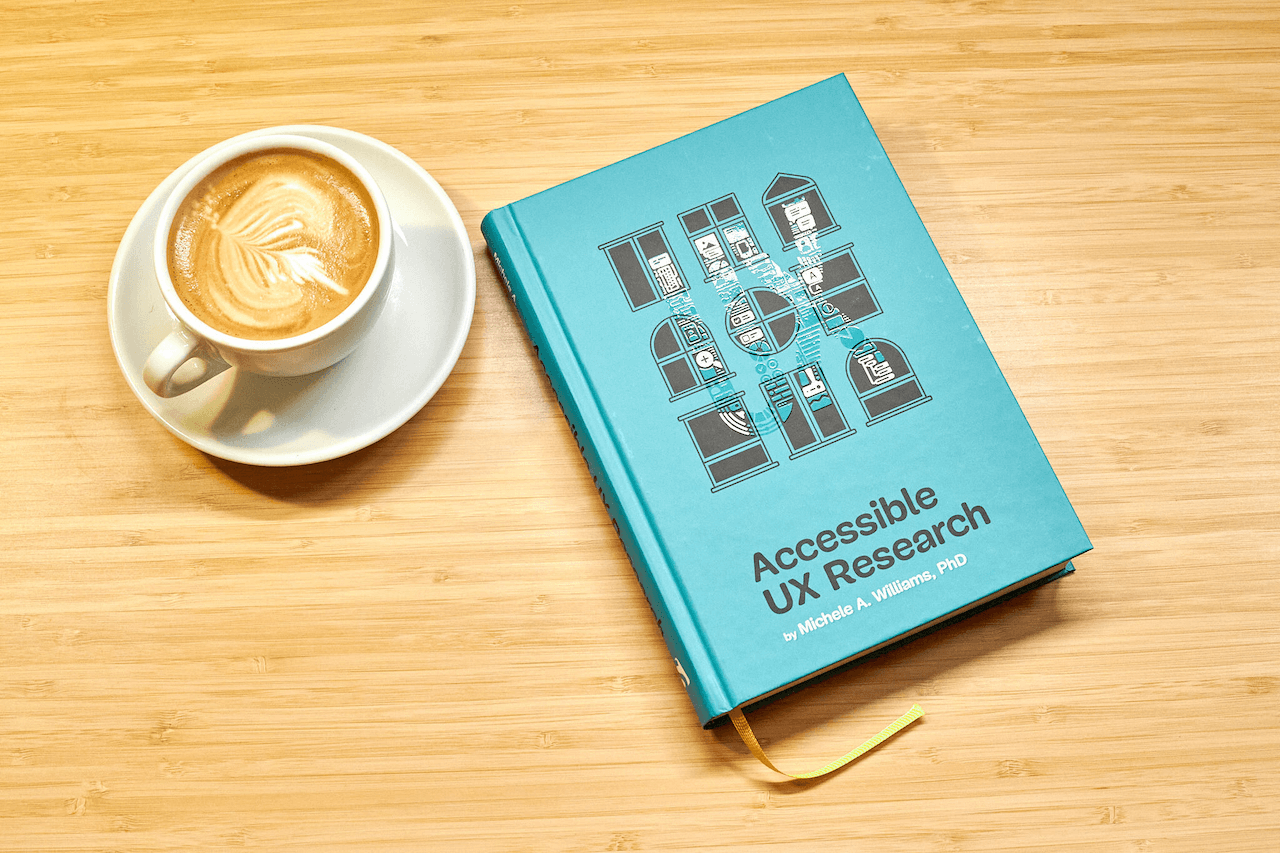
The book isn’t a checklist for you to complete as a part of your accessibility work. It’s a practical guide to inclusive UX research, from start to finish. If you’ve ever felt unsure how to include disabled participants, or worried about “getting it wrong,” this book is for you. You’ll get clear, practical strategies to make your research more inclusive, effective, and reliable.
Inside, you’ll learn how to:
- Plan research that includes disabled participants from the start,
- Recruit participants with disabilities,
- Facilitate sessions that work for a range of access needs,
- Ask better questions and avoid unintentionally biased research methods,
- Build trust and confidence in your team around accessibility and inclusion.
The book also challenges common assumptions about disability and urges readers to rethink what inclusion really means in UX research and beyond. Let’s move beyond compliance and start doing research that reflects the full diversity of your users. Whether you’re in industry or academia, this book gives you the tools — and the mindset — to make it happen.
324 pages. Written by Dr. Michele A. Williams. Cover art by Espen Brunborg. Download a free sample (PDF, 2.3MB) or get the book right away.
Please note: We’ve found a way to get printed books to our US customers! After several months of dealing with customs and tariff issues, we are happy to announce that all of our books — including this brand-new one — are once again shipping worldwide.
With a foreword by Jared Smith of WebAIM and an extensive interview with a disabled researcher, “Accessible UX Research” brings together insights from throughout the Accessibility community. Photo by Marc Thiele. (Large preview) The book includes tips and strategies to help anyone doing research at any point in the product design cycle. Photo by Marc Thiele. (Large preview) Contents
In Accessible UX Research, Michele Williams takes you on a deep dive into the real world of UX research, with a roadmap for including users with different abilities and needs.
1. Disability Mindset +For inclusive research to succeed, we must first confront our mindset about disability, typically influenced by ableism.
2. Diversity of Disability +Accessibility is not solely about blind screen reader users; disability categories help us unpack and process the diversity of disabled users.
3. Disability in the Stages of UX Research +Disabled participants can and should be part of every research phase — formative, prototype, and summative.
4. Recruiting Disabled Participants +Recruiting disabled participants is not always easy, but that simply means we need to learn strategies on where to look.
5. Designing Your Research +While our goal is to influence accessible products, our research execution must also be accessible.
6. Facilitating An Accessible Study +Preparation and communication with your participants can ensure your study logistics run smoothly.
7. Analyzing and Reporting with Accuracy and Impact +How you communicate your findings is just as important as gathering them in the first place — so prepare to be a storyteller, educator, and advocate.
8. Disability in the UX Research Field +Inclusion isn’t just for research participants, it’s important for our colleagues as well, as explained by blind UX Researcher Dr. Cynthia Bennett.
Appendix +In the appendix, you’ll find helpful summaries and tips to optimize your testing environment and your interactions with participants.
You’ll find plenty of useful references in the appendix at the end of the book. You’ll refer to these pages again and again. Photo by Marc Thiele. (Large preview) About the Author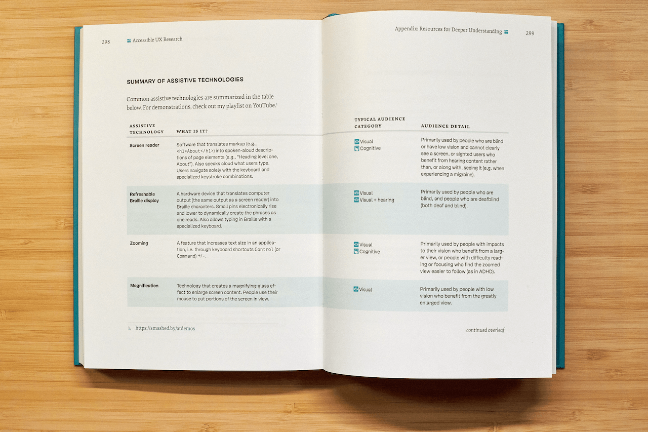
Dr. Michele A. Williams is owner of M.A.W. Consulting, LLC - Making Accessibility Work. Her 20+ years of experience include influencing top tech companies as a Senior User Experience (UX) Researcher and Accessibility Specialist and obtaining a PhD in Human-Centered Computing focused on accessibility. An international speaker, published academic author, and patented inventor, she is passionate about educating and advising on technology that does not exclude disabled users.
Testimonials “Accessible UX Research stands as a vital and necessary resource. In addressing disability at the User Experience Research layer, it helps to set an equal and equitable tone for products and features that resonates through the rest of the creation process. The book provides a solid framework for all aspects of conducting research efforts, including not only process considerations, but also importantly the mindset required to approach the work.This is the book I wish I had when I was first getting started with my accessibility journey. It is a gift, and I feel so fortunate that Michele has chosen to share it with us all.”
Eric Bailey, Accessibility Advocate “User research in accessibility is non-negotiable for actually meeting users’ needs, and this book is a critical piece in the puzzle of actually doing and integrating that research into accessibility work day to day.”
Devon Pershing, Author of The Accessibility Operations Guidebook “Our decisions as developers and designers are often based on recommendations, assumptions, and biases. Usually, this doesn’t work, because checking off lists or working solely from our own perspective can never truly represent the depth of human experience. Michele’s book provides you with the strategies you need to conduct UX research with diverse groups of people, challenge your assumptions, and create truly great products.”
Manuel Matuzović, Author of the Web Accessibility Cookbook “This book is a vital resource on inclusive research. Michele Williams expertly breaks down key concepts, guiding readers through disability models, language, and etiquette. A strong focus on real-world application equips readers to conduct impactful, inclusive research sessions. By emphasizing diverse perspectives and proactive inclusion, the book makes a compelling case for accessibility as a core principle rather than an afterthought. It is a must-read for researchers, product-makers, and advocates!”
Anna E. Cook, Accessibility and Inclusive Design Specialist Technical Details
- ISBN: 978-3-910835-03-0 (print)
- Quality hardcover, stitched binding, ribbon page marker.
- Free worldwide airmail shipping from Germany.
- eBook available for download as PDF, ePUB, and Amazon Kindle.
Producing a book takes quite a bit of time, and we couldn’t pull it off without the support of our wonderful community. A huge shout-out to Smashing Members for the kind, ongoing support. The eBook is and always will be free for Smashing Members. Plus, Members get a friendly discount when purchasing their printed copy. Just sayin’! ;-)
More Smashing Books & GoodiesPromoting best practices and providing you with practical tips to master your daily coding and design challenges has always been (and will be) at the core of everything we do at Smashing.
In the past few years, we were very lucky to have worked together with some talented, caring people from the web community to publish their wealth of experience as printed books that stand the test of time. Trine, Heather, and Steven are three of these people. Have you checked out their books already?
The Ethical Design HandbookA practical guide on ethical design for digital products.
Understanding PrivacyEverything you need to know to put your users first and make a better web.
Touch Design for Mobile InterfacesLearn how touchscreen devices really work — and how people really use them.