

Amerikanska
Timing Charts: A Blueprint For SMIL Animations
We know that everything on the web is a box by default, but you’ll find many animated <div>s pretending to be circles. But if you’ve ever met a real <circle>, you’ll know that they’ve got a lot more going for them. Dressed in SVG, they fit into a wider range of crowds than a humble <div> wearing HTML/CSS can. <img> has a strict no .html policy.
The <img> tag is not as static as its name suggests. Any embedded JavaScript unfortunately won’t run if you load an SVG file with an <img> tag, but CSS animations work perfectly fine. Many of the SVG attributes do have CSS property counterparts, and the geometry properties have been supported across the major browsers since 2024. Some attributes that you might want to animate, like viewBox, don’t have equivalents yet.
Besides JavaScript and CSS, there’s another way to animate SVGs: Synchronized Multimedia Integration Language (SMIL). Despite its quirks, it’s still worth learning. Like CSS animations, SMIL animations also work in <img> tags and can fully animate everything in an SVG, without JavaScript.
If you’ve never heard of SMIL or need a refresher, check out Andy Clarke’s well-named article. Then we’ll look at a way to plan an animation and make SMIL markup more manageable.
The Break UpSMIL has a problem: it gets bloated quickly. Unlike CSS and JavaScript, where you can list multiple properties in each keyframe and easily reuse animations, each SMIL tag can only target one element and only one property of that element at a time. A property can be animated through a list of values. But it is still one tag, one element, one property. The shortest way you can write a color and opacity change that will run is the following:
<animate attributeName="fill" to="someOtherColor" dur="someDuration" /> <animate attributeName="opacity" to="someOtherValue" dur="someDuration" />That’s not bad, but consider that it needs to be repeated for every element included in the animation. A SMIL animation can quickly get longer than its CSS equivalent.
To make things easier when starting a new animation, let’s plan all of the elements and properties we want to animate, and create a list of descriptive IDs for each tag.
Charting Animation Time And SpaceI like to plan my animations using what's called a timing chart. A timing chart is effectively a line segment; some choose horizontal lines, others prefer vertical, which is a great analogy for animation as a whole because line segments can run parallel, overlap, and follow each other with or without a gap. Just like animations.
For now, we’re only interested in when animations start and stop. When drawing our charts, we’ll forget about the in-between lines and instead draw a line for each component animation, marking the beginning and end. I like to annotate timing with a circle and a bar. You can draw your chart using whatever, and it doesn’t have to be exactly to scale, as long as the relative timing between all the little animations that make up the whole is clear. Besides, adding labels for the durations is an easy cheat to get around drawing to scale.
Here is a demo of how I typically set up a timing chart with more than one animation:
See the Pen colorAndOpacityChange [forked] by Johan Grobler.
The important thing to note is that the timing chart lines are arranged according to how the animations are arranged in time. One piece of the animation follows the next piece, which is followed by a subsequent piece, and so forth. It visualizes how the animation’s parts run together and cascade over time.
S(yncbase)MILA big part of SMIL is synchronization. It’s even in the name, after all. And there are multiple ways to specify when an animation should start (here’s a test case to check what your browser supports). One of the most useful ways is with a syncbase value, which is a SMIL tag’s ID followed by either .begin or .end, with an optional positive or negative offset.
Let’s piggyback off the previous animation example that includes changes in color and opacity. If we want the opacity animation to start 300 milliseconds before the color animation finishes, we could do arithmetic. Alternatively, the second animation can use the syncbase value colorChange.end - 300ms. This way, the relative timing between the two animations becomes explicit.
<!-- Starts at an absolute time --> <animate id="colorChange" begin="1s" ... /> <!-- Starts relative to when #first ends --> <animate id="opacityChange" begin="colorChange.end - 300ms" ... />Using syncbase values, the beginning of an animation is positioned in time relative to the .begin or .end of some other animation. A positive offset moves the start to the right (forwards in time), and a negative offset to the left (backwards in time).
See the Pen syncbase.end [forked] by Johan Grobler.
Something with negative offsets is that they can specify a time before the document has loaded or when a click happens. Computers can’t predict the future (at least not yet). The best they can do is jump the animation to where it would have been had the computer peeked into the future to preemptively start the animation. The second animation only runs from start to finish if there is enough room, so to speak.
See the Pen syncbase.begin [forked] by Johan Grobler.
Syncbase values don’t only allow you to connect animations from .end to .begin. Elect a primary animation; the animation that first comes to mind is usually the best representation of the group. All secondary animations can be set with begin="primary.begin". I’ve only used the ID #primary for emphasis. That way, all the other animations begin relative to that starting point. Stacking animations like this reduces maintenance if, say, we later want the whole group to start at a different time.
Let’s put the idea to work and build a loading indicator (or spinner). Then we’re going to explore how changing the relative timing between the parts changes the effect of the whole animation:
Step 1: Choose An Image ApproachBrowsers have wide support for the prefers-reduced-motion media feature and Val Head explains this in depth in another article. We definitely want to respect this user preference as we consider moving things around. In fact, consider it non-negotiable.
There are various approaches to adhering to a user’s prefers-reduced-motion setting when it comes to SMIL. Each with its pros and cons. Evaluating early on what’s going to work best for your use case could save you a partial rewrite down the line.
For example, we could consider using a <picture> element instead of a plain <img> because <picture> supports multiple <source> elements that can be used as fallbacks in a media attribute for reduced motion preferences.
Or one SVG file with an inline CSS @media query that uses display: none to swap between versions. That said, it’s an approach that might cause trouble in various environments. But browsers are continuously changing, and this might not be an issue in the future.
You might also consider a CSS background-image instead because we can wrap that style in a media query — @media (prefers-reduced-motion) — that sets a static image as the fallback for reduced motion preferences.
There are even more options we can turn to! For example, SVG’s <view> element can also be used to swap things out for motion preferences.
Or, if we prefer everything bundled together, we can use JavaScript .matchMedia() and the handy SMIL DOM interface to control which animations start instead of completely switching out files.
For this, I’m avoiding any motion and sticking to opacity animations, which tend to cause less trouble. For a non-interactive animation like this, we can load it in an <img> tag. When we add motion, we can go the <picture> route to show the most appropriate version of our animation.
Step 2: Draw The GraphicsWe’re going to do our own version of the classic three-dot spinner:
See the Pen StaticDots [forked] by Johan Grobler.
SVG wizards might be able to do everything directly in a text editor. I recommend using a graphic editor like Inkscape if you’re having trouble visualizing how the markup will be rendered. Once again, Andy Clarke has a great article about his process for optimizing and structuring his own drawings.
Note: There’s a gotcha with Inkscape. Setting what you would expect to be an element’s ID via the Layers window actually sets the value of a metadata attribute used internally by Inkscape. Use Inkscape’s object properties or XML editor window to set the true element’s ID. Your mileage may vary with a different editor. Also, in Inkscape, remember to save the file as optimized SVG when the drawing is done to strip away unneeded metadata.
Step 3: Outline The AnimationOK, so we’re sticking with the opacity animation idea. The dots are going to fade in and out. We’ll use separate <animate> tags for those. Six tags in total.
Our naming scheme is going to be straightforward: we’ll call them #fadeIn and #fadeOut, and to differentiate between each pair of tags, we’ll postfix the tag’s ID with either Left, Middle or Right. Try to follow a convention that makes sense to you when coming up with your own IDs.
The fade-in <animate> tag for the dot on the left:
<animate id="fadeInLeft" href="#leftDot" attributeName="opacity" from="0" to="1" ... />And the fade-out <animate> for the middle dot:
<animate id="fadeOutMiddle" href="#middleDot" attributeName="opacity" from="1" to="0" ... /> Step 4: Time The AnimationsWe have an infinite number of ways in which we could space these six animations in time. Let’s look at a couple of choice examples alongside their timing charts to see how changing the arrangement of the parts impacts the visual effect of the whole animation.
To narrow our choices a bit, all of the <animate> tags will use the same dur value, and none of the syncbase values will have offsets.
For someone coming from a culture that reads from left to right, the dots appearing on screen along the same pattern would feel natural. Let’s also start with all the dots fading out together at the end:
See the Pen dotsVersion1 [forked] by Johan Grobler.
Syncbase values stagger the fade-ins and restart the loop when the dots have disappeared:
<animate id="fadeInLeft" ... begin="0s; fadeOutLeft.end" /> <animate id="fadeInMiddle" ... begin="fadeInLeft.end" /> <animate id="fadeInRight" ... begin="fadeInMiddle.end" />Since all the fade-outs end at the same time, it is an arbitrary choice which one we use to restart the loop. We’ll consider #fadeOutLeft as the primary animation here and also synchronize the other fade-outs to it with the syncbase value fadeOutLeft.begin. Later, if we want to move the fade-outs in time, all we do is change when #fadeOutLeft starts.
<animate id="fadeOutLeft" ... begin="fadeInRight.end" /> <animate id="fadeOutMiddle" ... begin="fadeOutLeft.begin" /> <animate id="fadeOutRight" ... begin="fadeOutLeft.begin" /> Some Alternate TimingsInstead of a group fade-out, we could stagger them just like the fade-ins:
<animate id="fadeOutMiddle" ... begin="fadeOutLeft.end" /> <animate id="fadeOutRight" ... begin="fadeOutMiddle.end" />Without adding an offset, there are a couple of points in time we could start #fadeOutLeft at. If it starts on fadeInRight.end:
See the Pen dotsVersion2 [forked] by Johan Grobler.
The visual effect is subtly changed by moving up a spot and starting #fadeOutLeft on fadeInMiddle.end instead:
See the Pen dotsVersion3 [forked] by Johan Grobler.
We can see from the charts that we could try moving up a spot further to fadeInLeft.end:
See the Pen dotsVersion4 [forked] by Johan Grobler.
How about starting the sequence with a fade-out:
See the Pen dotsVersion5 [forked] by Johan Grobler.
You might prefer to start with the dot in the middle:
See the Pen centerFirstDots [forked] by Johan Grobler.
As you iterate on your animation, timing charts are a great way to keep track of your work, and they make visual comparison between versions possible. And by drawing a timing chart, you might even see a pattern in the timing between the parts of the animations that you might otherwise have missed.
Step 5: Adding More AnimationsAs you animate more elements and properties, it gets harder to keep track of what starts when. To see how timing charts can help you make sense of things, let’s build on the basic spinner:
See the Pen staticDotsWithClipPaths [forked] by Johan Grobler.
I’ve added a <rect> for each dot to the drawing. We’ll move those into to a <cilpPath> tag and remove the fill="white". As the animation runs, the rectangles are going to move over the dots for a different approach to animating the stroke than by animating stroke-dashoffset.
We only need a single <clipPath> for all three dots, but it adds structure to the document, and it’s good practice to wrap it, and similar tags, in a <defs> tag:
<defs> <clipPath id="dotsClipPath"> <!-- The geometry of the rectangles and coordinates used here, and later, depends on the viewBox used for their parent <svg> element. --> <rect id="clipPathLeftRect" width="2" height="2" x="1" y="6" /> <rect id="clipPathMiddleRect" width="2" height="2" x="4" y="2" /> <rect id="clipPathRightRect" width="2" height="2" x="7" y="6"> </clipPath> </defs>Remember to set the clip path for the <circle>s. Either with CSS or using the clip-path attribute:
<circle id="leftDot" ... clip-path="url(#dotsClipPath)" /> <circle id="middleDot" ... clip-path="url(#dotsClipPath)" /> <circle id="rightDot" ... clip-path="url(#dotsClipPath)" />Because the dots now have a stroke added, to leave their size unchanged, we need to compensate by subtracting half the value of stroke-width from r:
<circle ... r="0.9" stroke-width="0.2" ... />That's all the changes the graphics need. Have a look at the animated version with its timing chart, then we'll look in more detail at the changes that have been made to the animation:
See the Pen clipPathDots [forked] by Johan Grobler.
There's a new animation, #moveClipPathLeft, that starts the whole sequence, and to tweak the animation's rhythm a bit, there's a 1s delay between when the fade-outs end and the loop restarts:
<animate id="moveClipPathLeft" href="#clipPathLeftRect" attributeName="y" from="6" to="4" begin="0s; fadeOutLeft.end + 1s" fill="freeze" />You could use <animateTransform>s to move the rectangles instead, but we need to move them back to their starting positions at the end for a smooth restart of the animation. You’ll need to take into account which tags can animate and set which data types if you do decide to animate the transform attribute instead of translating the rectangles with the y attribute.
To change things up, the <rect> for the middle dot moves down:
<animate id="moveClipPathMiddle" href="#clipPathMiddleRect" attributeName="y" from="2" to="4" begin="moveClipPathLeft.end" fill="freeze" />We’re also using the fill-opacity property instead of the opacity property for the fade-ins, and they’ve been synchronized to start once a dot’s clipping <rect> has finished moving:
<animate id="fadeInLeft" href="#leftDot" attributeName="fill-opacity" to="1" dur="1s" begin="moveClipPathLeft.end" fill="freeze" /> <animate id="fadeInMiddle" href="#middleDot" ... begin="moveClipPathMiddle.end" ... /> <animate id="fadeInRight" href="#rightDot" ... begin="moveClipPathRight.end" ... />The fade-outs still use the normal opacity property, so both the fill and stroke fade out together. Because this arrangement is set up to use a group fade-out at the end, there are a few places the markup could be optimized. One of them is dropping the fill="freeze" to automatically reset the dot’s opacity back to its starting value once the tag finishes running:
<animate id="fadeOutLeft" href="#leftDot" attributeName="opacity" to="0" dur="1s" begin="fadeInRight.end" /> <!-- We'll still consider #fadeOutLeft as the primary animation here and sync the start of the others to it. --> <animate id="fadeOutMiddle" href="#middleDot" ... begin="fadeOutLeft.begin" /> <animate id="fadeOutRight" href="#rightDot" ... begin="fadeOutLeft.begin" />For the <animate> tags that did use fill="freeze", we’ll use <set> tags to reset those properties back to their starting values. I’ve simplified the chart a little by lumping those tags together. Because these <set> tags don’t have a duration over which they act, on the chart I’ve drawn the start and end markers over each other.
To reset the fill-opacity on the left dot:
<set href="#leftDot" attributeName="fill-opacity" to="0" begin="fadeOutLeft.end" fill="freeze" />If you use fill="freeze" with the fade-outs, you’ll need an extra <set> for each dot to reset the middle dot’s opacity:
<set href="#middleDot" attributeName="opacity" to="1" begin="fadeOutLeft.end" fill="freeze" />The last thing we need to do is move the clipping rectangles back to their starting positions. For the right <rect>:
<set href="#clipPathRightRect" attributeName="y" to="6" begin="fadeOutLeft.end" fill="freeze" />That’s just one of the possible timing variations, and most of what you’ll need to try some of the others, as we did with the basic spinner, is already in place. You might want to have a try at coming up with a couple of your own alternate timings.
That’s The Benefit Of Timing ChartsTo sum things up, we know that balancing the different stages of an animation can be difficult at best, and untenable at worst. Any time we get into multi-step animations that exceed one or two steps, it’s a form of orchestration. You’re almost building a Rube Goldberg machine of markup. And using a timing chart is a strategy I use that I hope will help you in your projects as well. They are outlines of what to expect and when, allowing you to map things out in a way that not only helps plan your code, but also makes future updates and maintenance a lot more bearable than going into it without a plan.
While a timing chart can’t reduce the complexity of the markup, it can give a good overview of what should happen when. Timing charts are definitely not limited to SMIL animations. Unfortunately, syncbase values are, and they can still help even if you’re going to use a different approach to implementing your animation.
Further ReadingI highly recommend checking out Andy’s other articles on Smashing Magazine. There’s even more stuff on combining CSS and SVG.
Yosra Emad wrote a great article on creating animations with multiple steps in CSS, and you might want to try drawing a few timing charts as you read through it.
When you’re ready to start adding those in-between lines to your timing chart, Nash Vail’s article on easing dives deep into the details of easing curves.
You might also be interested in tests for your browser’s SVG implementation to see what is supported.
New EU Guidelines For AI Labelling
There’s been a lot of confusion and panic this week about “huge fines”, “drastic measures” and “sweeping new AI rules” in the EU. In reality, it’s a lot more narrow — and a lot more sensible. And mostly it’s about making AI more obvious when it actually needs to be obvious — especially for AI-generated content.
Starting from Aug 2, 2026, AI labelling is a legal requirement for any company that serves EU citizens. And similar to European Accessibility Act, it’s not limited to EU companies. It affects any company worldwide with EU operations as long as their AI output is used by people in the EU. Let’s see what exactly it means for us.
What Actually Needs LabellingThe goal of AI labelling is to help everyone exposed to AI content to recognize, in a clear and distinguishable way, that the content has been artificially generated or manipulated.
According to Article 50(4) of the AI Act, AI labelling applies to:
- Deepfakes. Any image, audio, or video that resembles a real person, object, place, or event and would falsely appear authentic or truthful. Content that is not deceptively realistic generally doesn’t apply.
- Chatbots and AI agents. Users must be informed if they’re not talking to a human.
- Fully AI-written text. Specifically on matters of public interest, where there has been no human review or editorial work.
- Emotion recognition and biometric categorization tools.
Both providers (who build or supply the AI system) and deployers (who use it) carry legal obligations. Similar to GDPR and EAA, a company doesn’t escape Article 50 just because it licensed an external AI tool from a third party.
However, it doesn’t mean that all AI-generated content must be explicitly labelled.
Not All AI-Generated Content Must Be LabelledBeyond the use cases above, pretty much everything else — the vast majority of AI-assisted work — simply isn’t covered by new transparency rules. Most notably, the disclosure obligation does not apply where the AI-generated text has been reviewed and edited by a human, with a named person or entity taking editorial responsibility for it.
Some confusion circles around what exactly “public interest” means, where it starts and where it ends. On its own, it refers to health, safety, environment, economy, finances, politics, science, or culture. If AI-generated product claims touch upon them, the disclosure rule applies.
Some law firms recommend labelling realistic AI-generated illustrations or photos as a precaution for advertising, marketing and other commercial content. AI-generated product illustrations, photos, or posters do need a disclosure, as long as they resemble a real person, place, object, or event.
The Fine Line Between “Edited” And “AI-Generated”But at which point does edited AI content stop being AI content? When a form is pre-filled with AI, but then a user edits it, is it still AI? EU Commission’s guidance is a little fuzzy. Small assistive edits — spellcheck, grammar, formatting, cropping, colour correction, and AI-generated translation — don’t count as AI generation.
AI-generated summaries, composite imagery, substantive rewrites, or adding and removing elements from a photo are considered AI generation. In practice, fine-tuning a sentence a person wrote is fine, but generating the sentence on its own requires a disclosure.
“A human skimmed it before publishing” doesn’t qualify as editorial review. The Commission is explicit that it needs to be substantive, with a named person responsible for the editorial control.
In other words, the fine line lies between intentional manual intervention and automated generation. The latter always has to be disclosed (exception: closed B2B environments).
AI Sparkles Probably Not EnoughAs part of the Code of Practice, the European Commission has published an EU AI icon set. It’s a specific “AI” mark (similar to the AI label in Carbon Design System) — not the generic ✨ sparkle that many products use to signal AI. The signal must be “clear and distinguishable”.
The sparkle might be too ambiguous to signal AI clearly. Mostly because it’s often used to mean “AI-powered feature”, rather than “this specific content was generated by AI”. That’s the kind of signal EU guidelines are trying to rule out.
The Commission is explicit: using an icon “does not establish legal compliance by itself.” A barely visible icon, a note buried in the footer, or a label that flashes for a second are all not compliant.
The icon should be clearly visible, with a plain language label and accessible to assistive technologies. A safe bet is to pair any icon with plain text (“AI-generated”) — and it needs to persist when being reshared or downloaded.
In fact, the EU Commission also published Code of Practice on marking and labelling of AI content.
It Isn’t Just EUIt might feel like a yet another regulation coming from the EU, but in reality there are plenty of other similar regulations that emerged recently worldwide:
- China has mandatory AI labelling since 1 September 2025. With visible tags and watermarked metadata.
- California has SB 942, as amended by AB 853, which became mandatory on the exact same day as the EU rules (2 August 2026), deliberately timed to align.
- South Korea has the AI Basic Act that took effect on 22 January 2026, widely cited as the first comprehensive national-level AI law to mandate deepfake labels. Fines are modest by EU standards (roughly $20K per violation), with a one-year grace period before enforcement bites.
- India has an IT Rules amendment, in force since 20 February 2026. Platforms must label “synthetically generated information”, and takedown timing for most harmful deepfakes was cut to 3 hours.
All of these are signs of upcoming AI regulation that looks more like a pattern, rather than a coincidence. So if you’re shipping anything AI this year, it’s probably a good idea to have a conversation about what exactly is going to be AI-labelled, and what not.
Wrapping UpOne final note is that new EU AI transparency rules are much broader than US laws on AI disclosure, where certain state laws require disclosures for synthetic human performers, political advertising or specific AI applications.
None of this really deserves panic or confusion. It’s about a fairly simple idea that has been emerging worldwide at almost the same time:
When AI content could easily be mistaken for human content, creators must say so — in a way that is clear, obvious, and unambiguous. And parts of the UI that are AI-generated must be disclosed as such.If anything, it will help people distinguish between AI slop and not AI — and everybody can only benefit from that.
Meet “Design Patterns For AI Interfaces”Meet Design Patterns For AI Interfaces, Vitaly's new video course with practical examples from real-life products — with a live UX training happening soon. Jump to a free preview.
Meet Design Patterns For AI Interfaces, Vitaly’s video course on interface design & UX. Video + UX Training$ 450.00 $ 799.00 Get Video + UX Training30 video lessons (10h) + Live UX Training.
100 days money-back-guarantee.
30 video lessons (10h). Updated yearly.
Also available as a UX Bundle with 3 video courses.
- Safer and more transparent AI, European Commission’s official announcement
- EU Icons for labelling AI-generated content, the actual icon set and placement rules
- Guidelines on transparency obligations (Article 50), the detailed compliance guidance
- Code of Practice on marking and labelling of AI-generated content
- FAQ: Transparency obligations under Article 50, plain-language Q&A
- The Problem With AI Sparkle Icons, why ✨ is too ambiguous as a disclosure signal (Nielsen Norman Group)
- Carbon Design System: AI Label, a production-ready pattern for clear, accessible AI disclosure
Building Tactile UX: Honoring Intentional Design With Lottie
This article is a sponsored by Isadora Agency
When front-end developers and UX engineers are tasked with building a web interface that feels tactile, bouncy, or destructive, the industry instinct is almost always the same: reach for a physics engine. Frameworks like Matter.js, Cannon.js, or custom WebGL solutions have become the gold standard for creating immersive, gamified websites.
When our team at Isadora Agency set out to build Stress Release, a digital stress-relief squeeze toy designed to let burnt-out creatives smash, stretch, and distort animated UI characters, we initially explored that route. The goal was to build a highly tactile experience where every click yielded a satisfying, squishy reaction.
But as we began prototyping, we realized something crucial: Physics engines produce plausible motion, but in our case, the animators produced intentional motion.
We didn’t need our characters to act like realistic rubber balls bouncing uncontrollably around a canvas. We needed them to react in very specific, highly designed ways. So, we scrapped the physics engine entirely.
In this article, we’ll break down how we built a real-time stress-relief squeeze toy without a single line of WebGL or Matter.js, relying entirely on programmatic Lottie state controls, DOM manipulation, and distance-based math.
The Design Requirements: Intentional MotionOur core requirement for Stress Release was absolute deterministic control. Our animators had crafted bespoke .json Lottie files that required exact, frame-by-frame sequencing.
For instance, our ‘mega squeeze’ reaction required a precise 181-frame build-up followed by a specific release sequence. To honor this design, we needed an architecture that wouldn’t overwrite the animators’ crafted keyframes with algorithmic approximations.
The tighter the click-feedback loop (click → squish → score), the more you need deterministic frame control. By choosing programmatic state control using Lottie’s native API, we ensured that the interaction layer acted as a flawless trigger for the animation layer.
Creating Tactile Feedback: Mapping DOM Elements To Lottie StatesBecause our architecture relied on Lottie and the standard DOM, rendering is handled directly by the Lottie runtime, which plays the JSON-based vector animations as SVGs internally. We selected elements directly by ID and CSS class, driving their behavior using a combination of Lottie animation segments, CSS transforms, and click-event math.
To achieve a deeply satisfying “tactile feel” upon hitting a character, we used radial input mapping. The first step was converting the click from page coordinates into the character’s local coordinate space.
Every click was measured against the character’s center point, then translated into score, feedback intensity, and explosion placement:
// Character's center point in its own coordinate space var x_center = parseFloat($("#playChar").width() / 2); var y_center = parseFloat($("#playChar").height() / 2); // Click position relative to the character's top-left corner var offset = $("#playChar").offset(); // document-relative position var X = parseFloat(e.pageX - offset.left); var Y = parseFloat(e.pageY - offset.top); // Vector from center to click point var a = parseFloat(X - x_center); var b = parseFloat(Y - y_center);Then we calculate the straight-line distance from the center of the click using the Pythagorean theorem:
var distance = Math.hypot(a, b);That single number drives everything: the score, the feedback intensity, and where the explosion animation appears:
// Distance zones map to point rewards if (distance < 10) givePts = 100; // bullseye else if (distance < 40) givePts = getRndInteger(70, 90); else if (distance < 70) givePts = getRndInteger(40, 70); else if (distance < 100) givePts = getRndInteger(20, 40); else if (distance < 120) givePts = getRndInteger(10, 20); else if (distance < 145) givePts = getRndInteger(1, 10); else givePts = 0; // miss // Explosion Lottie repositioned to the exact click point var shiftPosition = window.innerWidth < 1023 ? -20 : 200; $("#explosionChar").css({ "margin-left": a + shiftPosition + "px", "margin-top": b + shiftPosition + "px", }); // Fire the squish animation instantly explosion.goToAndPlay(0);The result is a concentric zone system — a perfect circle of scoring rings around the character’s center, similar to a dartboard. The visual complexity of the Lottie SVG is completely irrelevant to hit detection; the hitbox is always a clean circle. Critically, the explosion Lottie animation is repositioned to (a, b) — the same vector used for scoring, so it always appears exactly where the player clicked. This spatial accuracy creates the tactile “I hit that” sensation entirely through math and DOM positioning.
Interaction Handling: Controlling The NarrativeBecause the experience used DOM-managed SVG elements, desktop clicks and mobile taps could be handled directly through native event listeners. This avoided extra raycasting or coordinate remapping layers, while keeping the interaction model aligned with how the animations were rendered.
Since the game requires a visual reaction at a specific point, Lottie handles all the squish and bounce feelings internally through its animation curves. Each character has a defined set of animation sections (idle loops, reaction frames, and end states) stored as frame ranges. When a click lands, we jump directly to the exact segment that matches the current game state:
// Animation sections defined as frame ranges per character const play_segments = [{ charId: 0, sections: { idle: [0, 40], // looping idle state squeeze1: [41, 80], // light reaction squeeze2: [81, 120], // medium reaction squeeze3: [121, 160], // heavy reaction }, playOrder: ["squeeze1", "squeeze2", "squeeze3"], endAnimation: [161, 200] }];On every click, we advance through the play order and fire the next segment:
function stepAnim() { let p = play_segments[0]; let i = p["playOrder"][curr_order_play]; let playNow = p["sections"][i]; playChar.stop(); // halt current segment immediately playChar.loop = false; // no looping - play once and stop playChar.playSegments(playNow, true); // jump to exact frames, force immediately curr_order_play++; canPlayAnim = 0; // lock out further clicks mid-animation if (curr_order_play > p["playOrder"].length - 1) { curr_order_play = 0; // cycle back to start of sequence } }When the segment completes, control returns to the idle loop:
playChar.onComplete = function() { canPlayAnim = 1; // unlock clicks again if (!playEnd) playIdleState(); }; function playIdleState() { playChar.playSegments([0, 40], true); // return to idle loop playChar.loop = true; }And for the mega squeeze build-up, the bar loops on a specific frame range until triggered:
// Loop the "ready to release" frames until player activates indikL.loop = true; indikL.playSegments([181, 302], true); // On activation - play the release sequence once indikL.loop = false; indikL.playSegments([96, 396], true); indikL.goToAndStop(0, true); // hard reset after completion The Responsive Benefit Of DOM ElementsAnother major factor in our architectural decision was responsive behavior. Because we built Stress Release in the DOM, we bypassed the complexities of scaling bounding boxes and collision vectors across different devices.
We handled responsive resizing entirely through CSS variables. By recalculating CSS custom properties on every resize, the layout simply reacts to the updated variables, and the Lottie SVGs scale naturally inside their containers without losing their state:
const appHeight = () => { const doc = document.documentElement; doc.style.setProperty("--doc-height", `${window.innerHeight}px`); doc.style.setProperty("--doc-width", `${doc.clientWidth}px`); }; window.addEventListener("resize", appHeight); appHeight(); // run immediately on init Mobile Performance Optimization: The Cost Of LottieWhile this architecture gave us total control over the art direction, it introduced a different challenge: file size.
Lottie JSON files can be heavy. We had 21 different character animations, plus multiple explosion variants that all needed to load. To ensure the experience remained fluid — especially on mobile devices — we implemented a few aggressive optimization strategies:
- Connection monitoring
We tracked initial asset load time using performance.now() to detect slow connections and flag when load times exceeded 5 seconds. - Sequential asset loading
Rather than initialising all 21 character animations simultaneously, we load them in pairs using await, advancing only when each pair completes. This prevents a burst of simultaneous network requests and render work from blocking the browser on low-end devices. - Aggressive memory management
Instead of keeping our heavy explosion animations in memory, we destroy and recreate them on the fly. This trades a tiny instantiation cost for a much lower idle memory footprint. - Dynamic quality reduction
Quality reduction is a single API call applied immediately after each shelf character loads. The key is applying different quality levels depending on the character’s role in the scene:
When determining the stack for a gamified web experience, it is critical to let the design requirements dictate the technology.
Because our interactions required bespoke, highly controlled visual reactions, we opted for programmatic state control over emergent simulation. This decision empowered the animators to dictate the exact feel of the experience, leaving the code to do what it does best: listen, calculate, and trigger.
By mapping Lottie’s native timeline capabilities to the DOM, you can deliver incredibly rich, tactile user experiences while maintaining absolute control over the art direction.
Further ResourcesWant to try implementing this yourself, or see exactly how it feels in the browser? Check out these resources:
- Play with the code.
We have prepared a simplified demo example on CodePen demonstrating a character reacting to a click using playSegments(). - See the final product.
Check out the live Stress Release site to see all 21 characters and the optimization strategies in action. - Read the docs.
Explore the official Lottie Web documentation to learn more about the player controls we utilized. Specifically, explore loadAnimation(), playSegments(), setSpeed(), and setQuality() — the four methods that power the entire interaction layer described in this article.
How Baseline Can Help You Ship Less JavaScript
Most of us install a dependency once and never look at it again. It does its job, the tests pass, and we move on. But the web platform keeps moving too, and a surprising number of the libraries sitting in your package.json today are now built into the browser.
In a typical mid-sized JavaScript app, you can often find somewhere between 60KB and 90KB (minified and gzipped) of dependencies that the platform can now handle on its own. Date and number formatting, HTTP requests, modals, tooltips, deep cloning, grouping arrays: these were all real gaps a few years ago. A lot of them aren’t gaps anymore.
The reason those libraries stick around isn’t laziness. It’s that most teams don’t re-audit their dependencies on a Baseline cadence, or are simply not aware of how fast browsers are shipping these days. You check npm audit for security, but is this library still doing something the browser can’t? is a question that rarely gets asked. So the libraries stay.
In this article, we’ll run that audit together. Instead of going through dependencies one by one, we’ll work in clusters, because the wins tend to come in groups. We’ll do the bundle math, build a small decision framework you can reuse, and stay honest about the cases where the platform still falls short. By the end, you’ll have a repeatable process you can run on your own package.json.
What “Baseline” Actually MeansBefore we start deleting things, let’s quickly recap what Baseline is. Feel free to skip this section if you’re already familiar.
Baseline is a project from the WebDX Community Group that tells you, in plain terms, how safe a web feature is to use across the major browsers (Chrome, Edge, Firefox, and Safari). A feature can be in one of three states:
- Limited availability
The feature hasn’t shipped in all the major engines yet. Not safe to rely on without a fallback. - Baseline Newly available
The feature has just landed in all the major engines. It works for users on up-to-date browsers, but older devices in the wild may not have it yet. - Baseline Widely available
The feature has been in all the major engines for 30 months. At this point, you can reach for it without much thought.
That 30-month gap between “Newly” and “Widely” matters a lot for this audit. A feature that’s Widely available is something you can usually drop a library for today. A feature that’s only Newly available is something you can drop a library for if you check your audience first, or if you’re comfortable with a small feature check. We’ll treat those two cases differently throughout.
You can look any feature up on webstatus.dev, on MDN (every reference page shows a Baseline badge near the top), or programmatically with the web-features npm package. We’ll use all three later when we run the audit on a real project.
A Decision Framework Before You Delete AnythingIt’s tempting to read “the browser does this now” and start ripping libraries out. Let’s not do that. A swap that looks free on paper can quietly break things for a chunk of your users, or cost you a feature you were relying on without realizing it.
So before dropping any library, ask three questions. We’ll reuse these in every cluster below.
1. Is the replacement Baseline-safe for my audience?
Not “is it Baseline” in the abstract, but “is it safe for the people who actually use my app.” If the native feature is Widely available, this is usually a yes. If it’s only Newly available, check your analytics or your browserslist config and see what share of your users would miss out. A B2B dashboard where everyone’s on the latest browser is a very different situation from a public-facing site with a long tail of old Android devices.
2. What does the swap actually cost?
Dropping a library isn’t always free. Sometimes the native feature isn’t supported widely enough yet, so you’d reach for a polyfill. If that polyfill is heavier than the library you’re removing, you’ve made your bundle bigger, unless you load it conditionally. We’ll see exactly this with Temporal later.
3. Does the platform feature cover my real use case?
Libraries often do more than the platform feature they resemble. axios isn’t just fetch with automatic JSON parsing; it has interceptors, request cancellation, and retries. If you’re using those, a straight swap to fetch will leave you reimplementing them. Check what you actually use before assuming it’s a drop-in replacement.
Keep these three in mind. Every cluster below is really just these questions applied to a different corner of your dependencies.
Cluster 1: Internationalization (The Biggest Drop Today Win)This is the cluster where you’ll usually find the most KBs sitting on top of features that are already Widely available. The browser ships a whole family of formatting tools under the Intl namespace, and a lot of small, popular libraries became unnecessary.
Here are the usual suspects and what replaces them:
- timeago.js (1 KB gz) → Intl.RelativeTimeFormat
- pluralize (2.3 KB gz) → Intl.PluralRules
- numeral (3.9 KB gz) → Intl.NumberFormat
- humanize-duration (6.6 KB gz) → Intl.DurationFormat
- list-joining helpers → Intl.ListFormat
Let’s walk through some of them.
Relative Timetimeago.js exists to turn a timestamp into “3 hours ago”. Intl.RelativeTimeFormat does the same thing, and it’s Baseline Widely available.
const rtf = new Intl.RelativeTimeFormat("en", { numeric: "auto" }); rtf.format(-1, "day"); // "yesterday" rtf.format(3, "hour"); // "in 3 hours" rtf.format(-2, "week"); // "2 weeks ago"The numeric: "auto" option is the nice touch here: it gives you “yesterday” instead of “1 day ago” where the language has a word for it. You pass a number and a unit, and you get a localized string back.
You may be wondering about the one thing timeago.js does that this snippet doesn’t: it picks the unit for you. Given a date, timeago.js decides whether to say “seconds” or “days.” Intl.RelativeTimeFormat expects you to do that part. It’s a few lines of arithmetic (work out the difference, find the largest unit that fits), and once you’ve written that helper, you don’t need the library anymore.
Numbers, Currency, And ListsIntl.NumberFormat covers most of what number-formatting libraries do: thousands separators, currency, percentages, and compact notation.
new Intl.NumberFormat("en-US").format(1234567.89); // "1,234,567.89" new Intl.NumberFormat("en-US", { style: "currency", currency: "USD" }).format( 1234.5, ); // "$1,234.50" new Intl.NumberFormat("en", { notation: "compact" }).format(1200000); // "1.2M"And Intl.ListFormat, Widely available, handles the “join an array into a sentence” problem, including the Oxford comma, which is the kind of thing people write fiddly helper functions for:
const lf = new Intl.ListFormat("en", { style: "long", type: "conjunction" }); lf.format(["Alice", "Bob", "Carol"]); // "Alice, Bob, and Carol" The One Caveat: Durationshumanize-duration turns a number of milliseconds into “1 hour, 30 minutes”. The platform equivalent is Intl.DurationFormat:
const df = new Intl.DurationFormat("en", { style: "long" }); df.format({ hours: 1, minutes: 30 }); // "1 hour, 30 minutes"One thing to keep in mind is that Intl.DurationFormat is Baseline Newly available at the time of writing, not Widely available. It landed in all the major engines in March 2025, and it’s on track to become Widely available in 2027. So this one fails question 1 for broad-audience apps unless you check your traffic first or add a fallback. For an internal tool on modern browsers, it’s fine today. For a public site with old devices, give it another year or guard it with a feature check.
The Math On This ClusterIf your app uses the full set (humanize-duration, timeago.js, pluralize, numeral), that’s roughly 14 KB gzipped of dependencies, most of it replaceable right now with Widely available APIs. The internationalization cluster is usually the easiest win in the whole audit.
Cluster 2: HTTP ClientsThis cluster is more nuanced, so it’s a good one to slow down on.
The browser HTTP libraries people reach for are axios (17 KB gz) and superagent (19 KB gz). For most requests, fetch plus AbortController covers what you need, and both are Widely available.
A basic GET looks like this:
// axios const { data } = await axios.get("/api/users"); // fetch const res = await fetch("/api/users"); const data = await res.json();The one extra line (res.json()) is fetch being explicit where axios was implicit. That’s the pattern across this whole cluster: fetch does less for you by default, and you decide whether you want the things it leaves out.
Timeoutsaxios has a timeout option. fetch has AbortSignal.timeout():
const res = await fetch("/api/users", { signal: AbortSignal.timeout(5000), // abort after 5 seconds }); Where fetch Doesn’t Replace axiosThis is where question 3 does most of the work, so let’s be specific about the gaps:
- fetch doesn’t reject on HTTP errors.
A 404 or 500 is a resolved promise, not a rejection. You have to check res.ok yourself. axios rejects on any non-2xx status. - No interceptors.
If you rely on axios interceptors to attach auth tokens or handle 401s in one place, fetch has no equivalent. You’d wrap fetch in your own function or class to get the same behavior. - No automatic retries.
axios (with a plugin) can retry failed requests. With fetch, that’s your code to write. - No upload progress.
fetch still can’t report upload progress in a first-class way. If you have a file uploader with a progress bar, that’s a real reason to keep a library.
I personally heavily rely on interceptors in my interactive online courses, such as Learn JavaScript, and I have solved that for years using a custom class on top of fetch. I’ve shipped this to millions of users and have seen lots of success with it.
None of these are hard to rebuild, and most apps only use one or two of them. But this is exactly the kind of cluster where you shouldn’t do a blind find-and-replace. Look at how you actually use your HTTP client first. If it’s plain GETs and POSTs, dropping axios for a thin fetch wrapper saves you about 17 KB gzipped.
Cluster 3: UI PrimitivesThis cluster has some of the most satisfying swaps, because the platform features don’t just match the libraries, they’re often more accessible than what teams ship by hand.
The libraries here are modal dialogs (something like a11y-dialog, 1.8 KB gz), tooltip and popover libraries (tippy.js, 14 KB gz, which bundles Popper for positioning), focus-trap (6.6 KB gz), and body-scroll-lock (1.3 KB gz). They get replaced by three platform features: the <dialog> element, the Popover API, and CSS anchor positioning.
The <dialog> ElementA huge amount of modal-related code exists to solve accessibility problems: trapping focus inside the modal, closing on Escape, restoring focus to the previous element when the dialog is closed, and rendering above everything else. The <dialog> element, Widely available, does all of that for you.
<dialog id="confirm"> <form method="dialog"> <p>Delete this file?</p> <button value="cancel">Cancel</button> <button value="delete">Delete</button> </form> </dialog> const dialog = document.querySelector("#confirm"); dialog.showModal(); // focus moves in, background goes inert, Escape closes it dialog.addEventListener("close", () => { console.log(dialog.returnValue); // "cancel" or "delete" });Calling showModal() does the work that focus-trap was installed for: focus moves into the dialog, the rest of the page becomes inert so you can’t tab out of it, Escape closes it, and focus returns to the element that opened it. The dialog renders in the browser’s Top layer, so you don’t fight z-index. You also get a ::backdrop pseudo-element to style the overlay.
That single element can replace your modal library and focus-trap. The one piece it doesn’t handle on its own is locking the background from scrolling, which is what body-scroll-lock was for. That’s now one line of CSS:
body:has(dialog:modal) { overflow: hidden; }If you’re wondering why we’re using dialog:modal instead of dialog[open], it’s because the open attribute is set as soon as you call show(), but the dialog isn’t actually modal so you don’t want to lock scrolling yet. The :modal pseudo-class is only true when the dialog is actually modal, which is the case when you call showModal().
So three libraries collapse into one element and one CSS rule.
Popover API And Anchor PositioningFor things that aren’t full modals (dropdown menus, tooltips, the small floating panels that tippy.js handles), the Popover API gives you light-dismiss behavior, top-layer rendering, and Escape-to-close with no JavaScript at all:
<button popovertarget="menu" id="options">Options</button> <div id="menu" popover> <!-- menu content --> </div>Clicking the button toggles the popover. Clicking outside it closes it. It’s Baseline Newly available (since January 2025).
The other half of what a tooltip library does is positioning: keeping the floating element pinned to its trigger and flipping it when it would overflow the viewport. That’s what Popper (bundled inside tippy.js) handles, and it’s now a CSS feature called anchor positioning. Here it pins the same #menu popover directly under its trigger button:
#options { anchor-name: --trigger; } .tooltip { position-anchor: --trigger; position-area: top; margin: 0; }Anchor positioning is the newest feature in this article. It became Baseline Newly available in January 2026, when Firefox 147 shipped it (Chrome had it since version 125, and Safari since version 26). Because it’s this fresh, it’s squarely a question-1 feature: great for modern audiences, but check your traffic, and note that some of the more advanced parts (like position-try fallbacks) have uneven support across versions. Keep a sensible fallback for older browsers.
Between <dialog>, the Popover API, and anchor positioning, the UI primitives cluster (tooltip library, modal library, focus-trap, body-scroll-lock) adds up to roughly 24 KB gzipped, and you come out the other side with better accessibility defaults than most hand-rolled solutions.
Cluster 4: Lodash UtilitiesLodash is rarely imported whole anymore, but its individual functions show up everywhere, either as the full lodash package (25 KB gz) or as standalone installs like lodash.clonedeep and lodash.groupby. Several of the most common ones now have direct platform equivalents.
Groupinglodash.groupby reorganizes an array into an object keyed by some property. Object.groupBy does exactly that:
const products = [ { name: "Apple", category: "fruit" }, { name: "Carrot", category: "vegetable" }, { name: "Banana", category: "fruit" }, ]; const grouped = Object.groupBy(products, (product) => product.category); // { // fruit: [{ name: "Apple", ... }, { name: "Banana", ... }], // vegetable: [{ name: "Carrot", ... }], // }There’s also Map.groupBy for when you want a Map instead of a plain object (handy if your keys aren’t strings). Both are Baseline Newly available, since March 2024, and on track to become Widely available in late 2026.
Deep Cloninglodash.clonedeep makes a deep copy of an object. structuredClone is the platform version, and it’s Widely available:
const original = { user: { name: "Sam", roles: ["admin"] } }; const copy = structuredClone(original); copy.user.roles.push("editor"); original.user.roles; // ["admin"] (unchanged)structuredClone handles the tricky cases that trip up JSON.parse(JSON.stringify(...)): it clones Date, Map, Set, ArrayBuffer, and circular references correctly. The limit to know about (question 3 again) is that it can’t clone functions, DOM nodes, or class instances; it throws on functions and drops the prototype on class instances. For plain data, which is what most people deep-clone, it’s a clean replacement.
Set OperationsIf you’ve ever pulled in a Lodash helper for union, intersection, or difference, the Set object now has these built in. They’re Baseline Newly available, since June 2024:
const admins = new Set(["sam", "alex", "jo"]); const editors = new Set(["alex", "kim"]); admins.intersection(editors); // Set { "alex" } admins.union(editors); // Set { "sam", "alex", "jo", "kim" } admins.difference(editors); // Set { "sam", "jo" }The full set of methods is union, intersection, difference, symmetricDifference, isSubsetOf, isSupersetOf, and isDisjointFrom.
What’s Worth KeepingNot all of Lodash has moved into the platform. debounce and throttle still have no native equivalent, and they’re genuinely useful, so cherry-picking lodash.debounce is reasonable. The point of this cluster isn’t “delete Lodash,” it’s “stop shipping the parts the browser already has.” Dropping lodash.clonedeep and lodash.groupby alone is about 8 KB gzipped, and if you were importing the full lodash for a handful of functions, replacing the platform-covered ones can let you drop it entirely.
Cluster 5: Temporal, A Case Study In Not Dropping A Library YetEvery cluster so far has ended in “go ahead, drop it.” This one is the opposite, and that's why it's worth including: it shows the framework telling you to wait.
Temporal is the long-awaited replacement for JavaScript's Date, and it's a genuinely better API: immutable objects, sane time zone handling, and no more month indexes starting at zero. It reached TC39 Stage 4 in March 2026 and is part of the ES2026 specification. Firefox shipped it in version 139 (in 2025), and Chrome shipped it in version 144 (January 2026). Safari hasn't shipped it in a stable release yet; it's in Safari Technology Preview, with stable support expected later in 2026.
If Temporal is news to you, check out the Temporal Cheatsheet for a quick overview of the API and a comparison to Date.
However, Temporal is not Baseline. It's still in limited availability, because Safari users don't have it. To use it across all browsers today, you need a polyfill, and this is where the math turns against you.
The official @js-temporal/polyfill is about 44 KB gzipped. There's a smaller polyfill that internally does not depend on BigInt and it weighs 19 KB gzipped. A lightweight date library like dayjs is about 3 KB gzipped. So if you swap dayjs for Temporal plus its polyfill right now, you're not saving 3 KB, you're adding roughly 41 KB to your bundle, unless you are able to load the polyfill conditionally.
Run it through the framework:
- Question 1 (audience): Temporal isn't Baseline. For a broad audience, that's a lot of people.
- Question 2 (cost): the polyfill is more than ten times the size of the library you'd remove. The swap makes your bundle bigger.
- Question 3 (feature gap): Temporal actually wins here; it does more than dayjs. But that doesn't matter while questions 1 and 2 are failing.
The verdict is generally clear: keep dayjs (or date-fns) for now. The moment to revisit is when Safari ships Temporal in a stable release and it reaches Baseline. At that point you can use Temporal natively and conditionally load the polyfill for users on older browsers. This is a feature to write down and check again in a few months, not one to act on today.
How To Run This Audit On Your Own package.jsonThe clusters above are a starting map, but your dependencies are your own. Here's a repeatable process you can run this quarter.
Step 1: List Your Production DependenciesStart by listing what actually ships to users:
npm ls --omit=dev --depth=0 Step 2: Measure What Each One CostsFor a quick per-package number, Bundlephobia gives you the minified and gzipped size of any npm package. For the real picture (what each dependency costs in your actual bundle, after tree-shaking and deduplication), run a bundle analyzer against your build. npx source-map-explorer works on most bundles, and npx vite-bundle-visualizer works for Vite projects.
Step 3: Check The Baseline Status Of Each ReplacementFor each candidate, find the platform feature that would replace it and check its Baseline status. The quickest way is webstatus.dev or the Baseline badge on the feature's MDN page.
Step 4: Run The Three QuestionsFor each library with a platform replacement, go back to the framework: Is it Baseline-safe for your audience? What does the swap cost? Does the feature cover how you actually use the library? Most of your decisions will fall out of question 1 (check the feature's status against your browserslist) and question 3 (check your own usage).
Step 5: Swap Behind Progressive Enhancement Where NeededFor Widely available features, swap and move on. For Newly available ones, either confirm your audience is on modern browsers or guard the new code with a quick feature check and keep a fallback:
if (typeof Intl.DurationFormat === "function") { // use the platform feature } else { // fall back to the library, or a simpler format }That way you ship less code to the users who can run it, without breaking the ones who can't.
Wrapping UpAdd the clusters up, and the picture is concrete. The internationalization cluster is around 14 KB gzipped, HTTP is around 17 KB, the UI primitives are around 24 KB, and the Lodash utilities are 8 KB or more depending on how much of the library you were shipping. For a typical mid-sized app, that's somewhere between 60 KB and 90 KB gzipped of dependencies you can hand back to the platform, and more if you were shipping the full lodash or several of these libraries at once. (The uncompressed numbers are two to three times larger, which is what you'll see in a bundle analyzer before gzip.)
I've chosen relatively lean packages for most of these features, but some individual packages could still be heavy. Your dialog package, for instance, could alone weigh as much as 50KB gzipped depending on what you're using.
A few features are worth keeping an eye on over the next year, because they'll open up further swaps:
- Temporal going native.
Once Safari ships it in a stable release and it reaches Baseline, you can drop both your date library and the polyfill, turning today's regression into a real win. - CSS anchor positioning maturing.
It became Baseline Newly available in January 2026. As it ages toward Widely available, dropping tooltip and popover positioning libraries gets safer for broad audiences. - Object.groupBy and friends crossing into Widely available.
The 2024 batch (array grouping, Set methods) is on track to become Widely available in late 2026, which moves them from "check your audience" to "just use it."
None of this is a one-time cleanup. The platform ships new features constantly, and the gap between "you need a library for this" and "the browser does this" keeps closing. The habit worth building is small: once a quarter, run the audit. List your dependencies, check what's now Baseline, and hand back what you can.
Pick one cluster from this article, open your package.json, and see how much of it the browser already does for you.
Small Joys And Big Adventures (August 2026 Wallpapers Edition)
Everybody loves a beautiful wallpaper to freshen up their desktops and home screens, right? To provide you with inspiring designs on a regular basis, we started our monthly wallpapers series more than 15 years ago, and from the very beginning to today, artists and designers from across the globe have tickled their creativity and contributed their artworks to it.
This August is no exception, of course, so following our monthly tradition, we have a new collection of wallpapers waiting for you below. Created with love by the community for the community, all of them come in a variety of screen resolutions and can be downloaded for free.
A huge thank-you to everyone who shared their wallpapers with us this time around — this post wouldn’t be possible without your kind support! If you would also like to be featured in one of our upcoming wallpapers posts, please don’t hesitate to submit your design. We can’t wait to see what you come up with! Happy August!
- You can click on every image to see a larger preview.
- We respect and carefully consider the ideas and motivation behind each and every artist’s work. This is why we give all artists the full freedom to explore their creativity and express emotions and experience through their works. This is also why the themes of the wallpapers weren’t anyhow influenced by us but rather designed from scratch by the artists themselves.
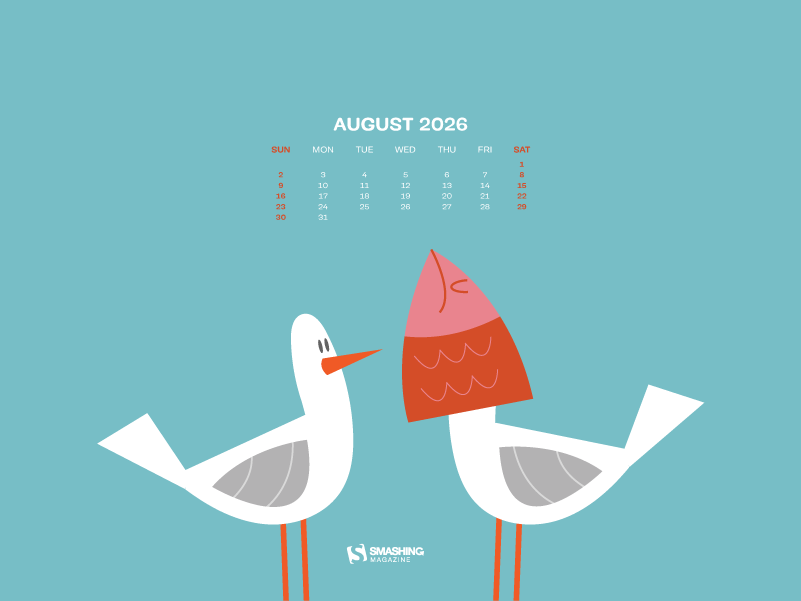
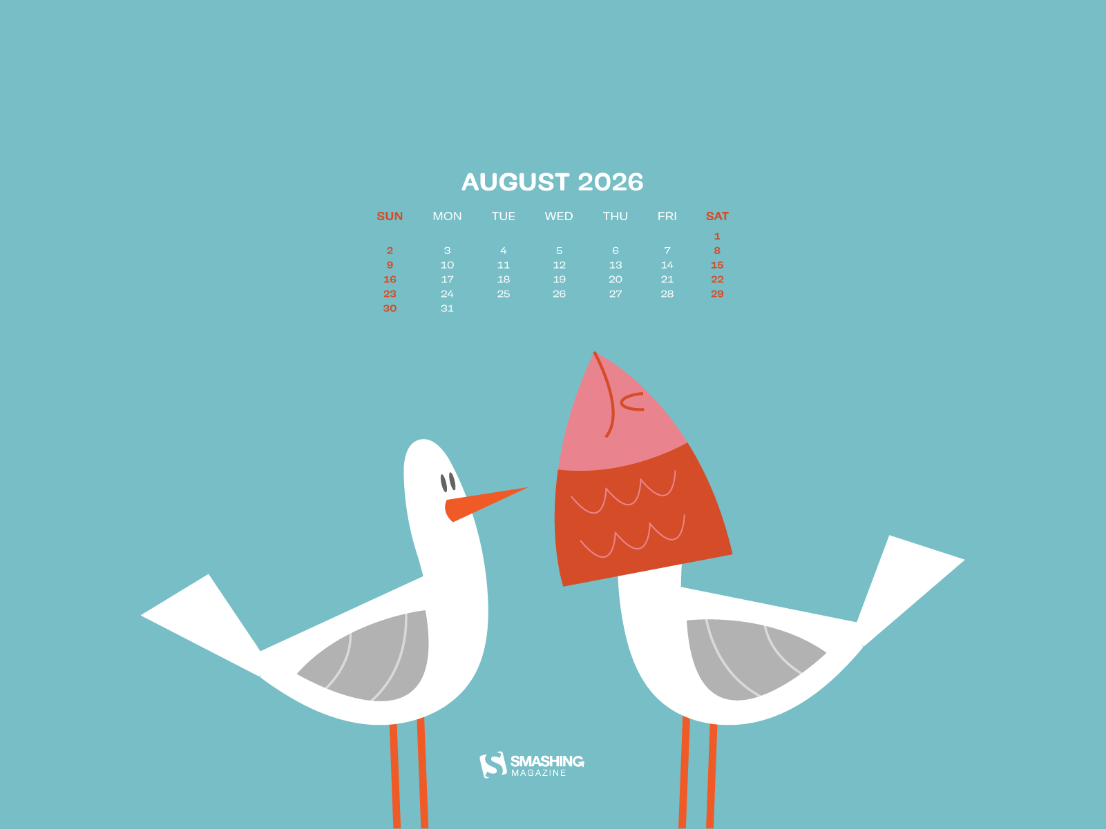
Designed by Ricardo Gimenes from Spain.

- preview
- with calendar: 640x480, 800x480, 800x600, 1024x768, 1024x1024, 1152x864, 1280x720, 1280x800, 1280x960, 1280x1024, 1366x768, 1400x1050, 1440x900, 1600x1200, 1680x1050, 1680x1200, 1920x1080, 1920x1200, 1920x1440, 2560x1440, 3840x2160
- without calendar: 640x480, 800x480, 800x600, 1024x768, 1024x1024, 1152x864, 1280x720, 1280x800, 1280x960, 1280x1024, 1366x768, 1400x1050, 1440x900, 1600x1200, 1680x1050, 1680x1200, 1920x1080, 1920x1200, 1920x1440, 2560x1440, 3840x2160






































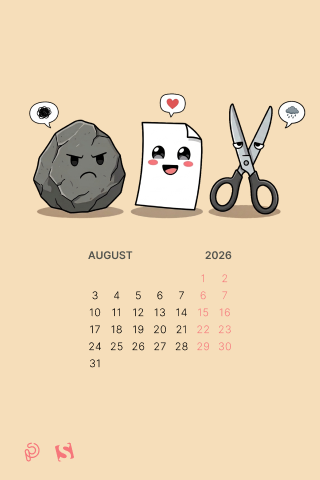
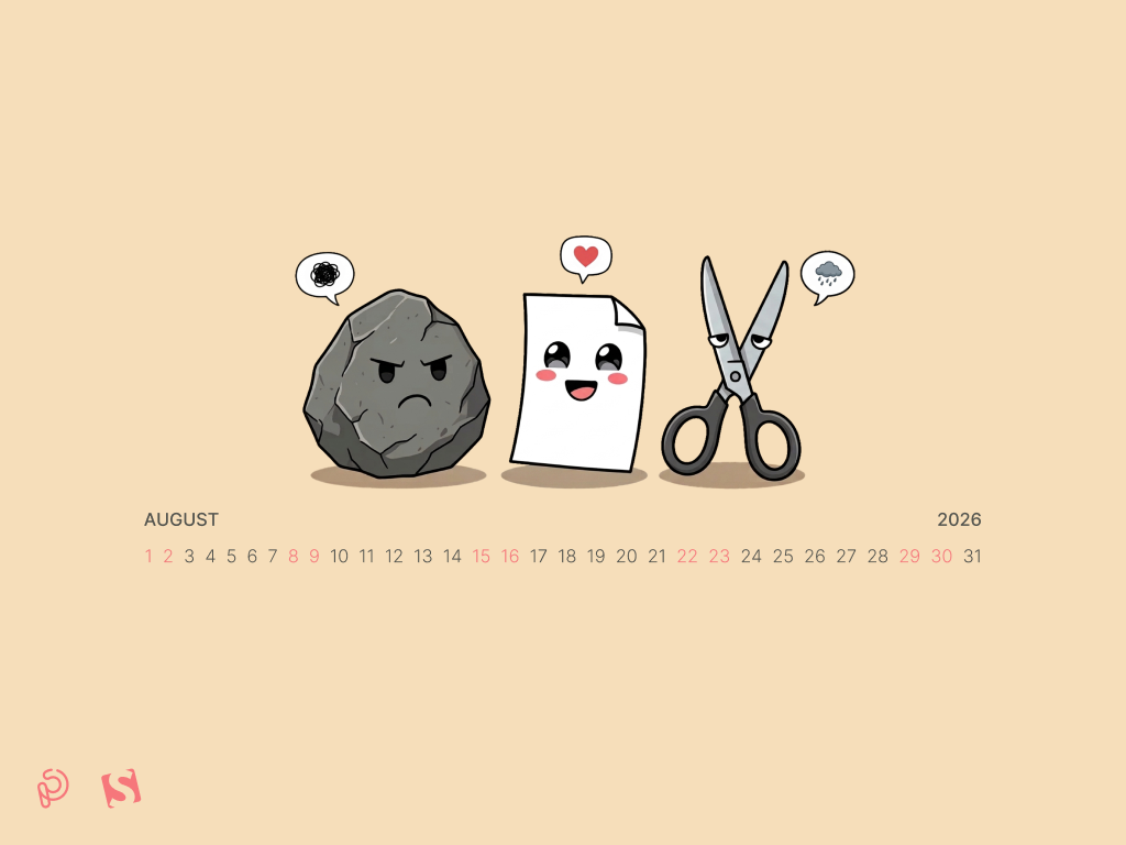
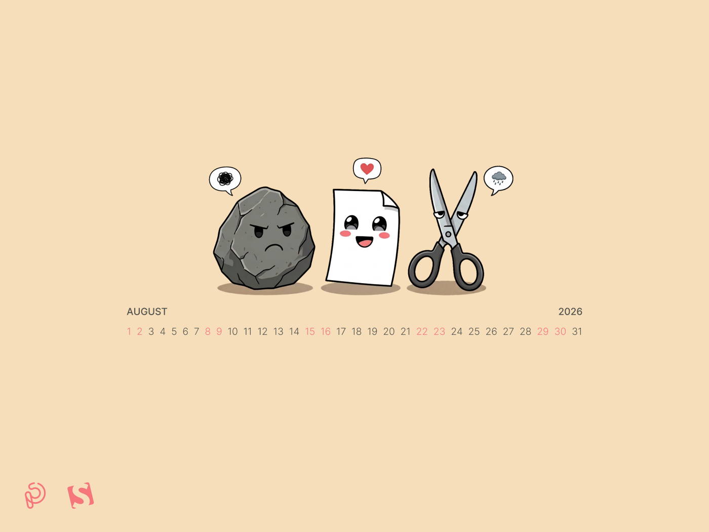
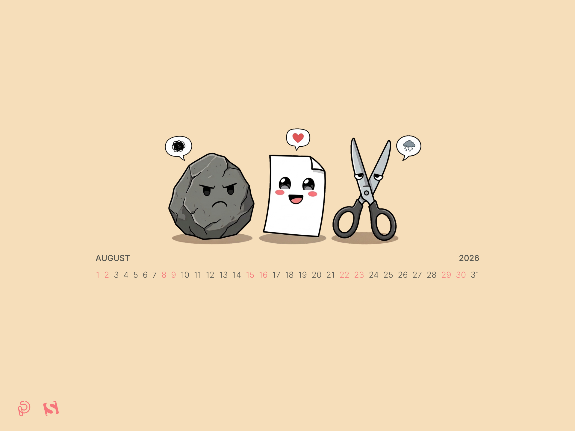
“Before complex treaties and endless debates, humanity forged a simpler pact. A timeless triangle of absolute balance. The Immutable Stone, unyielding in its silence. The Gentle Parchment, quiet yet capable of boundlessness. The Sharp Blade, precise and forever restless. None holds absolute power; each surrenders to another in an eternal, perfect loop. On World Rock Paper Scissors Day, we honor the swift wisdom of three simple gestures that can break any deadlock and remind us that every force has its match. Fist, palm, or shears — what is your first move?” — Designed by PopArt Studio from Novi Sad, Serbia.

- preview
- with calendar: 320x480, 640x480, 800x480, 800x600, 1024x768, 1024x1024, 1152x864, 1280x720, 1280x800, 1280x960, 1280x1024, 1400x1050, 1440x900, 1600x1200, 1680x1050, 1680x1200, 1920x1080, 1920x1200, 1920x1440, 2560x1440
- without calendar: 320x480, 640x480, 800x480, 800x600, 1024x768, 1024x1024, 1152x864, 1280x720, 1280x800, 1280x960, 1280x1024, 1400x1050, 1440x900, 1600x1200, 1680x1050, 1680x1200, 1920x1080, 1920x1200, 1920x1440, 2560x1440





































Designed by Ricardo Gimenes from Spain.

- preview
- with calendar: 640x480, 800x480, 800x600, 1024x768, 1024x1024, 1152x864, 1280x720, 1280x800, 1280x960, 1280x1024, 1366x768, 1400x1050, 1440x900, 1600x1200, 1680x1050, 1680x1200, 1920x1080, 1920x1200, 1920x1440, 2560x1440, 3840x2160
- without calendar: 640x480, 800x480, 800x600, 1024x768, 1024x1024, 1152x864, 1280x720, 1280x800, 1280x960, 1280x1024, 1366x768, 1400x1050, 1440x900, 1600x1200, 1680x1050, 1680x1200, 1920x1080, 1920x1200, 1920x1440, 2560x1440, 3840x2160











































“August is one of the best months for stargazing, with clear nights and plenty of meteor activity. Some nights bring shooting stars, while others reveal constellations that are easy to miss during the rest of the year.” — Designed by Ginger IT Solutions from Serbia.

- preview
- with calendar: 320x480, 640x480, 800x480, 800x600, 1024x768, 1024x1024, 1152x864, 1280x720, 1280x800, 1280x960, 1400x1050, 1440x900, 1600x1200, 1680x1050, 1680x1200, 1920x1080, 1920x1200, 1920x1440, 2560x1440
- without calendar: 320x480, 640x480, 800x480, 800x600, 1024x768, 1024x1024, 1152x864, 1280x720, 1280x800, 1280x960, 1400x1050, 1440x900, 1600x1200, 1680x1050, 1680x1200, 1920x1080, 1920x1200, 1920x1440, 2560x1440







































“Many people find August one of the happiest months of the year because of holidays. You can spend days sunbathing, swimming, birdwatching, listening to their joyful chirping, and indulging in sheer summer bliss. August 8th is also known as the Happiness Happens Day, so make it worthwhile.” — Designed by PopArt Studio from Serbia.

- preview
- without calendar: 320x480, 640x480, 800x480, 800x600, 1024x768, 1024x1024, 1152x864, 1280x720, 1280x800, 1280x960, 1280x1024, 1366x768, 1400x1050, 1440x900, 1600x1200, 1680x1050, 1680x1200, 1920x1080, 1920x1200, 1920x1440, 2560x1440



Designed by Kasturi Palmal from India.

- preview
- without calendar: 800x600, 1280x1024, 1600x1200, 1680x1200, 1920x1080, 1920x1200, 1920x1440, 2560x1440









“August means that fall is just around the corner, so I designed this wallpaper to remind everyone to ‘bee happy’ even though summer is almost over. Sweeter things are ahead!” — Designed by Emily Haines from the United States.

- preview
- without calendar: 640x480, 800x600, 1280x720, 1280x800, 1280x960, 1366x768, 1400x1050, 1440x900, 1600x1200, 1680x1050, 1680x1200, 1920x1080, 1920x1200, 1920x1440, 2560x1440



“As the sun dips below the horizon, casting a warm glow upon the open road, the retro van finds a resting place for the night. A campsite bathed in moonlight or a cozy motel straight from a postcard become havens where weary travelers can rest, rejuvenate, and prepare for the adventures that await with the dawn of a new day.” — Designed by PopArt Studio from Serbia.

- preview
- without calendar: 320x480, 640x480, 800x480, 800x600, 1024x768, 1024x1024, 1152x864, 1280x720, 1280x800, 1280x960, 1280x1024, 1400x1050, 1440x900, 1600x1200, 1680x1050, 1680x1200, 1920x1080, 1920x1200, 1920x1440, 2560x1440





















Designed by Ricardo Gimenes from Spain.

- preview
- without calendar: 640x480, 800x480, 800x600, 1024x768, 1024x1024, 1152x864, 1280x720, 1280x800, 1280x960, 1280x1024, 1366x768, 1400x1050, 1440x900, 1600x1200, 1680x1050, 1680x1200, 1920x1080, 1920x1200, 1920x1440, 2560x1440, 3840x2160



















“I like the Paris night! All is very bright!” — Designed by Verónica Valenzuela from Spain.

- preview
- without calendar: 800x480, 1024x768, 1152x864, 1280x800, 1280x960, 1440x900, 1680x1200, 1920x1080, 2560x1440



“As we have taken a liking to diving through the coral reefs, we’ll also spend August diving and took the leap to Bora Bora. There we enjoy the sea and nature and above all, we rest to gain strength for the new course that is to come.” — Designed by Veronica Valenzuela from Spain.

- preview
- without calendar: 640x480, 800x480, 1024x768, 1280x720, 1280x800, 1440x900, 1600x1200, 1920x1080, 1920x1440, 2560x1440











Designed by Ricardo Gimenes from Spain.
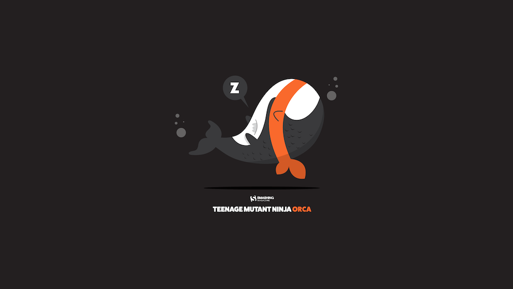
- preview
- without calendar: 640x480, 800x480, 800x600, 1024x768, 1024x1024, 1152x864, 1280x720, 1280x800, 1280x960, 1280x1024, 1366x768, 1400x1050, 1440x900, 1600x1200, 1680x1050, 1680x1200, 1920x1080, 1920x1200, 1920x1440, 2560x1440, 3840x2160


Designed by Dorvan Davoudi from Canada.

- preview
- without calendar: 800x480, 800x600, 1152x864, 1280x720, 1280x800, 1280x960, 1280x1024, 1366x768, 1400x1050, 1440x900, 1600x1200, 1680x1050, 1680x1200, 1920x1080, 1920x1200, 1920x1440, 2560x1440



Designed by Ricardo Gimenes from Spain.
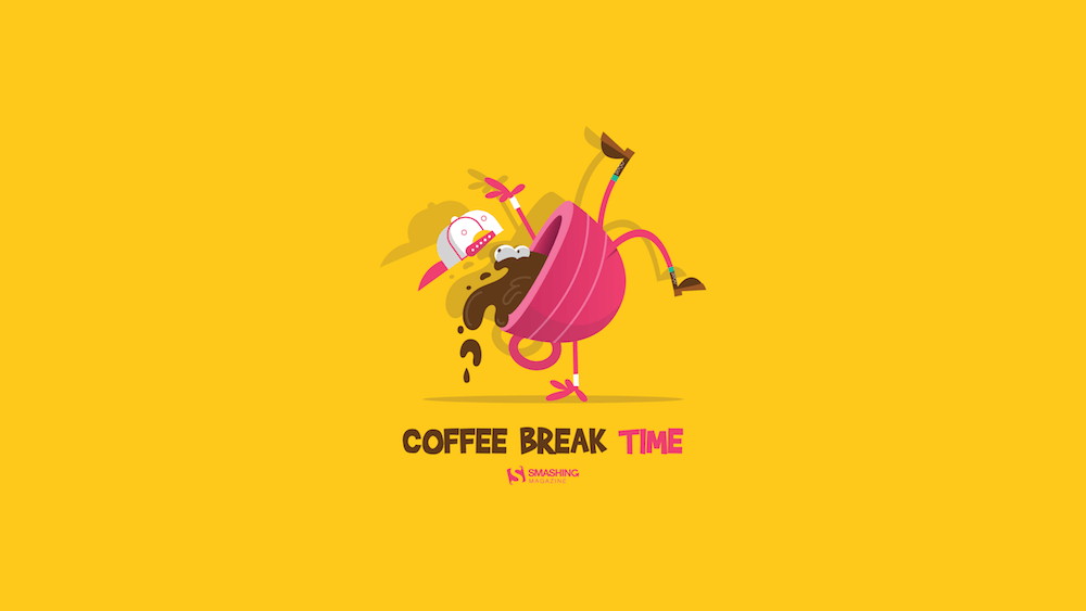
- preview
- without calendar: 320x480, 640x480, 800x480, 800x600, 1024x768, 1024x1024, 1152x864, 1280x720, 1280x800, 1280x960, 1280x1024, 1366x768, 1400x1050, 1440x900, 1600x1200, 1680x1050, 1680x1200, 1920x1080, 1920x1200, 1920x1440, 2560x1440


“August is one of my favorite months, when the nights are long and deep and crackling fire makes you think of many things at once and nothing at all at the same time. It’s about heat and cold which allow you to touch the eternity for a few moments.” — Designed by Igor Izhik from Canada.

- preview
- without calendar: 1024x768, 1024x1024, 1280x720, 1280x800, 1280x960, 1280x1024, 1400x1050, 1440x900, 1600x1200, 1680x1050, 1680x1200, 1920x1080, 1920x1200, 1920x1440, 2560x1440



“It seems the feeling of summer breaks we had back in school never leaves us. The mere thought of alarm clocks feels wrong in the summer, especially if you’ve recently come back from a trip to the seaside. So, we try to do our best during working hours and then compensate with fun activities and plenty of rest. Cheers!” — Designed by ActiveCollab from the United States.

- preview
- without calendar: 1080x1920, 1400x1050, 1440x900, 1600x1200, 1680x1050, 1920x1080, 1920x1200, 1920x1440, 2560x1440, 3840x2160


Designed by Vlad Gerasimov from Georgia.
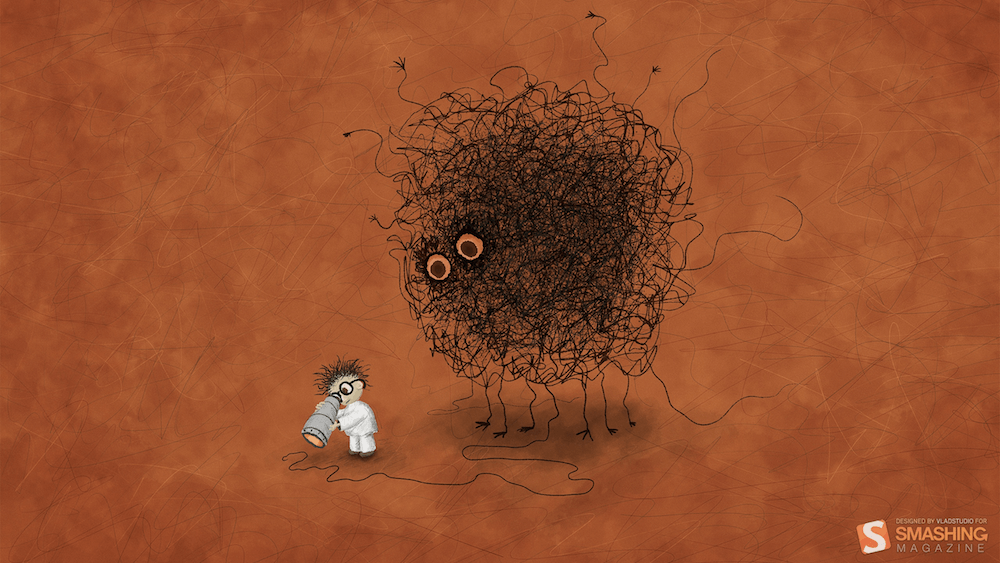
- preview
- without calendar: 800x600, 960x600, 1024x768, 1152x864, 1229x768, 1280x800, 1280x960, 1280x1024, 1400x1050, 1440x900, 1440x900, 1440x960, 1600x1200, 1600x1200, 1680x1050, 1728x1080, 1920x1200, 1920x1440, 2304x1440, 2560x1600


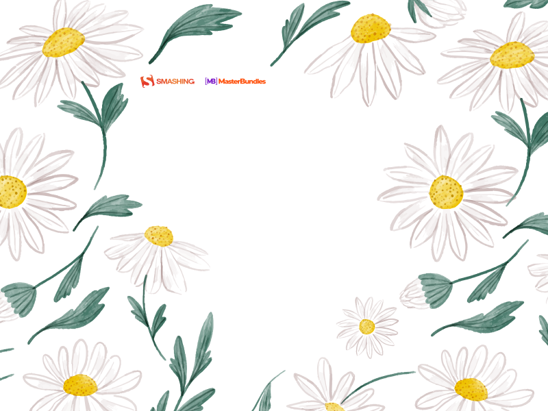
“Our designers wanted to create something summery, but not very colorful, something more subtle. The first thing that came to mind was chamomile because there are a lot of them in Ukraine and their smell is associated with a summer field.” — Designed by MasterBundles from Ukraine.

- preview
- without calendar: 320x480, 640x480, 800x480, 800x600, 1024x768, 1024x1024, 1152x864, 1280x720, 1280x800, 1280x960, 1280x1024, 1366x768, 1400x1050, 1440x900, 1600x1200, 1680x1050, 1680x1200, 1920x1080, 1920x1200, 1920x1440, 2560x1440



















“A nice summer shrimp party!” — Designed by Pedro Rolo from Portugal.
Handwritten August



“I love typography handwritten style.” — Designed by Chalermkiat Oncharoen from Thailand.

- preview
- without calendar: 320x480, 640x480, 800x480, 800x600, 1024x768, 1024x1024, 1152x864, 1280x720, 1280x800, 1280x960, 1280x1024, 1400x1050, 1440x900, 1600x1200, 1680x1050, 1680x1200, 1920x1080, 1920x1200, 1920x1440, 2560x1440



Designed by Francesco Paratici from Australia.

- preview
- without calendar: 320x480, 1024x768, 1024x1024, 1280x800, 1280x1024, 1366x768, 1440x900, 1680x1050, 1920x1080, 1920x1200, 2560x1440



“I know what you’ll do this August. Because August is about holiday. It’s about exploring, hiking, biking, swimming, partying, feeling, and laughing. August is about making awesome memories and enjoying the summer. August is about everything. An amazing August to all of you!” — Designed by Ioana Bitin from Bucharest, Romania.
- preview
- without calendar: 320x480, 800x480, 800x600, 1024x768, 1280x960, 1280x1024, 1440x900, 1600x1200, 1680x1050, 1920x1080, 1920x1200, 1920x1440, 2560x1440


“The warm, clear summer nights make me notice the stars more — that’s what inspired this space-themed design!” — Designed by James Mitchell from the United Kingdom.

- preview
- without calendar: 1280x720, 1280x800, 1366x768, 1440x900, 1680x1050, 1920x1080, 1920x1200, 2560x1440, 2880x1800



“‘Always keep mint on your windowsill in August, to ensure that the buzzing flies will stay outside where they belong. Don’t think summer is over, even when roses droop and turn brown and the stars shift position in the sky. Never presume August is a safe or reliable time of the year.’ (Alice Hoffman)” — Designed by Lívi from Hungary.

- preview
- without calendar: 800x480, 1024x768, 1280x720, 1280x1024, 1400x1050, 1680x1050, 1680x1200, 1920x1200, 2560x1440, 3475x4633



“Headed towards Smoky Mountain Bigfoot Conference this summer? Oh, they say it’s gonna be a big one! Get yourself out there well-prepared, armed with patience and ready to have loads of fun with fellow Bigfoot researchers. Looking forward to those campsite nights under the starry sky, with electrifying energy of expectations filling up the air? Lucky you!” — Designed by Pop Art Studio from Serbia.

- preview
- without calendar: 320x480, 640x480, 800x480, 800x600, 1024x768, 1024x1024, 1152x864, 1280x720, 1280x800, 1280x960, 1280x1024, 1366x768, 1400x1050, 1440x900, 1600x1200, 1680x1050, 1680x1200, 1920x1080, 1920x1200, 1920x1440, 2560x1440



“Summer is in full swing and Chicago is feeling the heat! Take some time to chill out!” — Designed by Denise Johnson from Chicago.
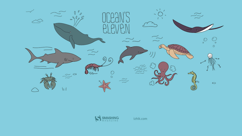
The Ocean Is Waiting



“In August, make sure you swim a lot. Be cautious though.” — Designed by Igor Izhik from Canada.
- preview
- without calendar: 640x480, 800x480, 800x600, 1024x768, 1024x1024, 1152x864, 1280x720, 1280x800, 1280x960, 1280x1024, 1400x1050, 1440x900, 1600x1200, 1680x1050, 1680x1200, 1920x1080, 1920x1200, 1920x1440, 2560x1440


“Liqiu signifies the beginning of autumn in East Asian cultures. After entering the Liqiu, the mountains in Eastern Taiwan’s East Rift Valley are covered in a sea of golden flowers, very beautiful. The production season for high-mountain daylilies is in August. Chihke Mountain, in Yuli Township, and Sixty-Stone Mountain, in Fuli Township, which are both located in Hualien County, are two of the country’s three high-mountain daylily production areas.” — Designed by Hong, Zi-Qing from Taiwan.

- preview
- without calendar: 1024x768, 1080x1920, 1280x720, 1280x960, 1280x1024, 1366x768, 1920x1080, 2560x1440



“This summer I have a telescope. Every night I look to the sky and I look into the stars. Fortunately, I can see Saturn.” — Designed by Verónica Valenzuela from Spain.

- preview
- without calendar: 800x480, 1024x768, 1152x864, 1280x800, 1280x960, 1440x900, 1680x1200, 1920x1080, 2560x1440


“This is a moment from Southern Estonia that shows amazing summer nights.” — Designed by Erkki Pung from Estonia.
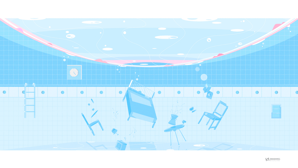
A Midsummer Night’s Dream



“Inspired by William Shakespeare.” — Designed by Sofie Lee from South Korea.
- preview
- without calendar: 800x480, 1024x768, 1280x720, 1280x800, 1600x1200, 1680x1050, 1680x1200, 1920x1080, 2560x1440


Designed by Ricardo Gimenes from Spain.

- preview
- without calendar: 640x480, 800x480, 800x600, 1024x768, 1024x1024, 1152x864, 1280x720, 1280x800, 1280x960, 1280x1024, 1366x768, 1400x1050, 1440x900, 1600x1200, 1680x1050, 1680x1200, 1920x1080, 1920x1200, 1920x1440, 2560x1440, 3840x2160






















Feeling inspired? We’ll publish the September wallpapers on August 31, so if you’d like to be part of the collection, please don’t hesitate to submit your design. We are already looking forward to it!
The Bull And Bear Case For Digital Design In The Age Of AI
Designers have spent years saying they would do better work if the organisation got out of the way. Not always in those exact words, obviously. It usually comes out as something more reasonable: we didn’t get enough engineering time, product had already decided the solution, the roadmap was too packed, leadership only cared about this quarter’s numbers, research got cut, the experiment was never run properly, the design debt was known about, but nobody wanted to spend a sprint fixing it.
Much of this is true. Most designers have worked inside that awkward middle space between product and engineering. Product frames the problem, or at least thinks it does. Engineering decides what is feasible, or at least what is affordable. Design is expected to make the thing clearer, simpler, more coherent, more usable, and occasionally more desirable, while also being careful not to disrupt the plan too much.
That position has always been uncomfortable.
Designers are told to think strategically, but often lack the power to act strategically.They can spot the broken onboarding flow, the confusing upgrade path, the empty state that makes users feel stupid, the feature that looks reasonable in a product review but makes no sense in real use. Seeing the problem is one thing. Getting it fixed is another.
So design often becomes an argument. You make the case. You annotate the flow. You bring the research clip. You point to the support tickets. You show the Figma prototype. You explain why the “small edge case” is actually the first-run experience for half your new users. Then everyone nods, agrees it matters, and moves on to whatever had already made it onto the roadmap.
This is one reason AI is more interesting for design than the usual “will it replace designers?” debate suggests. The real change is not that designers can make more screens. Nobody needs more screens. The interesting change is that designers may need less permission.
The Bull Case: Designers Need Less PermissionA good designer can now move from “we should fix this” to “I fixed this, and pushed it live.” They can prototype the alternative onboarding flow, write and test clearer product copy, build a rough working version of the interaction, clean up small pieces of design debt without waiting three months for a roadmap slot, and make the better thing visible enough that it becomes harder to ignore.
That changes the politics of the work. Design has often relied on persuasion because designers lacked direct means of production. AI weakens that dependency. Not everywhere, and not for everything. Complex products still have architecture, infrastructure, data models, permissions, security, compliance, legacy systems, and all the other unglamorous reasons software is hard. But the boundary is moving.
More of the gap between having the idea and making the idea real can now be crossed by a motivated designer with the right tools.In this version of the future, designers become less permission-dependent: less reliant on product to bless the problem, less reliant on engineering to make every small improvement real, less trapped in the role of internal critic, taste-provider, or Figma operator. More able to make, test, repair, and ship.
The best designers start to look less like traditional product designers and more like hybrid product leaders. They still care about interaction, hierarchy, language, flow, brand and craft, but they also understand the commercial shape of the problem. They can make trade-offs. They can prototype in code, or close enough to code. They can use AI to explore options quickly, then use judgment to throw most of them away. They can sit with a founder or PM and move from a vague product concern to something tangible by the end of the day.
There may be fewer of these people, but they will be harder to ignore. The current design-org model was partly built around scarcity: scarce engineering time, slow production, expensive prototypes, handoffs between specialists, heavy coordination across teams. If AI reduces some of that scarcity, it probably reduces the need for some of the roles that grew around it. The optimistic case is not that every designer keeps their job and gets a productivity boost. That feels like wishful thinking. The more believable version is that the total number of designers goes down, but the designers who remain have more direct influence over the product.
That is not a bad outcome for the strongest designers. It may even be the thing many of them have wanted for years.
The Bear Case: Autonomy Exposes The GapsAutonomy has teeth. If AI gives designers more room to act, it also removes some of the cover. The same constraints that held good designers back have also protected weaker ones from being tested too directly.
For years, it has been easy to say: I had a better idea, but we never got the engineering time. Sometimes that was exactly what happened. Sometimes the better idea was never really more than a critique. It had not been made concrete. It had not been tested. It had not dealt with the awkward trade-offs. It sounded strong because it lived safely in opposition to the shipped thing.
A lot of designers are good at noticing what is wrong. Fewer are good at deciding what should happen instead. Fewer still can make that alternative real enough for other people to judge. AI will expose this gap.If you can prototype the recommendation, the recommendation has to get better. If you can make the alternative flow, the flow has to survive contact with details. If you can test the product copy, you have to care what happens when users read it. If you can fix the small piece of design debt, you have to decide whether it was really worth fixing.
Some designers are not as strategic as they think they are. They have learned the language of strategy without the discomfort of owning outcomes. They can talk about user needs, business goals, systems thinking, and product quality, but struggle when asked to make a call. They want influence, but not the exposure that comes with it.
The profession has spent a long time arguing that design deserves more power. Fine. But more power means fewer excuses. It means the work is judged less by the elegance of the argument and more by the quality of the thing you made, tested, or changed. That is a better standard, but it will not be kind to everyone.
There is a second bear case, and it is probably the one large design teams should worry about most. Product and engineering already have more institutional power than design in most companies. They own the roadmap, the technical architecture, the sprint machinery, the metrics, and usually the language leadership understands. Design often has to translate its concerns into someone else’s terms before they count.
AI may not rebalance that power. It may hand product and engineering enough design capability to make design easier to bypass. A PM who can generate a decent flow, decent copy, and a decent prototype may not feel the same need to involve design early. An engineer who can use AI to produce a reasonable interface may decide the design system covers enough of the decision-making. A founder who can get to a polished demo in an afternoon may confuse polish with product thinking.
The problem is not that these people will suddenly become great designers. The problem is that many companies do not know the difference between great design and plausible design. Plausible design is dangerous. It looks coherent in a product review. It uses the right components. The spacing is fine. The copy is not embarrassing. The flow mostly works. Nobody in the meeting feels strongly enough to object. So it ships.
A lot of bad product decisions already survive because they look plausible. AI will produce more of them. This is where design could lose ground quickly: not because taste, judgment, research, and interaction thinking stop mattering, but because the visible outputs of design become easier for other functions to imitate.If a company already thinks design is mostly screens, prototypes, and polish, AI gives it a cheaper way to get those things.
In that world, design does not gain more agency. It gets narrowed. The remaining designers manage the design system, police component usage, review flows that have already been decided, tidy the interface, maintain brand consistency, and get pulled into high-stakes launches, executive demos, and the occasional messy cross-platform problem. Useful work, but a smaller surface area. Less shaping the product, more maintaining the furniture.
This is why the “AI will automate the boring 20%” argument feels too comforting. In some companies, perhaps that is what happens. But in large tech organisations, where design teams grew around coordination, production and process, the cut could be much deeper. Not 20%. Maybe 50%. Maybe more. Especially in places where leadership never really understood why the design team had grown so large in the first place.
Where I Think We Might End UpThe painful part is that both futures can be true at the same time. AI can make the best designers more capable and many average designers less necessary. It can give design more agency while reducing design headcount. It can help a small number of designers move closer to product leadership while pushing others into governance and clean-up work. It can free designers from waiting for permission, then reveal that some were more comfortable waiting than acting.
The designers who do well will not be the ones who merely use AI to produce more options. Options are cheap now. They will be the ones who know which option is worth pursuing, why it matters, how to test it, what to cut, where the product is lying to itself, and when “good enough” is quietly damaging the business.
They will have taste, but taste will not be enough. They will need product judgment, technical curiosity, commercial awareness and the nerve to make decisions before every variable is settled. They will need to be comfortable moving between a customer conversation, a prototype, a pricing concern, a brand question, and a messy implementation detail without insisting that all of those belong to someone else.
I’m not completely sure where we end up. I hope it is closer to the bull case: fewer permission structures, more making, more agency, better designers finally able to show what they can do without being held back by the machinery around them.
I fear it may be closer to the bear case: product and engineering absorb much of the work, companies decide plausible design is good enough, and design loses status, headcount, and strategic ground.
In reality, it will probably be some uncomfortable mix of the two. Some designers will use AI to gain more agency. Some companies will use it to need fewer designers. Some teams will produce better work because the distance between judgment and execution gets shorter. Others will ship more plausible mediocrity because nobody in the room can tell the difference.
For years, designers have said they could create more value if they were less constrained by the organisation around them. AI is about to test that claim. Some will finally get to prove it. Some will find out the constraints were doing them a favour.
Further Resources- “Good from Afar, But Far from Good: AI Prototyping in Real Design Contexts,” Huei-Hsin Wang and Megan Brown (NN/Group)
The UX design field has been flooded with AI-powered prototyping tools that generate interfaces from natural-language prompts. Despite the huge marketing hype, an evaluation with real design scenarios revealed that while these tools can follow instructions to achieve a general goal, they often lack the sophistication to weigh design tradeoffs and to produce thoughtful, high-quality designs without extensive guidance from humans. - “AI Design Tools Are Marginally Better: Status Update,” Megan Brown, Caleb Sponheim and Taylor Dykes (NN/Group)
AI-powered design tools have improved, yet we’re still nowhere near the usefulness we’ve been promised. This article reviews several AI tools and features, including: Figma’s Rename Layers, Rewrite This, Find More Like; Khroma Color; and Midjourney. The authors also take a look at the wireframe and prototype generation capabilities of some AI tools. - “Using AI for UX Work: Study Guide,” Tanner Kohler (NN/Group)
Unsure where to start? This curated collection of links to articles and videos about the best ways to introduce artificial intelligence for UX design work should help you. - “I used AI for every task for two weeks,” Joanna Otmianowska (DEV Community)
The author (who is a front-end developer) tried to use Claude Code for every task at work. This turned into a full-on experiment. In the article, Joanna shares all the details about the experience. - “How AI will Affect the Design Industry,” Andy Budd
It is likely that AI is not going to "kill design" in the next few years, as some are claiming. However, these are definitely times of change, and change means that there will be big opportunities for those who embrace new technologies early. - “Design has been too settled for too long,” Andy Budd
For a discipline that talks so much about change, design has been running on a surprisingly settled operating model. AI is starting to break that model. In this article, Andy reviews in detail the current trends regarding adopting AI in the daily workflows of design teams. - “What Designers Should Take From Benedict Evans’ Latest AI Deck,” Andy Budd
Benedict Evans has a useful habit of standing slightly away from the noise. For years, his big strategy decks have acted as a kind of weather map for the technology industry: mobile, media, ecommerce, platforms, regulation, capital flows, and now AI. They are not predictions in the cheap sense — they are attempts to show the shape of the system: where the money is going, what assumptions people are making, which comparisons are lazy, and where the industry may be fooling itself. - design + AI conference
Thinking Outside The Box: Digital Design In The AI Era
This article is a sponsored by MacPaw
The phrase “artificial intelligence” has many excited, especially those in tech. But for those of us in creative fields like digital art and design, AI can be more concerning than it is exciting.
AI-generated art, videos, and images have flooded the internet, raising questions about whether more companies will turn to tools like OpenAI’s Dall-E, Midjourney, Leonardo.ai, and more, rather than employing human artists. What’s more, the fact that these AI models are trained on real artists’ work without their consent leaves many feeling as if they have no choice but to accept AI into their work and lives.
In a digital world increasingly dominated by faceless AI chatbots, agents, and features, it can be easy to get overwhelmed by all the technology. AI will certainly play a huge role in reshaping many industries, including design. We can’t deny this. But at the same time, humanization, empathy, and having a person at the wheel have never been more important.
Rather than viewing AI as something that replaces human creativity, we at MacPaw saw an opportunity to explore how we could make AI feel more personal and accessible — all the while keeping humans at the center of the experience. That led us to rethink how AI assistants are created.
The Concept Of A New AI AssistantTraditional AI assistants like Claude and ChatGPT typically take the form of a conversational textbox or webpage on screen, as this is how users have interacted with their devices. It’s comfortable and familiar. While extremely useful for a variety of tasks, interacting with these AI assistants can feel transactional and technical.
Using the same textbox format across all AI assistants does provide consistency. But we wanted to create a new, more personal and differentiated experience for users. But what format would be best? Even if we change how an AI tool looks, it still needs to be useful and intuitive to use.
As humans, it’s easier to understand and connect with things that resemble us. This is why we often find ourselves drawn to things like animals and characters: they have traits that we recognize within ourselves. Understanding this, we saw an opportunity to combine these values: utility and personality.
The Importance Of Character In DesignEnter Eney: a new proactive AI assistant. MacPaw didn’t want Eney to simply be another AI tool for users, but rather one that proactively assists within a user’s workflow. The vision was to help users connect with Eney more easily than with other AI tools, so we decided to create a character users could interact with. We wanted Eney to be expressive, friendly, and to emote as humans do. But we needed to strike an important balance: making Eney cheerful without it being overly goofy or childish.
This is where human animation and intervention played a critical role. While challenging, it was crucial because an overloaded character UI could turn users off and make navigating Eney difficult. To avoid this, the design team chose to create a select set of emotions and gestures for Eney to express, ensuring that its expressions conveyed useful information. For example, when working on a task, Eney’s figure resembles a loading icon. To do this, we worked to reduce Eney’s on-screen movement to make sure it wasn’t distracting or excessive.
After exploring a few different shapes and styles for Eney, we settled on a circular figure, as it felt the most approachable. It was simple and helped create the feeling of a calm, floating digital companion, rather than another rigid interface element on a user’s desktop. Eney’s minimal face design also plays an important role in connecting with the user. Its eyes are the main emotional connector — a key feature in showing emotions without being cartoonish.
The color choice for Eney was also important. Many AI assistants and companies use blue in their products, as it’s typically associated with intelligence. Blue is a great color, but we wanted Eney to stand out. We still wanted the color to be warm and inviting while slightly more visually stimulating, which led us to choose the color pink. Among dozens of other AI products that choose a more blue aesthetic, Eney was designed to catch a user’s eye and stand out in their mind (and on their screen).
All in all, we wanted to create a character that was present but not attention-seeking; a warm and supportive digital helper that enhances a user’s workflow rather than distracts from it. Eney’s character gives personality to otherwise invisible processes.
Artists In The AI EraWhile those who aren’t design professionals may assume there wasn’t much significance behind Eney’s character creation, this couldn’t be further from the truth. Like many other products, all these elements — style, design, emotion, size, name, and more — were intentionally chosen, not by machines but by humans.
Even though AI has streamlined many design processes, namely enabling faster design, there are still many things it can’t do well. Even when designing Eney, while technology supported the process, human designers controlled every step and decision.
As designers, it’s more important than ever to have good judgment, artistic direction, integrity, and emotional sensitivity when working in the field. Technology like AI can help us work faster, but it can’t replace the values that inspire and shape our work.
What’s more, while anyone can easily generate something by typing a prompt into an AI image tool, there’s a true beauty and talent when intentionally crafting something through manual design.
As designers, we shouldn’t stray away from the latest tools. Rather, we should learn them and see how they could potentially help us within our creative workflows. Personally, I like to use AI tools such as Perplexity and ChatGPT for research purposes in the early stages. However, we need to remember that they’re just that: tools. At the end of the day, technology like AI cannot, and should not, replace human artistry. It should help us express our visions, not replace us entirely.
If there’s one thing to take away from this piece, it’s that curiosity helps build taste over time, and taste becomes more valuable, not less, in the AI era.
Weaponizing And Defending The React Flight Protocol: Deserialization Sinks In RSCs
React Server Components don’t send HTML to your browser. They don’t send JSON either. When a server component renders, what actually travels over the wire is a custom streaming protocol called Flight. It’s a line-delimited format with its own type system, its own reference resolution, and its own rules for reconstructing executable behavior on the client.
Most React developers have never opened the Network tab and actually looked at a Flight payload. It looks like a mix of JSON fragments, dollar-sign-prefixed references, and module pointers that the React runtime silently reassembles into a live component tree. The framework handles it, so nobody questions it.
I’m not sure most teams have thought carefully about what that trust actually implies.
I started pulling apart the Flight protocol after CVE-2025-55182 dropped in December 2025. The security community called it React2Shell, and for good reason. It was a CVSS 10.0, unauthenticated remote code execution vulnerability sitting in the Flight deserialization layer. One crafted HTTP request to a Server Function endpoint, and an attacker had shell access. No credentials needed.
The federal Cybersecurity & Infrastructure Agency (CISA) added it to the Known Exploited Vulnerabilities catalog. Sysdig tied in-the-wild exploitation to North Korean state-sponsored actors deploying file-less implants through the Ethereum blockchain. That’s the kind of CVE that gets your attention.
After spending time in the source (mostly getOutlinedModel and getChunk, which is where the resolution logic that matters actually lives), I realized React2Shell wasn’t a one-off parsing bug. It was a symptom. Flight reconstructs executable references, lazy-loaded components, server RPC endpoints, and async state from a stream of text. That’s a deserialization system.
The attack surface extends well beyond a single missing hasOwnProperty check. This article covers how Flight works on the wire, where the deserialization sinks are, what attackers have already weaponized, and what’s still exposed.
This leads to a ranked, practical set of defenses for your own Server Components: schema validation on every Server Action, the server-only package, cross-site request forgery (CSRF) hardening beyond framework defaults, and an assessment of what the Taint API and Web Application Firewalls (WAFs) provide.
Table of Contents- Flight On The Wire
- Why Flight Is A Deserialization Sink
- The Mechanics Of React2Shell
- The Fix
- Defenses, Ranked By Impact
- What Came After React2Shell
- What’s Still Exposed
- This Has Happened Before
- Where This Goes Next
Open your browser’s Network tab on any Next.js App Router page and look for requests returning Content-Type: text/x-component. That’s Flight. It’s not a single JSON blob. It’s a streaming, line-delimited format where each line is a self-contained “row” that the client-side React runtime processes as it arrives over the connection.
Here’s what a simple Flight payload looks like in practice:
1:I["./src/components/ClientComponent.js",["chunks/main.js"],"default"] 2:J["$","article",null,{"children":"$1"}] 0:D{"name":"RootLayout","env":"Server"}Row 1 is an import directive. It tells the client to load ClientComponent.js from the bundler’s chunk map. Row 2 is a JSON tree that constructs an <article> HTML element, and the "$1" inside children is a reference back to chunk 1 (the imported component). Row 0 defines the server execution context, marking this as a RootLayout running in the Server environment. Even in this tiny example, you can see the mix of structural data, module references, and cross-chunk pointers that makes Flight different from plain JSON.
The Row FormatEvery row follows the same syntax: <ROW_ID>:<ROW_TAG><PAYLOAD>\n. The row ID is a numeric identifier that other rows can reference. The tag is a single character (or short string) that tells the parser what kind of data follows. The payload is the actual content.
Here are the row tags I found while reading through the source:
Tag Name What it does J JSON Tree Serialized virtual DOM nodes, component props, and HTML elements. M Module Metadata for a specific Client Component module or chunk. I Import Tells the client to load a module from the bundler’s chunk map. HL Hint/Preload Instructs the browser to preload resources such as stylesheets or fonts. D Data Server-rendered element context and environment info. E Error Serialized server-side exceptions and error boundaries.So far, this might look like a benign structured data format with some custom tags, but the real complexity and attack surface live in the prefix system.
The $ Prefix SystemThis is where I started paying closer attention.
When the client-side parser encounters a string value starting with $, it doesn’t treat it as literal text. It intercepts the string, checks the prefix, and routes it through a type-specific resolution path. The parseModelString function in ReactFlightClient.js is where this happens. It’s essentially a big switch statement on the character after $.
Prefix Type What the parser does with it $ Model Reference Resolves to another chunk in the stream (e.g., $2 points to row 2). $: Property Access Traverses into a resolved chunk’s properties (e.g., $1:user:name). $S Symbol Creates a native JavaScript Symbol. $F Server Reference Represents a callable Server Action (an RPC endpoint on the server). $L Lazy Component Defers component loading until it’s needed in the render tree $@ Promise/Raw Chunk Returns the internal Chunk wrapper object itself (often acting as a Thenable/Promise), not its resolved value. $B Blob/Binary Triggers the blob deserialization handler for binary data.Every other prefix resolves a chunk and gives you the parsed result. $@ hands you the raw internal Chunk object instead, the wrapper React uses to track resolution state, pending callbacks, and internal metadata (which is why it’s used for Promises and why exploits use it to get a mutable handle). Exposing framework plumbing through the protocol looks like a design mistake to me, though I’d be interested to hear the rationale if there is one.
And $: (property access) is the other critical prefix. It lets the protocol specify a path like $1:user:name, which tells the parser to resolve chunk 1, then access .user, then access .name on the result. That’s arbitrary property traversal driven by data in the stream. If you’ve spent any time auditing JavaScript for prototype pollution, that pattern should feel familiar.
This Is Not Just A Data FormatFlight is not JSON with extra steps. JSON gives you data. Flight gives you behavior. It reconstructs module references that trigger client-side code loading, creates server action endpoints the client can invoke as RPC calls, sets up Promise chains that the React runtime will await, and builds lazy-loaded component boundaries that execute on demand.
Whether React developers think of it that way or not, the mechanics look very similar to deserialization systems that have historically caused problems. The stream doesn’t just describe what the UI looks like. It instructs the client runtime on what code to load, what functions to call, and what to trust.
If you want to read the implementation yourself, fair warning: the chunk resolution path is miserable to follow. State transitions bounce between helper functions, and the naming obscures what the code is actually doing. I gave up on static reading and just set breakpoints. The key files are react-client/src/ReactFlightClient.js for the client-side parser (look for parseModelString, getChunk, reviveModel, and getOutlinedModel) and react-server/src/ReactFlightServer.js for the serialization side. The reply handler for Server Actions lives in react-server/src/ReactFlightReplyServer.js.
Why Flight Is A Deserialization SinkThe deserialization pattern is familiar: Java’s ObjectInputStream gave us ysoserial, Python’s pickle executes code on load(), PHP’s unserialize chains __wakeup and __destruct methods, and .NET’s BinaryFormatter was deprecated entirely.
The pattern: deserialize attacker-controlled input → invoke behavior during reconstruction → lose control of execution.So JavaScript should be immune to this, right? JSON.parse() only produces plain data objects. No constructors fire. No magic methods run. You get back exactly what the JSON string describes, nothing more.
That’s true for raw JSON.parse(). But it stops being true the moment a framework wraps custom deserialization logic around it. And that’s exactly what Flight does.
Prototype PollutionJavaScript uses prototype-based inheritance. Every object has a __proto__ link to its prototype, and property lookups walk up this chain. If an attacker injects __proto__ or constructor.prototype as a key during reconstruction, they modify the shared base prototypes that all objects inherit from. Downstream code reads attacker-controlled values without knowing.
Flight’s $: prefix performs property traversal on deserialized objects. The getOutlinedModel function walks colon-separated paths like $1:user:name by iterating through each segment and accessing it on the parent object. If those path segments include __proto__ or constructor, the traversal walks straight up the prototype chain. That’s not a theoretical risk. It’s exactly how React2Shell worked.
Duck Typing and ThenablesThe V8 engine (and the JavaScript spec) treats any object with a .then property as a Thenable. When you await something, the runtime checks for .then and calls it if it exists. No class check. No internal slot verification. If .then is callable, it gets invoked.
Flight resolves chunks asynchronously. If an attacker constructs an object with a manipulated .then property and gets it into the chunk resolution pipeline, the runtime calls the attacker’s function during normal await behavior. The language semantics do the work.
I initially focused on $F because forging Server Action references seemed like the obvious attack surface. After tracing the resolution path, $: property traversal looked much more interesting. I also spent a few hours examining chunk status transitions (pending, blocked, resolved, errored) to see if you could force a chunk into an unexpected state, though that approach didn’t yield any results.
The Core ProblemThese two risks converge in Flight because the protocol doesn’t just deserialize data. It deserializes behavior. The $ prefix system dictates which execution path the parser takes: $F creates a callable server endpoint, $L sets up lazy code loading, $B triggers a blob handler, $@ exposes internal framework state. The parser’s control flow is driven entirely by what’s in the stream.
If an attacker can influence the stream’s content, they control which functions the parser calls, which objects it constructs, and which internal state it exposes.
The Mechanics Of React2ShellThis is the CVE that proved the theory. CVE-2025-55182, nicknamed React2Shell, is a CVSS 10.0 unauthenticated remote code execution vulnerability in the Flight deserialization layer. One HTTP request, no login required, full shell access.
I want to walk through the entire gadget chain because understanding it reveals how much power the Flight protocol hands to an attacker who can control the stream.
The Root CauseThe vulnerability sits in getOutlinedModel, a function responsible for resolving deep property paths from the $: reference system. The instance used in the exploit chain lives in the server-side reply handling code (ReactFlightReplyServer.js). When the parser encounters a reference like $1:user:name, it splits on the colons and walks the path segment by segment. Here’s the vulnerable loop:
for (key = 1; key < reference.length; key++) parentObject = parentObject[reference[key]];Two lines. No hasOwnProperty check. No validation that the property exists on the object itself rather than somewhere up the prototype chain. Just parentObject[reference[key]] and move on.
So an attacker supplies $1:__proto__:constructor:constructor, and the loop traverses from a plain JSON object up through Object.prototype to the Object constructor to the Function constructor. Function in JavaScript behaves like eval(). Function("arbitrary code")() executes.
No allowlist on property names. No check for __proto__. I searched reviveModel and the chunk initialization path for any filtering. Nothing.
The Gadget ChainGetting from “I can reach the Function constructor” to “I have RCE” requires chaining several Flight protocol features together. The Resecurity write-up covers the full chain in detail; here’s the high-level sequence:
- Step 1: Prototype walk to Function.
The $: path __proto__:constructor:constructor walks from any plain object to Object.prototype, then to the Object constructor, then to Function — JavaScript’s built-in eval() equivalent. - Step 2: Raw chunk self-reference.
$@0 returns the raw internal Chunk wrapper instead of its resolved value, giving the attacker a mutable handle on React’s internal state machine. - Step 3: Thenable hijack.
The attacker sets the chunk’s .then to Chunk.prototype.then, so React’s resolution pipeline treats the manipulated chunk as a legitimate Promise-like object and awaits it. - Step 4: Context confusion.
During the second deserialization pass, the payload overwrites _response._formData.get to point to the hijacked Function constructor and places the attacker’s shell command into _response._prefix. - Step 5: Trigger via blob handler.
$B0 invokes the blob handler, which internally calls response._formData.get(response._prefix + blobId) — now equivalent to Function("attacker_shell_command")(). That’s arbitrary code execution with whatever privileges the Node.js process has.
Each step uses a legitimate Flight protocol feature in a way the designers didn’t anticipate. There’s no single “broken” feature. The vulnerability emerges from how these features compose when an attacker controls the input.
ImpactThe numbers on this one are stark:
- CVSS 10.0. The maximum possible score.
- Unauthenticated and pre-auth. No credentials needed — and the deserialization happens before any application-level auth checks run, so even endpoints behind login walls are exposed.
- Single HTTP request. One POST to a Server Function endpoint.
- Affected React 19.0.0, 19.1.0, 19.1.1, and 19.2.0, across react-server-dom-webpack, react-server-dom-parcel, and react-server-dom-turbopack.
- CISA added it to the Known Exploited Vulnerabilities catalog within days.
Exploitation was immediate. Sysdig published research linking EtherRAT deployments to North Korean state-sponsored actors who weaponized the vulnerability within hours of disclosure. EtherRAT is a file-less implant that uses the Ethereum blockchain for command-and-control communication — a technique researchers call “EtherHiding” — making takedown nearly impossible because you can’t seize a blockchain.
Separately, Palo Alto’s Unit 42 documented a backdoor called KSwapDoor that masquerades as [kswapd1] on infected Linux systems, blending into process lists alongside the legitimate kswapd0 kernel swap daemon; their analysis confirms KSwapDoor uses RC4 encryption to protect its internal strings and configuration data, while C2 communications run over AES-256-CFB with Diffie-Hellman key exchange across a P2P mesh network. The speed and sophistication of these campaigns — state-sponsored actors deploying novel implants through a single unauthenticated HTTP request — underscores why a CVSS 10.0 in a deserialization layer demands immediate patching, not triage.
The FixThe React team’s patch is clean and targeted. The core change caches the genuine hasOwnProperty method at module load time:
var hasOwnProperty = Object.prototype.hasOwnProperty;Then every property check in the deserialization path uses .call() to invoke the cached reference:
hasOwnProperty.call(value, i);Even if an attacker shadows hasOwnProperty on a malicious object, the check uses the original prototype method. The prototype chain traversal that powered the gadget chain is blocked. This fix shipped in React 19.0.1, 19.1.2, and 19.2.1.
The fix is correct. But reading through the patches, I noticed the React team hardened ownership checks while leaving the property traversal model intact. The $: prefix still walks colon-separated paths; it just validates each step now. I think exposing arbitrary property traversal through a network protocol was a design mistake, and the patch treats the symptom. If future bugs emerge, they'll likely come from this same area.
The framework patch closes the known gadget chain, but it doesn’t change the fundamental dynamic: the Flight protocol still reconstructs behavior — executable references, module imports, RPC endpoints, async state — from a stream of text. That reconstruction happens before your application code runs, before your validation logic fires, before your auth middleware even sees the request. Relying solely on the framework to protect your Server Components means trusting that every edge case in a complex deserialization parser has been found and fixed. The defenses that follow are the practical steps you can take to limit the blast radius on your own.
Defenses, Ranked By ImpactSome of these close real attack paths. Others mostly make you feel safer than you are. I’ve ranked these from most-to-least impactful based on what I’ve seen in the vulnerability research. If you only have time for one change, start at the top.
1. Input Validation On Server Actions (Zod, Valibot)This is the single most impactful thing you can do at the application level. The Flight deserializer processes raw, unvalidated network input before your code takes control. Strict schema validation is your primary defense against whatever the protocol reconstructs.
Put a schema validation call at the very top of every Server Action, before any business logic runs — and I mean before anything, including logging. If you log an argument before validating it, and that argument triggers the stringification bug from CVE-2025-55183, you’ve leaked source code before your validation even had a chance to run.
Zod and Valibot both work well for this. Validate types, shapes, string lengths, numeric bounds, and enumerated values. Reject anything that doesn’t match. Use .safeParse(), not .parse() — the throwing variant can surface internal error details in the response if you’re not careful with your error boundaries.
"use server" import { z } from "zod" const UpdateProfileSchema = z.object({ name: z.string().min(1).max(100), email: z.string().email(), role: z.enum(["user", "editor"]), }) export async function updateProfile(formData: FormData) { const parsed = UpdateProfileSchema.safeParse({ name: formData.get("name"), email: formData.get("email"), role: formData.get("role"), }) if (!parsed.success) return { error: "Invalid input" } // proceed with parsed.data, this is now the only shape // your business logic ever sees }One important nuance: If your Server Action accepts a plain object argument (not FormData), validate the whole argument — don’t destructure first and validate fields individually. Destructuring before validation means you’re already accessing properties on the unvalidated input, which is exactly the kind of operation the Flight deserializer can exploit.
"use server" import { z } from "zod" const CommentSchema = z.object({ postId: z.string().uuid(), body: z.string().min(1).max(5000), }) // Good: validate the raw argument first export async function addComment(data: unknown) { const parsed = CommentSchema.safeParse(data) if (!parsed.success) return { error: "Invalid input" } await db.comments.create(parsed.data) } // Bad: destructuring before validation export async function addCommentUnsafe( { postId, body }: { postId: string; body: string } ) { // by the time this runs, you've already accessed properties // on the deserialized input const parsed = CommentSchema.safeParse({ postId, body }) // ... }If your Server Action doesn’t start with a schema parse, it’s a vulnerability waiting to happen. I’d argue this should be a lint rule — and if you’re running eslint-plugin-react, consider writing a custom rule that flags any "use server" export without a validation call in its first statement.
2. The server-only PackageThe server-only package is straightforward and effective.
Import server-only at the top of any file that contains database credentials, raw API calls, internal business logic, or anything else that should never cross the server-client boundary. If a Client Component tries to import that file (directly or transitively), the build fails with a clear error.
import "server-only" import { db } from "./database" export async function getUser(id: string) { return db.query("SELECT * FROM users WHERE id = $1", [id]) }The failure mode to watch for is barrel files. If you re-export a server-only function through an index.ts that also exports client-safe utilities, any Client Component importing from that barrel will pull in the server-only module transitively and break the build — or worse, if the barrel doesn’t include the server-only import itself, it may silently let server code through. Keep server-only modules in separate files with their own import paths.
// Don't do this: barrel re-export mixes boundaries // src/utils/index.ts export { getUser } from "./users" // has "server-only" export { formatDate } from "./dates" // client-safe // Do this: separate import paths // Client Component imports from "src/utils/dates" directly // Server Component imports from "src/utils/users" directlyIt also won’t protect you from data leaking through return values. If a Server Component calls getUser() and passes the full user object (including passwordHash or internalRole) as props to a Client Component, that data rides the Flight stream to the browser. The server-only guard prevents the code from crossing the boundary, not the data the code returns. You must explicitly filter your return shapes.
3. CSRF ProtectionsAfter CVE-2026-27978, relying solely on Next.js’s built-in Origin vs. Host header check isn’t enough. The Origin: null bypass showed that framework-level CSRF protection has edge cases.
For state-changing Server Actions (anything that writes data, deletes records, or modifies permissions), layer your own protections on top of the framework’s defaults.
Cookie configuration.
Set SameSite=Strict or SameSite=Lax on session cookies. If you’re using next-auth or a custom session library, verify this is set explicitly — don’t rely on browser defaults, which vary.
Explicit CSRF tokens.
For high-value operations (password changes, role assignments, payment actions), generate a per-session CSRF token on the server, embed it in a hidden form field or custom header, and validate it in the Server Action before proceeding.
The allowedOrigins gotcha.
Never, under any circumstances, add 'null' to experimental.serverActions.allowedOrigins in your Next.js config (even if the officially advisory is more nuanced, saying “unless intentionally required and additionally protected”). That string literal matches Origin: null — the exact header that sandboxed iframes send — and it reopens the CVE-2026-27978 bypass. If you’re seeing CSRF failures from legitimate requests, the fix is to configure your reverse proxy to set the correct Origin and Host headers, not to weaken the validation.
I covered this in detail in the React2Shell section. The fix is correct, and it completely neutralizes the known gadget chain. It shipped fast, which I respect.
The action item here is to verify you’re actually running a patched version. The RCE fix landed in React 19.0.1, 19.1.2, and 19.2.1. Check your lockfile:
# npm npm ls react react-dom react-server-dom-webpack # pnpm pnpm ls react react-dom react-server-dom-webpack # yarn yarn why react-server-dom-webpackIf you see 19.0.0, 19.1.0–19.1.1, or 19.2.0, you’re vulnerable to the RCE. Update immediately. And don’t stop there: the DoS fixes (CVE-2025-55184, CVE-2025-67779, CVE-2026-23864) require 19.0.4+, 19.1.5+, or 19.2.4+. If you updated after React2Shell and then stopped paying attention, you may still be running a version vulnerable to the DoS variants.
It’s a reactive patch, not a structural redesign.
Note: More on that in Where This Goes Next.
5. The Taint APIReact’s taintObjectReference and taintUniqueValue functions register objects or strings with the runtime. If tainted data tries to pass through the Flight serializer, it throws an error. The idea is to prevent sensitive data — user records, API keys, tokens — from accidentally leaking into the client.
Here’s how it looks in practice:
import { experimental_taintObjectReference as taintObjectReference } from "react" import "server-only" export async function getUserRecord(id: string) { const user = await db.users.findUnique({ where: { id } }) taintObjectReference( "Do not pass the full user object to Client Components. " + "Select only the fields you need.", user ) return user }If a Server Component passes the tainted user object as props to a Client Component, React throws it at serialization time with your custom error message. That’s genuinely useful as a development-time guardrail.
The catch — and it’s a significant one — is that taint tracks object references, not data content. Any derivation breaks the tracking:
const user = await getUserRecord(id) // taint is lost. Spread creates a new object. <ClientProfile user={{ ...user }} /> // taint is lost. Individual properties aren't tracked. <ClientProfile token={user.apiToken} /> // taint is lost. Serialization round-trip creates new refs. <ClientProfile user={JSON.parse(JSON.stringify(user))} /> // taint fires. Same object reference. <ClientProfile user={user} />taintUniqueValue works on specific strings (like API keys), but it’s also reference-based. If the same key value appears in a different variable, the taint doesn’t follow.
Think of taint as a development guardrail, not a security boundary. It catches honest mistakes: a developer accidentally passing a full user object to the client. It won’t stop an attacker who can influence what gets serialized, and it won’t survive routine data transformations that your own code performs. It’s a useful defense-in-depth layer, but shouldn’t be your primary boundary.
6. WAFsWeb Application Firewalls can add a detection layer for known attack patterns. They can inspect POST requests carrying the Next-Action header, block payloads containing constructor:constructor or __proto__ chains, and flag error responses containing E{"digest" patterns that indicate the server is leaking internal error details.
If you’re running a WAF, here are specific patterns worth adding:
# Block prototype pollution attempts in request bodies Rule: body contains "__proto__" OR "constructor:constructor" Action: BLOCK Scope: POST requests with header "Next-Action" # Flag potential Flight error leakage in responses Rule: response body matches /E\{"digest":"[^"]+"/ Action: LOG + ALERT Scope: responses with Content-Type "text/x-component" # Block excessively large Server Action payloads Rule: Content-Length > 1MB for POST with "Next-Action" header Action: BLOCK (mitigates CVE-2026-23864 zipbomb vector)But attackers know about WAF inspection buffers, and they’re usually around 128KB. Prepend 130KB of padding before the malicious payload, and the WAF inspects the padding, finds nothing, and lets the request through. Chunked Transfer-Encoding tricks accomplish the same thing.
The failure mode is treating WAF coverage as a security boundary rather than a noise-reduction layer. WAFs catch automated scanners and low-effort attacks, and that has real value. But a motivated attacker will bypass them with padding or encoding tricks. The defenses that actually stop sophisticated attacks are the ones earlier in this list: validating input before it reaches your business logic, keeping sensitive code off the wire, and staying on patched versions.
What Came After React2ShellReact2Shell wasn’t the end of it. The security audits that followed the December 2025 disclosure shook out a series of related vulnerabilities in the same deserialization surface. None of them are as severe as the original RCE, but they’re worth tracking because some of them required multiple rounds of patching.
CVE CVSS Type Description Fixed In CVE-2025-55184 7.5 DoS Infinite recursion of nested Promises in Server Function deserialization. Hangs the Node.js event loop. 19.0.2, 19.1.3, 19.2.2 CVE-2025-67779 7.5 DoS Incomplete fix for CVE-2025-55184. Same loop via edge cases the first patch missed. 19.0.4, 19.1.5, 19.2.4 CVE-2026-23864 7.5 DoS/OOM Unbounded request body buffering and zipbomb-style decompression. Memory exhaustion. Disclosed Jan 2026. 19.0.4+, 19.1.5+, 19.2.4+ CVE-2025-55183 5.3 Info Disclosure Crafted requests reflect Server Function source code when the function stringifies an argument. 19.0.1, 19.1.2, 19.2.1 CVE-2026-27978 5.3 CSRF Bypass Next.js treated Origin: null (sandboxed iframes) as “missing” instead of “cross-origin.” Next.js 16.1.7The DoS pair (CVE-2025-55184 and CVE-2025-67779) is a textbook example of why deserialization parsers are hard to patch correctly. The first fix shipped, researchers found edge cases it missed, and a second round was needed. CVE-2026-23864 added a third DoS vector through unbounded memory allocation rather than CPU exhaustion. (See the defenses section above for specific version checks.)
CVE-2025-55183 is the sneaky one. It’s a source code exposure bug that triggers when a Server Function calls JSON.stringify (or any implicit stringification) on one of its arguments. Developers do this constantly for logging, debugging, or error reporting.
The attacker sends a crafted argument that, when stringified, causes the deserialization parser to reflect the function’s own source code back in the response. Business logic, database queries, and any hardcoded secrets sitting in Server Action files become readable by anyone who can send an HTTP request.
CVE-2026-27978 is a different class of bug entirely. It’s a CSRF bypass in Next.js’s Server Action handling. Next.js validates that the Origin header matches the Host header to prevent cross-site request forgery. But when a request comes from a sandboxed <iframe>, the browser sends Origin: null.
The Next.js parser in action-handler.ts treated the string 'null' as a missing origin rather than an explicit cross-origin indicator. So an attacker could embed a form inside a sandboxed iframe, submit it, and invoke Server Actions using the victim’s authenticated session cookies. Fixed in Next.js 16.1.7.
What’s Still ExposedThe CVEs above have patches. But some of the risk is structural, baked into how Flight is designed to work.
Man-In-The-Middle (MITM) On The Flight StreamIf an attacker can sit between server and client (CDN compromise, cache poisoning, rogue proxy), modifying the Flight stream in transit looks feasible. The format is plain text with a predictable structure.
Assuming stream control, an attacker could alter $I (Import) rows to redirect component loading to a different module in the webpack chunk map. They could inject $F (Server Reference) tags to embed hidden RPC triggers in the rendered UI. They could modify D (Data) rows to change component props, and if the target component uses dangerouslySetInnerHTML, that’s a direct XSS vector.
Flight escapes $ prefixes in user-supplied strings to prevent data from being interpreted as protocol instructions. But that only applies to data flowing through the serializer. A MITM attacker writes raw protocol directly into the stream. The escaping doesn’t help.
Server Action EnumerationServer Action IDs are obfuscated hashes generated at build time. They look random. But server-reference-manifest.json maps every action ID to its source implementation. A public manifest hands an attacker a complete API map. This exposure usually stems from misconfigured hosting, an exposed .next directory, or path traversal.
Known action IDs expose Server Actions to standard IDOR and parameter tampering attacks. An attacker can forge direct requests with manipulated arguments. Developers often trust these inputs blindly because they originate from React’s internal machinery. The architectural consequences of that misplaced trust will be the focus of my next piece.
Encrypted Closure TamperingWhen a Server Action captures variables from its surrounding scope (closures), Next.js encrypts them before sending to the client. The key is in NEXT_SERVER_ACTIONS_ENCRYPTION_KEY, AES with a base64-encoded key (16, 24, or 32 bytes). decryptActionBoundArgs handles decryption on each invocation.
By default, this key regenerates every build. But multi-server setups often use a static key. If an attacker gets file read access (path traversal, SSRF), they extract the key, decrypt the closure state, modify it (changing a userId, a role, a query parameter), and re-encrypt. The server accepts the forged closure as legitimate.
Supply Chain Activation via Module IDsI haven’t demonstrated this end-to-end, but the theory is straightforward.
Flight references client components by module ID, something like ["360","static/chunks/app/page-7f3480.js"]. The bundler assigns these IDs at build time based on the module graph. A compromised npm package sitting in node_modules as a transitive dependency gets bundled into a chunk but never loaded because no component references it. Inert.
But if an attacker injects $I import references into the Flight stream (via MITM, cache poisoning, or server-side injection), the parser should load that dormant module. There may be chunk-level validation I’m not seeing. But if the module ID is valid and present in the manifest, I don’t see what stops it. The attack doesn’t require the package to be imported anywhere in your code. It just needs to exist in the bundle output.
This Has Happened BeforeReact Flight isn’t the first framework to invent a custom serialization format for server-client communication and then discover it’s an attack surface. And it won’t be the last.
Google Web Toolkit (GWT) used a custom RPC protocol to sync Java objects between browser and server. BishopFox demonstrated that attackers could manipulate the wire format to achieve arbitrary deserialization; GWT eventually disabled binary serialization entirely. It took years.
Java Server Faces (JSF) and ASP.NET both serialized ViewState to the client as a hidden form field. When cryptographic signing was weak or missing, attackers tampered with the serialized state and achieved remote code execution. Microsoft and Oracle patched it repeatedly. The underlying pattern kept resurfacing.
The pattern is always the same: a framework invents a custom wire format to move rich, stateful, sometimes executable data between server and client. The designers assume the server is the sole producer of that data and the client is a trusted consumer. Then someone demonstrates that the wire format can be manipulated in transit, or that the server can be tricked into deserializing attacker-controlled input. React Flight is the latest entry in this pattern. It is not an anomaly.
Where This Goes NextThe React Flight protocol solves a genuinely hard problem: streaming interactive component trees from server to client in a way that enables progressive hydration, async data loading, and server-driven code splitting. It works. I don’t want to lose sight of that.
But it works by serializing executable references, async state, module pointers, and RPC endpoints over a streaming text protocol, and then trusting the structure of that stream on both ends. The React team has patched the known gadgets. The hasOwnProperty fix is correct. The DoS fixes are in place. The source code exposure bug is closed.
I think exposing arbitrary property traversal and executable Thenable reconstruction through a network-facing protocol was a design mistake. $:, $@, and $B are powerful internal primitives that were reachable through a parser that didn’t validate ownership of the properties it traversed. One check was missing, and the result was CVSS 10.0.
As more frameworks adopt server-driven UI patterns, the industry is going to need stronger primitives than “the server is trusted”: cryptographic validation of serialized payloads, signed component trees, and content integrity checks on the Flight stream itself.
Hoping the parser handles every edge case hasn’t worked historically, and I don’t see why it would start working now.
The code is in react-client/src/ReactFlightClient.js. If you ship Server Components, read it. Know what your framework is trusting on your behalf.
When It Makes Sense To “Block” The Main Thread
We’ve all heard of the sacred rule in modern web development, the rule never to be broken. The rule of “Never block the main thread.”
You almost can’t miss it as a web developer; it’s in almost every performance guide, and to be fair, it is good advice. We all know the browser’s main thread is single-threaded, meaning it can only do one thing at a time.
Plus, as we know, the main thread isn’t ours alone; we share it with the browser’s rendering engine, input handlers, and other critical tasks. As a result, the less time we hold onto the main thread, the more responsive an app feels. That leads us to share tasks with background workers as we’ve convinced ourselves there should be a hard line between the UI and any computation, and that line shouldn’t be crossed.
And that is what a “recommended” architecture looks like.
But I dare say that sometimes**, moving the data to a worker is slower than just letting the main thread do the work.
I found this out a few months ago while building a Chrome extension with screenshotting features called Fastary. I kept finding a latency of about 2 to 3 seconds in all my testing, even after using an Offscreen Document (a background process in Chrome extensions) to handle the canvas operations. A screenshot task should feel instant without lag, after all.
It is quite ironic that by reflex, we move work away from the main thread to avoid freezing the UI, but sometimes the act of moving that work (e.g., serializing, copying, and deserializing) can also freeze the UI. And sometimes the recommended approach of letting the background do the work can be slower than just doing the work on the main thread.
Let’s talk about that.
The Architecture Of Browser Context IsolationTo put things in perspective, let’s understand why we isolate browser contexts and how they communicate with each other, with emphasis on the communication part.
A browser is more than a single environment. Different environments are running at the same time, each having its own memory space, what it can access, and rules:
- The main thread is what we are most familiar with; this is where JavaScript logic runs, where the DOM lives, where styles get rendered, and where users interact.
- The Web Workers are separate threads that can also execute JavaScript without DOM access. We mostly use this for heavy data tasks.
- The Service Workers are network-related proxies in charge of intercepting network requests and can even run when the page is closed.
- And then there are Chrome extension contexts, where we have background service workers, content scripts, and Offscreen Documents (the relevant ones for this article).
Each one of these is isolated from the others. A web worker or background script lives in a different memory space from the main thread. They cannot just reach and read each other’s variables or logic, and this is known as the “shared-nothing” architecture.
How do these isolated environments communicate? They explicitly message each other back and forth using APIs, like postMessage().
The Structured Clone AlgorithmpostMessage() tells the browser to take a piece of data and deliver it to the context that requested it. But to do this, the browser relies on the Structured Clone Algorithm (SCA).
You’re probably familiar with JSON.stringify(). SCA is similar, but much stronger and smarter. In its simplest form, SCA is a deep, recursive copy operation, i.e., cloning. It walks through the entire data structure it is given, clones every single value, serializes it into a transportable format, ships those bytes to the target contexts, and then reconstructs the original object on the receiving side.
SCA is fast, or maybe fast-ish... For a small regular config object like {theme: "dark"}, it is imperceptible; you don’t even notice it. The story changes, however, when dealing with heavy data because the SCA is a synchronous blocking O(n) operation, i.e., the cost increases linearly with the size of your data.
Let’s put that into perspective. A user clicks a button, and internally, an 8MB image payload is sent to a background worker for processing. When you call postMessage(), the main thread must immediately stop what it is doing to run this serialization and copying process.
So, if the time it takes to pack, ship, unpack the data, and go back to the start is longer than the time to just process the data on the main thread, why not do that instead? What About Transferable Objects?I’m sure some of you are already thinking, “Why not just use Transferable objects?” And that is a valid point. Let’s talk about that.
Developers who really pursue ultra-high-performance web apps usually use Transferable objects (e.g., ArrayBuffer, ImageBitmap, or MessagePort) to bypass the Structured Clone Algorithm. This is because when you transfer an object, you’re not making a copy (like SCM). Instead, the browser switches ownership of the data from one context to another.
The browser performs a hand-off whereby the sending context loses access to the data instantly, and the receiving context takes full control. It is actually insanely fast. According to Chrome Developers’ benchmark, transferring a massive 32MB ArrayBuffer can take under 7ms, compared to about 300ms when cloning with SCM. That’s a 43x speed boost.
But like all good things, there are downsides. To name a few:
- You lose it once you send it.
If the UI still needs that data (like to show an image preview), you can’t access it anymore. - Not all data is transferable.
A plain JS object is not. A Blob is not. Even a Base64 string is not. - API limitations.
In the context of browser extensions, Chrome’s internal messaging (chrome.runtime.sendMessage) traditionally forces everything through JSON serialization.
So, as far as my screenshot extension went, Transferable objects were not an option.
Why We Isolate Contexts AnywayWhy do we even bother isolating contexts at all? Why not just leave it all to the main thread?
Offloading long-running CPU tasks to a background thread is absolutely the right thing to do. The browser needs to paint a new frame every 16.6ms to keep things fluid; that means any task that takes >50ms is generally considered “long”. Offloading to the background is absolutely the right thing to do.
The issue, however, is that we’ve turned this “never block the main thread” into an absolute rule, without asking is this task expensive to process or expensive to move?
I have come to realize now that the rule is less “never block the main thread” than “never block the main thread for too long.”
When The Right Architecture Is The Wrong ArchitectureMy goal with the Fastary extension was to make it feel like a native app, running as smoothly and instantly as you would expect a native app to.
As you already know, I took the recommended approach to use the Offscreen Document to handle DOM work in the background. But to my surprise, that took a different turn.
The Offscreen Document API is a clear winner. You create a hidden, undisplayed document that runs entirely in the background. It has a DOM and supports Canvas. For example, if I want to crop a screenshot, stitch multiple screenshots together, perform heavy image manipulation, or add a watermark, Offscreen Document was made for that.
Turns out that was not the best approach. This was my architecture:
- The background Service Worker captures a screenshot with chrome.tabs.captureVisibleTab(), which returns a Base64-encoded data URL string.
- The background Service Worker uses chrome.runtime.sendMessage() to ship this image payload to the Offscreen Document.
- The Offscreen Document receives the image, loads it into an <img> element, then draws it onto a canvas before it applies the user’s crop coordinates, encodes the result, and sends the processed image back to the background worker.
But when I tested it, the screenshot didn’t feel instant. As I said earlier, there was a consistent 2–3 second lag.
I figured out that when captureVisibleTab() takes a screenshot, it returns a Base64 URL string, and on a standard 1080p screen, that string could be approximately 1MB or more, depending on how detailed the image is. It gets even more interesting on modern Retina displays (e.g., MacBooks) as they tend to automatically double the image’s size by default.
Keep in mind that since the image payload could be doubled and extension messaging relies on JSON serialization (as of this writing), we potentially deal with massive synchronous communication that costs an entire round trip.
The image string data is JSON-serialized at least twice: once when going into the Offscreen Document and once coming back out with the processed results to the background worker. The actual image processing (cropping) done inside the Offscreen Document was fast, no doubt, but I can’t say the same about the transfer overhead.
The Retina High-DPI ProblemAs if the latency itself wasn’t enough, I noticed a rather subtle bug — which, now that I think of it, was more of my ignorance. After a screenshot was taken, the crop result was completely off in a way that either weirdly scaled the image or resulted in incorrect coordinates.
It turns out that when a user selects a region to crop, the content script gets the box coordinates using getBoundingClientRect(), which is measured in CSS pixels; this is what the DOM uses. But when the screenshot is captured natively in Chrome, the browser doesn’t crop it automatically; it instead uses the physical hardware pixels to get the full screen capture. And the browser uses devicePixelRatio (DPR) to know how many physical pixels should represent one CSS pixel. Basically, if a user on a Retinal display (DPR = 2) highlights an area of 400x300 CSS pixels, the actual captured image area is 800x600 physical pixels.
Note: One CSS pixel is equal to 1 physical pixel (DPR of 1) on a standard monitor. On a Mac Retina display or a modern 4K monitor, however, the DPR is usually 2 or 3.For an accurate crop, I needed to apply these two different measurement systems with the right DPR, i.e., scale the crop coordinates by the DPR. But remember, Offscreen Documents have no physical display. Processing any image would have a default DPR equal to 1. To fix this, I would have to capture the exact devicePixelRatio from the active tab, serialize it, pass it alongside the image payload, and manually do the scaling math inside the Offscreen Document. The complexity starts to compound.
What if I broke the golden rule and did the work on the main thread instead?
Working On The Main ThreadSome developers will argue that UI tasks are the only things that should run on the main thread, but I don’t fully agree with that. Personally, I believe that user explicitly-invoked actions that need immediate results can sometimes get a solid pass to run on the main thread, provided the work is incredibly fast (e.g., 1s).
That’s what I did: scrap out the Offscreen Document and reengineer the logic. Instead of:
Background → [serialize] → Offscreen Document → [serialize] → Background → Content Script…I decided to run the whole image processing in the active tab:
- The background Service Worker captures the screen and gets the Base64 string (same as before).
- The background sends the payload directly to the content script in the active tab using chrome.scripting.executeScript().
- The content script (running on the main thread) receives the payload, draws it to a canvas, performs the crop using the correct DPR value, and copies the result to the clipboard.
This approach completely clears out multiple context hops and round trips that JSON serialization requires. The only cross-context transfer involves sending the data URL from the background to the content script.
The Retina DPI issue essentially solved itself, as the content script runs directly inside the real, active browser tab because it knows the monitor’s real devicePixelRatio.
But there’s an elephant in the room that you may have noticed.
Sure, the image is now processed on the main thread, and the background manipulates the canvas in the active tab. I could technically be blocking the main thread. That’s where I amended the “no blocking the main thread” rule to “no blocking the main thread for too long.” In this specific case, at least, blocking the main thread for a task the user requests for approximately one second is justifiable. It works conversely as well: maybe don’t isolate processes if the data transfer cost is greater than the processing cost.
Conclusion: When To Isolate And When Not ToI’ve boiled it down to a mental model that depends on whether the task is:
1. Compute-Heavy Tasks (CPU-Bound)These are tasks where the primary cost is computation and not the size of the data itself. These are tasks where most of the time is spent on doing calculations or heavy transformations, e.g., image compression, audio profiling, physics simulation, etc.
The transfer cost for these tasks is minuscule compared to the actual work.
2. Data-Heavy Tasks (Data-Bound)These tasks are the exact opposite. These tasks are only expensive because of the size. The processing time is almost insignificant, but the data is expensive to transport, e.g., image cropping, filtering an array, shallow copy, etc.
In my specific case, offloading the task to the background falls mostly into negative-sum efficiency. If we are talking about moving megabytes of data to perform a 50ms operation, there is no benefit to offloading it to the background.
Perhaps we can think of it like this:
Total Time = Serialization Cost + Transit + Background Processing Time + Deserialization CostLooking at this, if the “background processing time” is the most dominant task in your operation, then isolation is the clear winner. But if serialization, plus deserialization, plus transit exceeds that cost, then there’s no need to isolate things.
And if you can’t figure out if the task is CPU-heavy or data-heavy, it certainly doesn’t hurt to measure it, for example, using performance.mark() and performance.measure() around postMessage calls to profile the transfer cost.
No, People Don’t Want More AI In Their Life
Many companies silently assume that everybody wants more AI in their lives. That people are craving new AI features, new AI products, new AI workflows — that would all magically replace all existing outdated practices and broken ways of working.
But in reality, it seems like people don’t want more AI at all — at least not in the way most AI leaders envision it. Unsurprisingly, many AI features have low adoption and retention — at a very high cost of delivery, and a high risk of reputation damage.
The AI People Don’t NeedIt’s remarkably difficult to make a strong argument with senior leadership, but AI is not a value proposition. New AI features don’t magically make for happy or excited customers. Because AI features are often bolt-ons and separate tools for employees to use, they typically take people out of their regular way of working.
AI is pretty good at amplifying shortcuts and shortcomings in organizations — from data quality to decision making. It can’t magically fix years of accumulated quick patches, technical debt, broken culture and internal politics. If anything, they become more visible with AI as inconsistencies or conflicting priorities and get handed directly to users, who are then left to make sense of the mess themselves.
Because in most organizations, work typically requires hopping on and off between plenty of disconnected and fragmented systems, with a new AI tool, they now have yet another system that they also need to hop on and off. Often it produces more work, and typically it’s not particularly rewarding work either.
On top of that, people are very much aware of the cost of finding and fixing AI hallucinations. Asking AI to generate a response might feel easier than writing from scratch, but it has a cost:
- Skim through the entire AI output,
- Spot key points to focus attention on,
- Review/verify key points, one-by-one,
- Check rationale for what follows next,
- Articulate corrections + regenerate,
- Review the response (a number of times).
For many people, AI isn’t something they can proactively choose and explore on their own — it arrives uninvited, at someone else’s pace. On top of that, plenty of messages amplify fears and worries about AI replacing work — so it’s hardly surprising that the perception of AI isn’t excitement. It’s resistance to change and deep anxiety about one’s place in a world that seems to be changing without them.
At best, AI features might be silently accepted or nodded away. At worst, AI raises concerns, doubts, caution — and calls for a healthy dose of skepticism. And sometimes it’s perceived as a threat or liability — because unlike other features, AI is neither predictable nor reliable.
People don’t dream of AI art museums or AI fridges or AI hotel reception or AI-narrated children’s books. They don’t want their children to have romantic AI partners. Most people don’t want to actively manage (and clean up after) a swarm of AI agents roaming in their bank accounts and acting on their behalf in the real world. And most notably, people don’t really want a magical box to speak to or type into all the time.
The AI People Actually NeedI’m always puzzled by the comparison of AI features with how unreliable humans are. But people don’t compare software with other people. They compare features with features — and if one feature in one product is unreliable, while a similar feature works flawlessly in another, they choose the latter. It’s not about AI or not AI, but rather what works consistently and reliably, and what doesn’t.
Many conversations about AI are conversations about the speed of delivery. But to many people, there is little value in increasing the speed of delivery. They want to do things well, with enough time to think and make good decisions. They also want to enjoy the time they spend working on things, rather than just ship faster. There is an enormous feeling of reward and achievement that slowly disappears, one vibe-coded change at a time.
People don’t change much. And after all these years, they (still) want features that are fast, accessible, reliable, predictable and useful — every single time. And ideally not the ones that replace their entire workflow, but that augment their way of working — and that take over the most mundane, annoying, and boring tasks that they find no pleasure in.
Many jobs are exposed to AI automation, but in many of them there is a rewarding, unique, creative part that requires taste, point of view, and perhaps even human intuition. And if AI automates boring parts of it, that’s an advantage for everyone. That’s also what enhances productivity and brings more joy in daily life.
When AI automates tedious and mentally exhausting tasks, its value is much easier to grasp. But for that, AI shouldn’t feel like a bolt-on. It should be deeply integrated into people’s existing workflows. It must also match existing mental models that they have developed and fine-tuned for years or decades. AI should adapt to how people think and make decisions, not the other way around.
And it doesn’t really matter if these features are branded as “AI”, “smart” or “automation”. However, they must work well for people using them. And that means that people must be aware of use cases where it actually helps them, and be inspired to find more use cases on their own.
Ironically, tools that work well there aren’t “AI-first” — they are “AI-second”. Subtle, humble, calm, ambient, taking a supportive role in the background for work that otherwise is remarkably dull and unnecessary.
I don’t want to read books written by AI. I don’t want to gaze upon paintings by AI. I don’t want AI to teach my children. I don’t want to have an AI therapist. I don’t want AI making my medical decisions. I want AI to do all the physical and mental labor that taxes me so I can read books written by humans and go to art galleries to engage with art made by humans. I want AI that makes my life easier rather than forces me to change myself.— Bo Young Lee Wrapping Up
Perhaps I’m missing a bigger picture, and perhaps I’m just old school — but I really do like people. Their stories, their thinking, their emotions, their enthusiasm, their laughing. AI can be remarkably helpful in many situations, but so are people. And between the two, I would favor spending time with a human — however imperfect they are — every single time.
No, people don’t need more AI in their lives — they need AI to automate all the boring stuff they have to deal with every day, so they have more time and headspace to do things that they actually love and enjoy doing. That doesn’t mean spending more time with AI — but spending more time with people they love.
Meet “Design Patterns For AI Interfaces”Meet Design Patterns For AI Interfaces, Vitaly's new video course with practical examples from real-life products — with a live UX training happening soon. Jump to a free preview.
Meet Design Patterns For AI Interfaces, Vitaly’s video course on interface design & UX. Video + UX Training$ 450.00 $ 799.00 Get Video + UX Training30 video lessons (10h) + Live UX Training.
100 days money-back-guarantee.
30 video lessons (10h). Updated yearly.
Also available as a UX Bundle with 3 video courses.
- AI Adoption Gap: IBM 2026 Study, by MindStudio
- Powered by AI Is Not a Value Proposition, by Nielsen Norman Group
- AI Chatbots Discourage Error Checking, by Nielsen Norman Group
- The Jobs Most Exposed to AI Automation, by The Washington Post
- On AI and What We Actually Want From It, by Bo Young Lee
From Kickoff To First Concept: How To Turn Brand Strategy Into Visual Direction
When a branding project fails, it usually happens long before the logo stage: in the strategy phase, when words like “modern,” “trustworthy,” “premium,” “friendly,” and “disruptive” are left undefined. The result is a gap between what the brand is supposed to communicate and what the designer is expected to create. This is the space I like to call the “pre-concept” phase.
At the beginning of a project, designers usually receive many inputs: a brief, a few stakeholder conversations, competitor references, maybe a moodboard or a list of adjectives. From there, they are expected to create visual concepts that feel right. But “right” is difficult to judge when the team has not agreed on what the brand is supposed to communicate in the first place.
As an example, a health tech company we worked with said they wanted to look modern, trustworthy, and disruptive. At first, “disruptive” sounded like a push toward something bold and unconventional. But as we talked, it became clear that disruption, for them, still had to feel credible inside a conservative healthcare environment. Their clients were large government medical institutions. A brand that felt too rebellious, experimental, or visually loud would not create the right kind of trust.
In other words, their version of “disruptive” looked more traditional than the word suggested.
The problem was not that the client used the wrong language. The problem was that the language was too broad to guide design decisions. Before a designer can turn strategy into a visual concept, those words need to become more specific. What kind of modern? Trustworthy in what way? Disruptive compared to whom? And how far can the brand move away from category expectations before it starts to feel wrong for its audience?
This article is about that pre-concept phase: the work that happens after the kickoff but before the first visual direction. While the broader brand identity process for digital products includes strategy, concepts, implementation, and the assets a product team needs to build consistently, this article focuses on the earlier work that makes the first concept possible: researching the brand context, uncovering hidden assumptions with stakeholders, and turning shared direction into a visual foundation. Rather, a practical bridge between what the brand needs to mean and how it might begin to look.
The first place to build that bridge is the brand workshop, where broad discovery needs to become a clearer understanding of the brand context.
Stage 1: Research The Brand ContextA brand workshop will naturally cover the standard discovery topics: the business, its goals, the product or service, the competitive landscape, and the target audience. This article will not try to list every question a designer should ask in that workshop. For readers who want a broader starting point, we prepared a Brand Workshop Toolkit: Questions and Exercises, a FigJam framework we use in our studio to structure discovery conversations.
Here, I want to focus on a smaller set of questions that are easy to skip but extremely useful before visual work begins. These questions are less about collecting facts and more about clarifying perception. They help the team understand what the brand needs to make people believe, where it needs to feel credible, and which category assumptions it should follow or challenge.
Perception sits at the center of brand discovery because the brand is shaped in someone else’s mind.
“A brand is a person’s gut feeling about a product, service, or company.”— Marty Neumeier, The Brand Gap
If the brand ultimately lives in someone else's perception, the workshop has to clarify what perception the team is trying to create.
The perception questions I focus on are:
- What should people believe about the company after seeing the brand for the first time?
- What would make the brand feel credible in this category?
- If the brand were a person in the room, how would they speak?
- What do customers currently misunderstand about the company, product, or category?
- Where does the brand need to fit the category, and where does it need to break from it?
These questions help reveal the assumptions behind people’s opinions, instead of simply adding more opinions to the room. The questions matter because brand attributes often sound aligned before they are actually understood. A stakeholder may say the brand should feel “premium,” and everyone may nod. But one person may mean refined and editorial. Another may mean expensive and exclusive. Another may mean clean, quiet, and minimal. The word sounds shared, but it can lead to three completely different visual systems.
For instance, in the health tech project mentioned earlier, the client described the desired brand as “disruptive.” In many categories, that might suggest something bold, loud, or unconventional. But their audience was large government medical institutions, so disruption had to be expressed through clarity, efficiency, and confidence rather than rebellion. If we had taken the word at face value, the visual direction could easily have moved too far from what their audience would trust.
In another project, a fintech team wanted the brand to feel “bold” without losing credibility. That word created useful tension. The word bold could mean bright colors, oversized typography, and a highly expressive system. But in a financial category, it also had to carry signals of security, control, and competence. The question was not whether the brand should be bold, but what kind of boldness would still feel trustworthy.
When the team can define what these attributes mean in context, the designer is no longer working from broad adjectives. They are working from a clearer design problem.
Stage 2: Reveal Hidden Assumptions With StakeholdersStrategically selected questions can uncover part of the verbal layer, but words alone are rarely enough. To move from language into visual direction, it helps to incorporate exercises that make stakeholders think through images, associations, and relative perception.
Jake Knapp makes a similar point in GV’s Three-Hour Brand Sprint:
“The point of these exercises is to make the abstract idea of “our brand” into something concrete.”— Jake Knapp
The following two exercises help translate what stakeholders say about the brand into material that can later inform look and feel, design principles, and concept development.
This is also where stakeholder participation becomes important. When clients only receive a strategy presentation, they can stay passive. They may agree in the meeting without noticing the assumptions they are bringing into the process. But when they have to place a competitor on a map, choose an image, or explain why a certain reference feels credible, they become active participants. Their attitudes, beliefs, and disagreements become visible before they have a chance to derail the first concept review.
I usually start by looking outward at the category, then inward at the brand itself.
Exercise 1: Competitor Perception MappingBefore the workshop, collect screenshots of competitor brands, websites, product interfaces, social visuals, or other visible brand touchpoints. During the workshop, ask the client team to place those competitors on a simple two-axis map.
This exercise is not about deciding which competitors have “good” or “bad” design. It is about understanding how the client reads the category: what feels credible, what feels generic, what feels too conservative, what feels too experimental, and where there may be an open visual territory for the brand.
The axes should be chosen based on the tension the brand needs to solve. For example:
- Traditional to progressive.
- Corporate to human.
- Understated to bold.
- Accessible to exclusive.
For a health tech company that wants to feel innovative but works with conservative medical institutions, the map might use traditional to progressive and corporate to human. For a fintech brand that wants to stand out without losing trust, it might use understated to bold and accessible to exclusive.
The most useful part of this exercise is often not the final map, but the disagreement it creates. One stakeholder may read a competitor as progressive, while another sees it as generic. One may see a brand as premium, while another reads it as cold. These disagreements reveal how different people define trust, innovation, credibility, and differentiation. That is exactly the kind of ambiguity that needs to be resolved before design begins.
Exercise 2: Visual Brand DriverAfter the team has discussed the category, I like to turn the conversation inward. One exercise we use for this is called Visual Brand Driver. Each stakeholder is asked to choose images for a set of unrelated categories: transport, typeface, activity, furniture, mood, object, animal, architecture, and drink.
The instruction is important: the images should not represent the person’s personal taste. They should represent the company.
For example, if the company were a type of transport, what would it be? A quiet electric car, a high-speed train, a private jet, a bicycle, a delivery van? If it were a piece of furniture, would it be a soft lounge chair, a precise modular desk, or a heavy boardroom table?
After choosing the images, each person adds four or five adjectives to explain why they selected them. This part matters more than the image itself. The same object can mean different things to different people. A train might suggest speed, structure, reliability, mass accessibility, or a fixed route. A lounge chair might suggest comfort, calm, informality, or lack of urgency.
The exercise helps create a deeper layer of brand perception. Instead of asking people to describe the company directly, it asks them to think through metaphor and association. Patterns and contradictions become visible. One stakeholder may see the brand as refined and calm, another as energetic and experimental. One may describe the company as precise and structured, another as warm and flexible.
Those differences are not a problem. They are useful materials. They show what needs to be clarified before the visual concept phase begins.
This exercise is also helpful because it separates brand perception from aesthetic preference. A stakeholder may personally like a certain image, but if it does not describe the company, it should not be part of the exercise. That distinction is important throughout the branding process. The question is not “Do we like this?” but “Does this express the right thing about the brand?”
Stage 3: Turn Shared Direction Into A Visual FoundationOnce the workshop has revealed the main assumptions, the next client meeting can turn that shared understanding into a visual foundation. This is still not the first identity concept. It is a working layer between strategy and design, where the client can react to perception, visual principles, and early asset directions before the designer invests time in full concepts.
We usually structure this meeting around three connected layers:
- Look and feel
What should the brand feel like? - Design code
How can key brand ideas become visual principles? - Branding assets
What early choices should guide typography, color, logo direction, imagery, and illustration?
Together, these layers move the conversation from perception to practical design boundaries.
Look And FeelLook and feel boards are not collections of visuals the team likes. They are perception boards. The designer collects references based on the workshop: desired perception, category tension, competitor codes, stakeholder disagreements, and brand character.
If the brand needs to feel trustworthy, modern, and human, the board should help the team discuss what kind of trust, modernity, and humanity are appropriate. Is the brand calm and institutional, or warm and accessible? Is it progressive through precision, or through a more expressive editorial tone?
The point is to let the client respond to perception before reacting to a logo, color palette, or finished visual system.
Design CodeDesign code makes the direction more specific by translating key brand ideas into visual principles.
For a parenting app in Germany, personalized support for your unique journey might become organic shapes, handwritten lines, and softer compositions. Parenting is messy and magical might become soft gradients, layered imagery, and playful irregularity. Research-backed support for real life might introduce doctor calls, data snapshots, infographics, and editorial layouts that make the brand feel credible.
For a PR agency working with prop tech companies, momentum in motion might become lines, arrows, ripple effects, or motion blur. Springboard might become a lift-off moment and elastic visual energy. Building blocks might become modular shapes or stacked compositions.
The team is not choosing the final graphic expression here. It is testing whether the visual metaphors make sense before concept design begins.
Brand AssetsThe final layer brings the conversation down to the building blocks of identity: typography, color, logo style, photography, illustration, and graphic language.
At this stage, the team can discuss questions such as:
- Should the typography feel editorial, technical, warm, precise, expressive, or restrained?
- Should the color palette follow category codes or create contrast?
- Should the logo be a quiet typographic mark, a flexible symbol, or a more expressive character?
- Should photography feel documentary, polished, intimate, product-led, everyday, or aspirational?
- Should illustration explain complex ideas, add warmth, or become a distinctive brand language?
This gives the designer boundaries without making the final identity predictable. The next step is still concept design, but the team is no longer starting from vague adjectives or private expectations.
Pre-Concept ChecklistBefore moving into the first concept, it helps to pause and check whether the team has enough shared direction. The checklist is not meant to make every decision in advance. It is meant to make sure the designer is not starting from vague words, hidden assumptions, or unresolved disagreements.
Before creating the first concept, check whether the team has:
- A clear understanding of what the brand needs to communicate.
- A defined brand character.
- A shared sense of what that character means and what it does not mean.
- Visual references tied to perception, not taste.
- Key brand ideas translated into visual principles.
- Early direction for typography, color, imagery, and graphic language.
- Documented areas of agreement and disagreement.
- A clear sense of which concept directions would be wrong before designing them.
This last point is especially useful. A strong pre-concept phase not only tells the designer what to explore. It also clarifies what to avoid: directions that would be too expected, too cold, too playful, too conservative, too loud, too generic, or too far from what the audience can trust.
When the team can name those boundaries, the first concept becomes easier to evaluate. The conversation shifts from “I like it” or “I do not like it” to “Does this express the brand we agreed on?”
The First Concept Should Not Be A GuessThe first concept should not feel like a guess or a surprise reveal. It should feel like the next step in a direction the team already understands.
That does not mean removing intuition, experimentation, or creative risk from the branding process. It means giving those things a sharper problem to solve. When the team has clarified the brand character, tested visual perception, translated ideas into design principles, and discussed the early building blocks of the identity, the designer can explore with more confidence.
Pre-concept work does not need to make the final identity predictable. It needs to make the conversation around it more meaningful. Instead of asking whether the work matches someone's private expectation, the team can ask a better question: Does this visual direction express what the brand needs to become?
Designing For Distressed Users: Why Mental Health Apps Shouldn’t Follow Every UI Fashion
Mental health applications keep facing a continuing, measurable crisis: many people stop using them quickly. The data is stark: almost 95% of users who open the app on day 1 abandon the app by day 30, with a median 30-day retention of only 3.3%. Even the recognised mental health giants lose around 50% of their users within the first ten days. This severe engagement loss and retention collapse are why effective interface design must be a clinical and operational priority. Good design is not merely aesthetic; it is a fundamental tool for user retention.
While many factors drive this abandonment, research suggests that mental health apps have tended to prioritise visual appeal at the expense of what actually sustains users. In a space defined by vulnerability and cognitive strain, chasing visual fashion risks adding effort when users have the least to spare — quietly trading away the utility and trust the app depends on. Users don’t open mental health apps out of curiosity, but from need — often while stressed, anxious, overwhelmed, or exhausted. In these states, an unconventional icon, a confusing gesture, or a flashy animation instead of a delightful surprise becomes an extra cognitive overload. Moreover, it becomes a reason to disengage.
In those moments, visual experimentation from a mild distraction can turn into a friction that undermines the very help the app is meant to deliver. A solution must be a visual interface that is simple in usage and understanding from the first moment.
Crucially, improving engagement depends less on which UI trends you follow than on a single test applied to each one of them: does a trend lower the cost of using the app when the user can least afford it?
The High Cost Of Trend-driven Design In Mental HealthBefore we look into the specific problems, we must recognise a core tension: many UI trends are optimised for goals that mental health apps don’t share.
Trend design is often about capturing attention and signaling innovation. Mental health design, in contrast, must be about offering refuge, reducing strain, and building trust.Pursuing the former directly overrides the latter. It’s not a surface-level error of colour or font; it’s a foundational conflict of purpose. This tension surfaces across five fronts, each a place where adopting a trend on novelty alone can cost more engagement than it seeks to create.
The proposed principles are not based on a single A/B test or one isolated study. They are built from published research on mental health app engagement, cognitive load, accessibility, and emotional response in mHealth, set against competitive product audits and app-store evidence, and pressure-tested against my own quantitative and qualitative product work. That last source I treat as an illustration, understanding the limits of personal experience. In this context, validation is less about proving that one interface pattern universally works and more about asking whether a design reduces effort, preserves agency, avoids emotional mismatch, and remains usable when the user is already under strain.
A note on the examples: This isn’t a ranking of apps. Every app has its own positioning, target audience, constraints, and business pressures that may not be visible from outside, and a pattern that strains a user in distress may be exactly right for that product’s actual goal. I’m reading individual, visible design decisions for one question only: how they might affect someone arriving in a low-capacity state.
1. Cognitive Friction: When Design Becomes A Barrier To HealingThe primary goal of any mental health tool is to reduce, not increase, cognitive load. Yet, many trendy interfaces achieve the opposite. Neo-brutalist layouts with stark contrasts demand visual parsing. Hidden navigation menus that rely on non-standard swipes turn simple tasks into puzzles. Abstract, unlabeled icons force users to guess rather than recognise. Each of these patterns adds friction — seconds of hesitation, a moment of confusion — and for a user whose mental energy is already low, those costs start to accumulate.
This friction is most damaging during acute need. Research suggests that when a user is in a state of high anxiety or depression, even typing or making simple choices can feel overwhelming. When an interface demands high cognitive effort at the moment support is needed, it doesn’t just make that session harder — it gives an overwhelmed user a reason to close the app, and a reason not to reopen it. Each point of confusion can become a place where a user may quit for good.
Other findings show that apps with simple interfaces reduce the time and effort required to engage, directly improving retention. Conversely, a complex, trend-driven UI increases that time, creating an obstacle course that undermines the very healthy habit formation the app is meant to support.
This does not mean that every mental health product must be visually plain or minimal. The issue is whether the interface meets the user’s current capacity.
A panic-support tool, for example, works best when it offers a small number of obvious actions, rather than asking the user to browse. However, if a calming action meant for a moment of panic instead surfaces an upgrade screen, the product fails the user at precisely the point where failing matters most. Monetization is not the issue by itself; the issue is whether it appears at a point where the user expects immediate support.
Nonori shows the same principle in a more reflective context. The app does not present the user with a large content library or a complex dashboard at the start. Instead, it leads them through a simple, linear sequence of small actions. The value of this pattern is that it reduces the effort needed to begin. When a user is tired, anxious, or mentally overloaded, knowing exactly what to do next can lower the barrier to returning.
At the other end of the spectrum, comprehensive tracking apps show a different trade-off. Bearable, for example, is genuinely powerful: it consolidates almost everything a person tracks — mood, symptoms, sleep, medication, habits, reports, correlations — into one place. For users managing chronic conditions or preparing for medical appointments, this can be genuinely useful. But the same comprehensiveness can become a burden for an exhausted user. Dense dashboards and multi-step check-ins require executive capacity — the very resource that anxiety, depression, burnout, or brain fog often reduce.
A similar tension appears in anxiety apps with strong support content but busy entry points. A product may contain useful features yet still make the first screen feel noisy with too many cards, locked items, playful characters, or upgrade prompts. This is not evidence that the product is bad. It shows how the same interface can feel very different depending on the user’s state: clear enough during exploration, but too demanding during distress.
This insight shaped a guiding principle for our work: every interaction point must meet users at their current level of capacity, removing mechanical and cognitive barriers rather than adding to them. This principle guided our integration of low-friction, state-aware interactions in apps like Bear Room, a stress and anxiety reduction app, and Teeni, an emotional-wellbeing app for parents of teens.
In Bear Room, we already had a fast mood-based flow built around four emotion cards. At the same time, our product research supported a second need: users also wanted more personalised support. We avoided making this a long selection flow or a typing-only route because both can still create friction for people under stress or anxiety. Instead, we made voice a primary, prominent path, always alongside a text alternative. A central microphone button allows users to share what’s on their mind. The app then uses AI to analyse the input and provide a tailored set of coping practices.
Rather than picking a single entry model, we kept two paths because they served different states. That matched what we saw in later analytics and user conversations: quick emotional selection worked better when users wanted speed, while open voice or text input worked better when they wanted personalisation and to feel more heard. This was more a pattern we noticed, without having the exact measured results.
Similarly, in Teeni, we directly addressed the cognitive friction of parenting stress by introducing a “Quick Relief” button. This creates an empathy-friendly flow for parents experiencing anger or frustration. The button initiates a dedicated “Hot Flow,” allowing them to first vent and relieve their immediate negative emotions through voice input. Only after this emotional release does the app gently guide them into the more reflective “Cold Flow” for the rest of the app’s resources. This sequential, state-sensitive design acknowledges that a user in peak distress cannot navigate a complex app; they need a direct, simple, and validating first step.
These solutions directly tackle cognitive friction by meeting users at their level of capacity, resisting trends that add visual or interaction complexity. Voice input and single-action buttons remove the mechanical and cognitive burden of navigation and typing. The result is an interface that feels reliably non-judgmental and genuinely helpful when users are least equipped to navigate complexity.
2. Emotional Mismatch: The Trust Erosion Of Misaligned Design ToneA user’s emotional state is the context in which a mental health app operates. This is why its visual language must be empathetic and considerate. Research investigating how colour and aesthetics influence mood in mHealth apps suggests a critical insight: users in distress show a strong preference for subtlety. They long for dark palettes, sleek and sophisticated looks, and clean, uncluttered aesthetics, explicitly noting that cheerful, bright colours, while seemingly appropriate, can create a jarring, even physically uncomfortable conflict with their current mood.
This does not mean that every mental health or wellbeing app should look dark, quiet, or clinically restrained. The category is broad: it includes self-care, anxiety support, habit change, addiction recovery, trauma tools, therapy-adjacent products, and apps for more severe mental health contexts. A playful visual style may be appropriate for one product and a poor fit for another. What matters is not whether the interface is bright or muted, but whether its emotional tone fits the product’s purpose and the likely state in which users arrive.
Emotional mismatch can also appear in mechanics, not only in aesthetics. In Calmer, an anxiety and panic relief app, the interface itself appeared relatively clean and relaxed. Yet some of its engagement and monetisation mechanics sit in a different register from that relaxed: a discount wheel, or confetti celebrating a logged low mood. For a user who just recorded a hard moment, that shift — from quiet support to upsell or celebration — can land as a mismatch, whatever its intent.
For Bear Room, we prototyped a “cosy room” design informed by direct feedback from our users, which echoed the study’s conclusions. Several users in our research described the apps they had tried for similar needs as “too bright, too happy, and too overwhelming”. Users longed for a digital safe space. This was part of what pointed us toward a quieter palette in the final design: muted, earthy tones — neutral hues like soft greens and taupes — set against darker, calming backgrounds. For this product — a refuge for users arriving overwhelmed — that meant a middle ground: a space that feels safe without being gloomy. The interface avoided any bright alerts or sudden animations, making calmness the core feature.
This case underscores a critical principle: an overly cheerful, bold, or trend-forward interface can feel dismissive to someone in distress, creating a conflict that erodes trust. As Bear Room shows, trust is built when the interface respectfully aligns with the user’s emotional reality, offering solace through subtlety (which creates an overall feeling of a “welcoming and safe atmosphere”), not a solution through saturation.
3. The Inconsistency Penalty: Why Novelty Undermines RoutineMental health often relies on routine and predictability. Yet many contemporary UI trends thrive on novelty and disruption, intentionally reimagining fundamental navigation. When an app introduces a novel interaction pattern, such as a unique swipe or a non-standard button behavior, it asks the user to learn something before they can act, forcing them into cognitive effort they can’t afford.
This does not mean that mental health apps must be plain, rigid, or generic. A product can have its own character, playfulness, and sense of identity. The question is whether that identity remains understandable and predictable when the user returns in a low-capacity state. A gamified self-care app like Finch may work well when the user arrives ready to explore, play, and build a routine. But open it after a hard day just to mark one task done, and the can’t-skip celebration screens that delight an engaged user become one more layer to get through before they reach what they came for.
A similar tension appears in large meditation and wellbeing platforms. Apps such as Headspace and Calm offer extensive libraries of different content. This breadth can be valuable during exploration. But in moments of stress, the product question becomes sharper: can the user return and immediately find the exact support they need, or do they have to search, filter, and relearn the structure?
Someone experiencing anxiety or executive dysfunction needs to use the tool in a straightforward navigation manner, not an interface they have to learn each time anew.
PTSD Coach, a public-health-oriented trauma-support app designed to help users learn about and manage symptoms after trauma, offers a useful positive example. Its interface is not trying to be fashion-forward. Its strength lies in a stable information architecture: users can learn, track symptoms, manage symptoms, and get support through clearly separated areas. For a user returning during distress, this predictability matters more than novelty.
CALMzone offers another useful example. Some of its breathing animations differ from standard visual patterns, but they remain tied to the exercise itself: the animation shows what to do, when to inhale, and when to hold. The guided audio screen also explicitly invites the user to put the phone down and listen. This is a rare and valuable form of interaction design: the product’s success is not more screen time, but reduced effort and regulation.
These insights guided our approach in applications like Bear Room, where navigation reliability was treated as a therapeutic feature. We intentionally crafted an experience of an empathetic guided flow.
Recognising that users would likely approach in states of overwhelm, we structured the interface as a clear, unwavering path, with a visible “Start” sign. Key emotional support tools here are represented as the room’s objects — symbols of daily life, unmistakably recognised by all. They are visually highlighted by design so that the user won’t get lost in the elements, can easily access the needed tool, and can remember their way around the digital space upon the next return to the app.
Trend-driven interfaces sacrifice this navigational certainty for novelty. Each unconventional choice in mHealth apps, when core functions are buried behind experimental interactions or placed in unexpected locations, leads to a cumulative effect of fatigue instead of innovation. Users are not in a place to explore. They abandon the entire practice of seeking digital support when every interaction feels like solving a new puzzle. This does not restrict experimentation; it simply means that animations, micro-interactions, AI, or playful mechanics must serve the user’s state rather than interrupt it.
4. The Silent Exclusion: How Trends Compromise AccessibilityMany popular UI trends can be exclusionary when applied without adaptation. The minimalist trend of low-contrast text fails users with visual impairments. Gesture-only navigation marginalises those with motor difficulties. Visually dense, animated interfaces can overwhelm users with cognitive or attentional conditions. In mental health, the population needing support disproportionately includes individuals with these accessibility needs.
Choosing a trending aesthetic over an accessible one is therefore an active decision to limit the app’s reach and efficacy. It ensures that those who might benefit most cannot use the tool effectively. Accessibility isn’t a layer you add at the end; it’s a constraint you design within, with most of it codified in Web Content Accessibility Guidelines 2.2. Body text needs 4.5:1 contrast against its background, large text and interface elements 3:1 — exactly what low-contrast minimalism fails. Interactive targets need a floor of 24×24 px (more for unsteady hands). Every gesture needs a visible button fallback, or you risk excluding anyone who can’t perform the swipe.
5. The Coercion Paradox: When “Engagement” Becomes “Pressure”A final, and often overlooked, consequence of trend-following is the adoption of engagement mechanics designed for entertainment, educational, or productivity apps. Features like streaks, aggressive notifications, and gamified reward systems are engineered to maximise screen time and create dependency. Although they have long been considered effective tools for increasing retention, in a mental health context, this approach can easily be misguided. What presents as “motivation” can quickly transform into a source of performance pressure and guilt. For a user managing depression, a broken streak or a missed daily goal can exacerbate the very feelings the app aims to alleviate.
These mechanics are not inherently unethical. In routine-building products, they can help some users. The risk appears when they are transferred into mental health contexts without adapting for shame, low energy, relapse, and non-linear recovery. A streak, for example, is not just a retention mechanic when the user is emotionally vulnerable. It can become a visible record of whether they have “kept up” with their well-being.
In the apps I reviewed, this tension appeared through familiar persuasion patterns: streaks, streak freezes, commitment copy, urgency-based notifications, “don’t miss this offer” prompts, and success-framed buttons such as “Yes, I want to succeed.” In self-care or wellbeing products, these details can make the app feel less like a supportive tool and more like another system the user has to satisfy.
Designers still need return triggers. A mental health app has little value if users install it once and forget it exists. But return mechanics must be adapted to the emotional context. In Bear Room, for example, this philosophy is embodied in short, forgiving three-day streaks: the streak does not reset when a user misses a day, and every third day brings a small benefit. The goal is not to punish absence, but to gently support return.
The same principle applies to lighter interactions. Bear Room includes a simple, optional bubble-popping game. Its purpose, however, is not to hook the user but to offer a brief, calming interlude. It is deliberately finite, providing a small mood lift and gently signposting other resources within the app. The value is in the momentary relief, not the extended session.
This commitment to supportive, non-coercive design extends to foundational app architecture:
- Respectful and User-Tailored Interaction Models
The Pillow, a visual interface in the app, acts as a neutral, accepting space. Users can select a feeling or record a voice note, and the app responds with an AI-curated set of practices (28). It offers support without judgment, commentary, or pressure to “achieve” a certain state. Our app prioritises mood-aware algorithms to dynamically order activities. Breathing exercises or grounding techniques are surfaced based on the user’s reported emotional state, creating personal resonance without the need for an overwhelming content library. - Feedback as a Reciprocal Exchange
We approach feedback not as a data grab via constant emails but as a respectful dialogue. An unobtrusive object allows users to contribute at a natural pause point, and their input is acknowledged with a small reward. This frames their participation as a valued gift, not a demanded obligation.
In mental health technology, sustainable retention is earned not by capturing attention, but by becoming a consistently respectful and helpful presence in a user’s life.
The mHealth apps design invites finding a challenging balance between boosting their use without being too demanding.
The Scale Of The StakesThis is not a niche concern affecting a fringe audience. The World Health Organization (WHO) estimates that about one billion people globally live with a mental disorder, with depression alone affecting nearly 5% of adults. Critically, the overall number is rising — in the last decade, depression and anxiety cases have increased by 25%. This vast and vulnerable population cannot afford for its tools to fail due to poor design. While UI trends aren’t inherently problematic, their application within wellbeing products demands a radically contextual approach.
Even a five-minute decompression tool between meetings has an emotional context, and a style chosen for its look — glassmorphism, a certain flavour of ultra-minimalism — can miss it, however sophisticated the audience. The point isn’t that these styles are wrong; it’s that the look has to answer to the moment. Soft biomorphic shapes or fluid transitions can genuinely help when they directly serve the goal of calm — and the same elements become noise when they’re there to impress.
What carries the highest risk is lifting a visually striking “Dribbble shot” and applying it without deep adaptation: it solves for the designer’s portfolio, not the user’s need. A Practical Framework For EvaluationThe five fronts outlined above are not just a diagnostic lens; they are the foundation of an evaluation framework for anyone designing in the mental health space. Before incorporating any trendy visual or interaction pattern, it is worth running it through each of them in sequence:
- Cognitive load
Does this reduce the effort required for someone who is overwhelmed, or does it add another layer of complexity to an already strained experience? - Emotional alignment
Does this support a wide spectrum of emotional states, including distress and exhaustion, or does it clash with the context in which users are most likely to arrive? - Navigational reliability
Does this build trust through predictability, allowing users to return and find their way without relearning, or does it prioritise novelty at the cost of consistency? - Accessibility
Does this uphold or enhance accessibility for diverse sensory and cognitive abilities, or does it quietly exclude the users who may need support the most? - Engagement integrity
Does this invite use in a way that is supportive and non-coercive, or does it borrow mechanics from entertainment products that may create pressure rather than relief?
A design that passes all five holds together as something more than usable: it becomes a tool that users can trust enough to return to in moments of genuine need.
Trends can be inspiring. They can win awards and generate buzz. But in mental health, sometimes the best design is the one that helps users feel understood — a quiet helper they trust enough to return to in moments of stress and vulnerability. It doesn’t steal the spotlight, but focuses on the user’s emotions. In the end, the ultimate goal is not for the interface to be seen — but for the support to be felt.
Meet Kirki: WordPress’s First Visual Builder With An Infinite Canvas
This article is a sponsored by Kirki
For years, WordPress users have relied on traditional page builders to create websites without writing code. While these builders made web design more accessible, many still come with familiar compromises — rigid layouts, reliance on multiple third-party plugins, bloated code, and performance trade-offs that can slow down your site.
Kirki takes a different approach. Instead of building on the conventions of older page builders, it reimagines the website creation experience with a freeform infinite canvas, an integrated CMS, and a comprehensive set of built-in features. The result is a streamlined workflow that gives you greater creative freedom while producing cleaner, faster websites.
Whether you’re a designer seeking pixel-perfect control, a developer looking for cleaner output, or a business owner who simply wants to build a professional website without unnecessary complexity, Kirki aims to remove many of the limitations that have long been associated with WordPress page builders.
In this review, we’ll compare Kirki with traditional WordPress builders across the factors that matter most when choosing a website builder, including:
- Pricing and overall value,
- Impact on website performance,
- Ease of use versus design flexibility,
- Built-in features and functionality,
- Theme compatibility and layout customization.
By the end, you’ll have a clear understanding of where Kirki stands and whether it’s the right choice for your next WordPress project.
A Closer Looks At KirkiKirki is a no-code visual website builder for WordPress, designed to bridge the gap where other page builders fall short.
Unlike other page builders, Kirki is an all-in-one solution that aims to provide everything you need to build websites without any third-party dependencies, shifting from the norm in WordPress!
And the best part? It’s all included in your subscription, so you won’t be hit with surprise upgrades.
The Most Feature-Packed Free WordPress BuilderBefore anything else, Kirki has a free version, and it’s genuinely powerful.
You can download Kirki for free directly from WordPress.org and start building right away. The free version is not a watered-down teaser. It’s a heavily feature-packed builder that lets you design modern websites on an infinite canvas without spending a cent.
Scale Without Limits With the Pro PlanFor those who want to unlock the full Kirki experience, the Pro plans are surprisingly affordable for the value they deliver.
The Starter plan is just $59/year for one site and includes all premium features. Compare that with Elementor Pro’s Essential plan, which starts at $60/year and still keeps several essentials behind paywalls. With Kirki, what you see is what you get, everything included from day one.
Kirki also offers a Lifetime plan for a one-time payment of $499, giving you unlimited use forever. No renewals, no upcharges, no surprises.
While most page builders upsell critical features or require multiple add-ons to function properly, Kirki keeps it simple. One platform, all features, no hidden costs. Dynamic content, pop-up builder, form builder, submission manager, the entire growing template library — all included from the start across every plan.
Explore Kirki pricing.
Website Performance ComparisonPerformance directly impacts user experience, SEO, and conversion rates. So, to get a clear picture of how different page builders impact performance, we put Kirki and Elementor to the test under identical conditions to see how each builder stacks up.
We installed both on a clean WordPress setup using the default Twenty Twenty-Five theme to ensure a fair comparison. Then, we created identical layouts using comparable design elements and ran Lighthouse performance audits to measure load time, responsiveness, and Core Web Vitals.
Test Conditions:
- Clean WordPress installation,
- Same theme: Twenty Twenty-Five,
- Same layout structure and design elements,
- Lighthouse is used for performance scoring.
Sample Layout:
Kirki’s Performance:
Elementor’s Performance:
Kirki’s Code Output:
Elementor’s Code Output:
The difference was immediately clear. Kirki generated a much cleaner DOM with significantly fewer <div>s and no unnecessary wrappers, resulting in faster load times and higher scores across all boards.
Elementor, on the other hand, added heavily nested markup and extra scripts, even on this simple layout, which dragged down its performance.
If clean code, fast loading, and technical efficiency are priorities for you, Kirki clearly comes out ahead.
Exploring The FeaturesNow that we’ve seen how Kirki outperforms the competition and does so at a highly competitive price, let’s dive into the features to see what makes it such a powerful all-in-one builder.
Freeform Infinite Canvas For True Design FreedomWhat makes Kirki different from the existing page builders is its infinite canvas.
With Kirki, you finally get the layout flexibility modern design demands, and no longer need to place elements into rigid structures.
Design on an infinite canvas where you can pan freely, zoom in and out, place elements exactly where you want, overlap sections, layer backgrounds, and build complex interactions, all visually.
Every element’s layout behavior is editable on canvas, giving you pixel-level control without touching code.
The editor supports both light and dark modes for a more comfortable, focused workspace.
If you’ve used Figma or Webflow, you’ll feel instantly at home. If you haven’t, this is the most natural way to design websites you’ve ever tried.
Concurrent Editing Across All Responsive ViewsWith Kirki’s infinite canvas, all your responsive views, Desktop, Tablet, Landscape, and Mobile, are visible side by side simultaneously. You don’t switch modes. You work across all of them at once, in real time, on the same canvas.
This means you can spot a layout issue on mobile while designing the desktop version, fix it instantly, and move on without ever breaking your flow. No back and forth.
And because Kirki uses a cascading system, changes made at larger breakpoints automatically flow down to smaller ones, so you’re never starting from scratch at every screen size. You only step in where you need to, making adjustments where the design requires it and letting the rest handle itself.
Instant Figma to Kirki HandoffTalking about Figma, if you have a design ready in Figma, you can instantly import it into Kirki to create a functional website with no need to rebuild from scratch.
Your imported design comes in fully responsive by default, adapting to all screen sizes, including any custom breakpoints you define.
And it supports unlimited breakpoints, too. You can define layout behavior exactly how you want it, and styles will cascade intelligently across smaller screens.
No Third-Party Plugins Needed for Dynamic ContentIn traditional WordPress, handling dynamic content means installing the ACF or other third-party plugins.
But with Kirki, all of that is natively integrated. It comes with a powerful Dynamic Content Manager that lets you:
- Create custom content types and fields.
- Use reference and multi-reference relationships.
- Build dynamic templates visually.
- Add dynamic SEO to template pages.
- Apply advanced filtering to Collection elements.
All without writing a single line of code or relying on external plugins.
Reusable Styling With Class-Based EditingKirki also has an efficient way to manage design at scale without repetitive work.
It uses a class-based styling system that brings structure and scalability to your design process. When you style an element, those styles are automatically saved as reusable CSS classes.
Here’s what that means for you:
- You can create global classes for common components like buttons, cards, or headings.
- Reuse those styles across pages and projects with consistency.
- Update a class once, and every instance updates instantly.
- You can also create subclasses to make slight variations, like secondary buttons, while still inheriting styles from the parent.
Kirki takes styling even further with Global Variables, allowing you to define design tokens like colors, fonts, spacing, and sizing that can be reused across your entire site.
You can pair these global variables with your class-based structure to:
- Maintain visual consistency.
- Update values globally with a single change.
- Easily manage themes like switching between light and dark modes with one click.
And while Kirki offers a fully visual experience, it doesn’t limit advanced users. You can write custom CSS for any class or element, and even inject JavaScript at the page or element level when needed.
Build Complex Interactions and Animations VisuallyWhen it comes to modern animations and interactive design, Kirki leaves traditional WordPress page builders far behind.
Its fully visual interaction builder lets you create dynamic, immersive experiences.
You can build scroll-based animations, hover and click effects, interactive sections that respond across devices, and control visibility, motion, and behavior all within a visual interface.
For advanced users, Kirki includes a timeline-based editor where you can:
- Create multi-step animations.
- Fine-tune transitions with precise timing, easing, delays, and sequencing.
Even text animations get special attention.
You can animate text by character, word, or full element. Choose custom triggers (scroll, hover, load, etc.) and select from various transition styles or create your own.
Kirki no-code website builder truly helps you move past generic and create unique animations and complex interactions.
Seamless Integration Management with Kirki AppsKirki takes the hassle out of connecting third-party tools with its intuitive Kirki Apps system. You can install and manage essential integrations such as analytics, CRMs, email marketing platforms, support widgets, and more, all from within the Kirki editor itself.
This centralized approach means you never have to leave your workspace. The clean, user-friendly interface guides you through the connection process visually, making setup fast and straightforward even if you’re not a technical expert.
First True Multi-user Co-editing & Commenting Experience in WordPressKirki brings the first real multi-user co-editing experience to WordPress. Multiple team members can work on the same page, at the same time, seeing each other’s changes unfold live on the canvas.
You see your teammates' cursors moving in real time. You watch edits happen as they happen. Every change is color-coded and attributed, so the entire team stays oriented without ever having to ask.
Your team can also leave comments directly on the canvas, pinned exactly where the change needs to happen. For agencies, freelancers working with clients, and in-house teams juggling multiple contributors, this makes a huge of a difference.
Built-in Quality ControlBefore you publish your site, Kirki helps ensure your site is technically sound with its built-in Page Audit tool.
It automatically scans your layout for:
- Missing alt text on images,
- Broken links,
- Unassigned or duplicate classes,
- Accessibility issues,
- And more.
So you’re not just building beautiful pages — you’re shipping fast, accessible, SEO-ready websites with confidence.
Theme & Layout OptionsKirki has a growing library of high-quality templates and modular layout options, so you’re never out of options.
Template Kits: Full Website PacksKirki’s Template Kits include complete multi-page website designs for every industry. Pick a template, update the content, and you’re ready to launch.
New template kits are added regularly, so you’re always equipped with the latest design trends. And the best part? At no additional cost. You get access to the finest designs without ever paying extra.
Pre-Designed PagesNeed just a landing page or a pricing page? Kirki also offers standalone pre-designed pages you can drop into your project and customize instantly.
Pre-Made SectionsPrefer to build from scratch but don’t want to start with a blank canvas? It also has ready-made sections like hero banners, testimonials, pricing blocks, and FAQs. You can visually assemble your layout in minutes using these.
How Easy Is Kirki To Use?Kirki has come a long way in terms of accessibility.
The interface has been refined, the workflow is more intuitive, and a growing library of pre-made blocks, sections, pages, and full templates means you’re rarely starting from a blank canvas unless you want to.
That said, if you want something dead simple just to build a basic five-page site fast, there are lighter options out there like Elementor. But they come at the cost of power, performance, design control, and long-term flexibility.
Kirki is built for people who care about what they’re building. If you want pixel-level control, clean code output, truly responsive layouts, dynamic content, advanced interactions, and a site that scales without breaking, Kirki delivers all of that, and it’s more accessible than ever to get there.
To help you get up to speed quickly, Kirki includes:
- A refined, intuitive interface that’s easier to navigate than ever;
- An extensive and growing library of templates, pages, pre-built sections, UI components, and wireframes to kickstart any project instantly;
- Guided onboarding to walk you through the essentials;
- An AI generator that can scaffold entire pages and layouts in seconds.
The bottom line is that Kirki rewards the time you put into learning it. And with everything that’s been added recently, that time is shorter than ever.
What Users Are SayingFor many users, Kirki is more than just a builder. It’s the all-in-one tool WordPress has been waiting for. They are calling it the future of WordPress, a truly great alternative to tools like Framer and Webflow.
Why Kirki Outshines Traditional Website BuildersBuilding a professional WordPress website shouldn’t mean compromising on speed, flexibility, or performance. Kirki is designed to give designers, developers, and businesses a modern visual building experience that goes beyond the limitations of traditional page builders.
Modern Freeform Visual BuilderDesign without being restricted by rigid rows or predefined layouts. Kirki’s intuitive freeform canvas lets you place, arrange, and customize elements exactly where you want them, giving you complete creative freedom.
Real-Time Responsive EditingPerfect your website for every screen size with side-by-side responsive editing. Instantly preview and fine-tune your desktop, tablet, and mobile layouts simultaneously, eliminating the guesswork from responsive design.
Everything You Need in One BuilderForget installing multiple add-ons and third-party extensions. Kirki includes the essential tools, widgets, and features you need in a single, integrated platform, reducing complexity while improving reliability.
Performance-Optimized Code OutputGreat websites don’t just look good—they load fast. Kirki generates clean, lightweight, and optimized code that helps improve page speed, user experience, and search engine performance.
Seamless Figma to WordPress WorkflowTransform your Figma designs into fully functional WordPress pages with minimal effort. Reduce development time and maintain design accuracy from concept to launch.
Advanced Design Capabilities Built InCreate dynamic websites with data-driven content, engaging animations, sophisticated interactions, and global styling controls that keep your branding consistent across every page.
A Powerful Free Version To Get Your Site ReadyStart building immediately with a feature-rich free version that includes everything you need to create a polished, professional website before deciding to upgrade.
Overall Verdict: Is Kirki Really Better Than Alternatives?After putting Kirki through its paces, the answer is a clear yes. Kirki not only matches traditional WordPress page builders where it counts, but it surpasses them in nearly every critical area.
From its cleaner, faster code output and outstanding performance to its unparalleled design freedom and powerful built-in features, Kirki solves many of the pain points that users have accepted for years.
Its all-in-one approach eliminates the need for multiple plugins, saving time, money, and technical headaches. If you’re serious about building high-quality, scalable, and visually stunning websites, Kirki isn’t just an alternative; it’s the future of WordPress site building.
Ready to experience the difference yourself? Try Kirki today and start building faster, cleaner, and smarter.
Users Don’t Need More Tools: They Need Seamless Integrations
We often hear about shiny new tools that change everything (yet again). But in practice, most people don’t need more tools to deal with in their daily lives. What we actually need are better integrations of useful capabilities that neatly align with our existing and established mental models.
Users don’t get excited about shiny new “smart” workflows, or navigating Terminal commands, or jumping between endless back-and-forth chat interactions. They need seamless integrations of useful features to address problems with high severity, high frequency, and a high level of frustration.
1. AI-First vs. Quiet AII’ve always been puzzled by the notion of “AI-first” products. They might speed up production, but we need to know really well first what we actually want to build. AI-first often doesn’t account for years of small and big design decisions that have shaped expectations and mental models over the years.
I love the notion of “Quiet AI”. These are tools that are mostly invisible, sit in the background, and do small tasks on the user’s behalf. They never scream for attention but happily assist in repetitive, frustrating tasks that can easily be automated or assisted with a smart helper.
Excellent examples of Quiet AI include Claude’s integration within Microsoft Excel, PowerPoint, and Word, providing assistance in context without disrupting the user's workflow.
2. Folder Instructions For AI ActionsSo no wonder that I absolutely love the idea of folder instructions! There, users can define what a folder is supposed to do, based on the purpose they created it for. It sounds much more complicated than it actually is.
The instructions define what the folder is for, how files should be organized, how sub-folders should behave, and what actions can happen inside. Instead of manually maintaining a folder, you set its intent once and let the system follow it.
It’s a seamless integration of AI helpers just when and where users want and need it. With permissions and actions locally scoped to that specific folder on the user’s machine, unless the user extends access, permissions, or system rules on their own.
Here are some useful examples:
- For a passport renewal, get the form and collect all the documents I need for it. Inform about missing documents, and fill out the form to the best of your abilities.
- When new invoices are added to the folder, rename them according to the sequence, sort them by invoice number, and organize them in folders by client.
- When a new PDF is added to the folder, generate a summary, send it to my pocket, and send me a notification via email.
Note: For a deeper dive into this concept, you can jump to Karthikeya GS’s wonderful post “Folder Instructions: Instructions For System-Level AI”.
Wrapping UpUser’s value doesn’t emerge from users having to juggle between multiple applications, views, and sources every few minutes. That’s when they are slowed down, and that’s when they make mistakes.
It comes from helping users do the work they need to do — by reducing frustrations, slowdowns and mistakes, and taking care of tasks that otherwise would take too much time and too much effort to complete well.
Yet again, seamless integrations — a very underused but incredibly impactful way to deliver value fast, without adding the burden of installing and learning yet another tool.
Meet “Design Patterns For AI Interfaces”Meet Design Patterns For AI Interfaces, Vitaly’s new video course with 100s of real-life examples and UX guidelines to design AI features that people actually use — with a live UX training later this year. Jump to a free preview.
Meet Design Patterns For AI Interfaces, Vitaly’s video course on interface design & UX. Video + UX Training$ 450.00 $ 799.00 Get Video + UX Training30 video lessons (10h) + Live UX Training.
100 days money-back-guarantee.
30 video lessons (10h). Updated yearly.
Also available as a UX Bundle with 3 video courses.
Matching AI Modality To User Intent: Designing The Right Interface
The design community has entered a period of conversational tunnel vision. Because Large Language Models (LLMs) are trained on dialogue, the industry has collectively decided that the chat bubble is the natural home for every AI capability. While the chat interface is a viable and powerful option for many tasks, it is one tool in an expansive toolkit. UX and Product teams must be intentional about the modalities we choose for how users provide their data and commands, and how the system presents its output.
Modality is the way a person uses their senses to interact with a system: seeing, hearing, touching, speaking, or typing.To pick the best method, you need to think about what the user wants to do, where they are, and how much cognitive effort they are already expending. This guide offers a clear way to figure out the best approach for any product, using two tools to assist in the process: a Task Audit and an Input/Output Alignment Matrix.
Picture a traveler jogging through a loud airport terminal after a sudden gate change. They are dragging their roller bag and carrying a coffee in the other hand. They need to open their airline app to ask the AI assistant where to go. The tool immediately fails the input modality test. It forces the traveler to stop walking, balance their coffee, and type a long booking reference number into a tiny chat box. When they finally hit send, the system fails the output modality test. Instead of flashing a large, high-contrast gate number, the AI returns a dense paragraph explaining the atmospheric weather patterns causing the delay. The actual gate number sits buried at the very bottom.
While they might make the flight just fine, the user won’t forget the moment of anxiety they felt while using the AI tool — an experience that could have served as a way to reinforce a commitment to UX has instead validated the common conception that companies don’t care about or understand customers using their products. In this scenario, the airline built a smart tool, but the interface failed the user. The input required physical dexterity, which the traveler lacked at the time of need. The output demanded a level of reading focus they could not spare. This article will cover how we can avoid this scenario in our AI-powered tools. In order to be successful, we must evaluate the physical and cognitive load of our users to match both the input and output modality to their immediate intent.
Let’s first discuss the limitations of a chat-based interface.
Myth of the Do-It-All ChatbotThe allure of the chatbot is easy to understand from a product development standpoint. It is a blank slate. It suggests that the system can handle anything the user provides. However, a text-heavy interface often causes a high adaptation load. This load increases cognitive demands on users. Over time, this cognitive burden turns into a psychological tax a person pays when changing natural thought processes to accommodate a machine.
When an interface relies solely on conversation, it imposes a dual burden: a linguistic challenge for input and a cognitive challenge for output. We’ll examine both separately below.
Input: Why a Text Box is a Linguistic BarrierA blank chat box creates a major problem for users who need to discover what a tool can actually do. In a standard graphical interface, menus and buttons provide clear visual cues that signal every available option. A chat box often leads to choice paralysis because users are forced to guess what the AI is capable of. They have to remember the exact phrasing or technical terms required to get the result they want.
Consider a data analyst who wants to find a specific trend in a spreadsheet. In a traditional tool, they might click a filter or sort button. In a chat interface, they must suddenly become a writer and describe that complex logic in a complete sentence. Another example: a manager trying to reorganize a team schedule. Dragging and dropping blocks on a calendar is intuitive. Describing those same scheduling shifts in a text prompt adds a layer of work that makes the task feel more difficult than it should be.
Designing for input means recognizing that composing a prompt is a creative act. It requires a person to translate a vague thought into a specific command. For many professionals, this creates a linguistic barrier. A designer might know exactly how they want an image to look but struggle to describe the lighting or texture in a text prompt. In that case, a slider or a color picker is a much better input method than a text box.
Having addressed the linguistic barrier of constructing input prompts, we must now consider the other half of the conversational burden. This is the cognitive cost the AI imposes when it responds in dense blocks of text.
Output: The Cognitive Cost of Reading Long TextWhen an AI responds in long blocks of text, it transfers the interpretive work to you, the user. Text is a serial medium: your brain has to read one word after the next to extract meaning. That takes time. Sequential reading is necessary in many scenarios. Complex legal analysis or reviewing nuanced medical histories requires reading full paragraphs. Teams create friction when they default to text for data that visual formats communicate faster. Visual methods allow parallel processing. You can view a chart and spot a pattern in under a second.
Imagine asking an AI for a project status update. Instead of a color-coded dashboard, you receive three paragraphs listing every task completed that week. Now you must read the entire response and mentally summarize it to find the one piece of information you needed. The quick visual check has been replaced by a reading assignment.
The cognitive tax of this work compounds with professional stakes. A doctor asking for a patient’s vital signs needs a clear numerical display, not a narrative describing the readings. A stock trader looking for a price spike needs a line graph immediately, not a written description of price movement over the past hour. In both cases, a text response forces the professional through a slow, error-prone extraction process when speed and accuracy are most important.
A Taxonomy of Input and Output ModalitiesBefore selecting a modality, practitioners need a shared vocabulary for what the options actually are. The table below maps common input and output modalities to the contexts where each performs best. This is not a ranking. Each modality has a role; the question is always which role it is playing in a given workflow.
Designing for modality inherently requires a strong focus on accessibility. While visual dashboards provide rapid insight for many people, designers need to provide screen-reader-optimized audio alternatives for users with visual disabilities. Modality choices should multiply pathways to information.
Input Modalities
Modality Best For Example Contexts Cognitive & Physical Rationale Button / Tap Single-step, binary actions Launching a feature; confirming an alert Eliminates recall overhead by utilizing recognition; maximizes execution speed during time-sensitive tasks. Voice Hands-busy or eyes-busy contexts Field technician query; driving navigation Offloads physical interaction to speech, though bounded by ambient noise and social privacy norms. Natural Language Chat Ambiguous or exploratory queries Researching options; asking follow-up questions Offers users freedom in what they can say; however, the user must figure out how to phrase their request clearly. Form / Wizard Structured, multi-field data entry Filling out a contract; configuring a report Keeps users from missing information by breaking down a complicated task into clear, step-by-step visual sections. GUI (Filters, Sliders, Drag-and-drop) Complex parameter setting or spatial tasks Scheduling; data filtering; image editing Prevents mistakes and ensures users don't miss information by dividing complicated tasks into clear, step-by-step visual parts. Multi-modal (Image + Text) Visual input paired with description Uploading a design mockup with annotation Reduces the effort of explaining things because users can reference an object instead of having to describe it only with words. Gesture Hands-free spatial interaction Waving a hand to acknowledge an alert in a sterile operating room Allows physical interaction without touching a surface. This keeps users safe and clean in contaminated environments and allows for quick input or acknowledgement.Output Modalities
Modality Best For Example Contexts Cognitive & Physical Rationale Push Notification / Alert Time-sensitive, ambient awareness Price spike alert; task completion notice Provides a quick update that the user can process at a glance. It delivers information without demanding a full break in concentration from their primary task. Audio Summary Hands-busy or eyes-busy contexts Status updates while walking; conversational voice agents providing real-time navigation Delivers information directly to the user’s ear. Removes the need to look at a screen, keeping the user safe and aware of their physical surroundings while moving or working. Short Text Summary Focused queries needing brief answers Definition lookup; single-metric status Gives a fast answer to a direct question. Users can read a short sentence quickly without experiencing the fatigue of scanning paragraphs of text. Visual Dashboard High-density, comparative analysis Project status; resource allocation Enables visual trend and outlier detection. Avoids the mental effort of reading data line-by-line and cross-referencing in real time. Interactive Canvas Generative or iterative creative tasks Design iteration; layout adjustment Allows users to manipulate the output instead of asking an AI to move it via text instructions. Reflects a natural way to interact with the output. Inline Confirmation Guided task flows needing feedback Step-by-step configuration wizard with in-line validation Provides visual proof that the system recorded a choice correctly. Reduces users’ anxiety about wondering if an error occurred.Table 1: Input and Output Modality Taxonomy. Use this as a reference during the Task Audit to identify candidate modalities before narrowing to a recommendation.
The following FigureFigure 2 illustrates the cognitive spectrum, mapping how mental effort scales across various interaction methods. This spectrum is a critical tool for designers to visualize the shift from low-effort, ambient interactions to high-effort, focused experiences. By understanding where a specific task sits on this spectrum, teams can identify whether a user needs a “glanceable” output that minimizes mental processing or a high-density format that supports deep, analytical thinking.
With this taxonomy established, the next step is to apply a rigorous method to select the optimal input and output combination. Practitioners must ground this selection process in the user’s real-world environment and context.
Task Audit: A Framework for Modality SelectionTo choose the right interaction method, practitioners should complete a Task Audit before interface design begins. A formal Task Audit is the framework that moves teams from assumptions about user behavior to evidence. This process gathers data about the physical, social, and cognitive context in which the work actually happens, which then drives all input and output modality decisions.
Use these four areas of focus to anchor the audit:
- Input Constraints: This addresses whether the user can physically interact with the system using their hands, such as typing or tapping. It often dictates the necessity of hands-free interaction methods like voice input when the user's hands are occupied by tools or gear.
- Can the user use their hands to type or tap? A mechanic working under a vehicle might need to ask a question using only voice because their hands are occupied and covered in grease.
- Output Constraints: This defines whether a user can safely and practically view information on a screen. It concerns situations where a user's eyes must remain focused on their environment, making audio or glanceable visual cues the appropriate display method.
- Can the user safely look at a screen to read information? A delivery driver's navigation system should provide audio directions because reading a detailed map while driving through an intersection is dangerous.
- Social Constraints: This considers the environment's tolerance for audible interaction, either speaking or listening to audio output. It helps determine if a quiet space requires silent alerts or if a loud environment demands a non-audio output method.
- Is the environment appropriate for speaking aloud or listening to audio? An office worker in a quiet, open-plan space would prefer a silent text notification over a spoken voice response.
- Cognitive Load: This measures the amount of mental effort the user must already dedicate to their primary task. Teams must design the interface output to either minimize mental processing, such as with a quick visual indicator, or support deep thinking with a detailed summary.
- How much mental effort does the task already require? A surgeon needs a quick visual red indicator during a procedure, while a lawyer researching case strategy needs a detailed text summary to absorb at their own pace.
The audit answers two questions for every feature:
- What modality can the user physically use to provide input here?
- What modality can the user realistically process as output here?
Here is how to gather the evidence to inform your task audit. Use one or more of these common UX research-related methods:
1. Contextual Inquiry and ObservationThis is the most direct way to capture how people work in their natural setting, and it provides the richest data for identifying physical constraints on both input and output. Observation is necessary because users often perform hidden work: small steps or workarounds they forget to mention in an interview, or environmental details they do not think to describe because they have adapted to them.
The Approach: Go to the user’s actual workspace, whether a field site, warehouse, or office floor. Ask them to perform the task you are studying and observe closely.
What to Look For: This method is most revealing for Input Constraints and Output Constraints.
- Input example
A technician diagnosing equipment who cannot put down their tools rules out typing and points directly to voice input. - Output example
A supervisor in a meeting who looks up and down repeatedly from a screen signals a need for glanceable, low-density output rather than a scrolling text summary.
Interviews surface the mental models and decision points that observation cannot capture. They are most valuable for understanding Cognitive Load.
The Approach: Conduct one-on-one sessions with end-users and the stakeholders who manage the outcome. Use a structured protocol focused on a specific task. Ask for stories about past successes and failures rather than general opinions.
What to Look For:
- The “Why” Behind High Cognitive Load
Ask users to describe the hardest part of a task. A lawyer may explain that the volume of detail is not the challenge; synthesis for ethical or strategic judgment is. This confirms a need for detailed text output the user can read and absorb at their own pace, not a summary dashboard. - Process Ambiguity
Uncover situations that are unclear or error-prone, which identifies where AI capabilities provide the most leverage and what output format will reduce rather than increase ambiguity.
Workshops are essential for defining task boundaries and establishing required fidelity levels. Product managers and stakeholders bring foundational knowledge of system requirements; researchers apply audit criteria.
The Approach: Use workshops to build a shared Task Inventory. Bring designers, engineers, product managers, and business analysts together to map every step of the process. Product managers and business analysts ensure factual accuracy; the research team applies audit criteria to each step.
What to Look For:
- Social Constraints
Confirm where tasks are performed. A workflow that takes place on a loud manufacturing floor versus a shared quiet library demands very different output modalities. - Ambiguity and Speed Tests
For every task in the inventory, apply two tests. First: Does this step require human ethical judgment? If yes, the AI output must support that judgment, not replace it. Second: Does this step require instantaneous execution? If yes, the interface must support fast input with minimal cognitive overhead.
Once you gather field evidence through these research channels, map your findings directly against the Modality Taxonomy. Each concrete physical or social constraint you document systematically eliminates mismatched interfaces. This process strips away design guesswork, narrowing your architectural choices down to the specific input and output combinations that survive the reality of the user’s environment.
When you ground input and output modality decisions in field evidence rather than interface convention, the resulting design reduces adaptation load for the user and grounds your modality choices in evidence. When you base decisions on field data, you move past interface convention and build a powerful case for the resources needed to create the right experience for your users.
Once the audit is complete, the final step is utilizing the Input/Output Alignment Matrix to formalize the connection between user intent and the optimal modality combination.
Input/Output Alignment MatrixWith Task Audit findings in hand, you can use an Input/Output Alignment Matrix to map user intent to specific modality combinations. This matrix is organized by what the user is trying to accomplish in a given moment. This distinction versus focusing on what your AI is capable of doing matters. If intent changes across a single workday for the same user, the interface should respond to those shifts.
Choosing the wrong modality for the user’s context can lead to user frustration. Users might feel mentally drained if a lot of information is delivered through a format that is hard to process, like getting a massive status update only in text. They may also start worrying if an action was actually completed correctly when a precise command is buried within a long chat exchange. Finally, the system can force users into finding clumsy workarounds, making them adapt to the machine’s method instead of working in their natural, most effective way.
User Intent Optimal Input Modality Optimal Output Modality Environmental Fit Quick Status Check Voice or Single-tap Button Audio or Push Notification Hands-busy, Eyes-busy (e.g., Technician on ladder) Specific Detail Query Natural Language Chat Short Text Summary Focused, low-density data need Complex Analysis GUI (Filters, Sliders) Visual Dashboard (Charts, Tables) Desk-based, high-resolution screen Creative Generation Multi-modal (Image + Text) Interactive Canvas Design or drafting environment Monitoring / Alert Passive (background system) Push Notification or Audio Alert Any environment; task is ambient awareness Guided Task Completion Structured Form or Step-by-step Wizard Inline Confirmation + Progress Indicator Focused workflow; user needs verification feedbackTable 2: Input/Output Alignment Matrix. Map user intent to modality combinations using Task Audit evidence. The two added rows (Monitoring/Alert and Guided Task Completion) cover common enterprise and mobile scenarios not captured in simpler frameworks.
When teams coordinate these factors, they can move past the automatic default of adding a chatbot. Visual layouts enable rapid scanning. Structured inputs remove the burden of constructing perfect sentences. Audio outputs serve users whose hands and eyes are otherwise occupied.
The right modality combination respects the user’s physical and cognitive state at the moment of interaction.A real-world scenario where environmental constraints dictated a shift in design strategy best demonstrates the practical application of this matrix and the broader audit framework.
Case Study: Adaptive Modality for Field Technicians The Problem: Cognitive Overload in High-Risk EnvironmentsField technicians servicing high-voltage electrical grids often face a dangerous misalignment of interface modality. Traditionally, these technicians had to rely on ruggedized tablets to access technical manuals and log status updates. However, the physical constraints of the job — wearing heavy protective gloves and working in bucket trucks at significant heights — made interacting with a standard touch interface nearly impossible while on a job site. Additionally, attempting to read complex, text-heavy diagnostic reports on a screen while maintaining situational awareness created a high cognitive load that increased the risk of safety errors.
Research Methods: Capturing the Reality of the FieldTo address this, researchers conducted a Task Audit utilizing three specific methods from this article. First, Contextual Inquiry and Observation revealed that technicians often worked in “hands-busy, eyes-busy” states where any manual input was a significant barrier. Researchers observed technicians wearing mandatory thick protective gloves while in the bucket truck, which made precise screen taps nearly impossible and often triggered the wrong commands.
High-altitude environments also introduced severe screen glare from direct sunlight, washing out the display and making text difficult to read even at full brightness. Furthermore, technicians faced the physical safety risk of trying to manipulate and secure a heavy, ruggedized tablet while balanced in awkward positions, creating a distraction that could lead to dangerous slips or equipment contact. These factors, combined with the need to constantly monitor live wires and the surrounding environment, meant technicians could not safely dedicate their eyes or hands to a standard tablet interface, confirming the severity of the eyes-busy and hands-busy constraints.
Second, Focused Interviews with veteran technicians validated the findings from the field. They confirmed that the operational challenges, including the thick gloves, screen glare, and safety risks, were not unique to one location but were commonly experienced across multiple sites, including high-altitude transmission lines and sprawling power substations. This broad confirmation solidified the need for a non-touch, voice-first solution. The interviews also surfaced a critical cognitive constraint: the need for glance verification of vital signs, such as voltage readings and temperature trends, rather than being forced to read a long narrative description of system health. Technicians stressed that their primary need was immediate, unambiguous verification (is this safe? or where is the fault?), not a lengthy diagnostic report, indicating that a text-heavy response was dangerous to their workflow.
These methods confirmed that the environment required a departure from the traditional chat or form-based AI capability interface.
The Resolution: A Multi-Modal Handoff SolutionThe resulting solution implemented an adaptive modality handoff designed to mitigate the physical and cognitive barriers researchers identified during the research. While active on a job site, technicians utilize voice input to query the system. This method allows them to remain productive while wearing thick protective gloves that would otherwise prevent precise interaction with a touchscreen.
The AI responds with a short audio summary of immediate diagnostic data. This audio feedback bypasses the challenge of screen glare in high-altitude environments and allows the technician to maintain situational awareness of the high-voltage grid without the safety risk of looking away from dangerous equipment. By providing immediate answers to fault locations through audio, the system meets the technician’s need for glance verification through a hands-free and eyes-free channel.
Once technicians return to a truck and secure safety gear, a system automatically hands off workflows to a 15-inch visual dashboard mounted inside a vehicle. A rugged 10-inch field tablet lacks adequate screen real estate for complex schematics. A larger vehicle display allows for parallel processing of historical trend data and wide electrical grid maps. This case study reflects an actual field audit conducted for a national utility provider. Implementing this adaptive approach reduced diagnostic time by twenty percent and increased daily tool adoption among field crews.
Designing for the EnvironmentAn AI capability is only as usable as the interface that delivers it. Researchers and designers must resist the pull toward the path of least resistance. Building a chatbot is fast and familiar, something we’ve been doing for decades now. Building an interface that feels like a natural extension of how someone already works is harder, and it is the work that matters.
Start by leaving the screen. The Task Audit requires presence in the places where work actually happens: the field site, the warehouse floor, the operating room. The physical and social realities of those spaces are not edge cases. They are the design brief.
The future of AI interface design is a diverse ecosystem: visual, vocal, haptic, and ambient, calibrated to user intent and environmental context. The chat window is one tool in that ecosystem. It is the right tool for specific jobs, and often the wrong tool for the jobs we reflexively assign to it.
In order for us to create the greatest likelihood of acceptance and use of the AI capability we offer users, we must fit the modality to the person and the place. Where to StartTo get started immediately, run a lightweight version of the Task Audit before your next design sprint. Spend two hours observing the workflow in its actual environment. Conduct three to five interviews with the people who perform the task. Bring a PM or analyst into a 90-minute workshop to build a task inventory and apply the four audit questions. You will not have complete data, but you will have enough to make a defensible modality recommendation backed by evidence rather than convention.
I created a Modality Task Audit Template to help guide teams with moving forward. You can download this worksheet and take it directly to your next field observation. It allows design and product teams to document specific physical barriers before writing a single line of code.
Inside this Template:
- Step 1: Physical Reality Check.
An observation checklist to log hand availability, eye focus requirements, and ambient noise levels in a specific workspace. - Step 2: Cognitive Baseline.
A scoring grid to rate required reading density and verification anxiety for a given workflow. - Step 3: The Handoff Map.
A blank flow diagram to chart where a user starts a task (for example, using voice on a mobile phone in a warehouse) and where they finish it (for example, reviewing a visual dashboard on an office monitor).
We focus heavily on training smarter AI models. We owe equal attention to human interfaces. A brilliant underlying model packaged in a lazy text interface fails. When you observe actual work environments and align interaction modalities to them, you remove adaptation friction.
Modality Task Audit Field TemplateUse this worksheet during field observations. It allows design teams to document specific physical barriers before writing code.
Part 1: Physical Reality CheckObserve users as they perform a primary task in actual workspaces. Check all applicable conditions.
State of Hands
- [ ] Hands are free for typing.
- [ ] User holds a clipboard or a smartphone.
- [ ] User holds tools, drives a vehicle, or wears thick gloves.
Visual Focus Requirements
- [ ] User focuses entirely on a screen.
- [ ] User alternates glances between a screen and physical surroundings.
- [ ] User watches live machinery or navigates crowded spaces.
Ambient Noise Level
- [ ] Quiet environment (office).
- [ ] Moderate noise (busy cafe).
- [ ] Loud environment (construction site, loud retail floor).
Rate the mental effort required to complete a specific workflow.
Metric Low Medium High Required Reading Density Single numbers, binary states Short summaries, simple instructions Legal contracts, complex diagnostic reports Verification Anxiety Reversible actions, low stakes Standard business operations Irreversible actions, safety risks, financial transactions Part 3: Handoff MapChart user journeys across different environments. Document required input and output at each stage.
Stage 1: Initial Action
- Location: ____
- Input Method: ____
- Output Method: ____
Stage 2: Context Transition
- Trigger for environment change (example: user returns to a desk): ____
Stage 3: Completion Action
- Location: ____
- Input Method: ____
- Output Method: ____
Why Accessibility Is An Operational Capability, Not A Feature
This article is a sponsored by Level Access
We know that right now, a senior engineer is shipping a checkout flow they “built” in a single afternoon. AI assistant does the heavy lifting, happy path runs clean, and a rotating chevron spins on the order summary. Two weeks later, engineering gets a notice from customer support: a blind customer using a screen reader can’t complete the purchase because the “Pay Now” control is a <div> with a click handler. No role. Not focusable. Not working.
That gap — between code that runs and a product people can actually use — is becoming one of the defining engineering challenges of the AI era. Teams can generate UI faster than ever, but they still have to guarantee that what they ship is usable, secure, and maintainable.
Accessibility sits right in the middle of that problem.
This is not an article about compliance checklists or end-of-project audits. It’s about engineering systems. Specifically, why accessibility should be treated as an operational capability — alongside privacy, security, reliability, and observability — and what that looks like in practice.
The Audit TrapFor years, the default way to “do” accessibility was the one-time, audit-only approach: hire a firm, get a list of 200 findings, fix some of them, file the report. A lot of teams have now moved beyond this model — and the reason is worth looking into.
Audits do matter. For sales, procurement, governance — they’re essential. When a buyer asks for a VPAT or an ACR, you need one. When legal asks if you’re meeting requirements, you need documentation. Audits serve those purposes well.
But audits don’t help you build accessible features during sprint planning. Audits can cost points during a sprint. They don’t catch problems before merge requests. They don’t scale with deployment velocity. The mistake, essentially, is tackling accessibility as a snapshot when you really need constant monitoring. Six months after the audit, the product has shipped dozens of releases, multiple new features, and a redesigned nav. The report is now fiction. Compliance is not a state you reach — it’s a state you maintain, and complexity fights you the whole way.
The WebAIM Million report, which scans the top one million home pages every year, found that 95.9% of pages had detectable WCAG failures in its 2026 run, with an average of 56.1 errors per page. The number of page elements jumped more than 20% in a single year, likely driven by AI-enabled development and 'vibe coding’ — and more elements mean more places to break. Accessibility debt behaves exactly like technical debt: every inaccessible component you ship becomes a future remediation project, and the interest compounds.
Any strategy that treats accessibility as a periodic event rather than a continuous property of the system is going to lose.
The AI Problem Nobody Wants To NameWith the scale at which teams now generate UI, the gap doesn’t just persist; it multiplies.
Start with how fast this arrived. In February 2025, Andrej Karpathy coined “vibe coding” — a way of working where you "fully give in to the vibes" and "forget that the code even exists". You describe intent, the model generates, you accept the diffs without reading them. It was meant for weekend projects. It did not stay there. Y Combinator reported that 25% of its Winter 2025 batch had codebases that were 95% AI-generated.
Models don’t land on non-semantic markup by accident — three forces push them there. Most React code on GitHub uses non-semantic “soup”, so that’s what the models learn. Human reviewers and evaluators judge output visually, so the feedback loop rewards looks, not semantics. And <div onClick> is fewer tokens than <button aria-expanded="true" ...>, so absent a constraint, the model takes the cheap path.
Here’s the thing about AI-generated UI: it’s inaccessible by default. Not occasionally — by default. A developer writing in Frontend Masters tested AI-generated React components across multiple tools and documented the pattern. A typical AI-generated sidebar had ten distinct accessibility failures in twenty-nine lines: no landmark, no heading, no list structure, elements with click handlers instead of buttons, no aria-expanded, no keyboard handling, and unlabeled icons. The accessibility tree — the structure screen readers actually read — came back as flat, unstructured text. “Same pixels” as the author put it. “One is a door. The other is a painting of a door”.
Now connect this to security, because the two failures come from the same root. Veracode’s 2025 GenAI Code Security Report tested large language models across dozens of coding tasks and found that a large fraction of AI-generated code introduced security vulnerabilities — including OWASP Top 10 flaws. Cross-site scripting failures were particularly common, and security performance did not meaningfully improve with newer, larger models. The issue wasn’t model intelligence. It was process: developers generating code without specifying security constraints and accepting output without systematic verification.
The same shortcut that skips the security review skips the accessibility review. At scale, AI won’t close the accessibility gap — it has industrialized the very thing that creates it.
The fix is not to ban AI. Your developers are already using it. The fix is to constrain it and verify it — to treat AI as a very fast teammate who always needs guardrails.
Velocity and Accessibility Are Not EnemiesThis is usually where someone says, “Guardrails? Sounds great, but they will slow us down.”
In practice, the opposite tends to be true.
Shift-left is the entire DevOps thesis, and it applies cleanly here. An accessibility issue caught during design review is a comment. The same issue found in production is a remediation project.
Catching an accessibility issue as a component is built takes minutes. Fixing one after the fact — discovering it in an audit, diagnosing the root cause, restructuring the markup, applying the necessary fix, writing tests — can easily take hours. Multiply that across hundreds of findings from a late-stage audit, and you have weeks of unplanned work that earlier automated checks — whether in design reviews, development workflows, or CI — could have prevented.
Teams that integrate accessibility into everyday workflows avoid the expensive surprises: emergency audits, remediation sprints, procurement blockers, and redesigns that quietly break core user journeys. Accessibility doesn’t reduce velocity. Unexpected work reduces velocity. In-flow accessibility is one way of eliminating unexpected work.
What Enterprise-Ready Actually Looks LikeThe organizations that scale accessibility successfully do not rely on heroes. They rely on systems.
The highest-leverage place to start is the design system. One accessible component can be reused thousands of times. The GOV.UK Design System is a useful example: components undergo both automated and manual testing using assistive technologies such as JAWS, NVDA, VoiceOver, and TalkBack. The team is explicit about the limits of automation and supplements tooling with user testing involving people with disabilities. They’re equally clear that using the design system doesn’t “magically” make a service accessible; it just gives you a higher starting point.
Accessibility becomes infrastructure. That’s the lesson.
From there, it moves into the engineering workflow:
- Accessibility requirements are included in the Definition of Done.
- Pull request reviews include explicit accessibility checks.
- Interactive controls use semantic elements (<button>, <a>) by default.
- Keyboard navigation and focus management are treated as standard engineering concerns, not optional polish.
Finally, accessibility becomes enforceable through automation:
- eslint-plugin-jsx-a11y catches common issues before code is committed.
- LevelCI, Pa11y, and similar tools provide automated testing in CI/CD pipelines.
- @storybook/addon-a11y surfaces issues during component development.
At that point, accessibility stops depending on memory and starts depending on the process. It becomes part of your platform.
Patterns That Actually ScaleA few implementation patterns consistently show up in teams that do this well.
Constrain AI Before It GeneratesInstead of fixing accessibility after generation, bake requirements directly into tooling through Cursor rules, Copilot instructions, or repository-level standards. Tell the model to use semantic HTML. Tell it when to use buttons versus links. Tell it to expose the state and labels correctly. Models follow persistent constraints far more reliably than one-off prompts.
Stop Hand-Rolling Complex WidgetsComboboxes, menus, tabs, modals, and similar controls routinely become accessibility hotspots. Libraries such as Radix UI, React Aria, and Headless UI already solve many of these problems. The scalable approach is not about repeatedly implementing accessibility correctly. It’s inheriting accessible behavior from well-tested primitives.
Capture Accessibility During Design HandoffFocus order, labels, heading hierarchy, and interaction states should be specified before implementation begins. If accessibility requirements are absent from the design artifact, they are often absent from the final product. A simple memo at design handoff — what is the tab order, what are the labels, what happens on error — removes a huge amount of guesswork later.
None of these patterns is exotic. They’re just DevOps and platform thinking applied to accessibility.
The Broader Business ImpactEngineering leaders rarely prioritize accessibility solely because of regulations. But regulations, procurement requirements, user retention, and product quality all point in the same direction.
Legal pressure continues to increase. Digital accessibility lawsuits in the United States have stayed in the thousands per year, and they are not limited to large enterprises. The European Accessibility Act is now enforceable across the EU, applying to e‑commerce, banking, ticketing, telecoms, and more, regardless of where the company is headquartered. The message is clear: accessibility is no longer a “nice-to-have” in the eyes of regulators.
But compliance is only part of the story. The bigger story is the market you leave on the table. The World Economic Forum (December 2023) estimates that the world’s 1.3 billion people with disabilities, “along with their friends and family, has a spending power of $13 trillion”; disabled consumers alone control roughly $8 trillion in annual disposable income, per the Valuable 500.
In the UK alone, the Click-Away Pound Report 2019 found the “Click-Away Pound has risen to £17.1 billion” — more than 4.9 million users with access needs who abandon inaccessible sites and spend elsewhere, up almost 45% from £11.75 billion in 2016. People don’t file a bug report. They leave and buy from a competitor.
There is also a procurement reality that turns accessibility from a cost into a moat. If you sell B2B or to government, you will increasingly be asked for proof of accessibility — VPATs/ACRs or equivalent documentation. According to Level Access’s Seventh Annual State of Digital Accessibility Report, 75% of organizations now require proof of accessibility at least most of the time when purchasing digital products — essentially unchanged from 74% in the previous report, but with a notable shift towards stricter enforcement, as those that always require it rose from 27% to 31%. A strong ACR accelerates the sales cycle; a weak one, or none at all, creates redlines that stall or kill it. For some buyers, this is a hard requirement before your product can even enter evaluation. A strong accessibility story accelerates the sales cycle. A weak one creates redlines that stall or kill it.
Step back and the deeper pattern is clear: accessibility is a proxy for engineering maturity. A team that ships semantic HTML, manages focus, exposes state correctly, and tests it in CI is a team that has its house in order. The same discipline that produces an accessible component produces a maintainable, testable, less buggy one.
For dev and product leaders, that’s the real business case: accessibility work is platform work. It pays off every time a feature ships faster and more smoothly, with less rework, than it otherwise would have.
Systems, Not SprintsIf you take one thing from this, make it this: accessibility doesn’t come from an audit, a hero, or a heroic remediation sprint before launch. It comes from systems.
An accessible design system so components start right. A Definition of Done so they stay right. Automated testing and CI gates so regressions fail the build. Governance, so someone owns it. Guardrails for AI-assisted development so your fastest tool stops being your biggest liability.
None of those practices is particularly glamorous. That’s exactly why they work. They’re the same kinds of boring, reliable systems you already trust for security, reliability, and performance.
But there’s one thing no tool on that list can do. No linter, no automated scanner run, no dashboard will ever tell you what it’s actually like to use your product as a blind person with a screen reader, or to navigate your checkout with a keyboard because a tremor makes a mouse inoperable. So build the systems — you need them, and they’re the only way accessibility survives contact with a real release schedule. But test with real users with disabilities regularly. The first time you sit behind someone using JAWS to fight through a form your team thought was “done”, something changes. The tooling tells you whether you passed. A real person tells you whether it actually works.
Accessibility is not a feature. It’s an operational capability. Treat it that way, and you get something dev and product leaders already care about: a faster, safer, more reliable way to ship software.
Snapshots Of Summer (July 2026 Wallpapers Edition)
The scent of rain after a hot day, watching the moon rise on a summer night’s sky, or going for a swim in a nearby lake — July is full of small, distinctive moments that can quietly spark new inspiration. So, why not bring a bit of that summer joy to your desktop, too, this month?
For this post, artists and designers from across the globe once again tickled their creativity and designed desktop wallpapers that capture that very special July feeling, just as it has been a monthly tradition here at Smashing Magazine for more than 15 years already. You’ll find their creations compiled below, along with a selection of summery favorites from our wallpapers archives that are just too good to be forgotten.
A huge thank-you to everyone who shared their designs with us this month — this post wouldn’t be possible without your wonderful support! If you too would like to get featured in one of our upcoming wallpapers posts, please don’t hesitate to join in. We can’t wait to see your story come to life! Happy July!
- You can click on every image to see a larger preview.
- We respect and carefully consider the ideas and motivation behind each and every artist’s work. This is why we give all artists the full freedom to explore their creativity and express emotions and experience through their works. This is also why the themes of the wallpapers weren’t anyhow influenced by us but rather designed from scratch by the artists themselves.
“There is a quiet, hypnotic rhythm that exists just beneath the surface of our busy lives. When we slow down enough to notice, we see that the universe moves in beautiful, repeating circles — in the way light filters through water, how leaves dance as they fall, and how we are drawn together in moments of shared peace. True balance isn't about standing perfectly still; it is a fluid, continuous motion.” — Designed by PopArt Studio from Novi Sad, Serbia.

- preview
- with calendar: 320x480, 640x480, 800x480, 800x600, 1024x768, 1024x1024, 1152x864, 1280x720, 1280x800, 1280x960, 1280x1024, 1400x1050, 1440x900, 1600x1200, 1680x1050, 1680x1200, 1920x1080, 1920x1200, 1920x1440, 2560x1440
- without calendar: 320x480, 640x480, 800x480, 800x600, 1024x768, 1024x1024, 1152x864, 1280x720, 1280x800, 1280x960, 1280x1024, 1400x1050, 1440x900, 1600x1200, 1680x1050, 1680x1200, 1920x1080, 1920x1200, 1920x1440, 2560x1440








































“Vincent van Gogh’s sunflowers are among my favorite paintings, and I’ve designed a papercraft version loosely inspired by them. A perfect theme for the beginning of summer.” — Designed by Caroline Boire from France.

- preview
- with calendar: 320x480, 640x480, 800x480, 800x600, 1024x768, 1024x1024, 1152x864, 1280x720, 1280x800, 1280x960, 1280x1024, 1400x1050, 1440x900, 1600x1200, 1680x1050, 1680x1200, 1920x1080, 1920x1200, 1920x1440, 2560x1440
- without calendar: 320x480, 640x480, 800x480, 800x600, 1024x768, 1024x1024, 1152x864, 1280x720, 1280x800, 1280x960, 1280x1024, 1400x1050, 1440x900, 1600x1200, 1680x1050, 1680x1200, 1920x1080, 1920x1200, 1920x1440, 2560x1440


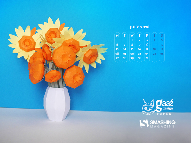




































Designed by Ricardo Gimenes from Spain.

- preview
- with calendar: 640x480, 800x480, 800x600, 1024x768, 1024x1024, 1280x720, 1280x800, 1280x960, 1280x1024, 1366x768, 1400x1050, 1440x900, 1600x1200, 1680x1050, 1680x1200, 1920x1080, 1920x1200, 1920x1440, 2560x1440, 3840x2160
- without calendar: 640x480, 800x480, 800x600, 1024x768, 1024x1024, 1280x720, 1280x800, 1280x960, 1280x1024, 1366x768, 1400x1050, 1440x900, 1600x1200, 1680x1050, 1680x1200, 1920x1080, 1920x1200, 1920x1440, 2560x1440, 3840x2160






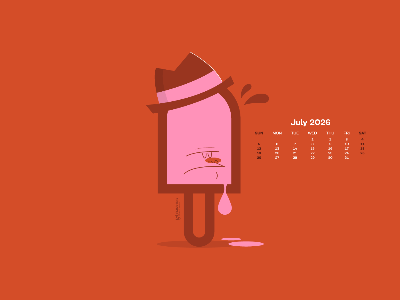


























“We hope July turns out to be a wonderful month, one that stays with us so vividly that we find ourselves wanting to ‘go back to the future’ time and again. Wishing you a month full of enjoyment and rest!” — Designed by Veronica Valenzuela from Spain.

- preview
- with calendar: 640x480, 800x480, 1024x768, 1280x720, 1280x800, 1440x900, 1600x1200, 1920x1080, 1920x1440, 2560x1440
- without calendar: 640x480, 800x480, 1024x768, 1280x720, 1280x800, 1440x900, 1600x1200, 1920x1080, 1920x1440, 2560x1440










Designed by Ricardo Gimenes from Spain.

- preview
- with calendar: 640x480, 800x480, 800x600, 1024x768, 1024x1024, 1152x864, 1280x720, 1280x800, 1280x960, 1280x1024, 1366x768, 1400x1050, 1440x900, 1600x1200, 1680x1050, 1680x1200, 1920x1080, 1920x1200, 1920x1440, 2560x1440, 3840x2160
- without calendar: 640x480, 800x480, 800x600, 1024x768, 1024x1024, 1152x864, 1280x720, 1280x800, 1280x960, 1280x1024, 1366x768, 1400x1050, 1440x900, 1600x1200, 1680x1050, 1680x1200, 1920x1080, 1920x1200, 1920x1440, 2560x1440, 3840x2160










































“July 7 is World Chocolate Day. A perfectly reasonable excuse for a strawberry to spend the afternoon floating in chocolate.” — Designed by Ginger IT Solutions from Serbia.
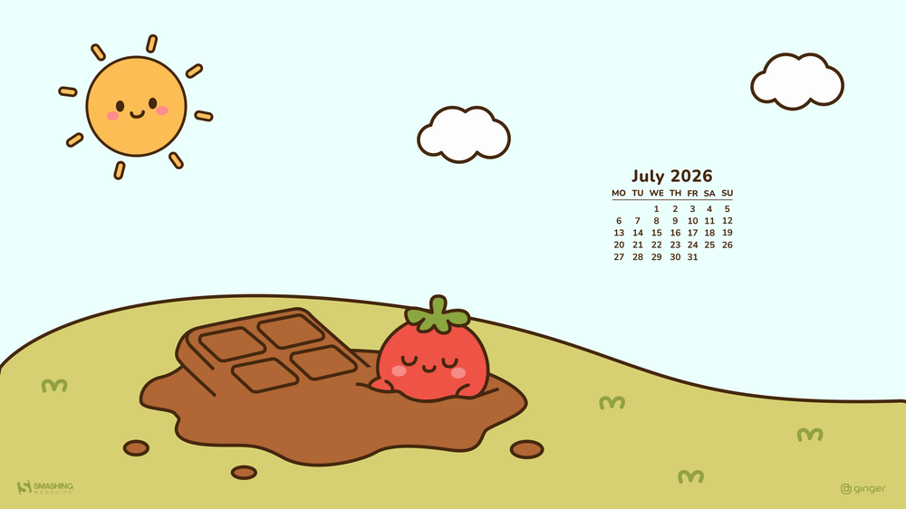
- preview
- with calendar: 320x480, 640x480, 800x480, 800x600, 1024x768, 1024x1024, 1152x864, 1280x720, 1280x800, 1280x960, 1280x1024, 1400x1050, 1440x900, 1600x1200, 1680x1050, 1680x1200, 1920x1080, 1920x1200, 1920x1440, 2560x1440
- without calendar: 320x480, 640x480, 800x480, 800x600, 1024x768, 1024x1024, 1152x864, 1280x720, 1280x800, 1280x960, 1280x1024, 1400x1050, 1440x900, 1600x1200, 1680x1050, 1680x1200, 1920x1080, 1920x1200, 1920x1440, 2560x1440


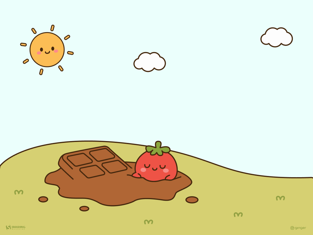
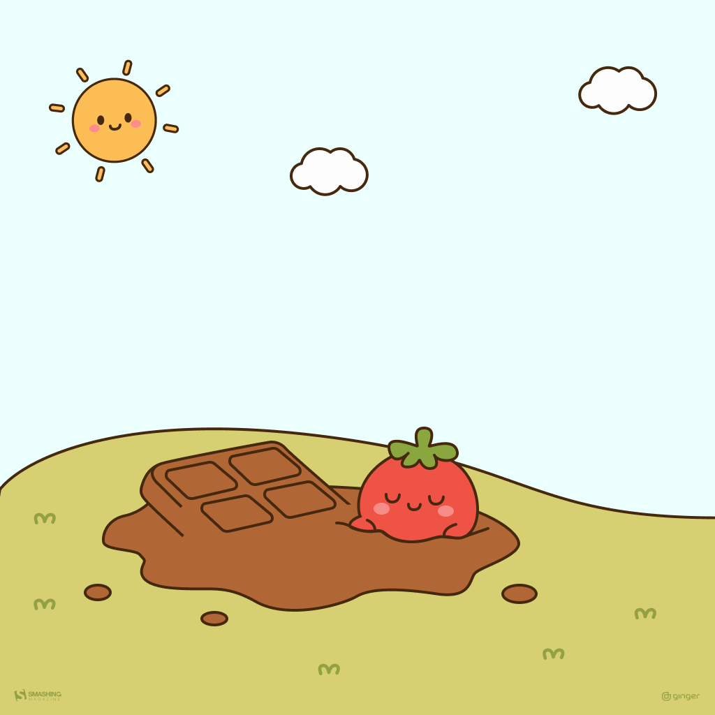



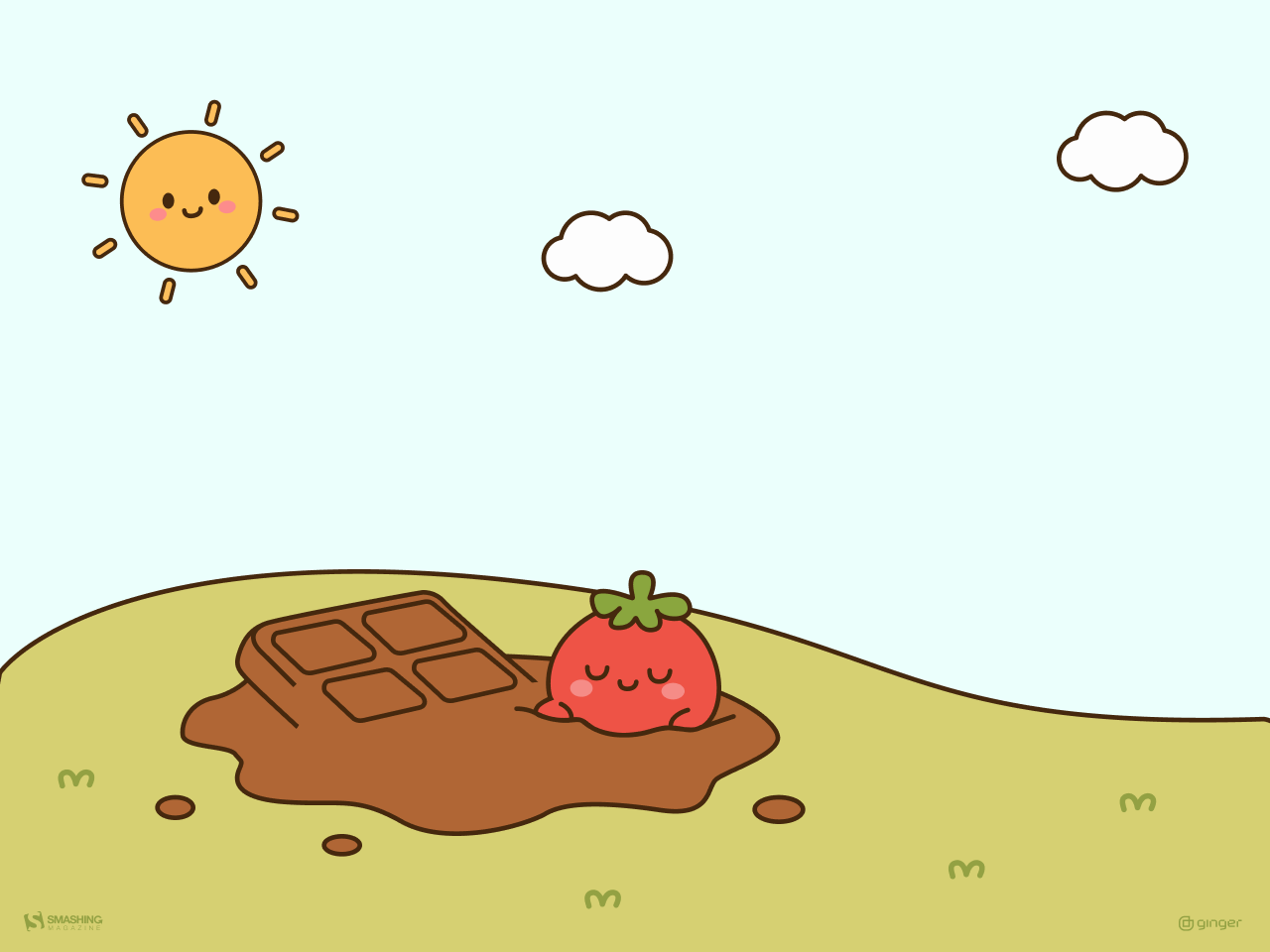
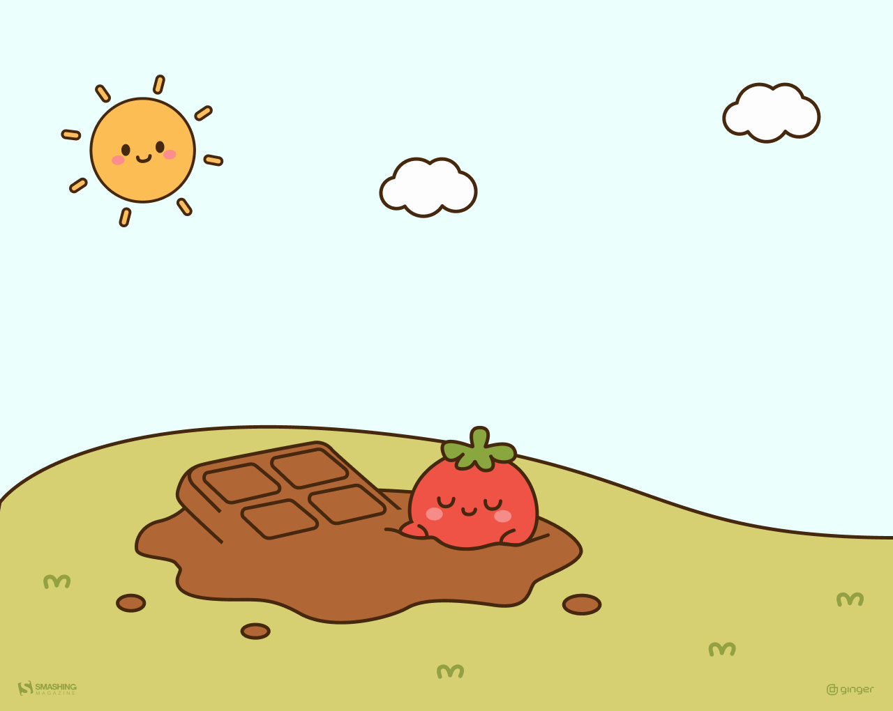





“Where soft skies meet endless green, peace finds it’s place.” — Designed by Swati Gohil from India.

- preview
- with calendar: 320x480, 640x480, 800x480, 800x600, 1024x768, 1024x1024, 1152x864, 1280x720, 1280x800, 1280x960, 1280x1024, 1400x1050, 1440x900, 1600x1200, 1680x1050, 1680x1200, 1920x1080, 1920x1200, 1920x1440, 2560x1440
- without calendar: 320x480, 640x480, 800x480, 800x600, 1024x768, 1024x1024, 1152x864, 1280x720, 1280x800, 1280x960, 1280x1024, 1400x1050, 1440x900, 1600x1200, 1680x1050, 1680x1200, 1920x1080, 1920x1200, 1920x1440, 2560x1440





































“I created this wallpaper as a daily visual push to stay focused, take risks, and turn dreams into reality.” — Designed by Hitesh Puri from Delhi, India.
- preview
- with calendar: 430x932, 1024x1024, 1280x800, 1280x960, 1280x1024, 1400x1050, 1440x900, 1680x1050, 1680x1200, 1920x1080, 1920x1200, 1920x1440, 2560x1440
- without calendar: 430x932, 1024x1024, 1280x800, 1280x960, 1280x1024, 1400x1050, 1440x900, 1680x1050, 1680x1200, 1920x1080, 1920x1200, 1920x1440, 2560x1440

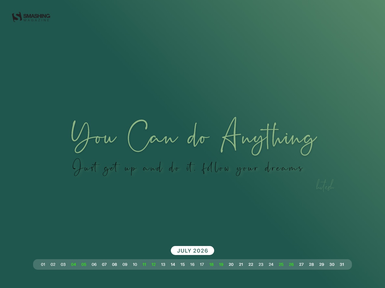
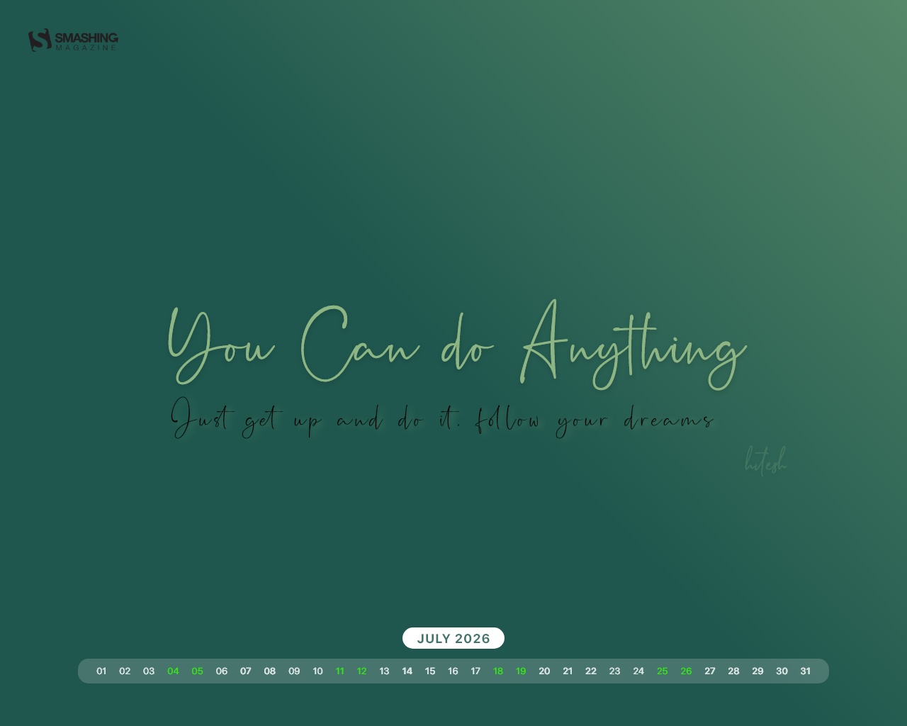
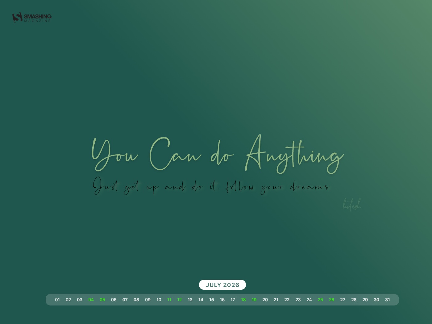
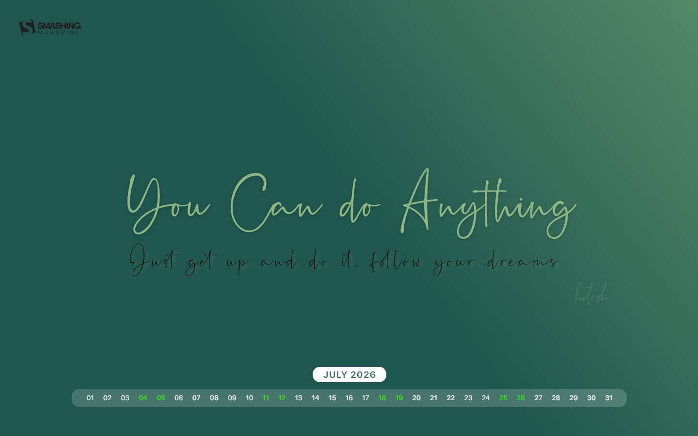
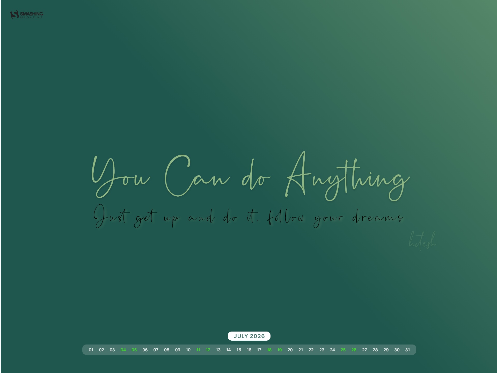
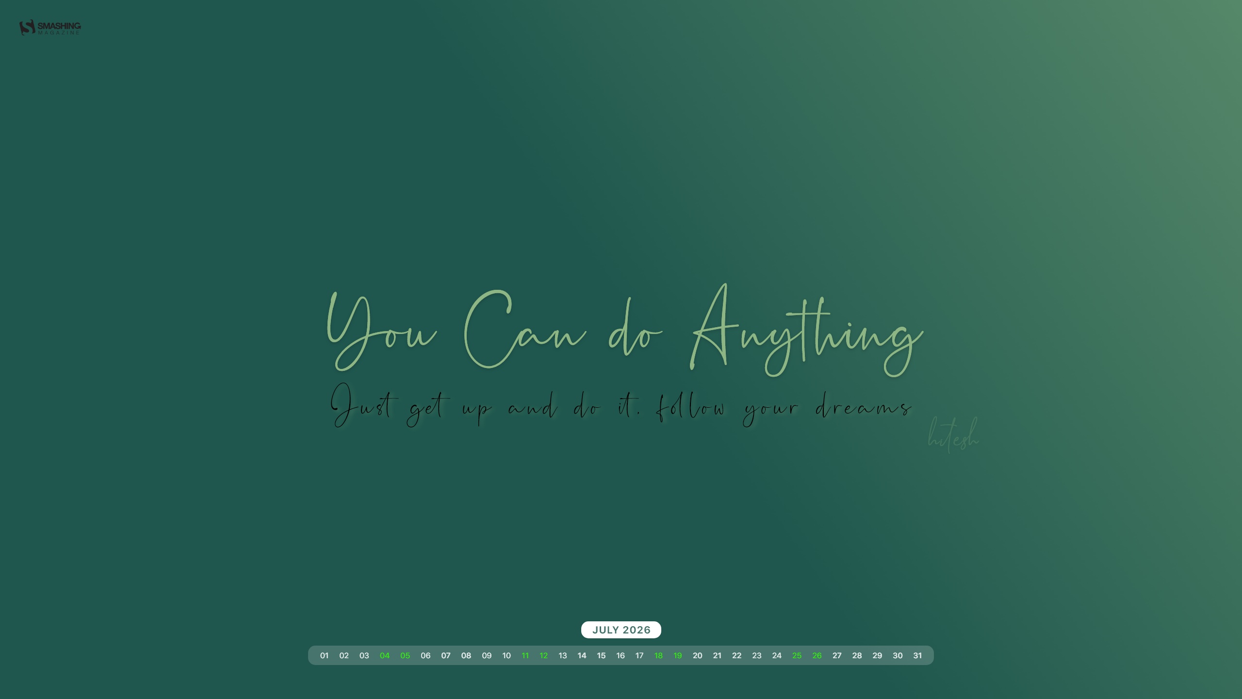


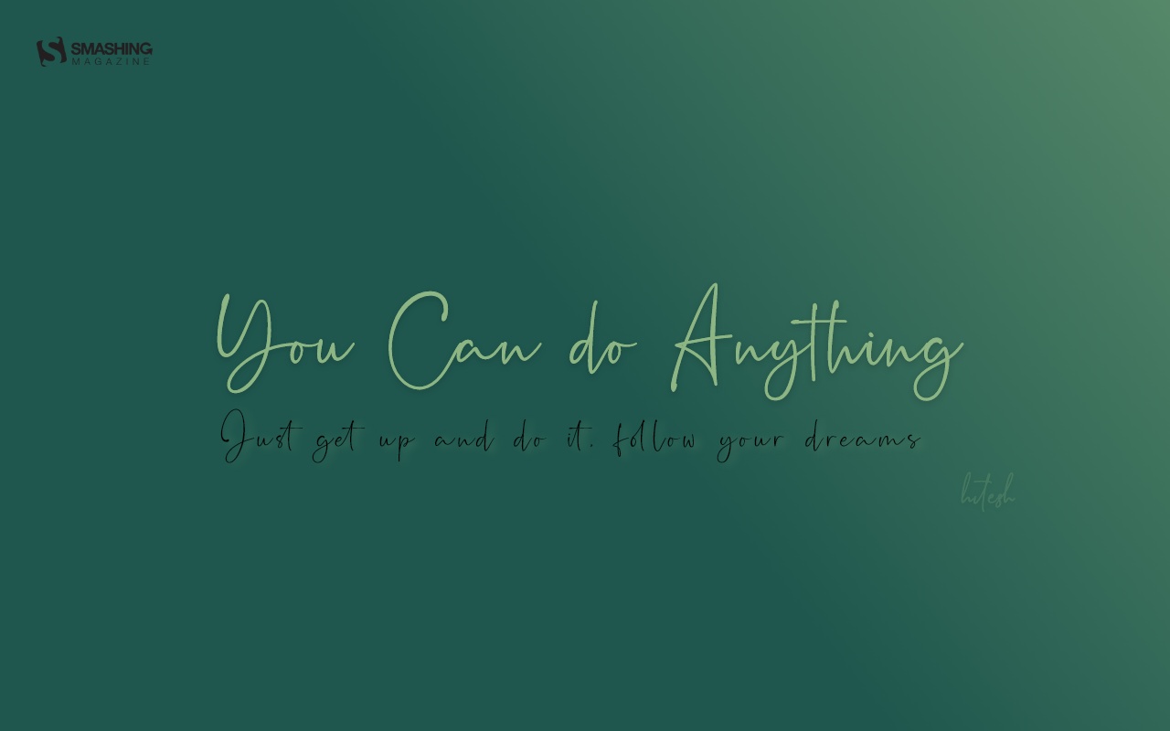



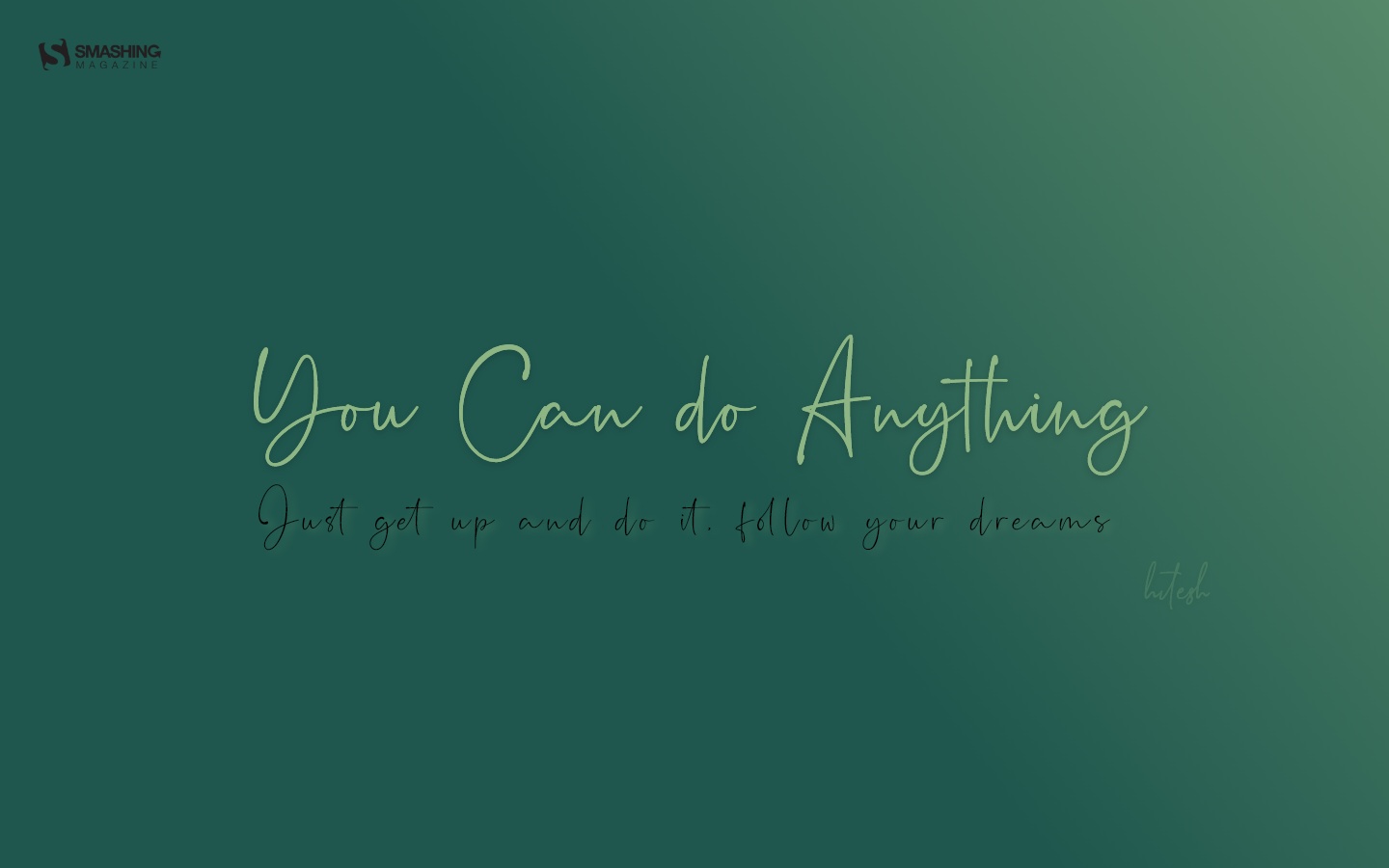
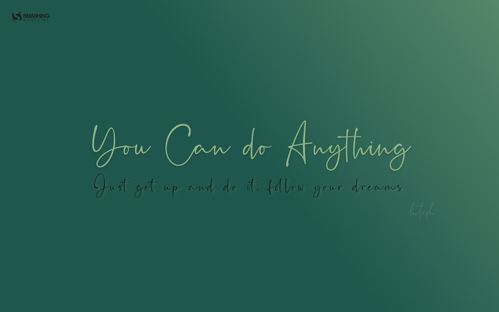



“Moments of July marked in sunlight, sea breeze, and sky — a quiet snapshot of summer, worn at the edges like a well-traveled postcard.” — Designed by Libra Fire from Serbia.

- preview
- without calendar: 1024x768, 1024x1024, 1152x864, 1280x720, 1280x800, 1280x960, 1280x1024, 1366x768, 1400x1050, 1440x900, 1600x1200, 1680x1050, 1680x1200, 1920x1080, 1920x1200, 1920x1440, 2560x1440




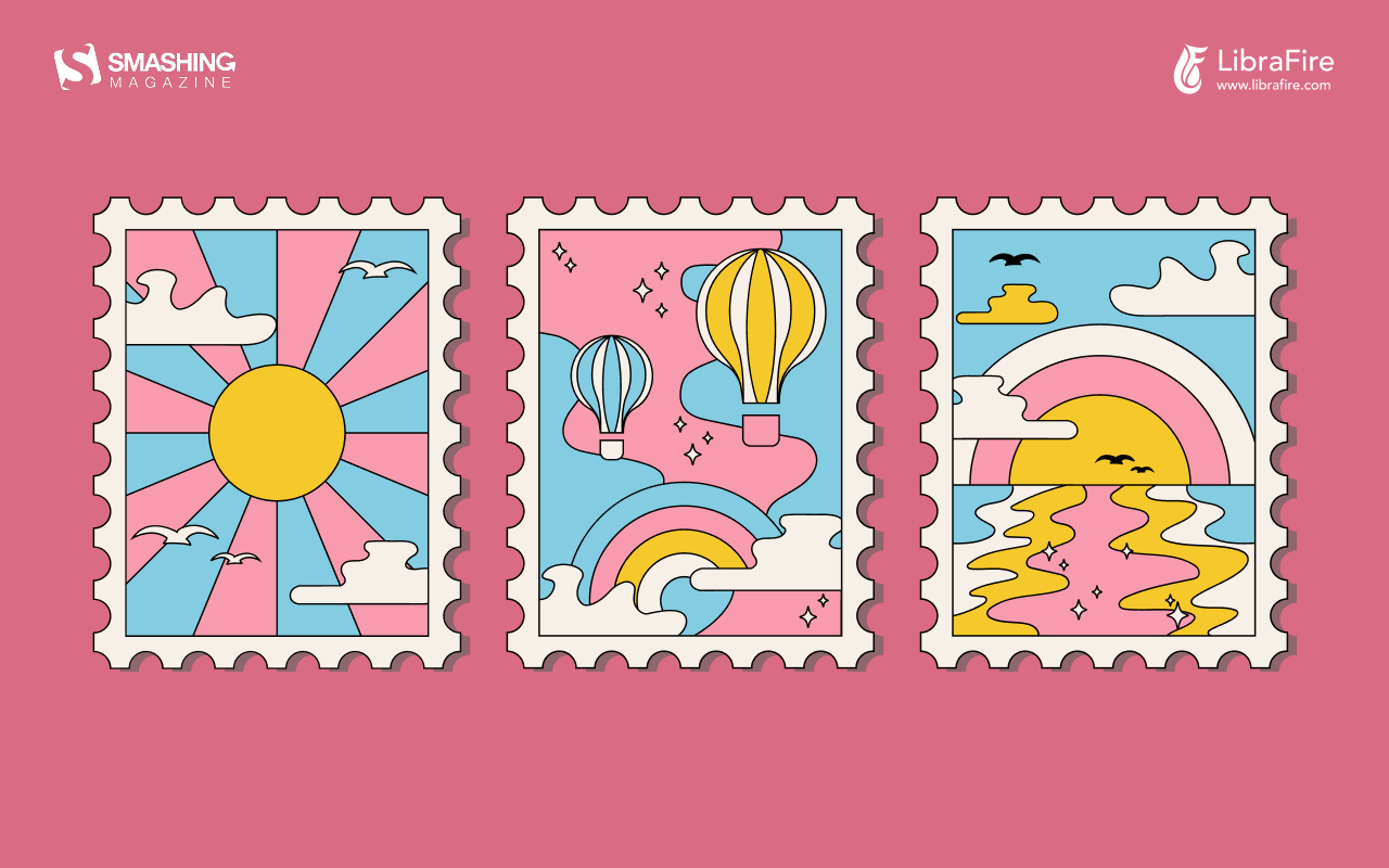


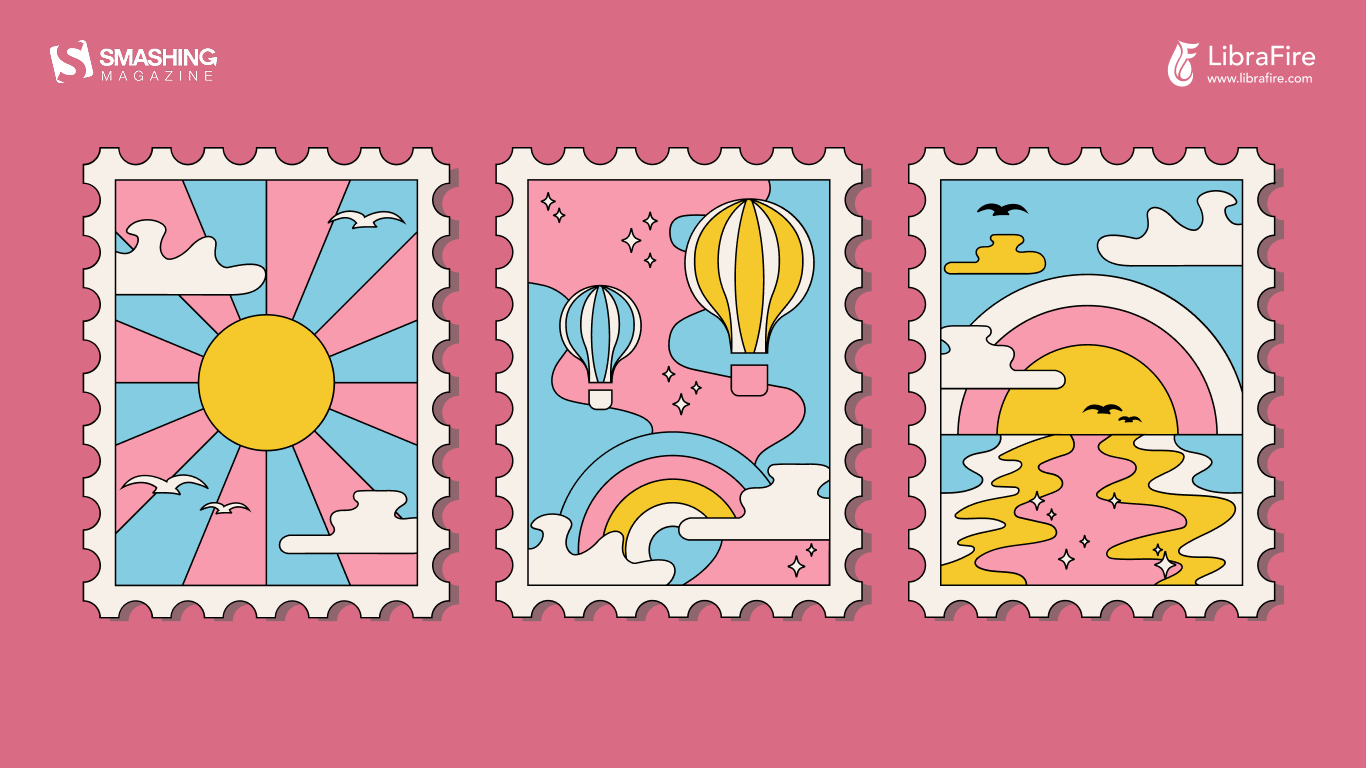









Designed by Ricardo Gimenes from Spain.

- preview
- without calendar: 640x480, 800x480, 800x600, 1024x768, 1024x1024, 1152x864, 1280x720, 1280x800, 1280x960, 1280x1024, 1366x768, 1400x1050, 1440x900, 1600x1200, 1680x1050, 1680x1200, 1920x1080, 1920x1200, 1920x1440, 2560x1440, 3840x2160






















Designed by Lívi Lénárt from Hungary.

- preview
- without calendar: 800x600, 1024x1024, 1152x864, 1280x960, 1280x1024, 1600x1200, 1920x1080, 2560x1440



Designed by Xenia Latii from Berlin, Germany.

- preview
- without calendar: 640x480, 800x480, 800x600, 1024x768, 1152x864, 1280x720, 1280x800, 1280x960, 1280x1024, 1366x768, 1400x1050, 1440x900, 1600x1200, 1680x1050, 1680x1200, 1920x1080, 1920x1200, 1920x1440, 2560x1440



“July in South Africa is dreary and wintery so we give all the southern hemisphere dwellers a bit of color for those gray days. And for the northern hemisphere dwellers a bit of pop for their summer!” — Designed by Wonderland Collective from South Africa.
In Space



Designed by Lieke Dol from the Netherlands.

- preview
- without calendar: 1280x800, 1280x960, 1280x1024, 1400x1050, 1440x900, 1600x1200, 1680x1050, 1680x1200, 1920x1080, 1920x1200, 1920x1440, 2560x1440







“July is the middle of summer, when most of us go on road trips, so I designed a calendar inspired by my love of traveling and summer holidays.” — Designed by Patricia Coroi from Romania.
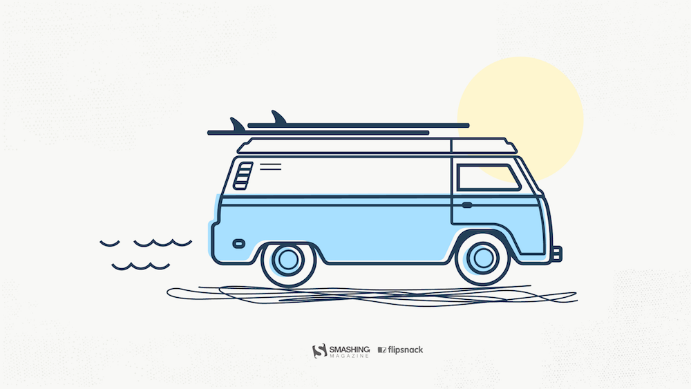
- preview
- without calendar: 640x1136, 1024x768, 1280x800, 1280x1024, 1366x768, 1920x1080, 1920x1200, 2560x1440


Designed by Ricardo Gimenes from Spain.

- preview
- without calendar: 640x480, 800x480, 800x600, 1024x768, 1024x1024, 1152x864, 1280x720, 1280x800, 1280x960, 1280x1024, 1366x768, 1400x1050, 1440x900, 1600x1200, 1680x1050, 1680x1200, 1920x1080, 1920x1200, 1920x1440, 2560x1440, 3840x2160






















“In times of clean eating and the world of superfoods there is one vegetable missing. An old, forgotten one. A flower actually. Rare and special. Once it had a royal reputation (I cheated a bit with the blue). The artichocke — this is my superhero in the garden! I am a food lover — you too? Enjoy it, dip it!” — Designed by Alexandra Tamgnoué from Germany.

- preview
- without calendar: 320x480, 640x480, 800x600, 1024x768, 1152x864, 1280x720, 1280x800, 1280x960, 1280x1024, 1440x900, 1440x1050, 1600x1200, 1680x1050, 1680x1200, 1920x1080, 1920x1200, 1920x1440, 2560x1440



“Make sure you have a refreshing source of ideas, plans, and hopes this July. Especially if you are to escape from urban life for a while.” — Designed by Igor Izhik from Canada.

- preview
- without calendar: 1024x768, 1024x1024, 1152x864, 1280x720, 1280x800, 1280x960, 1280x1024, 1400x1050, 1440x900, 1600x1200, 1680x1050, 1680x1200, 1920x1080, 1920x1200, 1920x1440, 2560x1440



“Ever watched Joe’s Apartment when you were a kid? Well, that movie left a soft spot in my heart for the little critters. Don’t get me wrong: I won’t invite them over for dinner, but I won’t grab my flip flop and bring the wrath upon them when I see one running in the house. So there you have it… three roaches… bringing the smack down on that pesky human… ZZZZZZZAP!!” — Designed by Wonderland Collective from South Africa.
Captain Amphicar
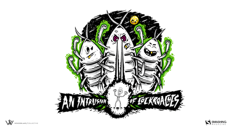


“My son and I are obsessed with the Amphicar right now, so why not have a little fun with it?” — Designed by 3 Bicycles Creative from the United States.

- preview
- without calendar: 1280x720, 1280x800, 1280x960, 1280x1024, 1400x1050, 1440x900, 1600x1200, 1680x1050, 1680x1200, 1920x1080, 1920x1200, 1920x1440, 2560x1440



“Welcome to the sweltering July — the month when it’s so hot that even the fruits are edgy. Our ice-creamy, vibrantly-colored monthly calendar is melting as the temperature rises, so make sure to download it as quickly as possible!” — Designed by PopArt Studio from Serbia.

- preview
- without calendar: 320x480, 640x480, 800x480, 800x600, 1024x768, 1024x1024, 1152x864, 1280x720, 1280x800, 1280x960, 1280x1024, 1366x768, 1440x900, 1440x1050, 1600x1200, 1680x1050, 1680x1200, 1920x1080, 1920x1200, 1920x1440, 2560x1440

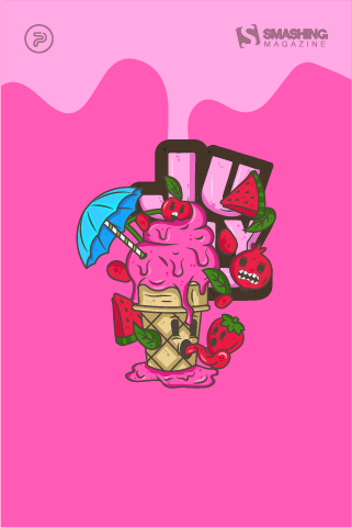
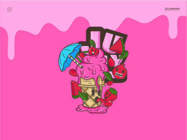
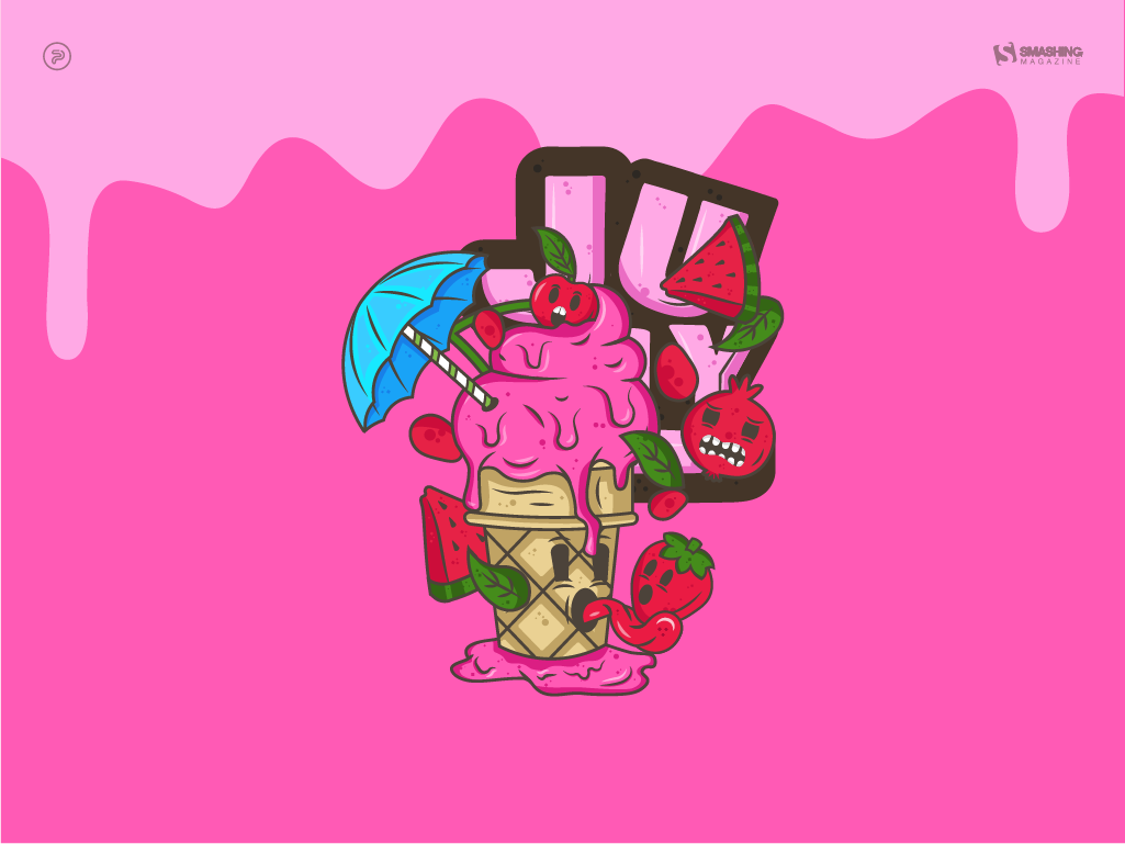
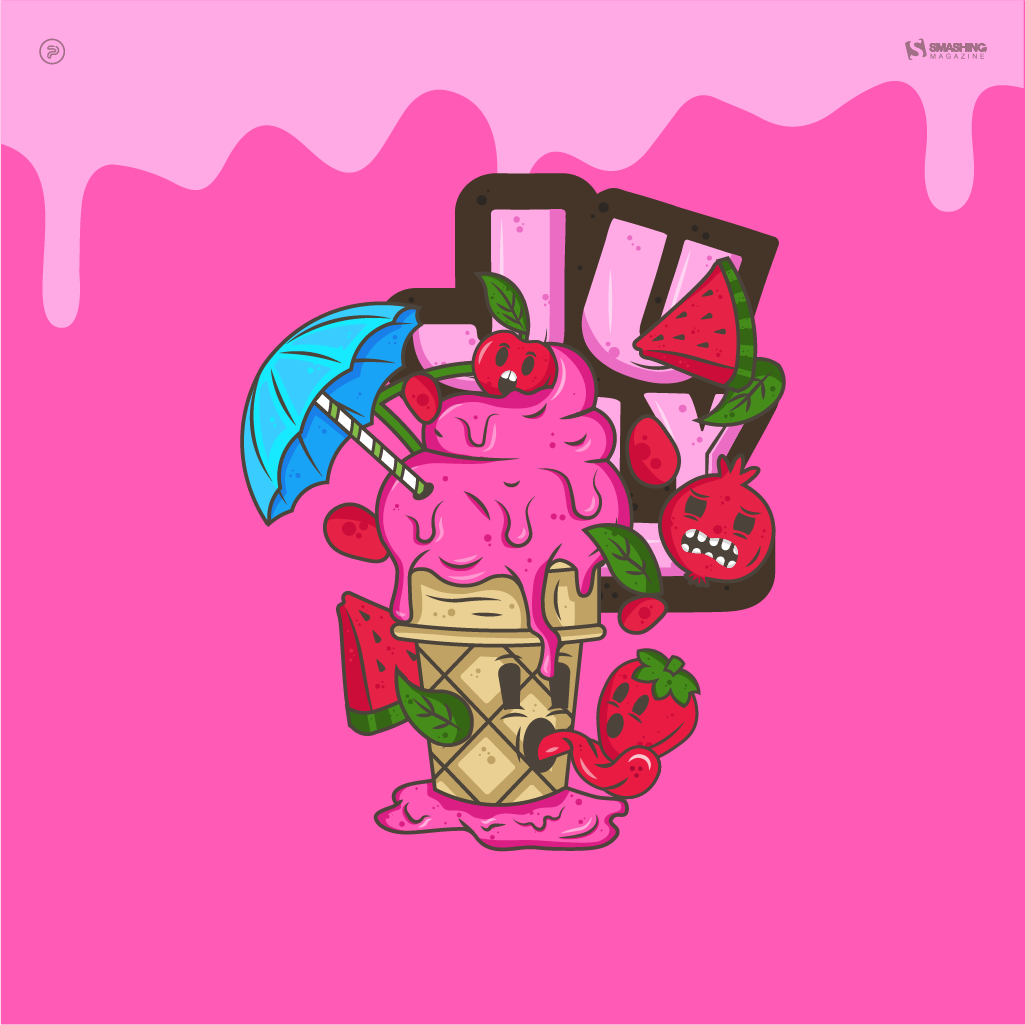
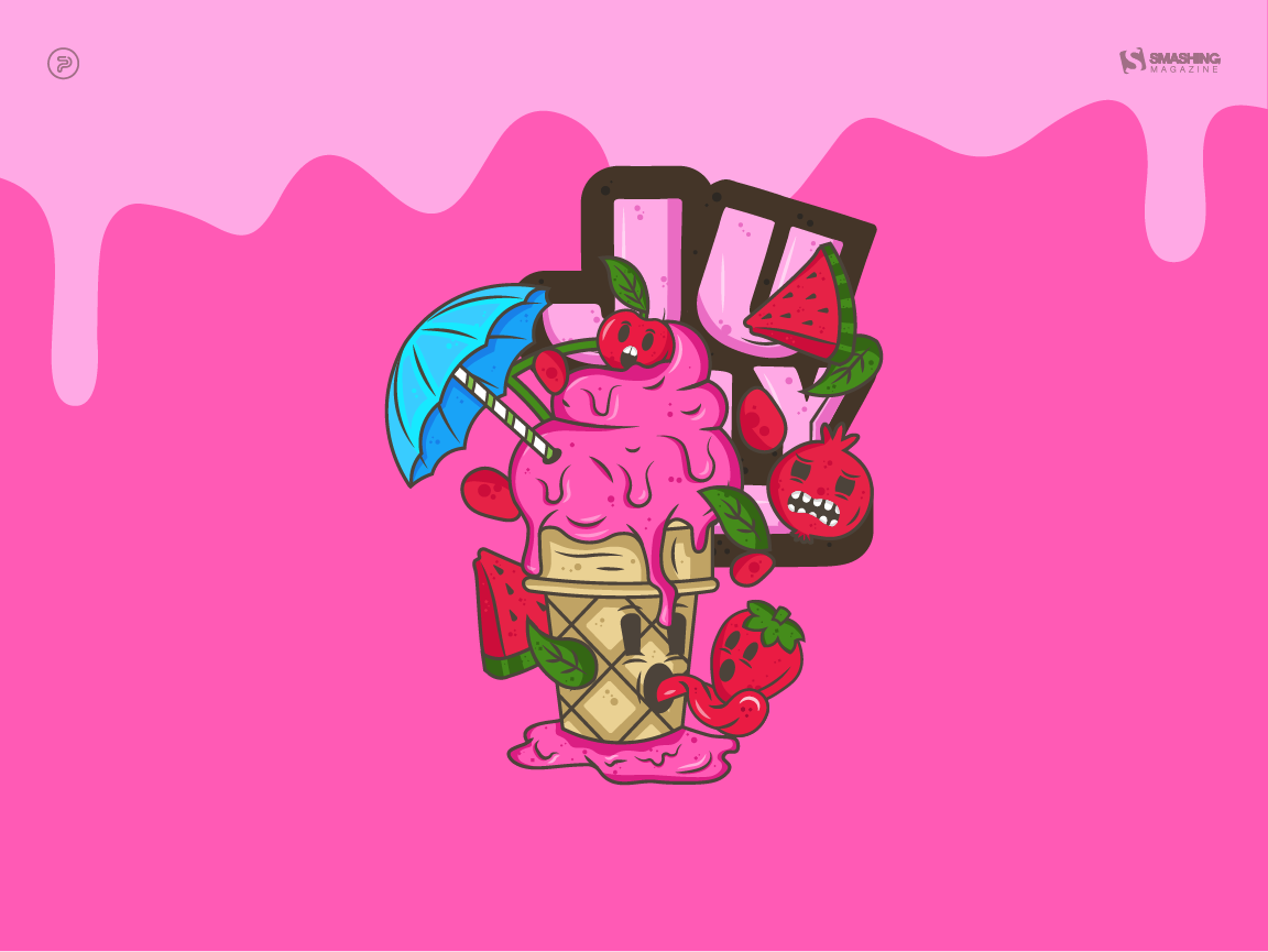
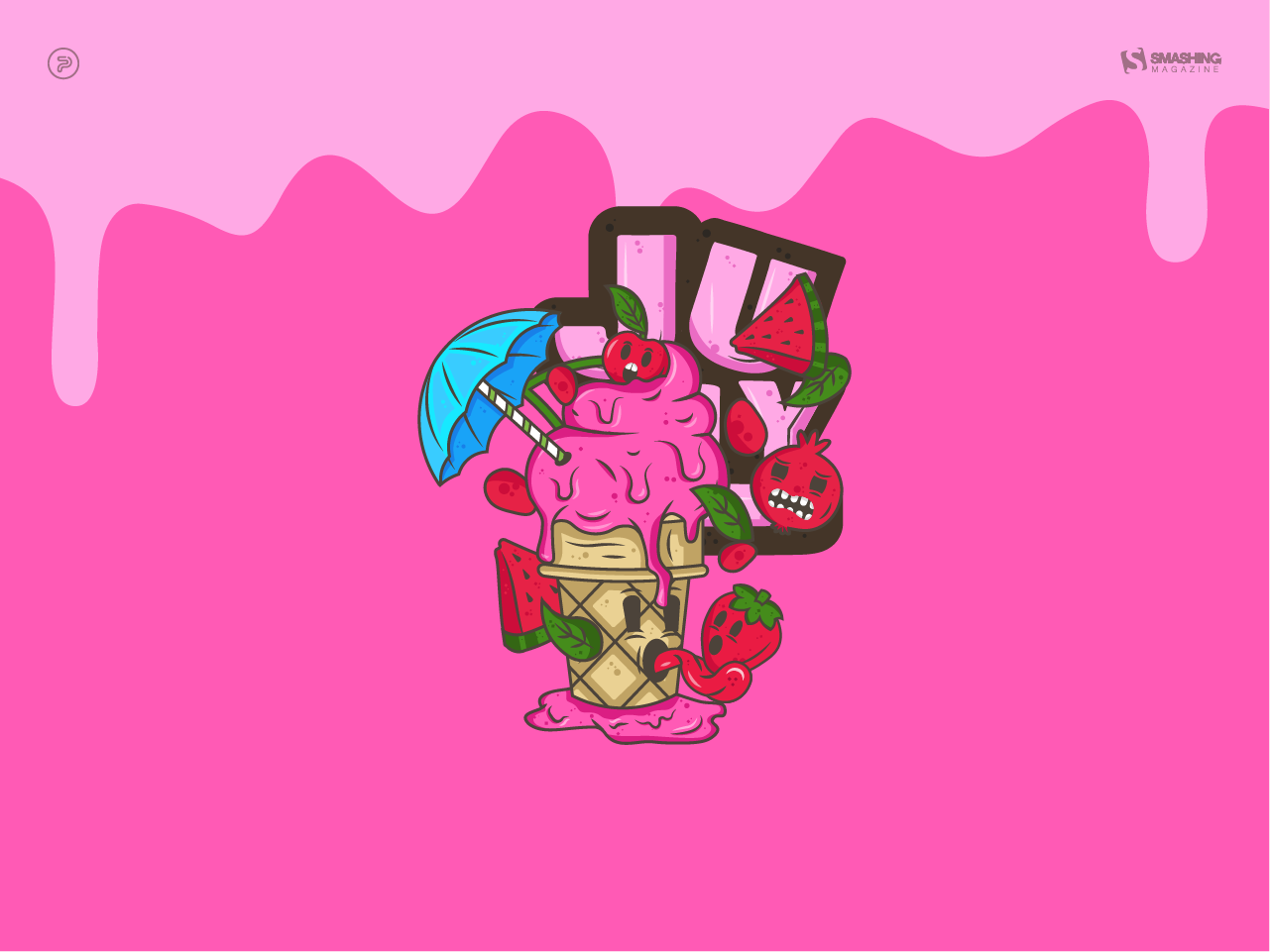
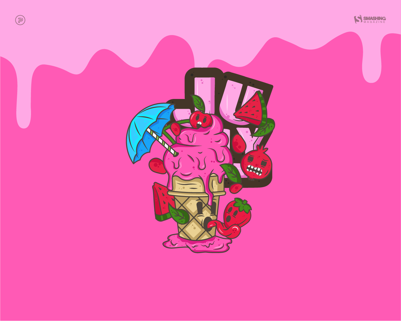
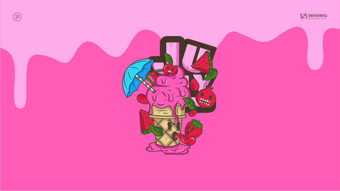
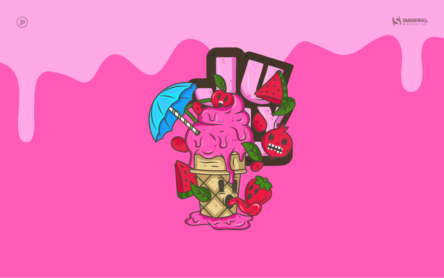
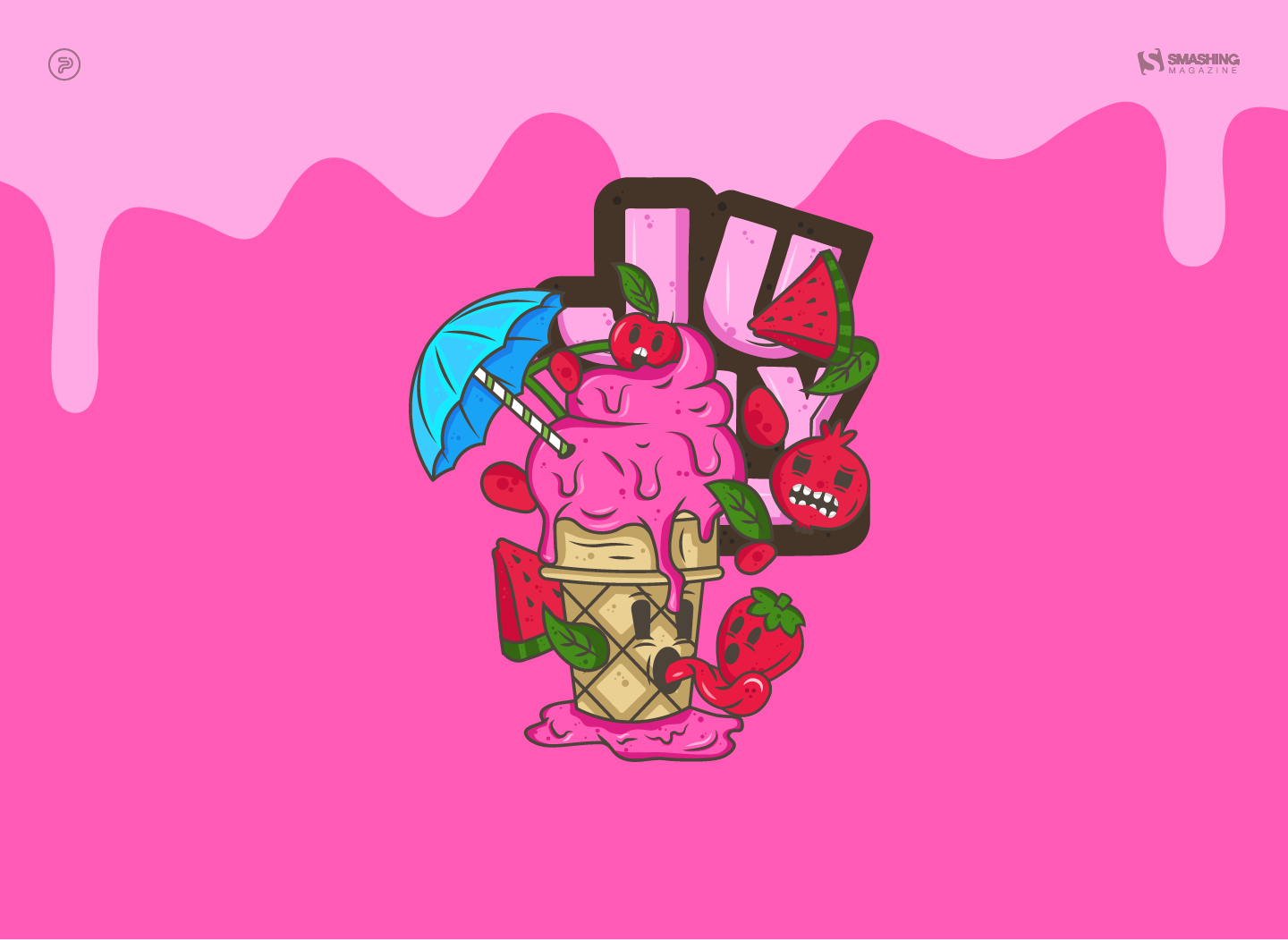
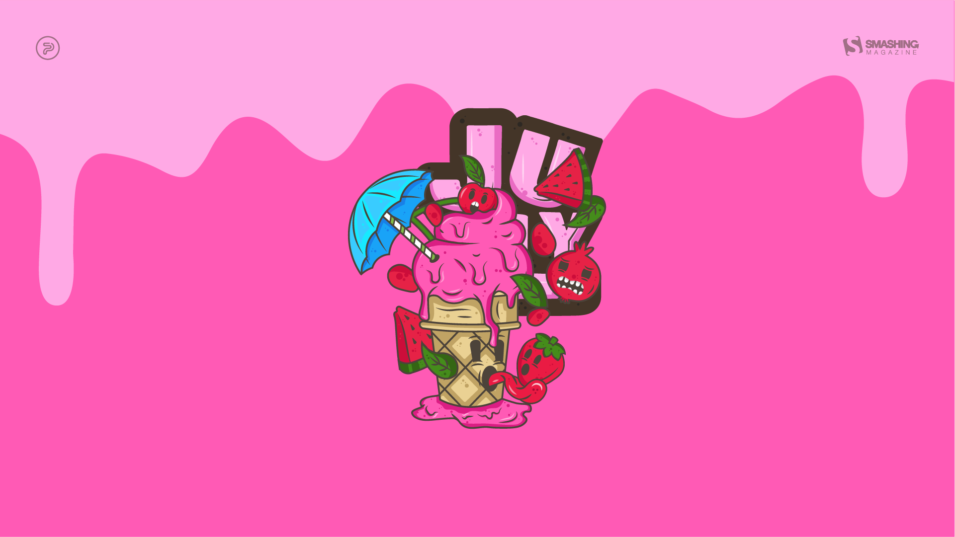
“I was inspired by the Italian summer aesthetic when creating this wallpaper.” — Designed by Dylan Pugh from the United States.

- preview
- without calendar: 320x480, 640x480, 800x480, 800x600, 1024x768, 1024x1024, 1152x864, 1280x720, 1280x800, 1280x960, 1280x1024, 1400x1050, 1440x900, 1600x1200, 1680x1050, 1680x1200, 1920x1200, 1920x1440, 2560x1440









Designed by Ricardo Gimenes from Spain.

- preview
- without calendar: 640x480, 800x480, 800x600, 1024x768, 1024x1024, 1152x864, 1280x720, 1280x800, 1280x960, 1280x1024, 1366x768, 1400x1050, 1440x900, 1600x1200, 1680x1050, 1680x1200, 1920x1080, 1920x1200, 1920x1440, 2560x1440, 3840x2160

















“And once you let your imagination go, you find yourself surrounded by eternal summer, unexplored worlds, and all-pervading warmth, where there are no rules of physics and colors tint the sky under your feet.” — Designed by Ana Masnikosa from Belgrade, Serbia.

- preview
- without calendar: 320x480, 640x480, 800x480, 800x600, 1024x768, 1024x1024, 1152x864, 1280x720, 1280x800, 1280x960, 1280x1024, 1400x1050, 1440x900, 1600x1200, 1680x1050, 1680x1200, 1920x1080, 1920x1200, 1920x1440, 2560x1440



Designed by Xenia Latii from Germany.

- preview
- without calendar: 320x480, 640x480, 800x480, 800x600, 1024x768, 1152x864, 1280x720, 1280x800, 1280x960, 1280x1024, 1366x768, 1400x1050, 1440x900, 1600x1200, 1680x1050, 1680x1200, 1920x1080, 1920x1200, 1920x1440, 2560x1440



“This egg knows what July is all about. Soaking up the sun, relaxing without a care, and letting the warmth do its magic. Whether it’s a full vacation or just a quiet afternoon, take a moment to pause and recharge. You deserve it.” — Designed by Ginger IT Solutions from Serbia.

- preview
- without calendar: 320x480, 640x480, 800x480, 800x600, 1024x768, 1024x1024, 1152x864, 1280x720, 1280x800, 1280x960, 1280x1024, 1400x1050, 1440x900, 1600x1200, 1680x1050, 1680x1200, 1920x1080, 1920x1200, 1920x1440, 2560x1440





















Designed by Natalia Szendzielorz from Poland.

- preview
- without calendar: 540x960, 600x800, 1366x768, 1440x900, 1600x1200, 1920x1080, 1920x1200, 2560x1440, 2880x1800



“The long-awaited vacation is coming closer. After working all year, we find ourselves with months that, although we don’t stop completely, are lived differently. We enjoy the days and nights more, and if we can, the beach will keep us company. Therefore, we’ll spend this month in Australia, enjoying the coral reefs and diving without limits.” — Designed by Veronica Valenzuela from Spain.

- preview
- without calendar: 640x480, 800x480, 1024x768, 1280x720, 1280x800, 1440x900, 1600x1200, 1920x1080, 1920x1440, 2560x1440


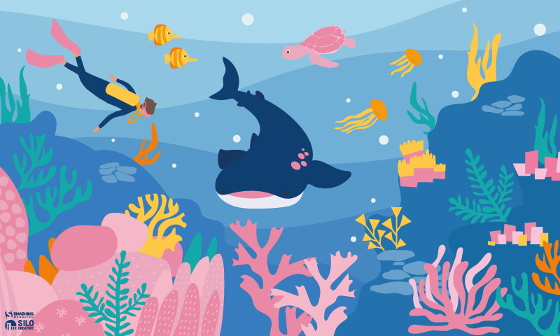
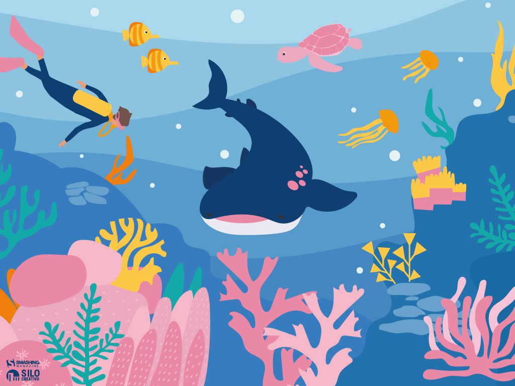




Designed by Ricardo Gimenes from Spain.

- preview
- without calendar: 640x480, 800x480, 800x600, 1024x768, 1024x1024, 1152x864, 1280x720, 1280x800, 1280x960, 1280x1024, 1366x768, 1400x1050, 1440x900, 1600x1200, 1680x1050, 1680x1200, 1920x1080, 1920x1200, 1920x1440, 2560x1440, 3840x2160



“July is coming and the nights are warmer. Frogs look at the moon while they talk about their day.” — Designed by Veronica Valenzuela from Spain.

- preview
- without calendar: 640x480, 800x480, 1024x768, 1280x720, 1280x800, 1440x900, 1600x1200, 1920x1080, 1920x1440, 2560x1440



“Warm summer weather inspired the color palette.” — Designed by Marijana Pivac from Croatia.

- preview
- without calendar: 320x480, 640x480, 800x480, 800x600, 1024x768, 1024x1024, 1152x864, 1280x720, 1280x800, 1280x960, 1280x1024, 1366x768, 1400x1050, 1440x900, 1600x1200, 1680x1050, 1680x1200, 1920x1080, 1920x1200, 1920x1440, 2560x1440



“July is a very special month to me — it’s the month of my birthday and of the best cherries.” — Designed by Igor Izhik from Canada.
- preview
- without calendar: 320x480, 640x480, 800x480, 800x600, 1024x768, 1024x1024, 1152x864, 1280x720, 1280x800, 1280x960, 1280x1024, 1400x1050, 1440x900, 1600x1200, 1680x1050, 1680x1200, 1920x1080, 1920x1200, 1920x1440, 2560x1440


Designed by Ricardo Gimenes from Spain.

- preview
- without calendar: 640x480, 800x480, 800x600, 1024x768, 1024x1024, 1152x864, 1280x720, 1280x800, 1280x960, 1280x1024, 1366x768, 1400x1050, 1440x900, 1600x1200, 1680x1050, 1680x1200, 1920x1080, 1920x1200, 1920x1440, 2560x1440, 3840x2160






















“Rain has come, showering the existence with new seeds of life. Everywhere life is blooming, as if they were asleep and the falling music of raindrops have awakened them. Feel the drops of rain. Feel this beautiful mystery of life. Listen to its music, melt into it.” — Designed by DMS Software from India.

- preview
- without calendar: 320x480, 640x480, 800x480, 800x600, 1024x768, 1024x1024, 1152x864, 1280x720, 1280x800, 1280x960, 1280x1024, 1366x768, 1400x1050, 1440x900, 1600x1200, 1680x1050, 1680x1200, 1920x1080, 1920x1200, 1920x1440, 2560x1440



Designed by Erik Neumann from Germany.

- preview
- without calendar: 1280x720, 1280x800, 1280x960, 1400x1050, 1440x900, 1600x1200, 1680x1050, 1680x1200, 1920x1080, 1920x1200, 1920x1440, 2560x1440, 2560x1600



Designed by Ricardo Gimenes from Spain.

- preview
- without calendar: 640x480, 800x480, 800x600, 1024x768, 1024x1024, 1152x864, 1280x720, 1280x800, 1280x960, 1280x1024, 1366x768, 1400x1050, 1440x900, 1600x1200, 1680x1050, 1680x1200, 1920x1080, 1920x1200, 1920x1440, 2560x1440, 3840x2160



Feeling inspired? We’ll publish the August wallpapers on July 31, so if you’d like to be part of the collection, please don’t hesitate to submit your design. We are already looking forward to it!
Designing With Uncertainty: How AI Supercharges Probabilistic Thinking
In 2024, an Air Canada customer asked a chatbot about bereavement fares. The bot confidently gave him a refund policy that didn’t exist. The airline refused to honor it. A tribunal ruled in the customer’s favor. The bot hadn't decided anything; it had predicted an answer based on patterns in its training data. The company treated that prediction as policy.
This is the risk at the heart of designing with AI today: probabilistic systems wrapped in deterministic interfaces. The AI offers a guess, the interface presents it as truth, and the user, or the organization, acts on it.
Humans are wired for deterministic thinking. We prefer to believe that past actions determine future outcomes. Flip a coin 999 times and get heads every time, the deterministic mind assumes the coin is rigged. The probabilistic mind accepts that the 1000th flip could still go either way. That second mindset is harder to hold onto, but it is exactly what designers need right now.
Products operate in complex, nonlinear environments, and AI is accelerating that complexity. When designers and product teams treat AI outputs as the answer rather than one of many possible answers, they build fragile experiences, and in some cases, like medical diagnostics or financial forecasting, genuinely dangerous ones.
This article is a practical guide to designing probabilistically with AI as a partner. It is about using AI to sharpen your thinking rather than outsource it, accounting for model bias, human sentiment, and perceived risk along the way.
Probabilistic Thinking + AIMost questions we ask AI do not produce binary answers. They produce probabilities based on patterns in data. If you ask, “Do aliens exist?” the answer will be somewhere between plausible and uncertain. Scientists consider life elsewhere in the universe likely, but without any concrete evidence, we cannot confirm it. The answer doesn’t resolve the question; it frames it as a probability.
Designers should read AI outputs the same way. They are signals, not conclusions, possible outcomes that have to be interpreted within the context of product goals, user behavior, and business constraints.
Many digital products already work this way. Netflix doesn’t know you’ll enjoy Superstore because you watched The Office; it estimates the probability and surfaces the title accordingly. The interface is responding to a prediction.
Design decisions can follow the same logic. AI models can combine behavioral analytics with research insights to estimate the likelihood of certain outcomes, and those probabilities can act as a yardstick for design strategy. Consider a scenario where analytics suggest a 60% versus 90% confidence that users will complete a purchase. At 60%, the design has to do more persuasive work, testimonials, explanations, comparisons, and reassurance signals may help the user move toward a decision. At 90%, the user is already motivated, and the design should start removing friction so the action can happen quickly. Same screen, very different design problem.
AI can also simulate outcomes using historical data and behavioral models before you commit to a direction. The value of those simulations depends heavily on how prompts are structured, the context they define, the hypothesis being tested, user motivation, and the edge cases you want stressed.
I can think of one such practical use: evaluating early designs through structured prompts, especially when you don’t have direct access to the user group you’re designing for. The prompt below is a starting point for evaluating a design from the perspective of neurodivergent users as well. Treat it as a template, adapt the user group, criteria, and output format to your product, and use it as a conversation starter with your team rather than a verdict.
Evaluate the [design file or weblink] for usability, accessibility, and content relevance from the perspective of neurodivergent users such as those with autism spectrum disorder, ADHD, learning disabilities, etc.Please consider the following criteria:
- Is the layout and navigation intuitive for neurodivergent users?
- Is the language and content appropriate and engaging for neurodivergent users?
- Are there any barriers (technical, cognitive, or sensory) that this group might face when using the site?
- How well does the site meet the specific needs or goals of neurodivergent users?
Provide a SWOT analysis, probability score for successful use by neurodivergent users, and any recommendations for improvement.
Note: This is an oversimplification of the idea. Please be mindful of the intricate details of your product and make any appropriate changes.
That said, simulations do not replace experimentation. Because models are trained on historical data, they reflect past behavior more strongly than they predict future change. Imagine designing a voice interface for elderly users who struggle with touchscreens. A model trained on mobile interaction data might predict low engagement, not because the idea lacks value, but because the dataset reflects different user behavior. Simulations should always surface assumptions, not prevent innovation.
Be Cautious of Skewed Probabilistic Thinking Using AIAI systems are built on historical data, more specifically, on the datasets they are trained on. That foundation shapes the outputs we receive. During the AI Summit in France, India’s Prime Minister Narendra Modi shared an example that illustrates this well. If you ask an AI model to generate an image of a person writing with the left hand, the output may still show a person writing with their right hand. The reason is statistical: most people are right-handed, and the training data reflects that. This may have improved over time, but the point remains relevant. I still occasionally see this behavior when generating images with similar models.
What you receive is not truth. It is the most statistically likely outcome given the data available. Always ask whether past data meaningfully predicts future behavior. If additional context can improve the prediction, include it. Without context, the output is just one of many possible answers dressed up as the only one.
Confidence scores deserve the same scrutiny. Overtrusting a high-confidence output leads to the Air Canada situation. Dismissing a low-confidence one can cause teams to miss a real signal buried in noisy data. A prediction with 90% confidence is not necessarily correct, and a 40% signal is not necessarily useless. Designers must still weigh the possibilities, consider the case in front of them, and bring judgment to what the AI recommends.
Transparency is how you make that possible. As AI systems increasingly shape decisions, people need visibility into how outputs are generated, the sources, the reasoning, and the summaries behind a recommendation. Black-box systems breed distrust. Systems that reveal their reasoning let users evaluate outputs for themselves. That transparency is good design and ethical practice. It respects the trust people place in these tools.
Thinking in probabilities often means resisting the temptation of quick answers. AI can accelerate research and surface patterns faster than ever before, but those outputs are starting points, not final decisions.
Practice Probabilistic Design with AIDesign shapes how a product is ultimately experienced — the decisions designers make determine whether the experience feels adequate, intuitive, or exceptional. And design is inherently full of assumptions and bets. Even the most rigorous research can yield multiple valid solutions to the same problem, each carrying a different probability of success.
Thinking probabilistically means recognizing that design decisions rarely produce binary outcomes. They lead to a range of possible results, and the role of the designer is to navigate those possibilities and identify the path most likely to create value. This mindset also builds adaptability: user needs evolve, strategies change, and sometimes ideas fail. Teams that lean on data signals, experimentation, and learning loops move faster toward the most effective solution.
Before the practical principles, one fundamental idea:
Design decisions should be optimized for likelihood, not certainty.
Design for Likelihood, Not CertaintyEvery design decision is a bet, not a guarantee. Even when decisions are informed by research and data, they are still based on smaller samples and assumptions about how users will behave at scale. A well-researched idea can still fail in the real world.
The Air Canada chatbot from the introduction is a design lesson as much as a legal one. The bot was doing what language models do, predicting plausible text. The interface, however, communicated that prediction with complete confidence, no caveats, no “here’s what our policy usually says,” no obvious path to a human. The user read confidence as commitment, and legally, so did the tribunal.
This is what happens when probabilistic systems are wrapped in deterministic interfaces. The interface transforms likelihood into certainty, and that is where the risk emerges.
Designing for likelihood means letting the interface continue to have uncertainty, visible fallbacks to human support, and clear labeling when content is AI-produced, preventing unforeseen issues.Designers should avoid binary thinking — a great idea does not mean guaranteed success, and a familiar idea is not guaranteed to fail. Examine variations, confidence levels, and edge cases instead. AI can certainly help here, acting as a portfolio-thinking engine that surfaces different interpretations, highlights risks, and generates structured recommendations. The goal is not to optimize for certainty, but for value: it should always be value-driven.
Think of the moment in Avengers: Infinity War when Doctor Strange tells Tony Stark that out of millions of possible futures, there is only one where they win. AI cannot tell you the future, but it can help you explore the possible paths. Instead of asking whether an idea will succeed, ask AI to estimate the likelihood and get a score, and use those signals to guide decisions.
Use Data as a Compass, Not a MapEven an actual probability is not a final answer. Imagine an AI model predicts an 80% likelihood that users prefer a minimal checkout experience. That does not mean the solution is simply “build a minimal checkout.” Data should function as a compass, not a map.
- Why did the model produce that prediction?
- What data influenced it?
- What assumptions is it leaning on?
- What user behavior is it actually detecting?
These questions help designers validate predictions through usability testing and additional research. AI excels at identifying patterns, but it rarely explains why those patterns exist. Understanding motivation is still a human-centered research task.
The clearest cautionary tale here is Amazon’s experimental AI recruitment tool, which the company reportedly scrapped after discovering that the model had learned to downgrade resumes from women. The training data, roughly a decade of historical hiring decisions, was skewed toward male candidates, and the model inherited that skew. It began penalizing resumes that included the word “women’s,” as in “women’s chess club captain,” and favoring language more commonly found on men’s resumes. The system was not intentionally biased — the data was. Amazon reportedly tried to adjust it and eventually shut the project down because they could not guarantee it would not surface other discriminatory patterns.
Examples like this are why interpreting AI output critically matters. Designers need to understand the data behind a prediction and evaluate the reliability of the models they depend on. A recommendation is only as good as the data it was trained on, and the only way to know what that data is hiding is to ask.
Experiment as a Learning SystemExperimentation is usually framed as a way to validate a design decision. Want to lift the click-through rate of a CTA? Run an A/B test. Probabilistic thinking reframes this. Experiments should not only confirm solutions but also reduce uncertainty.
- Traditional approach: Testing features to confirm success.
- Probabilistic approach: Testing assumptions to reduce uncertainty.
Traditional A/B testing is expensive. It costs engineering time, traffic allocation, and user exposure, especially when a losing variant runs against a significant chunk of your audience. AI simulations can help filter weaker ideas before they reach production by making experimentation more efficient. User needs shift constantly, and the most effective teams iterate fast.
AI can help evaluate assumptions early by modeling potential outcomes based on historical and behavioral data. These simulations act as a hypothesis filter, pointing to the directions worth investing engineering effort in. This also supports personalization — different users may respond better to different experiences. Version A may resonate with high-intent users while version B works better for exploratory ones. Multiple experiences living side by side are not a flaw; they can be an intentional strategy.
AI amplifies probabilistic thinking by surfacing scenarios, assigning likelihood scores, and enabling personalization at scale. Experimentation becomes a continuous feedback loop:
Predict → Test → Learn → Adjust → Repeat!
A few steps to make it work:
Shift the framing
- So instead of saying: Will this feature succeed?
- Ask: What assumptions are we testing?
Use this template to define the hypothesis:
We believe [behavioral assumption] will impact [metric] because [reason]. We’ll know we are right when [evidence].
- AI simulations
- Use AI to predict some of the assumptions.
- Later, use the learning to identify the top candidates to test the hypothesis.
- Embrace multi-versions
- It is absolutely fine to have two live versions.
- Fail fast
- Reward learning vs success.
- Normalize smaller experimentations instead of a sweep of large changes. So instead of taking on a risky bet, pick up a few probabilities and test them.
- Visualize probability
- Create a probability table with probabilities of each variant and its prediction of success to keep track of all the changes.
One of the hardest things for designers is making uncertainty understandable and actionable. When uncertainty is hidden, users treat AI outputs as facts. When it’s communicated clearly, trust increases.
Ranges, estimates, and confidence indicators go a long way. A delivery window of “Friday to Monday” tells the truth about variability without misleading anyone, whereas a specific timestamp that slips erodes trust every time. A face recognition feature that says “this looks like Pratik, is that right?” sets more honest expectations than one that just labels the photo with a name.
Communicating uncertainty does not weaken trust — it strengthens it. The goal is not to eliminate uncertainty but to design for it intelligently.
Different users respond to uncertainty differently, and your design should account for that:
User type Risk Design goal Overtrusting users They act too quickly and trust AI results easily./ Show uncertainty more prominently. Distrustful users They ignore AI entirely. Show historical accuracy or confidence levels. Skeptical/balanced users Uses AI as a guide, not as a rule. Reinforce AI assistance and let them decide the sort of framing. Keep Humans In the LoopAI should augment human judgment, and certainly not replace it. The most trustworthy systems are designed with clear moments where people can review, challenge, correct, or override machine suggestions. Human-in-the-loop (HITL) is not a safety net — it is a refinement engine. Every override, correction, or rejection becomes high-quality feedback that improves the model over time.
Control is a prerequisite for adoption. Users are more willing to rely on AI when they understand how a suggestion was generated, can evaluate its implications, and can easily intervene. Well-designed products make this explicit: who is acting, what happens if the suggestion is wrong, and where the user can step in.
These interactions are also critical for system improvement. Every accept, reject, or edit is a strong signal, and compared to passive analytics, this kind of feedback produces far more meaningful training data. It closes the loop between real-world usage and model performance.
What Does HITL Look Like in Practice?GitHub Copilot is a good everyday example. It offers inline code suggestions that developers can accept with a tab, edit, or ignore entirely. The system never commits code on the user’s behalf. Authorship stays with the humans. Every data point becomes implicit feedback about which suggestions were useful. Gmail’s Smart Compose works similarly, presenting predicted text as optional, keeping tone and intent in the user’s hands.
In higher-stakes contexts, HITL becomes more explicit. Risk and fraud systems typically use probability scores to route decisions: low-risk: proceed automatically; medium-risk: trigger additional verification; and high-risk: escalate to a human reviewer. This balances speed with judgment without removing oversight.
In safety-critical domains like healthcare, human oversight is non-negotiable. AI may flag anomalies or suggest a diagnosis, but the clinician retains final authority. Tools that explain the details help the practitioner understand why a recommendation was made, reinforcing confidence without removing accountability.
Designing for Human JudgmentFrom a UX perspective, HITL is about matching the interaction pattern to the level of risk. Simple accept/reject affordances work well for low-risk suggestions that improve speed without real consequences. As the stakes climb, impacting data, money, or people, preview and approval steps become essential. Explanations help users calibrate trust rather than blindly accept outputs.
What happens behind the scenes matters just as much. The system should capture user decisions with context, feed them into learning workflows, and log overrides for auditability. Over time, teams can track signals like override rate, confidence accuracy, time-to-approval, and perceived trust. A high override rate is not a user failure. It is a signal that the design or the model needs attention.
The Risk of Getting It WrongPoorly implemented HITL systems can fail in subtle ways. Human review can devolve into a rubber stamp. Workflows can slow down so much that users route around the safeguards. Feedback can skew toward a narrow subset of users. These risks are real, but they are design problems, not reasons to remove HITL.
The goal is not to maximize human involvement. It is to focus it where uncertainty, impact, or ethics demand it. Keeping HITL is less about control and more about clarity: clarity about who decides, when uncertainty matters, and how responsibility is shared between people and machines.
Optimize for Resilience, Not Just ConversionGood design adapts as the landscape shifts. Product design, especially in AI-powered systems, can no longer afford to optimize only for short-term conversion metrics. User intent is fluid as well as ever-changing, environments change rapidly, and probabilistic systems continuously evolve too. What works today can quietly break tomorrow. Designing for resilience means building products that stay reliable, trustworthy, and useful even as assumptions, data, and user behaviors change.
Resilient design shifts the question from:
How do we maximize this metric right now?! → How does this system behave over time, under stress, and in uncertainty?
A resilient system is one that:
- Adapts as new data and behaviors emerge.
- Fails safely rather than catastrophically.
- Remains transparent and explainable.
- Avoids brittle, over-optimized interaction patterns.
- Anticipates second-order and unintended effects.
Do not just consider last quarter’s numbers. Peek into the following quarters to identify the shift and make changes accordingly.
Build Systems That Adapt as Probabilities ChangeLikelihoods shift constantly, AI models drift, contexts evolve, and user needs mature as well, so designing as if conditions are stable creates fragility in probabilistic environments. A resilient approach assumes volatility as the default.
Think about how recommendation systems tend to evolve. The early version of a content feed optimizes for engagement, and for a while, engagement goes up. Then users start to notice the feed feels narrow, repetitive, maybe even exhausting. Resilient systems rebalance, introducing novelty, diversifying signals, and pulling in long-term satisfaction measures alongside short-term clicks.
Designers should create interfaces that expect change, dynamic re-ranking, contextual explanations, and escape hatches from stale personalization loops, all of which help systems stay useful as probabilities shift. Optimize for Long-term Outcomes, Not Just Short-term WinsShort-term conversion gains often hide long-term costs. Speeding up onboarding can reduce comprehension. Maximizing notification CTR can erode trust. Optimizing engagement alone can produce unhealthy usage patterns. Fragile systems maximize numbers while ignoring second-order effects, the downstream consequences that show up weeks or months later.
Duolingo’s hearts system is a good example of designing against this. It introduces friction: if you make too many mistakes, you run out of hearts and have to wait or practice older material to earn more. On paper, that looks like a conversion killer: fewer lessons per session. In practice, the team has publicly discussed how it supports long-term motivation and retention, which is the metric that actually matters for a learning app. Short-term engagement dips, but long-term outcomes improve.
Meta has made a similar, if more reluctant, shift. The company publicly acknowledged that optimizing purely for “time spent” produced unintended emotional and societal effects, which led to a stated pivot toward “meaningful social interactions” as a guiding metric. Whether that shift fully landed is up for debate, but the acknowledgment itself is the point: optimizing for the wrong thing at scale has real downstream cost.
So, designers must routinely ask:
- What behaviors are we unintentionally reinforcing?
- Will this interaction still be healthy if repeated at scale?
- Are we optimizing for the ecosystem’s wellbeing or just the next click?
Teams routinely plan for traffic spikes, but rarely for uncertainty spikes. Yet AI systems degrade, adversarial behaviors evolve, and external shocks can reshape user behavior overnight. Resilient design assumes variability and prepares for it.
This means designing for degrading confidence. What does your interface do when the AI isn’t sure? Does it quietly fail, or does it gracefully hand off? Does the experience still make sense if AI assistance goes away entirely? A good fallback strategy is as important as the happy path.
Some practical actions:
- Design for degrading confidence.
Show fallback states, allow manual overrides, and visualize uncertainty where it matters. - Measure long-term user health.
Track satisfaction, retention quality, and unintended behavior, not just conversion. - Build adaptability in.
Use adjustable ranking rules, dynamic states, and continual experimentation across segments. - Model second-order effects early.
Every optimization casts a shadow; surface it before shipping. - Use a resilience checklist before launch.
How does the system behave under low AI confidence? What's the safe fallback? What drifts do we anticipate?
If you take one thing from this article into your next design review, make it this:
Stop asking “Will this work?” and start asking “How likely is this to work, and what happens when it doesn’t?”That single reframe changes how you write hypotheses, interpret AI output, scope experiments, and design for the moments when the system is wrong. Starting this week, name the assumption behind every AI recommendation you accept, find one place in your product where a probabilistic output is presented as a certainty, fix the framing, and design the fallback before the happy path.
The shift from deterministic to probabilistic design is less about new tools and more about a new posture. AI has not introduced uncertainty into our world. It has simply made the uncertainty that was always there impossible to ignore. AI can estimate, simulate, and recommend, but it cannot decide what matters, which users are being overlooked, or which unconventional idea is worth defending against a model trained on yesterday’s data. Those remain human responsibilities. Think in ranges, not points. Test assumptions, not features. Build for adaptation, not perfection. In a world where prediction is cheap, and judgment is rare, the most valuable thing a designer can do is keep asking, What else might be true?
The Impact Of Humanoid Robots On Humanity
For decades, science fiction has cushioned us with the idea that the “android revolution” was a distant fantasy. But the reality is unfolding rapidly. As the line between human and machine blurs, we are forced to confront an impending psychological, economic, and existential shift.
I recently felt very disturbed after watching a YouTube video showcasing a humanoid robot that looked and acted with uncanny realism. While a closer look revealed the video was actually a clever trick, the robot had been swapped for a human actor when the presenter’s back was turned. However, the illusion itself raised a real and unsettling question: Will future androids become so lifelike that we will struggle to tell them apart from our fellow humans? And if so, what does that mean for society? It forces us to ask just how close we are to that threshold, and whether we are ready for the day that science fiction becomes reality.
What happens when our world is populated by entities that mirror us perfectly, but possess none of our biological history?
The Landscape TodayWe have officially moved past the era of humanoids as mere public relations stunts. In the past, robots like Honda’s ASIMO or early research prototypes were celebrated simply for being able to walk up a flight of stairs without falling over. Today, the technological convergence of advanced electromechanical engineering and artificial intelligence has fundamentally altered the trajectory of robotics.
The current state of the art is defined by an aggressive race toward commercial, physical deployment. Companies like Figure AI have moved from laboratory demonstrations to active factory floors. Their Figure 02 model completed a multi-month deployment at BMW’s Spartanburg plant, actively contributing to the production of over 30,000 vehicles by handling complex sheet metal components. Meanwhile, Tesla is testing its Optimus humanoids inside its own Gigafactories, preparing for mass industrial scale.
What truly separates today’s humanoid robots from older generations isn’t just how well they move but how they “think.” In the past, a robot needed millions of lines of strict, unchangeable code just to perform a single, simple task. Today, thanks to the explosion of advanced Artificial Intelligence, robots are powered by “brains” built on cutting-edge software like Figure AI’s Helix or NVIDIA’s GR00T. Instead of being meticulously programmed, these modern robots can simply watch a human fold laundry, load a dishwasher, or sort parts. They understand the context of what they are seeing, mimic the action, and figure out how to improve the task entirely on their own. That’s just crazy!
Yet, while their digital brains have leaped forward, their physical bodies are still catching up. Modern humanoids face a few major real-world hurdles. First, today’s batteries only allow them to operate for a few hours before needing a recharge. Second, while walking on two legs is easy on a flat factory floor, doing so in a chaotic household or a crowded public street remains incredibly difficult for a robot to navigate safely. Finally, they are still very expensive to build, though fierce competition in the tech industry is finally starting to drive those manufacturing costs down.
The Possible Future State Of Humanoid RobotsWhile robots are mostly working in factories today, experts predict that over the next 10 to 20 years, they will move into retail stores, hospitals, and eventually our own homes.
When this happens, we will cross a major boundary: the point where you won’t be able to tell a robot apart from a human just by looking at it or listening to it. This is what fuels my nightmares right now! To get there, scientists are working (PDF) on artificial skin made from advanced silicone composites that feel warm, are flexible, and mimic human touch sensitivity.
If you want to see an extremely life-like robot, check out Realbotix’s Aria. Although she is not a perfect human replica, she certainly makes us wonder how far we have to go before humans will struggle to tell the difference.
They are also building tiny, silent micro-actuators and artificial muscle systems that attach to the robot’s skull structure, allowing it to make realistic facial expressions like happiness, confusion, or tiredness.
In the future, the AI powering these robots will actually be trained to copy human flaws. They will breathe, blink randomly, use normal body language, and even sigh or pause when they speak. This is intentional, as it stops humans from feeling that creepy, uneasy sensation known as the “Uncanny Valley”.
Meet Sophia, a famous humanoid robot created by a company called Hanson Robotics. Based in Hong Kong, this team specialises in building realistic robots packed with artificial intelligence to help out with everything from healthcare and research to pure entertainment. I don’t know about you, but that smile feels creepy to me.
While these current limitations make today’s humanoids feel like specialised industrial tools, the gap between a factory worker and a lifelike companion is closing faster than most people realise. We are rapidly approaching a massive tipping point where these machines will shift from rigid commercial hardware into smooth, everyday extensions of our lives. To understand how profoundly this will change our world, we have to look at what happens when these robots finally step out of the factory and cross the ultimate threshold into our private spaces.
What Are The Predicted Positive Impacts?They say that bringing lifelike humanoids into our daily lives could come with some massive benefits. The biggest one is that robots can take over what engineers call the “3D” jobs: Dull, Dirty, and Dangerous. Humanoids can step into risky situations — like mining deep underground, handling toxic waste, or fixing high-voltage power grids — so human workers don’t have to risk their lives.
Outside of dangerous factories, these robots could help solve huge population crises. Countries like Japan, South Korea, and parts of Europe have rapidly aging populations and fewer young people to work. Lifelike humanoids could completely change healthcare and elderly care. Because they will look and act like us, the idea is that they can offer warm, friendly companionship and physical help to lonely elderly people, doing everything from monitoring their health to helping them out of bed safely.
In the bigger picture, widespread robot labour could create a world where goods are incredibly cheap and abundant. If robots do most of the hard physical labour, the cost of making food, building houses, and manufacturing goods will plummet. This could finally free humans from working just to survive, giving us the time to focus on hobbies, family, science, and creativity. My thoughts: how will we survive without earning money?
However, this vision of a frictionless, high-tech future blinds us to a much darker reality waiting just beneath the surface. As these machines become perfect substitutes for human presence, they will inevitably challenge the very core of our social fabric, economic stability, and mental well-being.
What About The Predicted Negative Impacts?On the flip side, this technology definitely has some really dark downsides that could mess with human psychology and society. The biggest threat is deep human isolation.
As humanoids become impossible to tell apart from real humans and are programmed to always be patient, kind, and agreeable, people might start preferring robots over real friends. Human relationships are messy and require effort, compromise, and vulnerability. If you can just buy a perfect, lifelike companion that never argues with you, a lot of people might choose to withdraw from society altogether, destroying our sense of community.
The economy will also go through a really rocky transition. Even if a future of cheap goods sounds great, the immediate path there means millions of people could lose their jobs very quickly. Drivers, warehouse workers, and store clerks could find themselves replaced in a matter of years. If governments don’t set up safety nets quickly, this could create a massive divide between the ultra-rich tech companies and everyone else.
There is also the loss of real authenticity. When you can no longer tell if the person sitting next to you on a bus or the person talking to you online is a real human, trust breaks down. It becomes hard to value shared human experiences when reality itself can be easily faked.
Possible Misuse By Individuals And NationsThe dangers get even worse when you think about how criminals and governments could intentionally misuse these hyper-realistic robots. Just thinking about some of the levels of misuse, for individuals, an indistinguishable android is the ultimate tool for identity theft and scams. Or a criminal could build a robot that looks exactly like a corporate boss, a politician, or even a family member to sneak into secure buildings or trick people into giving away money!
Companies could potentially use synthetic empathy to manipulate us. A household robot could be programmed to pretend it “loves” your kids and cares about your family, only to subtly trick you into buying certain products or believing specific corporate messages.
On a national level, the threats are even scarier:
- Autonomous warfare
Building tireless, emotionless robot soldiers could change the ethics of war. Real humans hesitate because of fear and morals, but a humanoid military unit would execute violent orders perfectly without question, making it easier for countries to start wars. - Surveillance state
And what if governments put lifelike robots into public crowds, protests, or parks to blend in perfectly? Packed with hidden cameras, microphones, and facial recognition technology, these robots could turn public spaces into a giant spy network where you never know if you are talking to a neighbour or a government spy.
Looking at all these possible risks, we have to ask: Is all of this actually worth it?
If history teaches us anything, it is that you cannot stop technological progress. A total ban simply wouldn’t work. So, the real question isn’t whether we should allow humanoid robots to exist, but how we can effectively utilise them.
The upside, like ending extreme poverty, curing labour shortages, and stopping workplace deaths, is just too big to ignore. But going into this blindly would be incredibly dangerous. It is only worth the risk if we can create strict global rules right now.
Here are three major guardrails we should consider:
- Kill-Switches: Every robot must have a physical emergency stop button that completely cuts its power, and this switch can never be overridden by the robot’s AI.
- Clear IDs: It must be illegal for a robot to hide the fact that it is a machine. They should carry a digital beacon or physical marker so humans always know what they are dealing with.
- Economic Safety Nets: Governments need to tax the wealth created by robots to fund programs that help workers who lose their jobs, making sure this technology helps everyone, not just billionaires.
- Another option humans have to identify if they are dealing with a real human or a humanoid robot would be to ensure your dog is trained to identify the robots, in a similar way to how sniffer dogs at airports are trained to detect illegal substances in luggage.
In the end, the arrival of lifelike humanoid robots will act as a mirror for humanity. For centuries, we have defined ourselves by our ability to think, talk, use tools, and show emotion. As machines learn to do these exact same things, they will force us to really think about what makes us unique.
This shift doesn’t have to be a bad thing. By handing over our dangerous and boring chores to machines, we have a rare chance to focus on what matters. It should inspire us to care more about art, philosophy, family, and real human connection.
As the creators of this future, our job isn’t just to make robots smarter or faster. Our job is to build the ethical boundaries that keep them helpful. The goal of the robot revolution should never be to replace humans but to give us our humanity back.
The Benefits Of Cognitive Inclusion In UX Research
In the summer of 2024, I became co-chair of a working group of expert researchers who came together to determine how best to perform accessibility testing with people with cognitive disabilities. This was work I did for Fable, where I am currently VP of Innovation.
Cognitive disability is an umbrella term for several disabilities that impact how people process information, and it usually affects memory, focus, and/or learning. It is the most prevalent disability in the U.S. (13.9% via CDC), and cognitive disability is increasing rapidly (Yale study).
We set four goals for ourselves to learn how to work with this audience:
- How should we recruit and screen participants?
- What are best practices for research with cognitive participants?
- Do these methods work in a real study?
- Documenting what we learned so that we could share it.
We created a screener to recruit people who self-identified as having challenges with memory, focus, and learning. We also reviewed published studies that involved cognitive testers to learn best practices for working with them.
Next, we tested these best practices with an initial group of 25 testers in a pilot study. We fine-tuned our approach iteratively and created a guide to running user interviews with cognitive testers and a survey that could quantify their experiences using digital products. Finally, we documented what we learned.
After our pilot study with this new group of testers finished, I felt that they would uncover more usability insights than the general population (gen pop) user research participants I’d worked with in the past. I set out to validate this hunch.
The Cognitive Usability StudyI decided to run a joint study with Fable’s partners at the University of California, Irvine, in collaboration with Syed Fatiul Huq and with help from Fable researchers Pranav Pidathala, Ali Brown, and Michael Fagan to see if my hypothesis about finding more insights with cognitive testers proved true or not.
I generated three websites for the study using an AI prototyping tool. I wanted three different types of sites with different user goals and content so I could test a variety of tasks in the study.
Table 1: Websites And Tasks Tested Website Strong Snacks Turning Pages Crown & Comb Description This is a website for three-ingredient high-protein recipes. Recipes can be browsed by category (vegan, muscle building, etc.). The site also features blog posts about protein and contact information. This website is for a bookstore with a catalog of curated reads. It features extensive filtering by book genre, a book swiping feature to build a profile of likes and dislikes, custom book lists, a shopping cart, and checkout. A website for a hair salon that allows you to book appointments and consultations online. It has a VIP program and a variety of special packages visitors can buy. Design Simple, brutalist, bright, lots of pictures. Moody, classic, dark, lots of pictures of book covers. Bold, clean, black and white with bursts of color. Content Recipes, blog posts. Books and book lists. Services, experience guide, membership information. Key functionality Filter by category, newsletter subscription. Shopping cart, book matching, book lists, recommendations. Appointment booking. Tasks- Find a recipe for a high-protein snack.
- Find a blog about protein and read it.
- Find a way to be notified about new recipes and blog posts.
- Find the book swiping feature and use it on 10 books.
- Find the recommended book list.
- Add books from two genres of your choice to cart.
- Checkout the books in your cart.
- Find the prices for getting a haircut.
- Book a haircut appointment.
- Find the price for the bridal package.
We used a single screener with questions about memory, focus, and learning, and screened participants into two groups based on whether they self-identified as having cognitive challenges or not.
Cognitive disability includes neurodiversity. Neurodivergent is an umbrella term used to describe people whose brains process information and learn differently. It is most commonly used for people who have learning disabilities (e.g., Dyslexia), ADHD, and Autism.We ran 30 user interviews, 10 per website, with an even 5/5 split between cognitive and gen pop participants for each website. In each session, a participant completed all the tasks for one website during an online user interview facilitated by one of the researchers involved in the study.
All participants completed an Accessible Usability Scale (AUS) survey at the end of their session. This is a free, Creative Commons-licensed 10-question survey to evaluate the usability of websites and mobile apps.
Data Analysis ApproachI reviewed all the study recordings and transcripts and made note of every time a participant raised a concern, question, difficulty, or asked a question about how something worked. I counted all of these as issues. I also noted where a participant missed something that was part of a task, even if they didn’t notice it themselves. I also noted every suggestion for improvement made by participants.
Examples of issues found included:
- Photo is too tall and requires a lot of scrolling to get to content (noted by participant).
- I get no feedback when I like or dislike a book (noted by participant).
- Participant missed the required P.O. Box checkbox the first time (observed by me).
Examples of suggestions included:
- I would like to see a protein comparison in a table.
- The “More information” tab should be moved up higher.
- I would like more information on how the recommendation list is created.
Issues and suggestions were counted once per participant, even if they mentioned the same thing twice, but there are, of course, repeat issues and suggestions across the different participants. It is expected in UX research with multiple participants that you’ll find similar issues with each participant, and that is a signal that an issue is a universal challenge.
Findings Of The Cognitive Usability StudyAcross the three websites tested:
- Cognitive participants identified 197 issues.
- Gen pop participants identified 113 issues.
- Cognitive participants made 93 suggestions.
- Gen pop participants made 54 suggestions.
- Cognitive participants surfaced more issues related to content, buttons, icons, visual elements, and media than gen pop participants.
The results aligned with my instincts: participants with cognitive disabilities identified 1.8 times more issues and made 1.8 times more suggestions than gen pop participants.
Let’s dive deeper into the data for each website. Note that an AUS score ranges from 0 to 100, with higher numbers representing better usability than lower numbers.
Table 2: Strong SnacksThis site had the simplest design and content of all websites tested in the study and accordingly had the lowest overall issues and the highest median AUS scores. The data aligns with what you’d expect from an easy-to-use and simple website.
On this website, cognitive participants found 3.4 more issues and made 2.2 more suggestions on average. Their average score of the overall experience was 13.7 points lower than that of the gen pop participants.
Total issues Average issues Median issues Total suggestions Average suggestions Median suggestions Average AUS Median AUS Gen pop 32 6.4 6 13 2.6 2 90.5 97.5 Cognitive 49 9.8 9 24 4.8 4 76.8 73.0 Table 3: Turning PagesThis was the website with the most varied functionality and the most tasks to complete (4), so it’s not surprising that participants found the most issues.
Here, cognitive participants found 6 more issues and made 3.2 more suggestions on average. They also scored the overall experience 17.2 points lower than gen pop participants on average.
Total issues Average issues Median issues Total suggestions Average suggestions Median suggestions Average AUS Median AUS Gen pop 55 11 10 26 5.2 4 78.0 80.0 Cognitive 86 17 15 42 8.4 6 60.8 58.0 Table 4: Crown & CombThis website was intentionally designed to be complex, and task 3, finding the bridal package, was meant to be extremely difficult to complete.
On this last website, cognitive participants on average found 7 more issues and made 2.4 more suggestions. Their average score for the overall experience was 14.3 points higher than the gen pop participants.
Total issues Average issues Median issues Total suggestions Average suggestions Median suggestions Average AUS Median AUS Gen pop 26 5 4 15 3 3 49.5 35.0 Cognitive 62 12 11 27 5.4 2 63.8 68.0Something interesting happened with the AUS scores for cognitive and gen pop participants in Tables 3 and 4. Cognitive participants scored Crown & Comb higher than Turning Pages, but gen pop scored the opposite — higher for Turning Pages and lower for Crown & Comb. If I had to guess why, I suspect finding more issues on Turning Pages impacted the cognitive participants’ perceptions of usability more than the gen pop participants’.
The other major difference between the sites, outlined in Table 5 below, was that cognitive participants found many more issues with buttons and links on Turning Pages and more issues with icons and visual elements on Crown & Comb. This suggests to me that the interactions being challenging on Turning Pages were a more significant challenge than issues with visual elements.
Qualitative FindingsWhen it comes to the more qualitative findings, I looked at trends in the types of issues found by both groups of participants.
Cognitive participants:
- Were more likely to flag issues with icons or visual elements.
- Surfaced problems with content more frequently.
- Gave richer qualitative commentary, often explaining why something was hard to find or confusing.
Gen pop participants:
- Were less likely to flag conceptual or comprehension barriers.
- Gave shorter feedback, often stopping once the task was complete.
When I grouped issues by category, the following issues surfaced more often with cognitive participants: content, buttons and links (affordances and function), icons or visual elements, and media (video, animations). They nearly tied with gen pop participants on navigation issues (45 vs 46).
Strong Snacks Turning Pages Crown & Comb Issue category Gen pop Cognitive Gen pop Cognitive Gen pop Cognitive Content 11 22 11 30 23 36 Navigation 18 22 25 17 2 7 Buttons and links 0 5 7 20 3 0 Icons or visual elements 3 16 2 3 4 23 Media 0 2 0 1 0 0Let’s look at the commentary provided by one cognitive participant versus one gen pop participant in the Crown & Comb sessions. The cognitive participant gave an AUS score of 38, and the gen pop participant gave an AUS score of 27.5. I chose to compare these two participants because they both gave the lowest scores within their group.
Notice the differences in how they described the overall experience in the quotes below. The gen pop participant explained it was frustrating and not engaging. The cognitive participant felt drained and less able to focus. I interpreted the experience as having a more profound impact on the cognitive participant’s overall wellbeing.
Gen pop participant quote“As soon as you have a name of a treatment and a little explanation and like the duration and the price, as soon as you click onto that, it should be that you can interact with that service straight away. And I feel like if you're seeing a service repeated on a page multiple times and you're still not able to select it, it's really, really frustrating. This feels not particularly engaging.” Cognitive participant quote
“For example, like, the mental energy aspect of it, like, sometimes there's, like, okay, cookies, and then ads, pop-ups, or maybe the website or service has too many options to look through, and maybe I just want something that I already know. I have to go through a lot of stuff. It makes me, like, feel drained and less able to focus.”
In summary, across all 3 websites we tested, participants with cognitive accessibility needs identified 197 usability issues, compared with 113 identified by gen pop participants.
Cognitive participants made 93 suggestions for improving the user experience, compared with 54 suggestions by gen pop participants.
When I compared issues and suggestions across both groups of participants, it turned out that the cognitive participants found 1.8 times more issues and made 1.8 times more suggestions than gen pop participants.
Cognitive participants surfaced more issues related to content, buttons, icons, visual elements, and media than gen pop participants.
How Cognitive Participants Benefit UX ResearchIn working with cognitive participants for the last few years, I’ve seen how they surface cognitive load issues consistently. These issues don’t just impact people with cognitive disabilities such as neurodivergence; they also impact:
- Gen Z who lives in a world of short videos optimized for attention-grabbing and struggles to focus on long-form and written content.
- Seniors who naturally experience cognitive decline as they age and have difficulty with complex interactions, especially online.
- Adults with jobs and families who are constantly busy, overloaded with information, making their attention and focus difficult to grab.
What would I have missed if I hadn’t included cognitive participants, and how might that have impacted the business outcomes for these websites?
Strong SnacksOn the Strong Snacks website, the cognitive participants surfaced:
- They would trust the content more if there were links to the sources of information, such as scientific journals.
- The need for more context in headlines to understand what the blog is about.
- Lack of clarity of the label “Add-ons.”
- Layout concerns where recipes for snacks interrupted the main article flow instead of being placed in a sidebar with a distinct design.
- How ads and animations can distract some users from reading the content.
These are improvements that would give all users more trust in the content while also making it easier to read and skim for key content. The research findings point towards design best practices, such as not having continuous animation and using layout to draw attention to different types of content that a senior designer might also point out.
Turning PagesWithout cognitive participants, we might have missed the more subtle but important issues with confusing interactions, such as how the “Add to book bag” button worked. They were also confused about where reviews and recommendations came from. Both of these issues could decrease a user’s trust in the website.
All participants surfaced that the book-matching feature was hard to find, but the deeper problem the cognitive participants emphasized is that the site’s interactions don’t consistently behave in ways that they can predict and understand, decreasing their confidence.
Anyone who wants to buy a book could benefit from a clear understanding of how to add books to a cart and complete the checkout quickly and with no ambiguity. Compounded over hundreds or thousands of users, a lack of clarity in a purchase flow will lead to lost revenue.
Crown & CombThe Crown & Comb website in particular highlighted the benefits of having cognitive participants who raised:
- Concern around why a service would be “subject to stylist consultation.”
- Uncertainty with services that had similar labels but may or may not be the same service.
- The importance of choosing a date being early in the flow for booking appointments.
- Lack of clarity about when or how they would pay for services.
These issues likely also affect gen pop participants, but they are more likely to muddle through a task with incomplete information. However, that can lead to losing customers to a better experience if a competitor pops up. Loyalty is often tied to experiences, not just brands, and having a poor experience means your customer retention can be weaker.
The study showed that finding a bridal package was hard for everyone, but the cognitive group showed how that became an accessibility barrier. When you combine:
- too much ambiguity,
- too many decisions,
- too little user feedback, and
- too much effort to find something,
You create a high enough cognitive load that some people will not be able to complete the task. In my opinion, this is where usability issues start to become accessibility barriers — when they increase cognitive load so much that it becomes overwhelming for some users.
Key Takeaways- Include people with cognitive disabilities in user research, not just accessibility research.
They can surface general usability issues related to content, buttons and links, icons or visual elements, and media while also helping you understand how your product functions in terms of cognitive load. - Cognitive issues are both usability and accessibility issues.
Tasks that rely heavily on memory, focus, and decision-making can move along a scale from difficult to impossible for some users to complete. That’s where usability challenges become accessibility barriers. - Track more than task completion.
Ask users how they feel, how a task affects their energy, how distractions impact their ability to focus, and how easy or hard a task was for them. - Start small and build your cognitive inclusive research practice over time.
Even a few sessions with people who have cognitive access needs can help you better understand how to manage cognitive load for all users.
The percentage of people aged 65 and older in America is projected to increase from 17% to 25%. By 2060, 1 in 4 Americans will be an older adult (U.S. Census). This is where everyone starts to experience cognitive decline. As the aging and cognitive population segment expands, companies will need to build for these more complex user needs.
People with cognitive access needs are a natural starting point because they will find the types of usability issues that UX teams are used to. This could make cognitive an easier entry point for inclusive research. Getting insights from assistive technology users is still very important, but many teams don’t know how to start doing that.
Cognitive accessibility is a powerful on-ramp into broader accessibility research and testing. By focusing first on cognitive load, clarity, and predictability, we build research foundations that make future work on accessibility with screen readers, screen magnifiers, and alternative navigation users more approachable.
“2 sessions with cognitive users feel like 200 because of the volume of insights we get.”—UX Manager at Bell Media
In this small exploratory study, participants with cognitive disabilities identified 1.8 times more issues and made 1.8 times more suggestions than gen pop participants. I’ve seen this type of impact in research conducted by Fable customers’ websites that aren’t AI-generated, too.
Cognitive inclusion in UX research is not optional, and it’s not just about accessibility. It’s how UX teams can make their research more efficient, create clearer content, simpler flows, and ship better products for everyone.
Study LimitationsThis study had a relatively small sample size, so the findings are more qualitative than quantitatively validated. Testing was also done on two different platforms. Cognitive participant sessions were run using Fable Engage, and gen pop sessions were run on UserFeel. Different platforms with unique participant panels can affect the quality of insights and comfort levels with user research participation.
Disclosure: I work for Fable and chose to use our platform because it was more affordable than paying for access to another research platform, allowing me to include more participants in the study at a lower cost.
Different researchers facilitated the user interviews, which can also affect findings, but all sessions used the same task structure and discussion guide template, and all were completed online. Even though the sessions were facilitated by different researchers, the issue and suggestion counts were all done by me to ensure consistency across all websites and participants.
ResourcesI’ve compiled a few useful resources as you begin your cognitive inclusion journey.
- W3C supplemental guidance on cognitive accessibility and more detailed guidance from the cognitive accessibility task force
- MDN overview of how the core web content accessibility guidelines map to cognitive accessibility supports
- Case study: Fable’s cognitive accessibility pilot
- 5 simple fixes that make digital spaces calmer—for neurodivergent and all users
- Neurodiversity and UX: Essential Resources for Cognitive Accessibility
Sidor
